Notifications
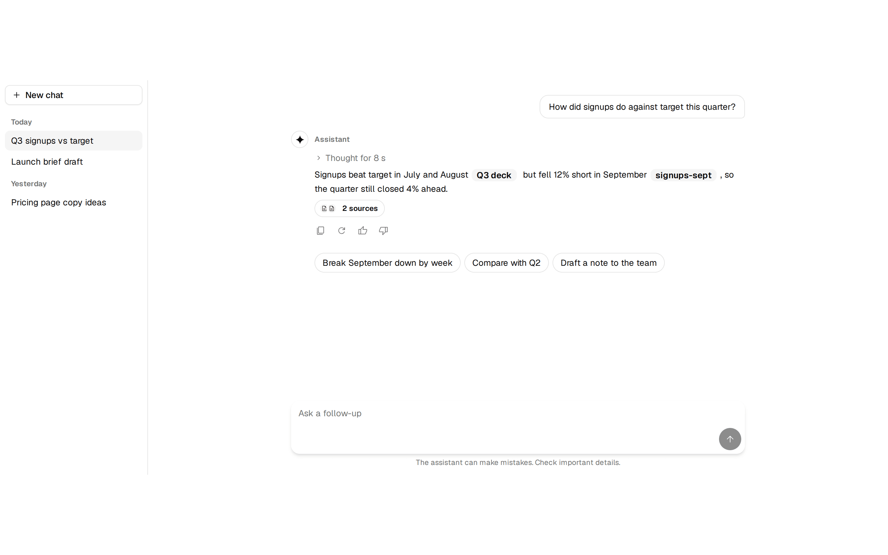
A notifications card listing recent events with icons, timestamps, unread indicators, and a mark-all-read action.
@quill
A notifications card listing recent events with icons, timestamps, unread indicators, and a mark-all-read action.
@quill
registry/blocks/notifications.tsx
import { Card, CardHeader, CardTitle, CardContent } from '@/components/ui/card'
import { Icon, type IconName } from '@/components/ui/icon'
import { Button } from '@/components/ui/button'
import { Separator } from '@/components/ui/separator'

const items: { icon: IconName; title: string; body: string; time: string; unread?: boolean }[] = [
  { icon: 'group', title: 'New member joined', body: 'Grace Hopper accepted your invite.', time: '2m', unread: true },
  { icon: 'check_circle', title: 'Deploy succeeded', body: 'acme-site is live in production.', time: '1h', unread: true },
  { icon: 'content_copy', title: 'Backup complete', body: 'Weekly backup finished successfully.', time: '4h' },
]

/** A notifications card listing recent events with icons, timestamps, unread indicators, and a mark-all-read action. */
export function Notifications() {
  return (
    <Card className="w-[360px]">
      <CardHeader className="flex flex-row items-center justify-between">
        <CardTitle>Notifications</CardTitle>
        <Button variant="link" size="sm">
          Mark all read
        </Button>
      </CardHeader>
      <CardContent className="flex flex-col gap-0 p-0">
        {items.map((it, i) => (
          <div key={it.title}>
            {i > 0 && <Separator />}
            <div className="flex items-start gap-3 px-6 py-3">
              <div className="flex size-8 shrink-0 items-center justify-center rounded-full bg-muted text-muted-foreground">
                <Icon name={it.icon} size={18} />
              </div>
              <div className="flex flex-1 flex-col">
                <span className="text-sm font-medium text-foreground">{it.title}</span>
                <span className="text-sm text-muted-foreground">{it.body}</span>
              </div>
              <div className="flex items-center gap-2">
                <span className="text-xs text-muted-foreground">{it.time}</span>
                {/* A read row keeps the dot's space, so every time sits in one column. */}
                {it.unread ? <span className="size-2 rounded-full bg-primary" role="img" aria-label="Unread" /> : <span aria-hidden className="size-2" />}
              </div>
            </div>
          </div>
        ))}
      </CardContent>
    </Card>
  )
}
A notifications card listing recent events with icons, timestamps, unread indicators, and a mark-all-read action. Do: Pair the unread dot with a real accessible label (role="img" aria-label="Unread"), as this block already does. Don't: Ship an unread indicator that's purely decorative with no accessible signal. Do: Give each notification an icon that matches its content (a person icon for membership events, a check for successful deploys) so the list can be scanned by icon alone. Don't: Reuse one generic bell icon for every notification regardless of type, forcing people to read each title just to tell them apart. Use activity-feed when the list is a read-only history with no read/unread state or mark-all action. Use sonner when the message is transient feedback about something that just happened — use a toast, not a persistent notifications list.