registry/blocks/alerts.tsx
import { Alert, AlertTitle, AlertDescription } from '@/components/ui/alert'
import { Icon } from '@/components/ui/icon'

/** A vertical stack of informational, success, and destructive alerts with icons. */
export function Alerts() {
  return (
    <div className="flex max-w-lg flex-col gap-4">
      <Alert>
        <Icon name="info" size={18} />
        <AlertTitle>Heads up</AlertTitle>
        <AlertDescription>Your trial ends in 3 days — upgrade to keep your projects.</AlertDescription>
      </Alert>
      <Alert>
        <Icon name="check_circle" size={18} />
        <AlertTitle>Changes saved</AlertTitle>
        <AlertDescription>Your profile has been updated successfully.</AlertDescription>
      </Alert>
      <Alert variant="destructive">
        <Icon name="warning" size={18} />
        <AlertTitle>Payment failed</AlertTitle>
        <AlertDescription>We couldn’t process your card. Update your billing details.</AlertDescription>
      </Alert>
    </div>
  )
}
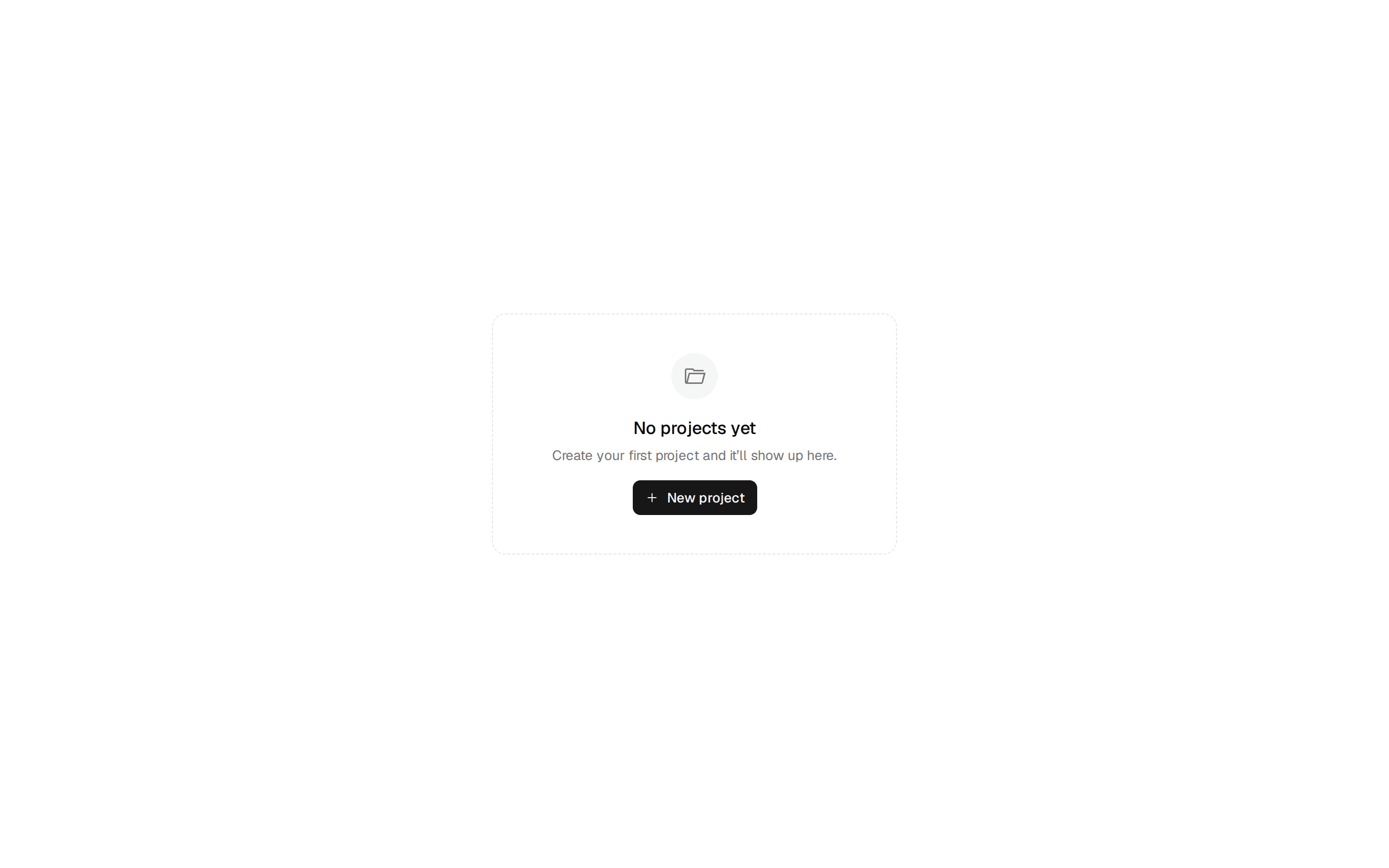
A vertical stack of informational, success, and destructive alerts with icons. Do: Match severity to consequence: destructive for blocking errors, default for neutral information. Don't: Use destructive styling for emphasis on non-error messages. Use sonner when the message is transient feedback about an action just taken — use a toast, not an inline alert. Use announcement-banner when the message is site-wide and dismissible rather than local to a page section. Use empty-state when the "message" is really an empty view that needs an explanation and a call to action.