registry/blocks/dashboard.tsx
import { Icon, type IconName } from '@/components/ui/icon'
import { Button } from '@/components/ui/button'
import { Input } from '@/components/ui/input'
import { Badge } from '@/components/ui/badge'
import {
  Card,
  CardHeader,
  CardTitle,
  CardDescription,
  CardContent,
} from '@/components/ui/card'

const nav: { label: string; icon: IconName; active?: boolean }[] = [
  { label: 'Overview', icon: 'dashboard', active: true },
  { label: 'Projects', icon: 'folder_open' },
  { label: 'Team', icon: 'group' },
  { label: 'Billing', icon: 'credit_card' },
  { label: 'Settings', icon: 'settings' },
]

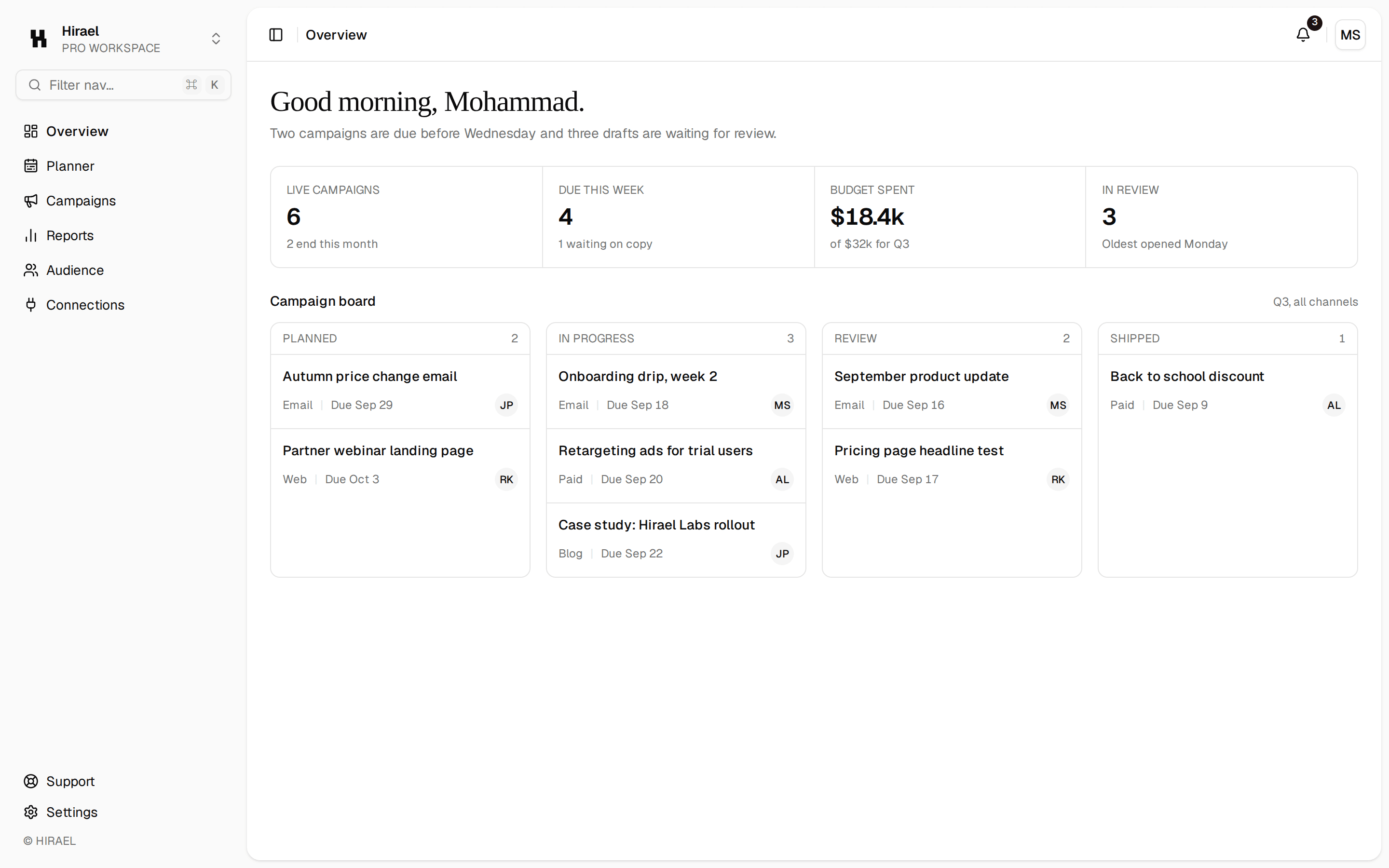
/** An app shell with sidebar navigation, a search header, and KPI stat cards. */
export function Dashboard() {
  return (
    <div className="flex h-[600px] w-full bg-background text-foreground">
      <aside className="flex w-56 shrink-0 flex-col gap-1 border-r border-border bg-sidebar p-3">
        <div className="px-2 py-3 font-heading text-lg">Quill</div>
        {nav.map((n) => (
          <button
            key={n.label}
            className={`flex items-center gap-2.5 rounded-lg px-2.5 py-2 text-left text-sm transition-colors outline-hidden focus-visible:ring-3 focus-visible:ring-ring/50 ${
              n.active ? 'bg-accent text-accent-foreground' : 'text-muted-foreground hover:bg-accent hover:text-accent-foreground'
            }`}
          >
            <Icon name={n.icon} size={18} />
            {n.label}
          </button>
        ))}
      </aside>
      <div className="flex min-w-0 flex-1 flex-col">
        <header className="flex items-center gap-3 border-b border-border px-6 py-3">
          <div className="relative flex-1 max-w-sm">
            <Input placeholder="Search…" className="w-full" />
          </div>
          <Button variant="ghost" size="icon" aria-label="Notifications">
            <Icon name="notifications" size={18} />
          </Button>
          <div className="flex size-8 items-center justify-center rounded-full bg-muted text-xs font-medium text-muted-foreground">
            AL
          </div>
        </header>
        <main className="flex flex-1 flex-col gap-5 overflow-auto p-6">
          <div className="flex items-center justify-between">
            <div>
              <h1 className="fraunces-text font-heading text-2xl">Overview</h1>
              <p className="text-sm text-muted-foreground">Welcome back, Ada.</p>
            </div>
            <Button>
              <Icon name="add" size={16} /> New project
            </Button>
          </div>
          <div className="grid grid-cols-1 gap-4 sm:grid-cols-3">
            {[
              { label: 'Revenue', value: '$48,120', delta: '+12%' },
              { label: 'Active users', value: '3,842', delta: '+4%' },
              { label: 'Conversion', value: '3.1%', delta: '+0.4%' },
            ].map((s) => (
              <Card key={s.label}>
                <CardHeader>
                  <CardDescription>{s.label}</CardDescription>
                  <CardTitle className="text-2xl">{s.value}</CardTitle>
                </CardHeader>
                <CardContent>
                  <Badge variant="secondary">{s.delta}</Badge>
                </CardContent>
              </Card>
            ))}
          </div>
        </main>
      </div>
    </div>
  )
}
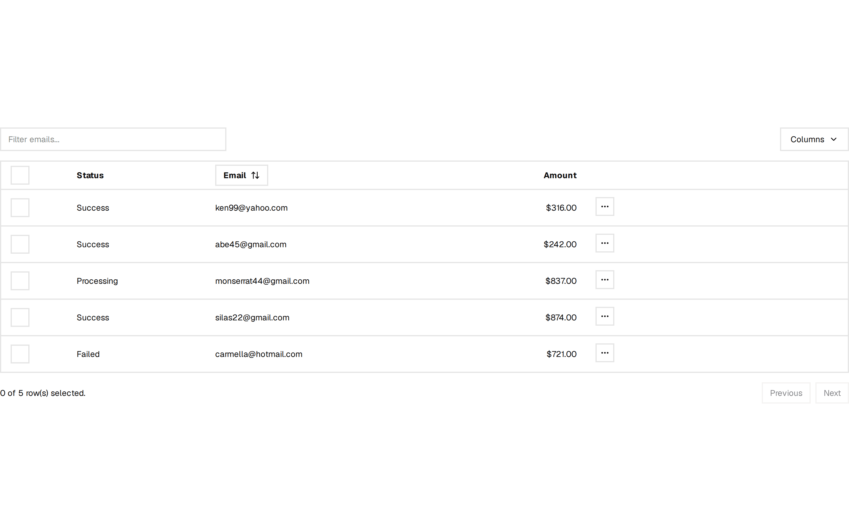
An app shell with sidebar navigation, a search header, and KPI stat cards. Do: Give the current nav item a distinct active state (background + text color), not just a subtle underline. Don't: Leave every nav item looking identical — users lose track of where they are. Use sidebar-nav when you need the collapsible icon-sidebar variant with grouped menus, not this fixed-width text sidebar. Use stat-cards when you only need the KPI row, not the full shell around it.