registry/blocks/empty-state.tsx
import { Icon } from '@/components/ui/icon'
import { Button } from '@/components/ui/button'

/** A dashed-border empty state with an icon, explanatory text, and a primary action. */
export function EmptyState() {
  return (
    <div className="flex w-[420px] flex-col items-center gap-4 rounded-xl border border-dashed border-border bg-card p-10 text-center">
      <div className="flex size-12 items-center justify-center rounded-full bg-muted text-muted-foreground">
        <Icon name="folder_open" size={24} />
      </div>
      <div className="flex flex-col gap-1">
        <h3 className="text-lg font-medium text-foreground">No projects yet</h3>
        <p className="text-sm text-muted-foreground">
          Create your first project and it’ll show up here.
        </p>
      </div>
      <Button>
        <Icon name="add" size={16} /> New project
      </Button>
    </div>
  )
}
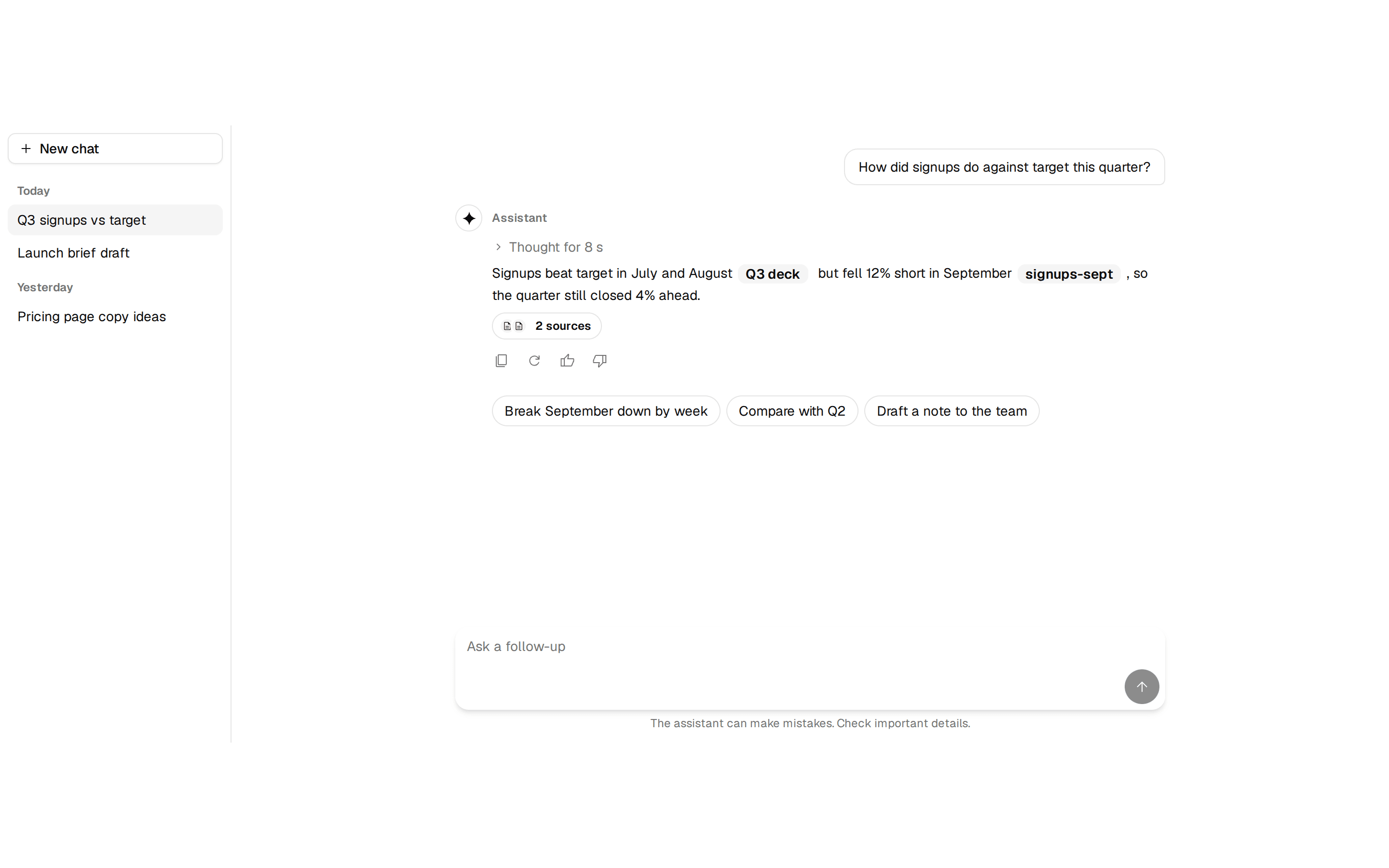
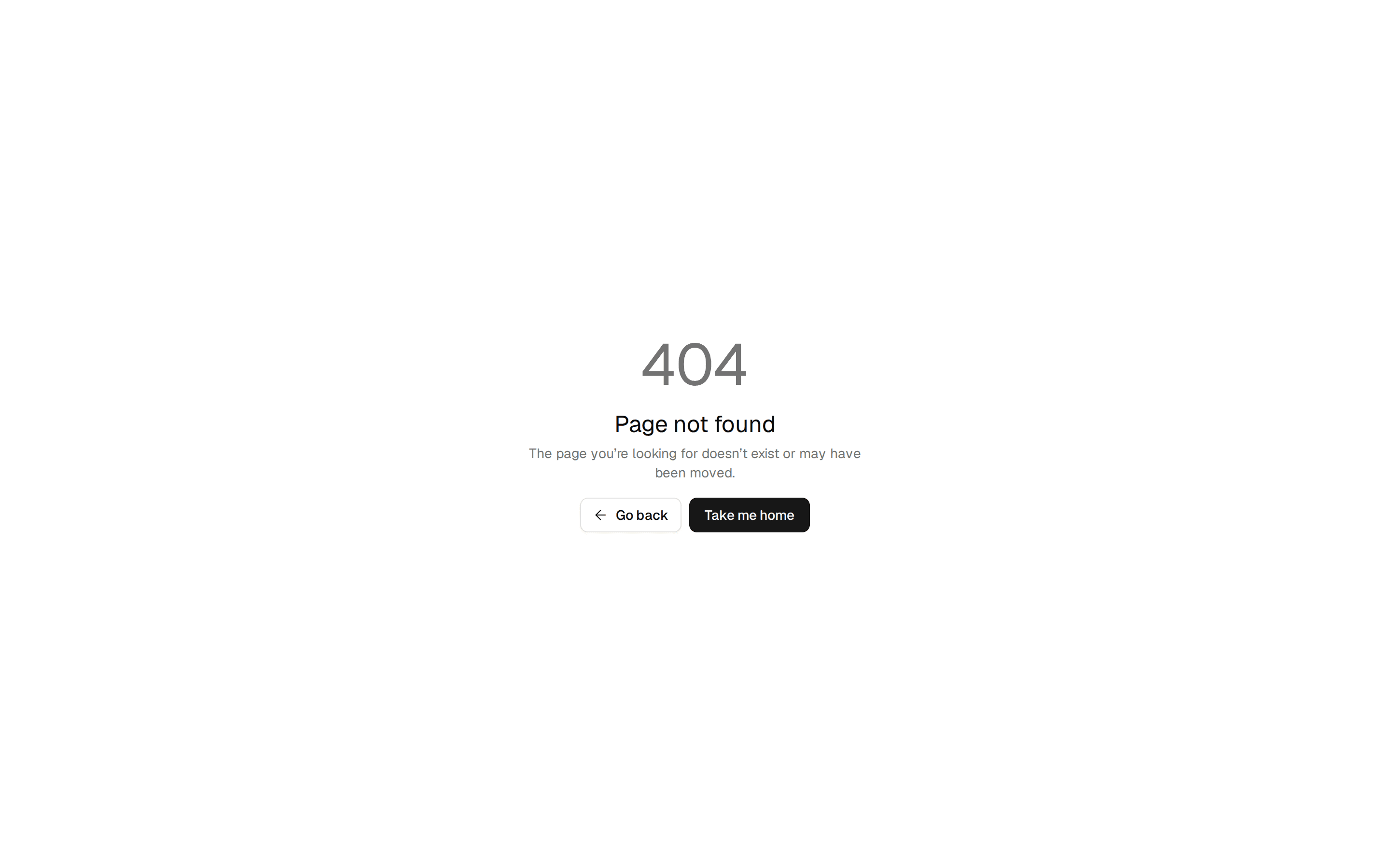
A dashed-border empty state with an icon, explanatory text, and a primary action. Do: Pair the explanation with a real, primary action button that actually fills the view (e.g. "New project"). Don't: Explain that a view is empty and leave the user with no way to act on it from that screen. Use empty when the empty state sits inside an existing surface (a list, a table, a card, a search result) and you compose it from parts: media, title, description and actions. Use empty-state for the finished stand-alone panel. Use error-404 when the view is empty because the resource doesn't exist or the route is wrong, not because the user hasn't created anything yet. Use onboarding when there's a multi-step setup to walk through, not a single action to take right now.