Empty State
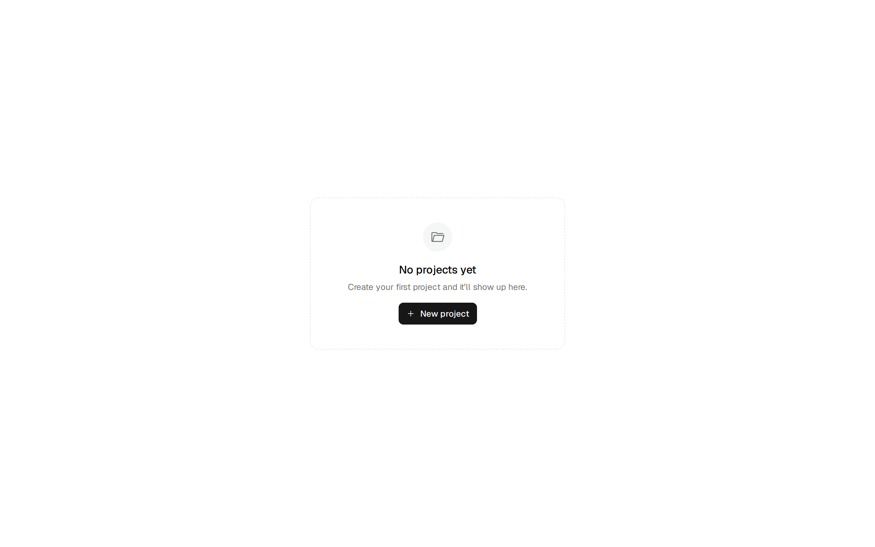
The designed answer for empty surfaces — icon or illustration, title, description, capability-gated actions, and a hint, across 6 variants and 3 sizes.
@ilinxa
The designed answer for empty surfaces — icon or illustration, title, description, capability-gated actions, and a hint, across 6 variants and 3 sizes.
@ilinxa
"use client";

import { isValidElement, type ReactNode } from "react";
import {
  Inbox,
  Lock,
  SearchX,
  Sparkles,
  TriangleAlert,
  WifiOff,
} from "lucide-react";
import { Button, buttonVariants } from "@/components/ui/button";
import { cn } from "@/lib/utils";
import type {
  EmptyStateAction,
  EmptyStateActionConfig,
  EmptyStateProps,
  EmptyStateSize,
  EmptyStateVariant,
} from "./types";

/** Per-variant default lucide icon (used when `icon`/`media` are both omitted). */
const VARIANT_ICON: Record<EmptyStateVariant, typeof Inbox> = {
  default: Inbox,
  search: SearchX,
  error: TriangleAlert,
  offline: WifiOff,
  permission: Lock,
  "first-use": Sparkles,
};

/** Variants that render `role="status" aria-live="polite"` — transient, state-change-driven (I4). */
const TRANSIENT_VARIANTS: ReadonlySet<EmptyStateVariant> = new Set([
  "search",
  "error",
  "offline",
]);

const SIZE_ROOT_CLASS: Record<EmptyStateSize, string> = {
  sm: "max-w-sm py-6",
  md: "max-w-md py-10",
  lg: "max-w-lg py-16",
};

const SIZE_TILE_CLASS: Record<EmptyStateSize, string> = {
  sm: "size-12 rounded-xl",
  md: "size-14 rounded-2xl",
  lg: "size-16 rounded-2xl",
};

const SIZE_ICON_CLASS: Record<EmptyStateSize, string> = {
  sm: "size-5",
  md: "size-6",
  lg: "size-7",
};

const SIZE_TITLE_CLASS: Record<EmptyStateSize, string> = {
  sm: "text-sm",
  md: "text-base",
  lg: "text-xl",
};

const SIZE_DESCRIPTION_CLASS: Record<EmptyStateSize, string> = {
  sm: "text-xs",
  md: "text-sm",
  lg: "text-base",
};

/** 60ms-stagger entrance reveal (tw-animate-css). Never the app-level `reveal-up` keyframe — P-F5. */
const REVEAL = "motion-safe:animate-in motion-safe:fade-in-0 motion-safe:slide-in-from-bottom-2";

function isActionConfig(action: EmptyStateAction): action is EmptyStateActionConfig {
  return (
    typeof action === "object" &&
    action !== null &&
    !isValidElement(action) &&
    "label" in action
  );
}

function renderAction(action: EmptyStateAction | undefined, kind: "primary" | "secondary") {
  // Also swallow `false`/`true`/`""` so the conditional-render idiom
  // `action={isAdmin && {…}}` doesn't mount an empty actions row (C5 F2).
  if (action == null || typeof action === "boolean" || action === "") return null;

  if (!isActionConfig(action)) {
    return action as ReactNode;
  }

  const { label, onClick, href, disabled } = action;
  const variant = kind === "primary" ? "default" : "outline";

  if (href) {
    // F-cross-13: no `asChild` — the anchor IS the styled surface via buttonVariants.
    return (
      <a
        href={disabled ? undefined : href}
        onClick={disabled ? (event) => event.preventDefault() : onClick}
        aria-disabled={disabled || undefined}
        tabIndex={disabled ? -1 : undefined}
        className={cn(buttonVariants({ variant }), disabled && "pointer-events-none opacity-50")}
      >
        {label}
      </a>
    );
  }

  return (
    <Button type="button" variant={variant} onClick={onClick} disabled={disabled}>
      {label}
    </Button>
  );
}

/**
 * EmptyState — the designed answer for any surface that can be empty: no
 * data yet, no search results, a failed fetch, offline, a permission wall,
 * or first-use onboarding. Icon-or-illustration slot, title, description,
 * up to two capability-gated actions, and an optional footer hint.
 *
 * Host owns all state — this renders the answer, it never fetches or
 * detects emptiness itself. Omit `action`/`secondaryAction` and the actions
 * row (and every `<button>`/`<a>`) is absent from the DOM (I2) — a
 * read-only empty state falls out for free.
 */
export function EmptyState(props: EmptyStateProps) {
  const {
    variant = "default",
    size = "md",
    icon,
    media,
    title,
    description,
    action,
    secondaryAction,
    hint,
    headingLevel = 3,
    animated = true,
    frame = "none",
    className,
  } = props;

  const HeadingTag = `h${headingLevel}` as "h1" | "h2" | "h3" | "h4" | "h5" | "h6";
  const isTransient = TRANSIENT_VARIANTS.has(variant);
  const isFirstUse = variant === "first-use";
  const isError = variant === "error";
  const reveal = animated ? REVEAL : "";
  // fill-mode "both" is load-bearing: tw-animate-css's `animate-in` defaults
  // animation-fill-mode to none, so a delay-staggered element would render
  // visible during its delay, snap to opacity 0, then animate back in (flash).
  const delayStyle = (ms: number) =>
    animated ? { animationDelay: `${ms}ms`, animationFillMode: "both" as const } : undefined;

  const Icon = VARIANT_ICON[variant];
  const primaryAction = renderAction(action, "primary");
  const secondaryActionNode = renderAction(secondaryAction, "secondary");
  const hasActions = primaryAction !== null || secondaryActionNode !== null;

  return (
    <div
      role={isTransient ? "status" : undefined}
      aria-live={isTransient ? "polite" : undefined}
      className={cn(
        "mx-auto flex flex-col items-center px-4 text-center",
        SIZE_ROOT_CLASS[size],
        frame === "dashed" && "rounded-2xl border border-dashed border-border",
        frame === "card" && "rounded-2xl border border-border bg-card text-card-foreground shadow-sm",
        className,
      )}
    >
      {media ? (
        // No aria-hidden here: `media` is consumer content — the host's own
        // alt/aria attributes on the node decide its AT semantics (C5 F3).
        <div className={cn("mb-4", reveal)} style={delayStyle(0)}>
          {media}
        </div>
      ) : (
        <div
          className={cn("relative mb-4 flex items-center justify-center", reveal)}
          style={delayStyle(0)}
          aria-hidden="true"
        >
          {isFirstUse ? (
            <span
              className={cn(
                "absolute -inset-1.5 rounded-2xl border-2 border-dashed border-primary/30",
                animated && "motion-safe:animate-spin",
              )}
              style={animated ? { animationDuration: "8s" } : undefined}
            />
          ) : null}
          <span
            className={cn(
              "absolute inset-0 rounded-2xl blur-lg",
              (variant === "default" || isFirstUse) && "bg-primary/12",
            )}
          />
          <span
            className={cn(
              "relative flex items-center justify-center rounded-2xl bg-muted text-muted-foreground ring-1 ring-border",
              SIZE_TILE_CLASS[size],
              isError && "text-destructive",
            )}
          >
            {icon ?? <Icon className={SIZE_ICON_CLASS[size]} />}
          </span>
        </div>
      )}

      <HeadingTag
        className={cn(
          "text-balance font-semibold text-foreground",
          SIZE_TITLE_CLASS[size],
          reveal,
        )}
        style={delayStyle(60)}
      >
        {title}
      </HeadingTag>

      {description ? (
        <p
          className={cn(
            "mt-1.5 max-w-prose text-pretty text-muted-foreground",
            SIZE_DESCRIPTION_CLASS[size],
            reveal,
          )}
          style={delayStyle(120)}
        >
          {description}
        </p>
      ) : null}

      {hasActions ? (
        <div
          className={cn("mt-5 flex flex-wrap items-center justify-center gap-2", reveal)}
          style={delayStyle(180)}
        >
          {primaryAction}
          {secondaryActionNode}
        </div>
      ) : null}

      {hint ? (
        <div
          className={cn("mt-4 text-xs text-muted-foreground/80", reveal)}
          style={delayStyle(240)}
        >
          {hint}
        </div>
      ) : null}
    </div>
  );
}