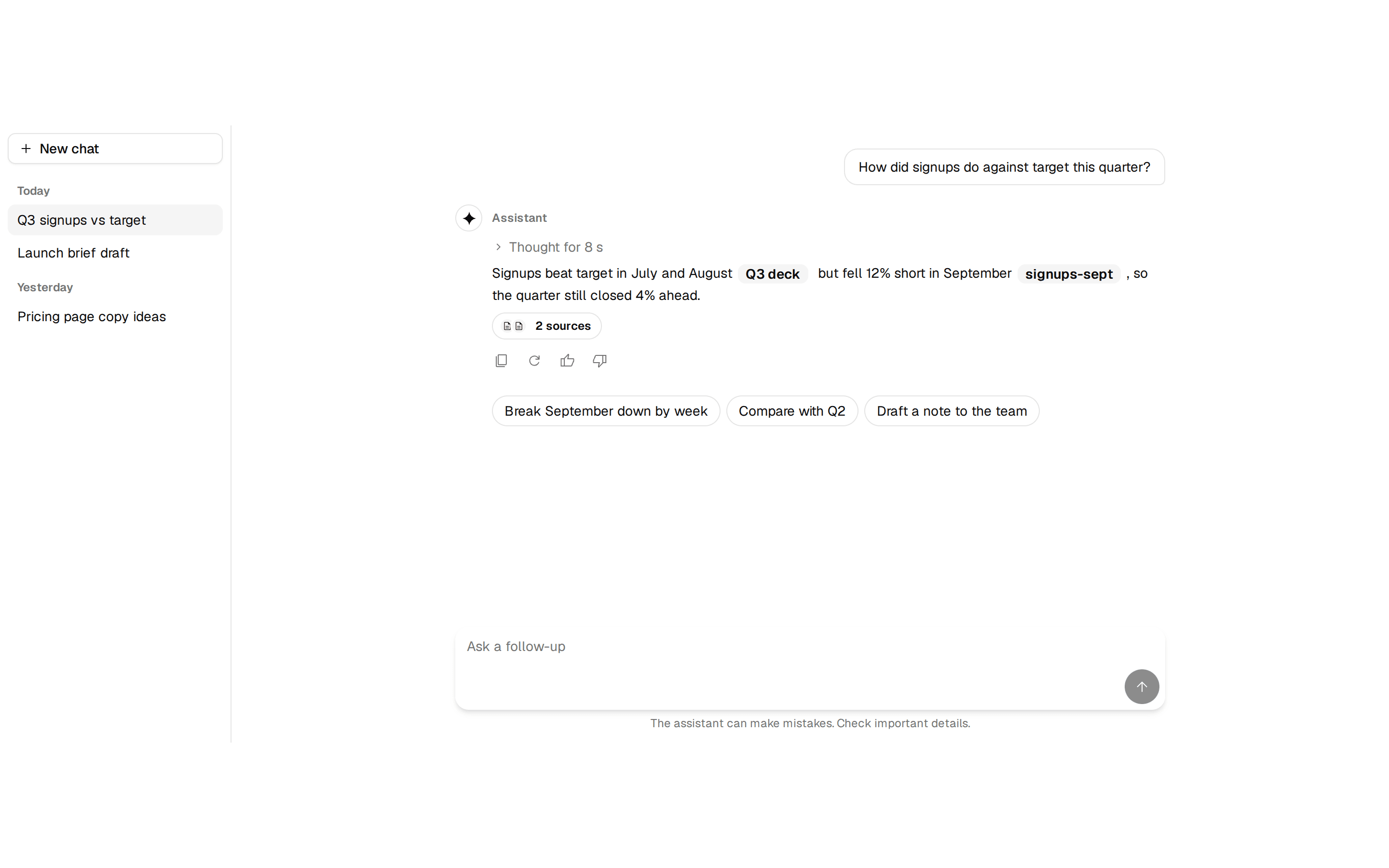
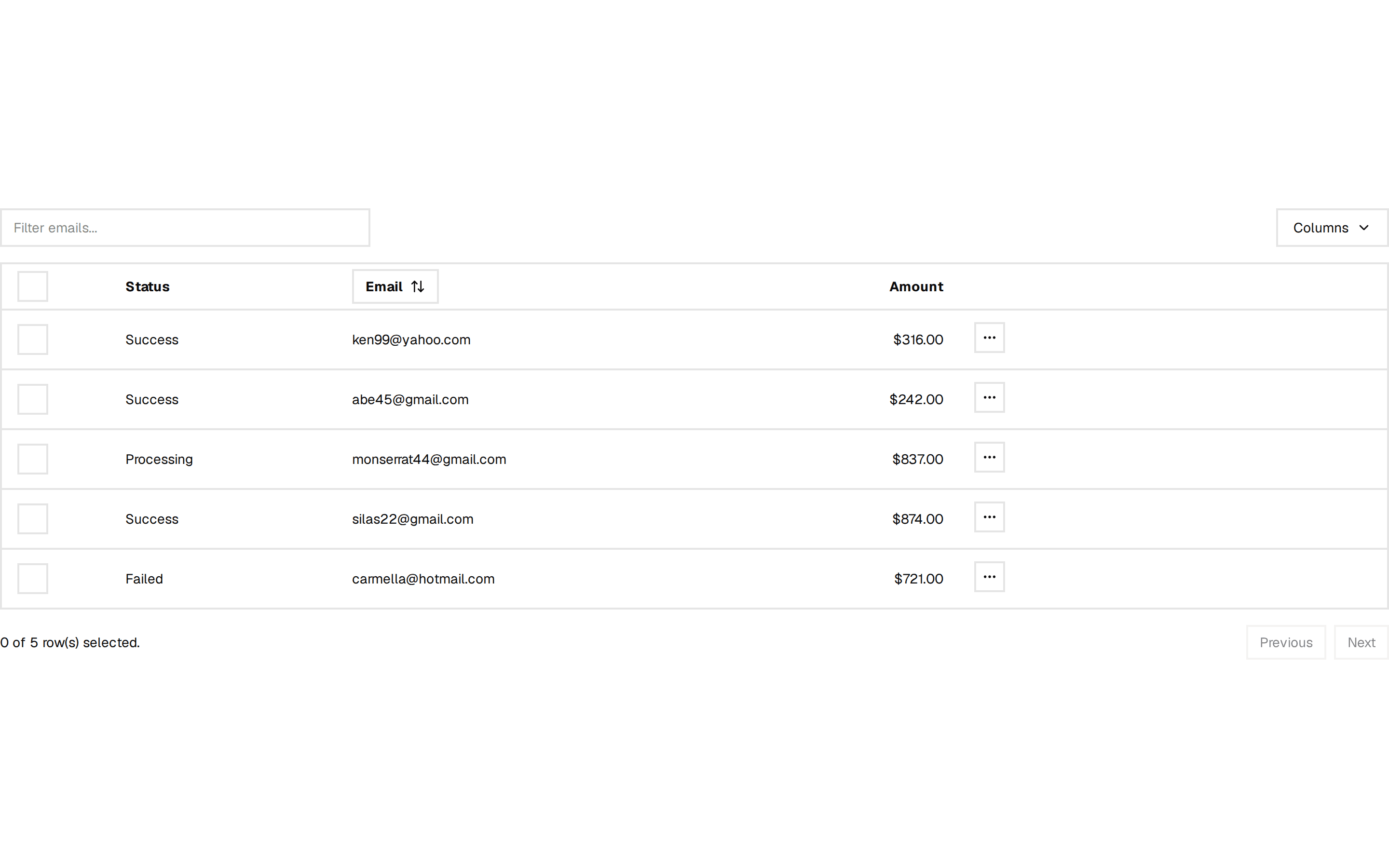
Data table
A filterable members table with a toolbar, ToneBadge status pills, and a per-row actions menu.
@quill
A filterable members table with a toolbar, ToneBadge status pills, and a per-row actions menu.
@quill
registry/blocks/data-table.tsx
import {
  Table,
  TableHeader,
  TableBody,
  TableRow,
  TableHead,
  TableCell,
} from '@/components/ui/table'
import { ToneBadge, type Tone } from '@/components/ui/tone-badge'
import { Button } from '@/components/ui/button'
import { Input } from '@/components/ui/input'
import { Icon } from '@/components/ui/icon'

const rows = [
  { name: 'Ada Lovelace', email: 'ada@example.com', role: 'Owner', status: 'Active' as const },
  { name: 'Alan Turing', email: 'alan@example.com', role: 'Admin', status: 'Active' as const },
  { name: 'Grace Hopper', email: 'grace@example.com', role: 'Editor', status: 'Invited' as const },
  { name: 'Katherine Johnson', email: 'kat@example.com', role: 'Viewer', status: 'Active' as const },
]

// Status → pigment, decided once so every row reads from the same vocabulary:
// moss for a live membership, gold for one still developing.
const STATUS_TONE: Record<(typeof rows)[number]['status'], Tone> = { Active: 'moss', Invited: 'gold' }

/** A filterable members table with a toolbar, ToneBadge status pills, and a per-row actions menu. */
export function DataTable() {
  return (
    <div className="flex flex-col gap-3">
      <div className="flex items-center gap-2">
        <div className="max-w-xs flex-1">
          <Input placeholder="Filter members…" />
        </div>
        <Button variant="outline" size="sm" className="ml-auto">
          <Icon name="filter_list" size={16} /> Filter
        </Button>
        <Button size="sm">
          <Icon name="add" size={16} /> Invite
        </Button>
      </div>
      <div className="overflow-hidden rounded-lg border border-border">
        <Table>
          <TableHeader>
            <TableRow>
              <TableHead>Name</TableHead>
              <TableHead>Role</TableHead>
              <TableHead>Status</TableHead>
              <TableHead className="w-10">
                <span className="sr-only">Actions</span>
              </TableHead>
            </TableRow>
          </TableHeader>
          <TableBody>
            {rows.map((r) => (
              <TableRow key={r.email}>
                <TableCell>
                  <div className="flex flex-col">
                    <span className="font-medium text-foreground">{r.name}</span>
                    <span className="text-xs text-muted-foreground">{r.email}</span>
                  </div>
                </TableCell>
                <TableCell className="text-muted-foreground">{r.role}</TableCell>
                <TableCell>
                  <ToneBadge tone={STATUS_TONE[r.status]}>{r.status}</ToneBadge>
                </TableCell>
                <TableCell>
                  <Button variant="ghost" size="icon" aria-label={`Actions for ${r.name}`}>
                    <Icon name="more_horiz" size={18} />
                  </Button>
                </TableCell>
              </TableRow>
            ))}
          </TableBody>
        </Table>
      </div>
    </div>
  )
}
A filterable members table with a toolbar, ToneBadge status pills, and a per-row actions menu. Do: Give every icon-only row-action button a per-row aria-label (e.g. "Actions for Ada Lovelace"), not a generic one. Don't: Ship a table full of icon-only buttons that all announce as the same unlabeled button to a screen reader. Use activity-feed when you want a read-only chronological list, not sortable/filterable records with row actions. Use kanban when the records are better organized by status columns than by table rows.