registry/blocks/badge-on-card.tsx
import { Card, CardContent } from '@/components/ui/card'
import { Badge } from '@/components/ui/badge'

/** Default, secondary, and destructive badges shown together on a card surface. */
export function BadgeOnCard() {
  return (
    <Card className="w-[280px]">
      <CardContent className="flex gap-2">
        <Badge>Default</Badge>
        <Badge variant="secondary">Secondary</Badge>
        <Badge variant="destructive">Destructive</Badge>
      </CardContent>
    </Card>
  )
}
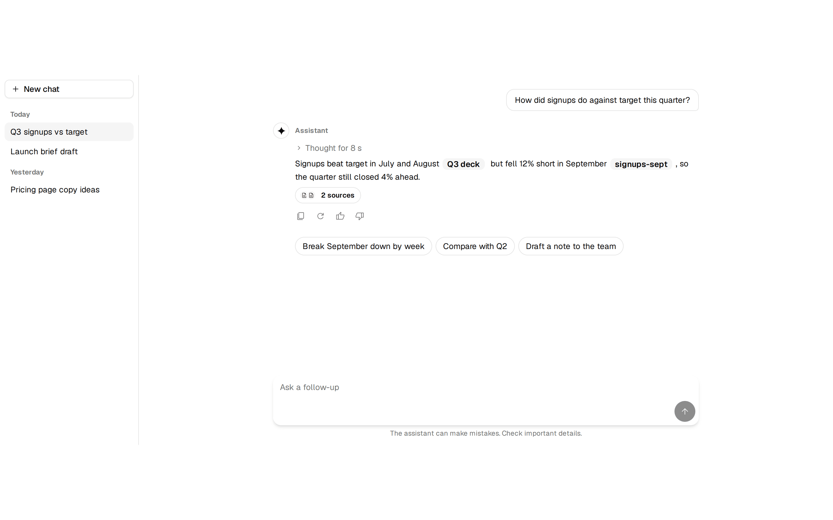
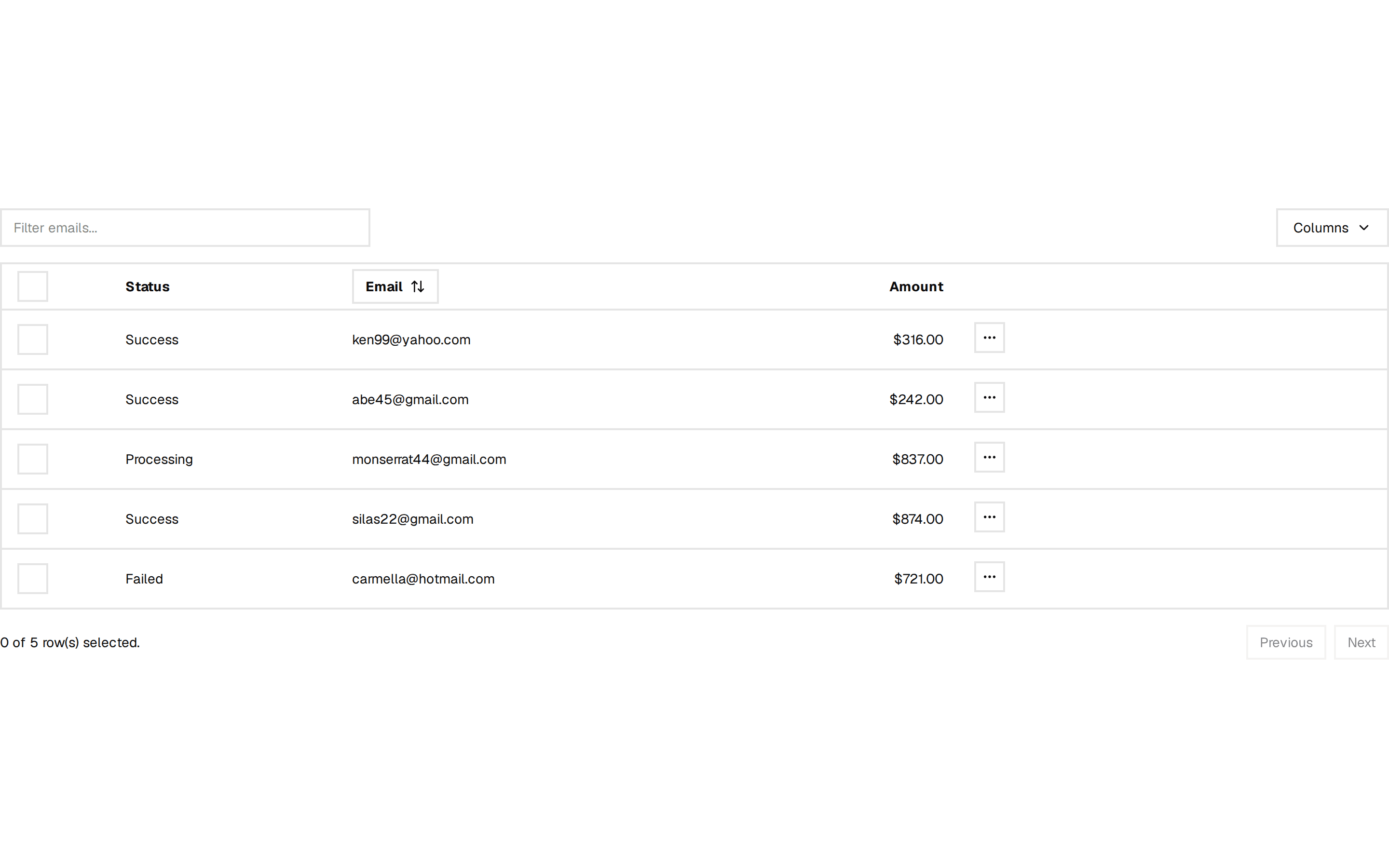
Default, secondary, and destructive badges shown together on a card surface. Do: Reserve the destructive variant for a status that actually needs attention (blocked, failed, overdue). Don't: Use destructive styling for emphasis on a badge that isn't actually a warning. Use tone-badge when you need a badge whose color is driven by a semantic tone token rather than the three fixed variants here. Use data-table when the badges are actually per-row status in a list of records, not a single card's labels.