Sidebar navigation shell
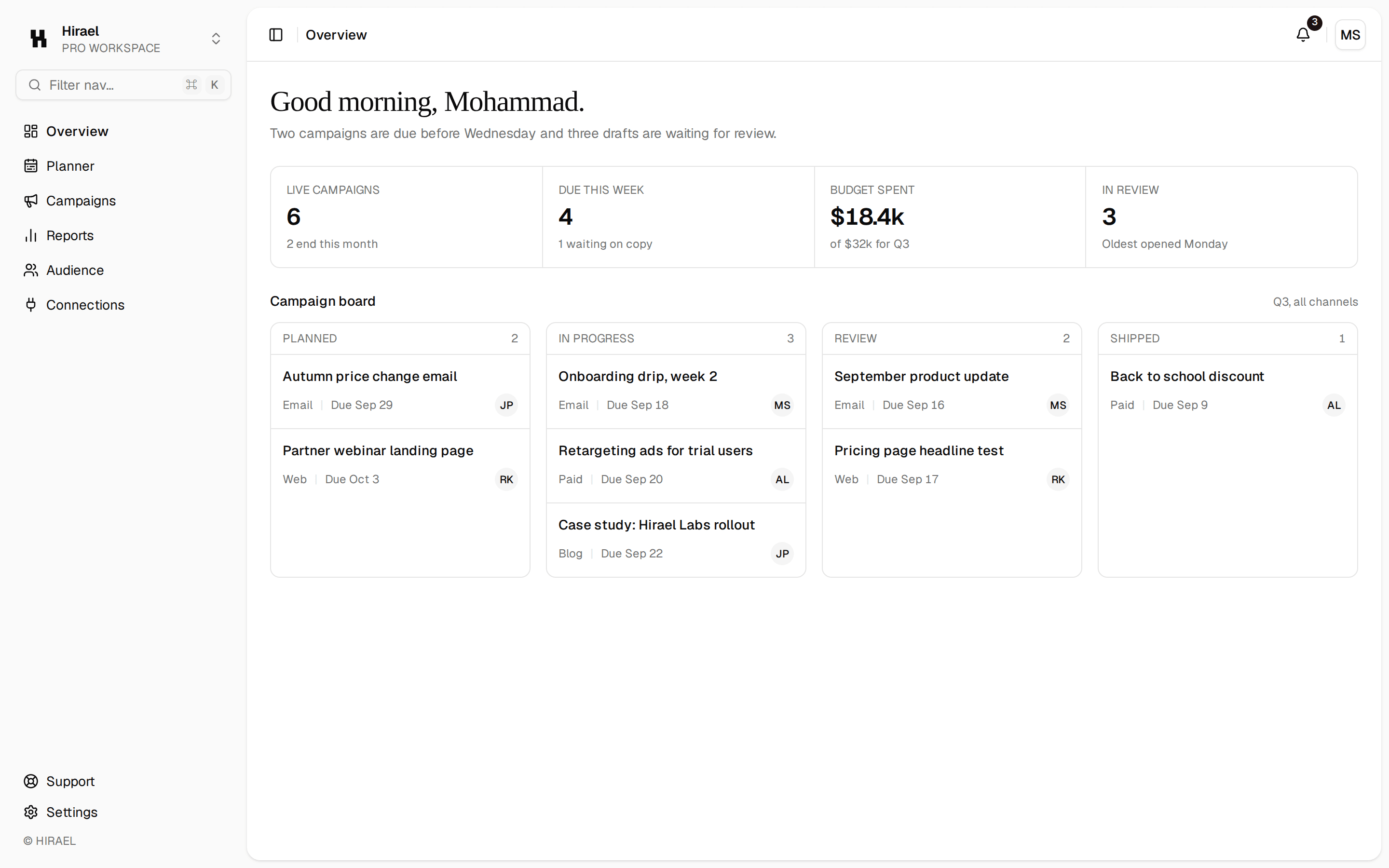
A collapsible icon-sidebar app shell with grouped menus, badges, a top bar, and a main area for the page — a card grid by default, or the children you pass in.
@quill
A collapsible icon-sidebar app shell with grouped menus, badges, a top bar, and a main area for the page — a card grid by default, or the children you pass in.
@quill
registry/blocks/sidebar-nav.tsx
import {
  Sidebar,
  SidebarContent,
  SidebarFooter,
  SidebarGroup,
  SidebarGroupContent,
  SidebarGroupLabel,
  SidebarHeader,
  SidebarMenu,
  SidebarMenuBadge,
  SidebarMenuButton,
  SidebarMenuItem,
  SidebarProvider,
  SidebarRail,
  SidebarTrigger,
} from '@/components/ui/sidebar'
import {
  Breadcrumb,
  BreadcrumbItem,
  BreadcrumbLink,
  BreadcrumbList,
  BreadcrumbPage,
  BreadcrumbSeparator,
} from '@/components/ui/breadcrumb'
import { Avatar, AvatarFallback } from '@/components/ui/avatar'
import { Separator } from '@/components/ui/separator'
import { Icon } from '@/components/ui/icon'
import { Card, CardContent } from '@/components/ui/card'

const workspace = [
  { icon: 'space_dashboard', label: 'Overview', badge: '', active: true },
  { icon: 'ink_pen', label: 'Engagements', badge: '4', active: false },
  { icon: 'palette', label: 'Clients', badge: '', active: false },
  { icon: 'photo_library', label: 'Deliverables', badge: '12', active: false },
] as const

const team = [
  { icon: 'group', label: 'Collaborators' },
  { icon: 'settings', label: 'Settings' },
] as const

/** A collapsible icon-sidebar app shell with grouped menus, badges, a top bar, and a main area for the page — a card grid by default, or the children you pass in. */
export function SidebarNav({ children }: { children?: React.ReactNode }) {
  return (
    // The stock sidebar is fixed to the window (full height, top 0) while this shell is a 560px box, so the
    // sidebar ran past the main area and ignored the page's margin; it is placed inside the shell instead.
    <SidebarProvider className="min-h-0">
      <div className="relative flex h-[560px] w-full [&_[data-slot=sidebar-container]]:absolute [&_[data-slot=sidebar-container]]:h-full">
        <Sidebar collapsible="icon">
          <SidebarHeader className="px-4 py-3">
            <div className="flex items-center gap-2">
              <span className="flex size-7 items-center justify-center rounded-md bg-primary text-xs font-medium text-primary-foreground">
                Q
              </span>
              <span className="font-heading text-sm font-medium text-foreground group-data-[collapsible=icon]:hidden">
                Quill
              </span>
            </div>
          </SidebarHeader>
          <Separator />
          <SidebarContent>
            <SidebarGroup>
              <SidebarGroupLabel>Workspace</SidebarGroupLabel>
              <SidebarGroupContent>
                <SidebarMenu>
                  {workspace.map((item) => (
                    <SidebarMenuItem key={item.label}>
                      <SidebarMenuButton isActive={item.active} tooltip={item.label}>
                        <Icon name={item.icon as never} />
                        <span>{item.label}</span>
                      </SidebarMenuButton>
                      {item.badge && <SidebarMenuBadge>{item.badge}</SidebarMenuBadge>}
                    </SidebarMenuItem>
                  ))}
                </SidebarMenu>
              </SidebarGroupContent>
            </SidebarGroup>
            <SidebarGroup>
              <SidebarGroupLabel>Team</SidebarGroupLabel>
              <SidebarGroupContent>
                <SidebarMenu>
                  {team.map((item) => (
                    <SidebarMenuItem key={item.label}>
                      <SidebarMenuButton tooltip={item.label}>
                        <Icon name={item.icon as never} />
                        <span>{item.label}</span>
                      </SidebarMenuButton>
                    </SidebarMenuItem>
                  ))}
                </SidebarMenu>
              </SidebarGroupContent>
            </SidebarGroup>
          </SidebarContent>
          <Separator />
          <SidebarFooter className="px-4 py-3">
            <div className="flex items-center gap-2">
              <Avatar size="sm">
                <AvatarFallback>JD</AvatarFallback>
              </Avatar>
              <div className="flex flex-col group-data-[collapsible=icon]:hidden">
                <span className="text-xs font-medium text-foreground">John Doe</span>
                <span className="text-xs text-muted-foreground">Team plan</span>
              </div>
            </div>
          </SidebarFooter>
          <SidebarRail />
        </Sidebar>
        <div className="flex min-w-0 flex-1 flex-col">
          <header className="flex items-center gap-3 border-b border-border px-4 py-3">
            <SidebarTrigger />
            <Separator orientation="vertical" className="h-4 data-vertical:self-center" />
            {children ? (
              // A page passed in brings its own page-header breadcrumb, so the
              // shell keeps the top bar to the trigger and the workspace name.
              <span className="text-sm text-muted-foreground">Workspace</span>
            ) : (
              <Breadcrumb>
                <BreadcrumbList>
                  <BreadcrumbItem>
                    <BreadcrumbLink href="#">Workspace</BreadcrumbLink>
                  </BreadcrumbItem>
                  <BreadcrumbSeparator />
                  <BreadcrumbItem>
                    <BreadcrumbPage>Overview</BreadcrumbPage>
                  </BreadcrumbItem>
                </BreadcrumbList>
              </Breadcrumb>
            )}
          </header>
          <main className="flex flex-1 flex-col gap-6 overflow-auto p-4">
            {children ?? (
              <div className="grid grid-cols-3 gap-4 max-lg:grid-cols-1">
                {['Active engagements', 'Review queue', 'Client notes'].map((title) => (
                  <Card key={title} size="sm">
                    <CardContent className="flex h-32 flex-col gap-1">
                      <span className="text-sm font-medium text-foreground">{title}</span>
                      <span className="text-xs text-muted-foreground">Nothing pressing.</span>
                    </CardContent>
                  </Card>
                ))}
              </div>
            )}
          </main>
        </div>
      </div>
    </SidebarProvider>
  )
}
A collapsible icon-sidebar app shell with grouped menus, badges, a top bar, and a main area for the page — a card grid by default, or the children you pass in. Do: Group sidebar items under labeled sections (e.g. "Workspace", "Studio"), as this block already does, rather than one long flat list. Don't: List every nav item at the same level with no grouping once the count grows past a handful. Use dashboard when you need a simpler, fixed-width text sidebar without the icon-collapse behavior. Use mail-shell when the main content area is a two-pane message list/reading layout, not a card grid.