registry/blocks/signup.tsx
import {
  Card,
  CardHeader,
  CardTitle,
  CardDescription,
  CardContent,
  CardFooter,
} from '@/components/ui/card'
import { Input } from '@/components/ui/input'
import { Label } from '@/components/ui/label'
import { Button } from '@/components/ui/button'

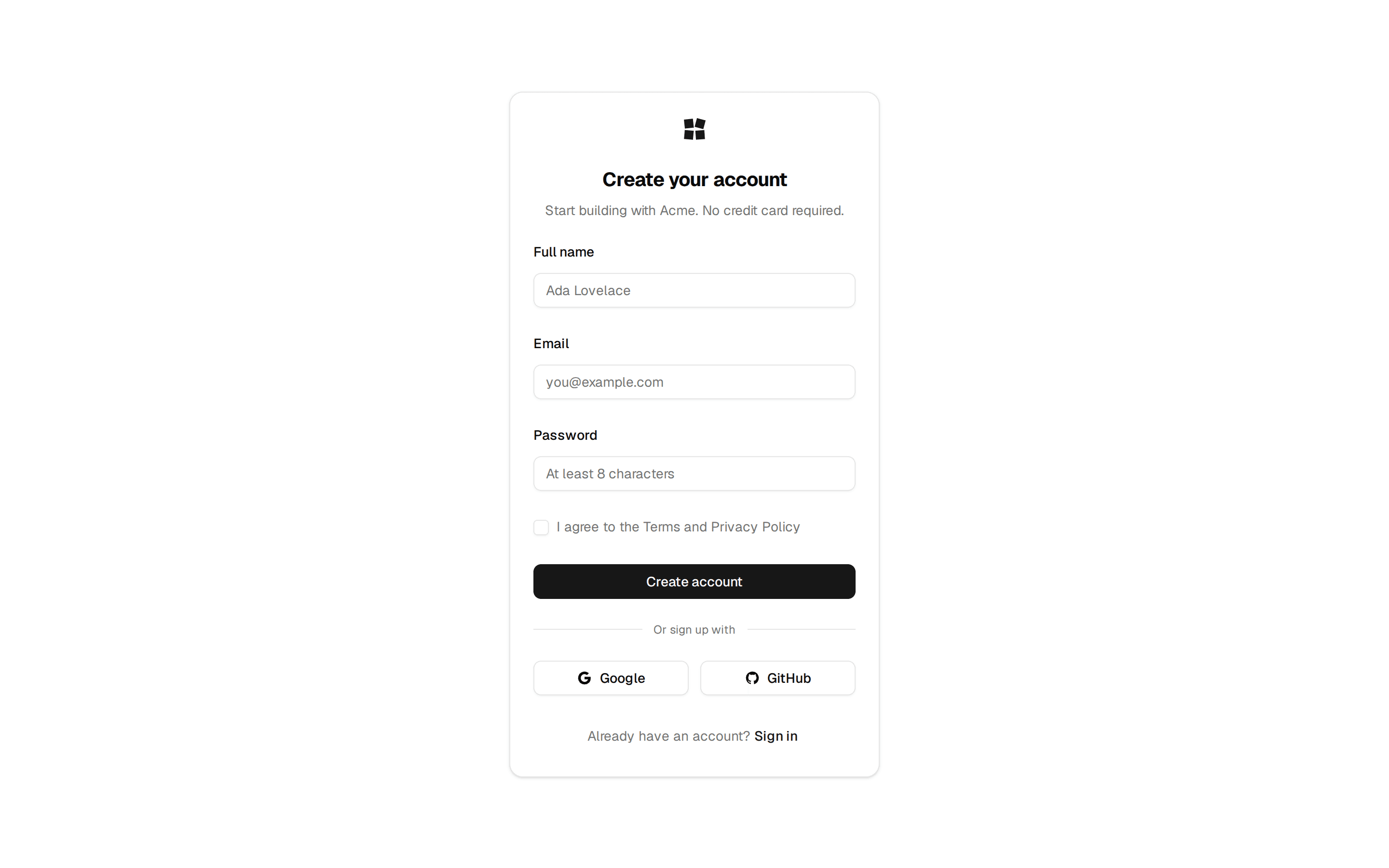
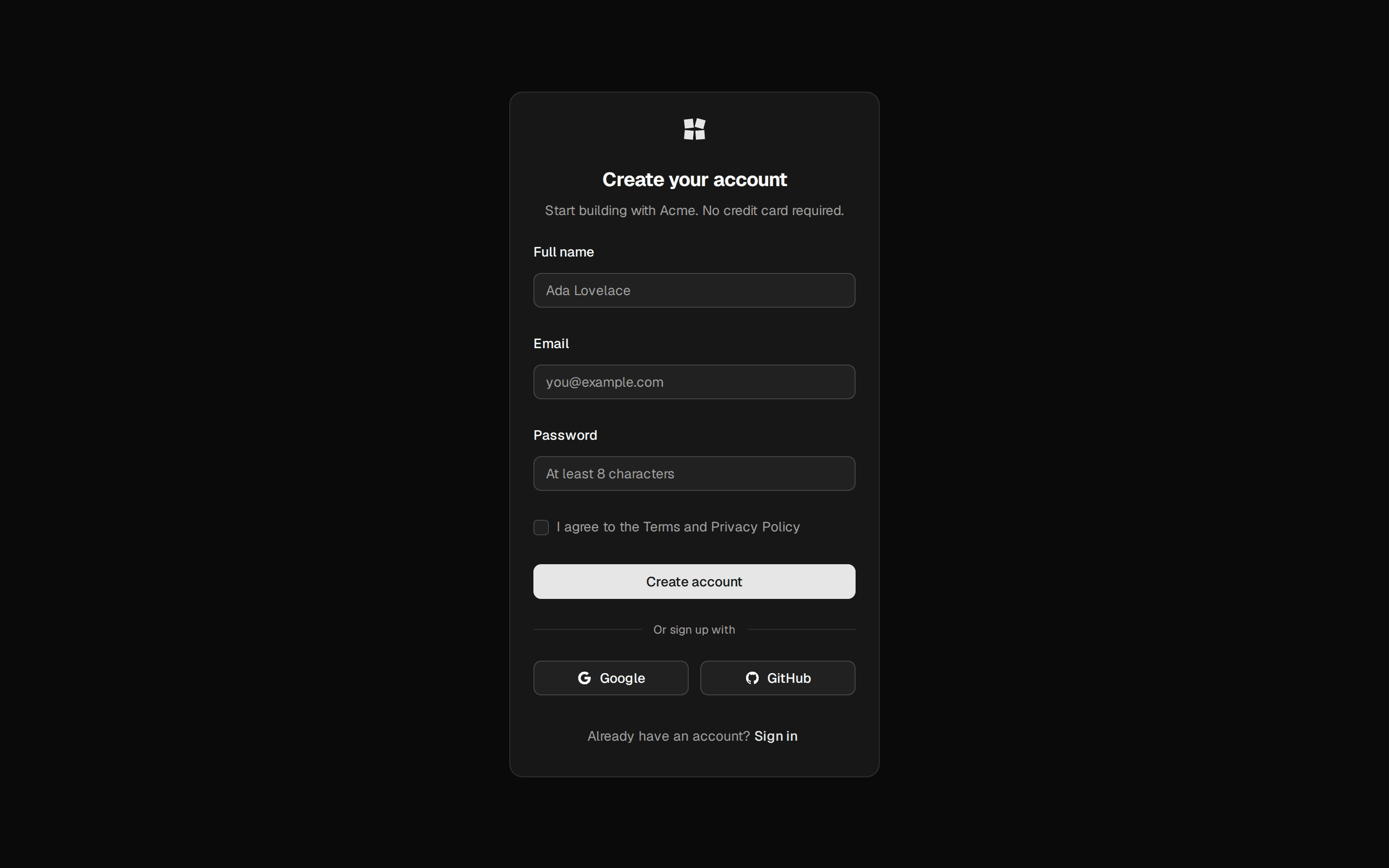
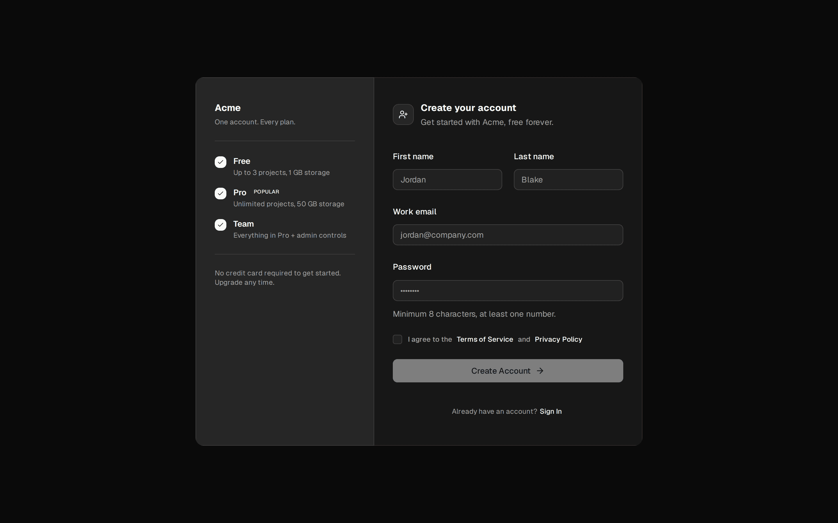
/** Standard account-creation card — name, email, password, and a link back to sign-in. */
export function Signup() {
  return (
    <Card className="w-[380px]">
      <CardHeader>
        <CardTitle>Create your account</CardTitle>
        <CardDescription>Start your 14-day free trial — no card required.</CardDescription>
      </CardHeader>
      <CardContent className="flex flex-col gap-4">
        <div className="flex flex-col gap-1.5">
          <Label htmlFor="su-name">Full name</Label>
          <Input id="su-name" placeholder="Ada Lovelace" />
        </div>
        <div className="flex flex-col gap-1.5">
          <Label htmlFor="su-email">Work email</Label>
          <Input id="su-email" type="email" placeholder="you@company.com" />
        </div>
        <div className="flex flex-col gap-1.5">
          <Label htmlFor="su-password">Password</Label>
          <Input id="su-password" type="password" placeholder="At least 8 characters" />
        </div>
      </CardContent>
      <CardFooter className="flex-col gap-2">
        <Button className="w-full">Create account</Button>
        <p className="text-center text-xs text-muted-foreground">
          Already have an account?{' '}
          <a href="#" className="rounded-sm text-primary underline underline-offset-4 outline-hidden focus-visible:ring-3 focus-visible:ring-ring/50">
            Sign in
          </a>
        </p>
      </CardFooter>
    </Card>
  )
}
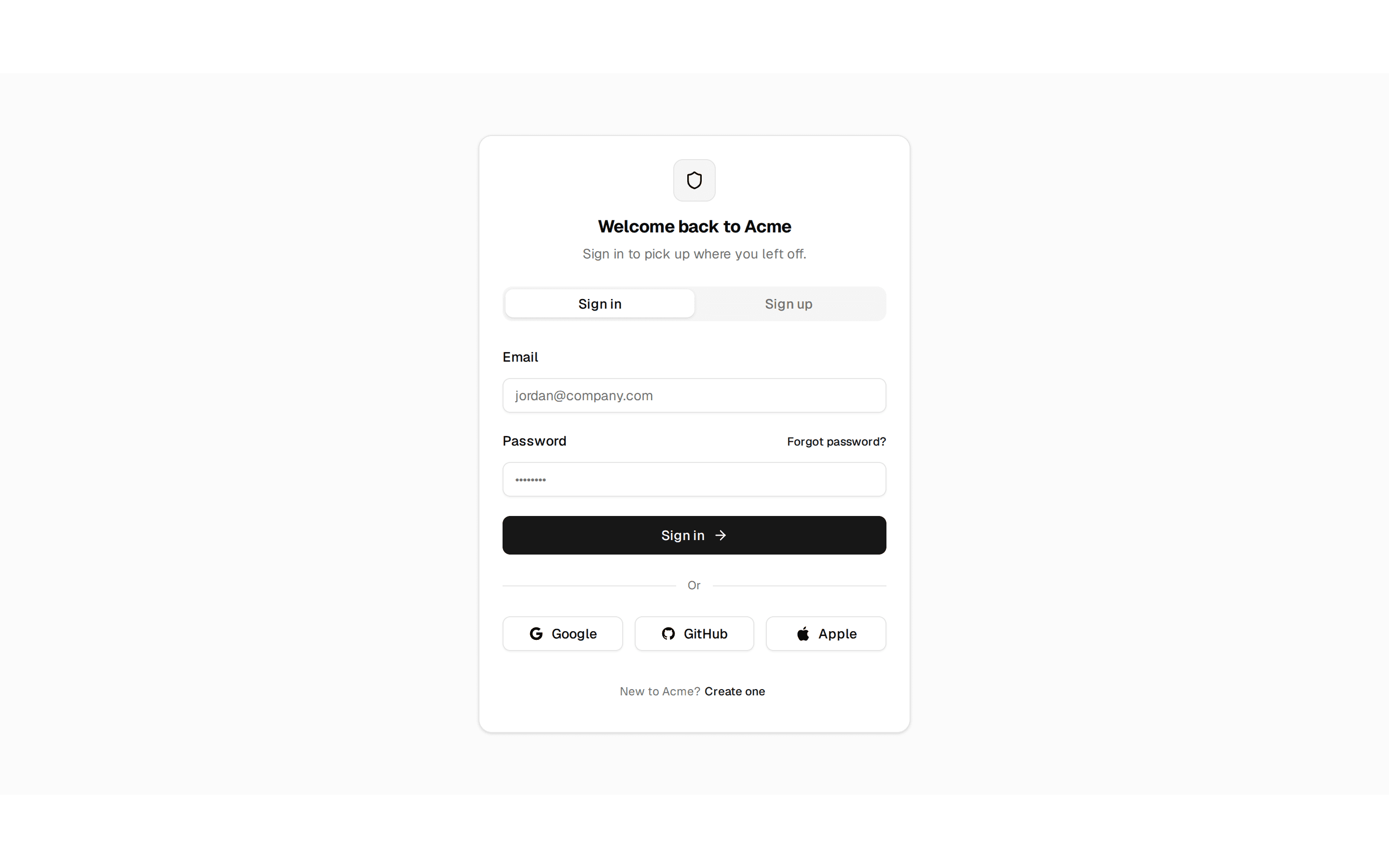
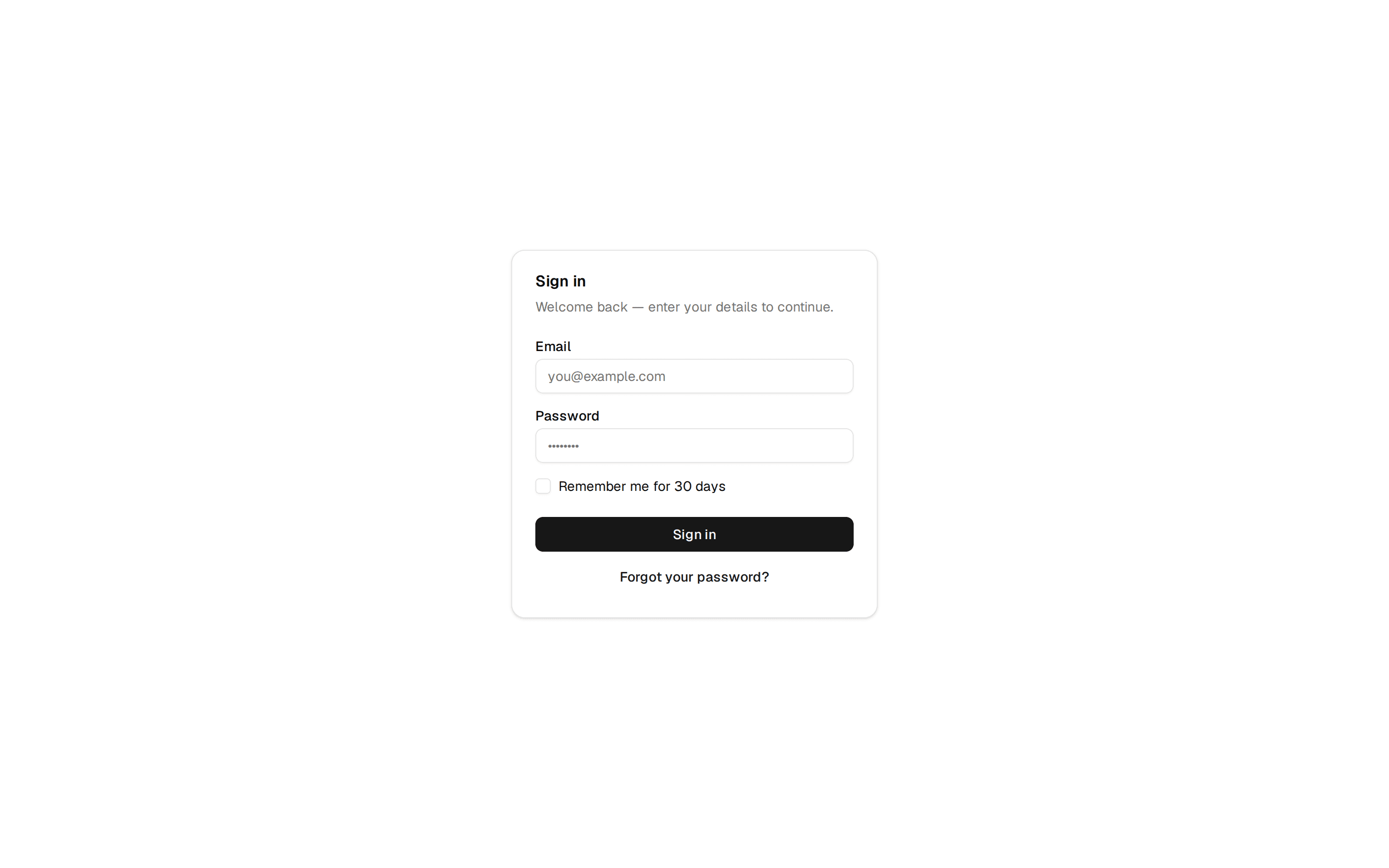
Standard account-creation card — name, email, password, and a link back to sign-in. Do: Use the description line to state what happens next (trial length, no card required) so the form isn't just fields with no context. Don't: Leave the card as a bare field list with no framing for why someone would fill it out. Use signup-social when you want OAuth providers to lead instead of a bare email/password form. Use login when the user already has an account — this card is only for new ones.