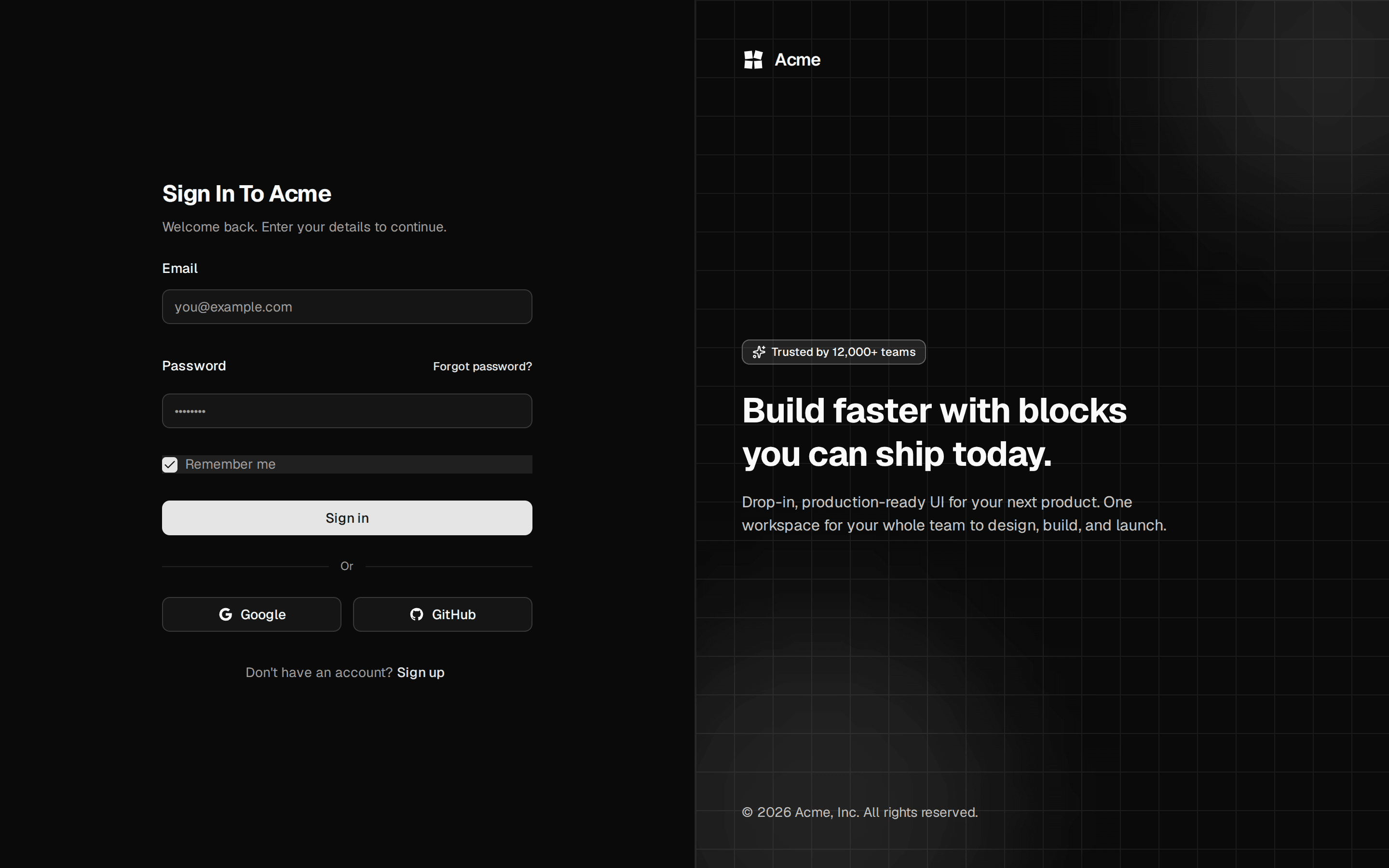
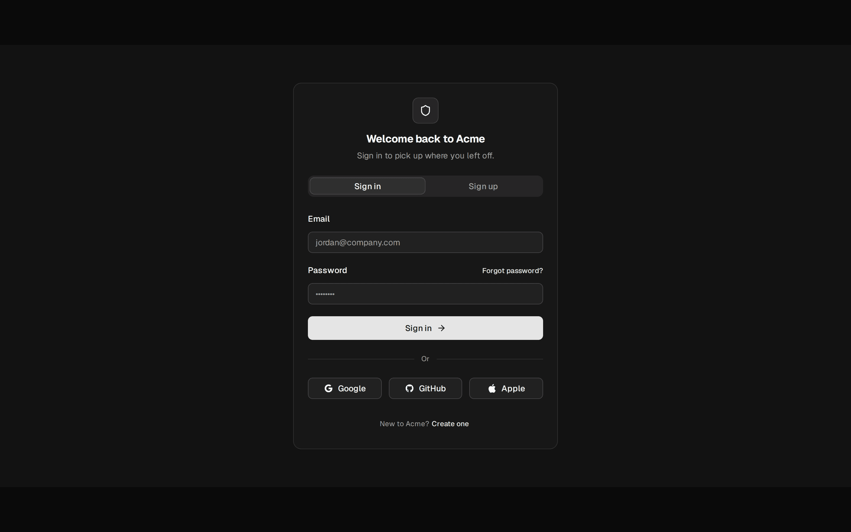
Set New Password With Rules
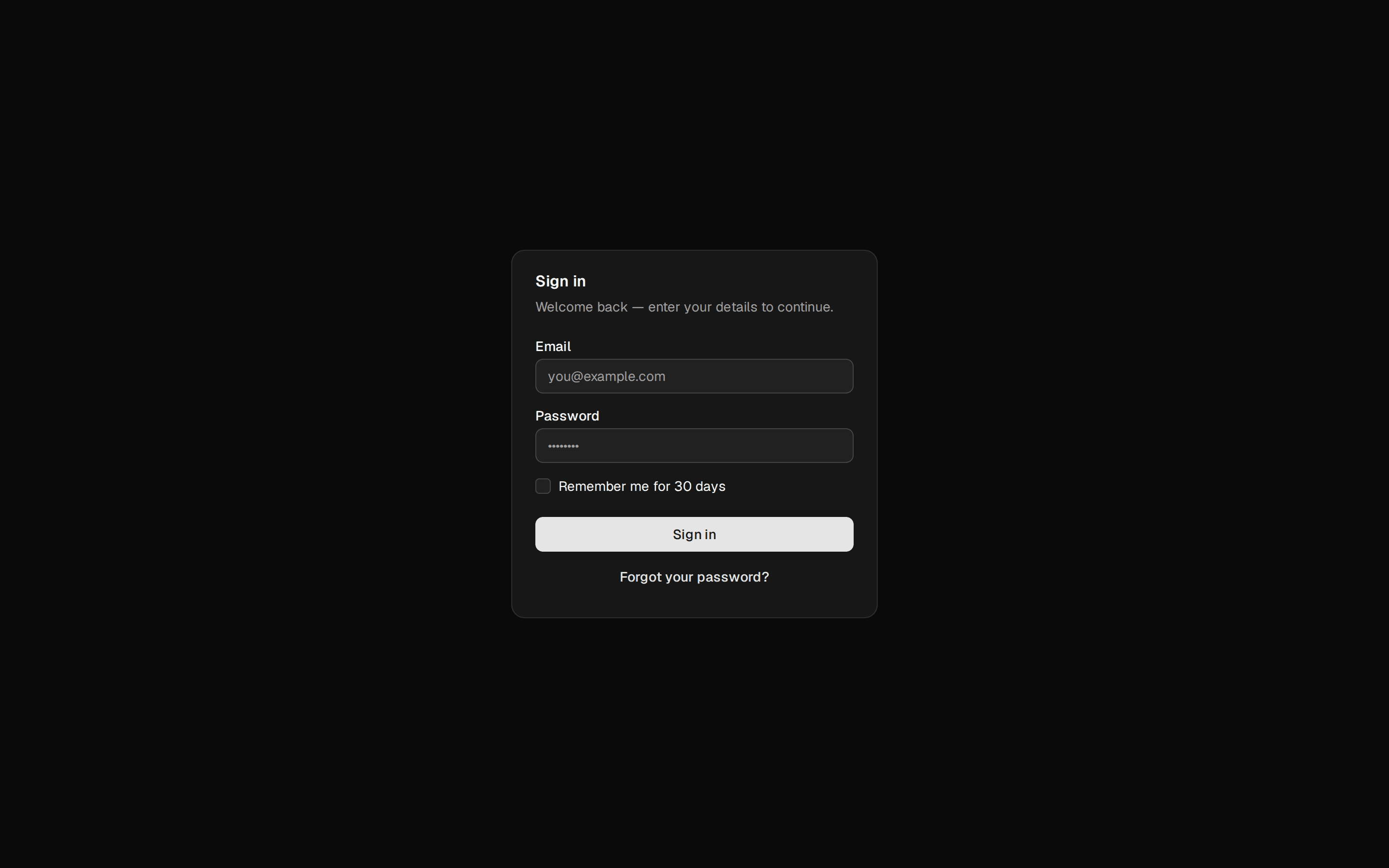
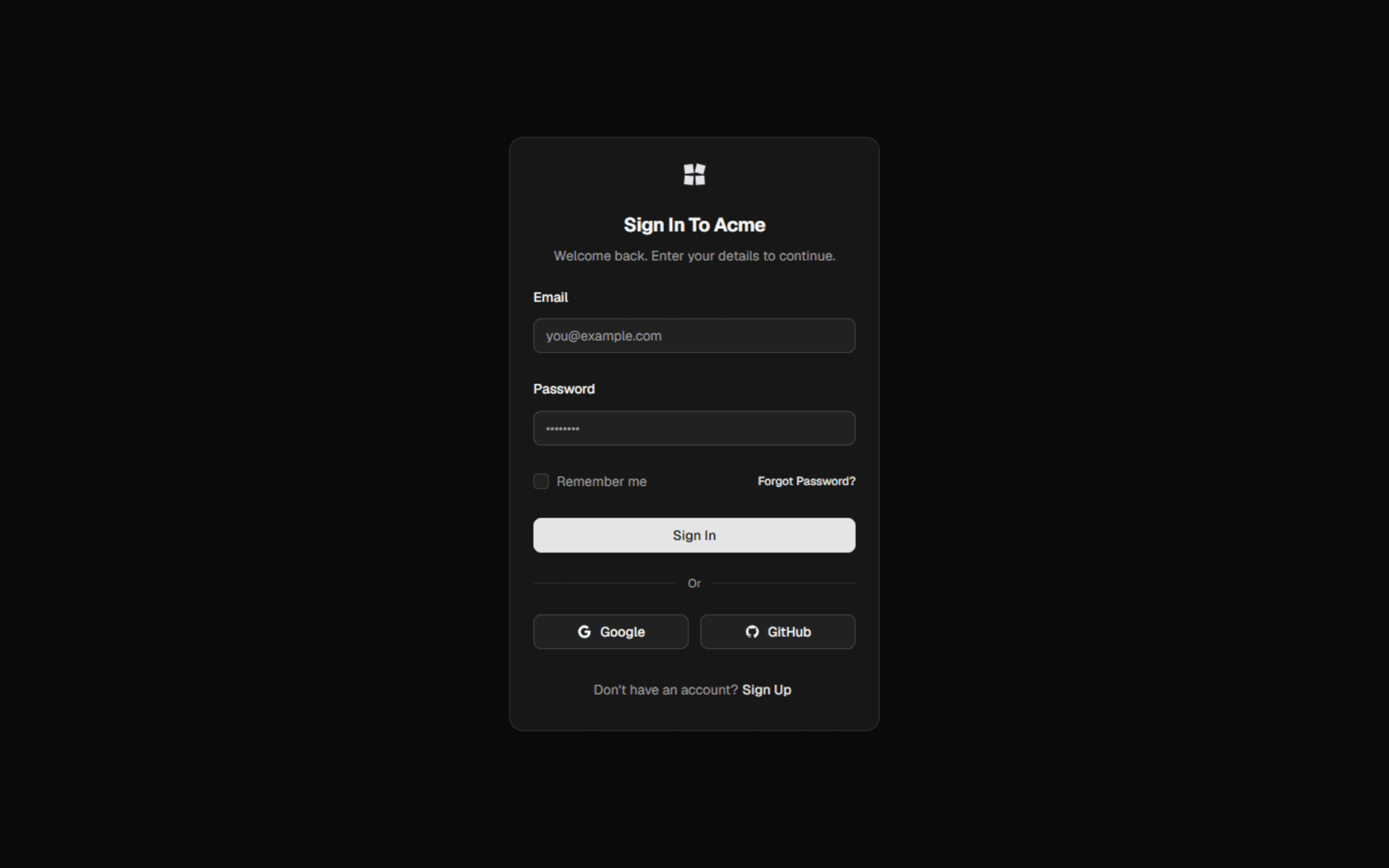
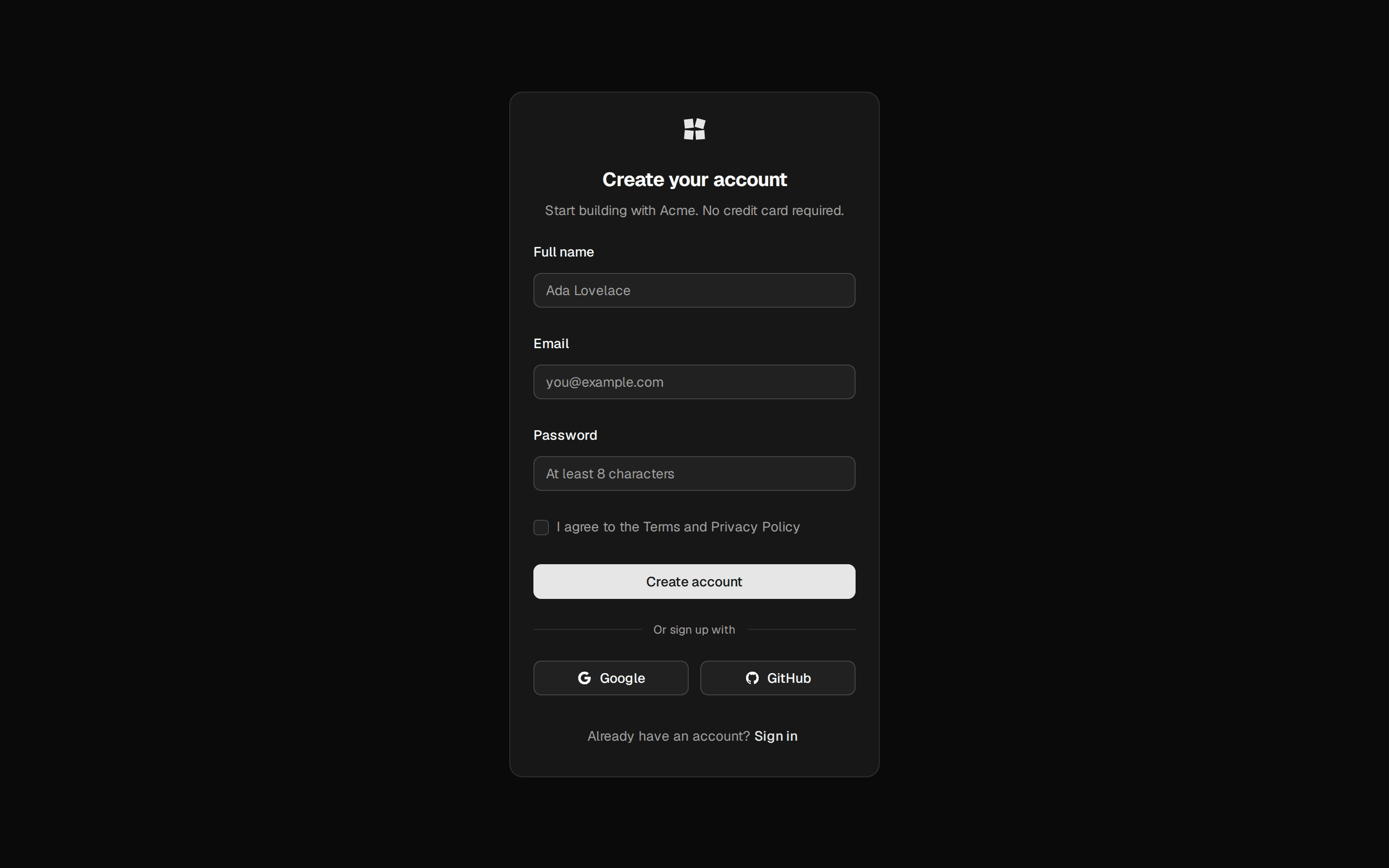
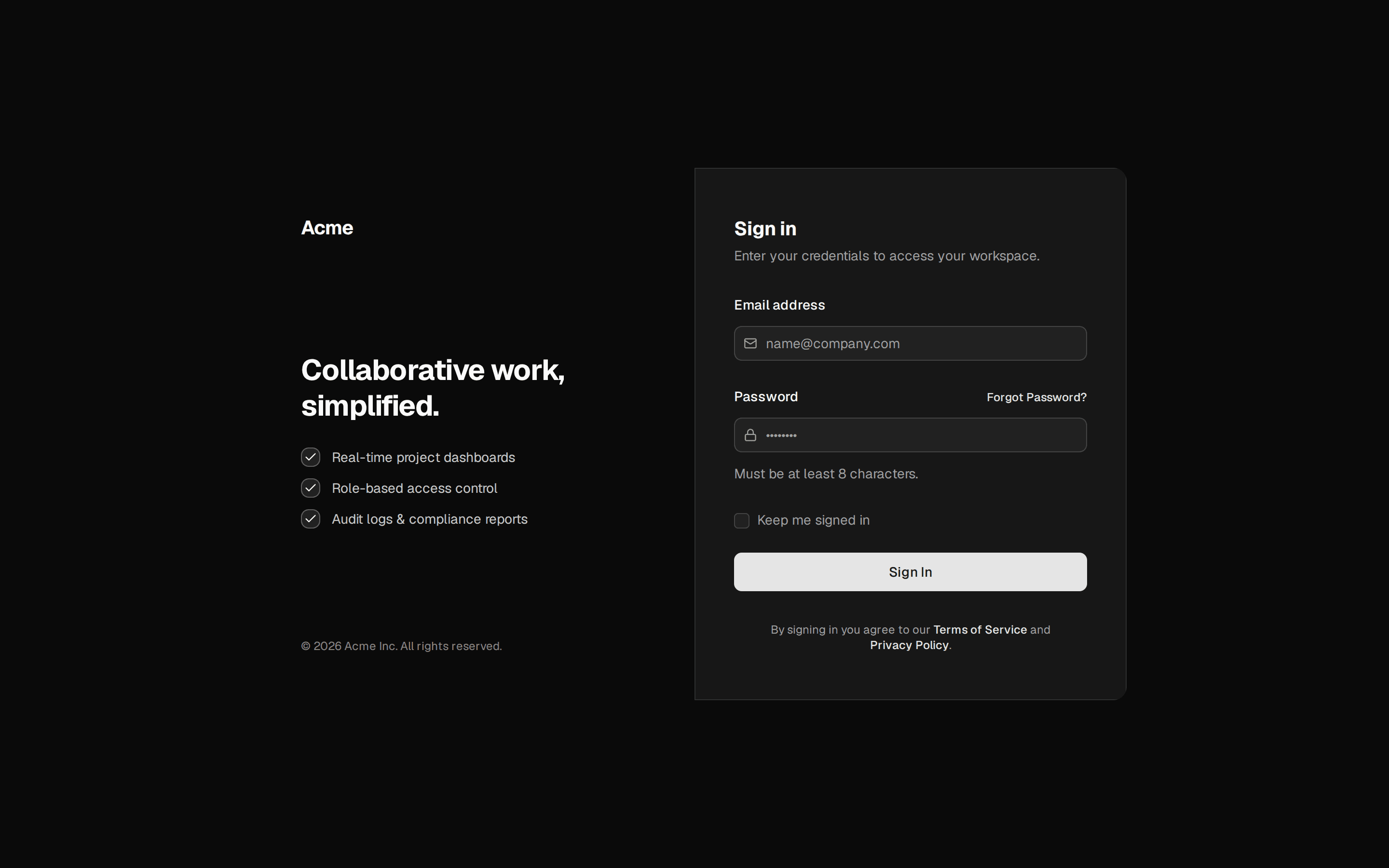
Reset-password card with new and confirm fields plus live requirement checks for length, uppercase, number, and match, ending in a success state.
@7ovr
Reset-password card with new and confirm fields plus live requirement checks for length, uppercase, number, and match, ending in a success state.
@7ovr
registry/blocks/auth/7/auth-block.tsx
"use client"

import { useState } from "react"
import { cn } from "@/lib/utils"
import { Button } from "@/components/ui/button"
import {
  Card,
  CardContent,
  CardDescription,
  CardHeader,
  CardTitle,
} from "@/components/ui/card"
import { Field, FieldLabel } from "@/components/ui/field"
import { Input } from "@/components/ui/input"
import { IconPlaceholder } from "@/components/icons/icon-placeholder"

function Rule({ ok, label }: { ok: boolean; label: string }) {
  return (
    <li className="flex items-center gap-2 text-xs">
      {ok ? (
        <IconPlaceholder
          lucide="Check"
          tabler="IconCheck"
          hugeicons="Tick02Icon"
          phosphor="Check"
          remixicon="RiCheckLine"
          className="size-3.5 text-foreground"
          aria-hidden="true"
        />
      ) : (
        <IconPlaceholder
          lucide="X"
          tabler="IconX"
          hugeicons="Cancel01Icon"
          phosphor="X"
          remixicon="RiCloseLine"
          className="size-3.5 text-muted-foreground/50"
          aria-hidden="true"
        />
      )}
      <span className={ok ? "text-foreground" : "text-muted-foreground"}>
        {label}
      </span>
    </li>
  )
}

export default function AuthBlock() {
  const [password, setPassword] = useState("")
  const [confirm, setConfirm] = useState("")
  const [done, setDone] = useState(false)

  const hasLength = password.length >= 8
  const hasNumber = /\d/.test(password)
  const hasUpper = /[A-Z]/.test(password)
  const matches = confirm.length > 0 && password === confirm
  const valid = hasLength && hasNumber && hasUpper && matches

  return (
    <section className="flex w-full items-center justify-center bg-background px-6 py-12 text-foreground">
      <Card className="w-full max-w-sm">
        <CardHeader className="text-center">
          <CardTitle className="text-xl font-bold tracking-tight">
            {done ? "Password updated" : "Set a new password"}
          </CardTitle>
          <CardDescription className="text-sm">
            {done
              ? "Your password has been changed. You can sign in with it now."
              : "Choose a strong password you don't use anywhere else."}
          </CardDescription>
        </CardHeader>
        <CardContent>
          {done ? (
            <Button
              className="w-full"
              render={<a href="#" />}
              nativeButton={false}
            >
              Continue to sign in
            </Button>
          ) : (
            <form
              onSubmit={(event) => {
                event.preventDefault()
                if (valid) setDone(true)
              }}
              noValidate
              className="flex flex-col gap-4"
            >
              <Field>
                <FieldLabel htmlFor="password">New password</FieldLabel>
                <Input
                  id="password"
                  name="password"
                  type="password"
                  placeholder="••••••••"
                  value={password}
                  onChange={(event) => setPassword(event.target.value)}
                />
              </Field>
              <Field>
                <FieldLabel htmlFor="confirm">Confirm password</FieldLabel>
                <Input
                  id="confirm"
                  name="confirm"
                  type="password"
                  placeholder="••••••••"
                  value={confirm}
                  aria-invalid={confirm.length > 0 && !matches}
                  onChange={(event) => setConfirm(event.target.value)}
                />
              </Field>
              <ul className="flex flex-col gap-1.5">
                <Rule ok={hasLength} label="At least 8 characters" />
                <Rule ok={hasUpper} label="One uppercase letter" />
                <Rule ok={hasNumber} label="One number" />
                <Rule ok={matches} label="Passwords match" />
              </ul>
              <Button
                type="submit"
                className={cn("w-full", !valid && "opacity-60")}
                disabled={!valid}
              >
                Update password
              </Button>
            </form>
          )}
        </CardContent>
      </Card>
    </section>
  )
}
Requires a base-* style in components.json (the shadcn init default). Legacy new-york/radix-* styles install Radix primitives, which reject the render prop this block uses.