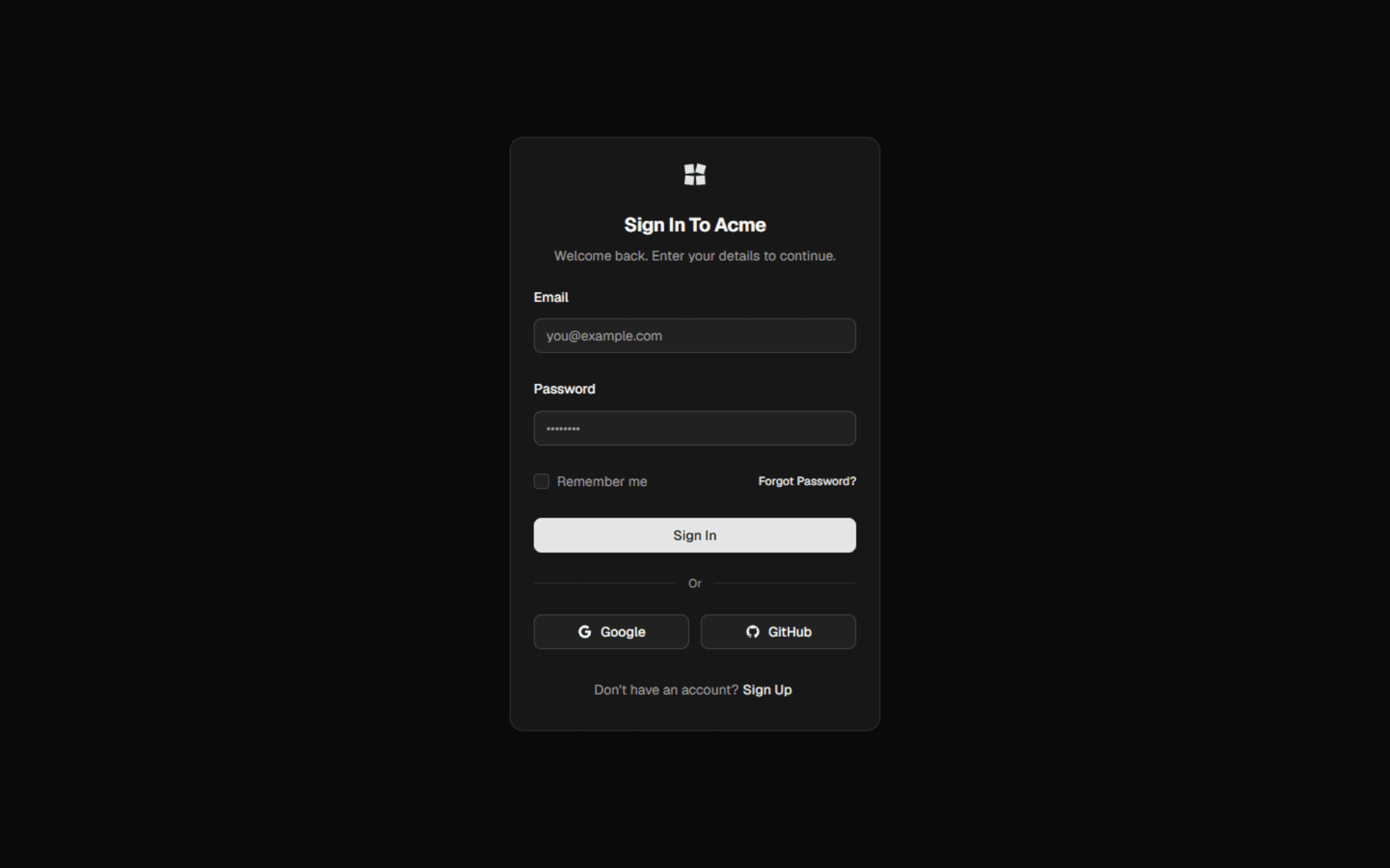
Login
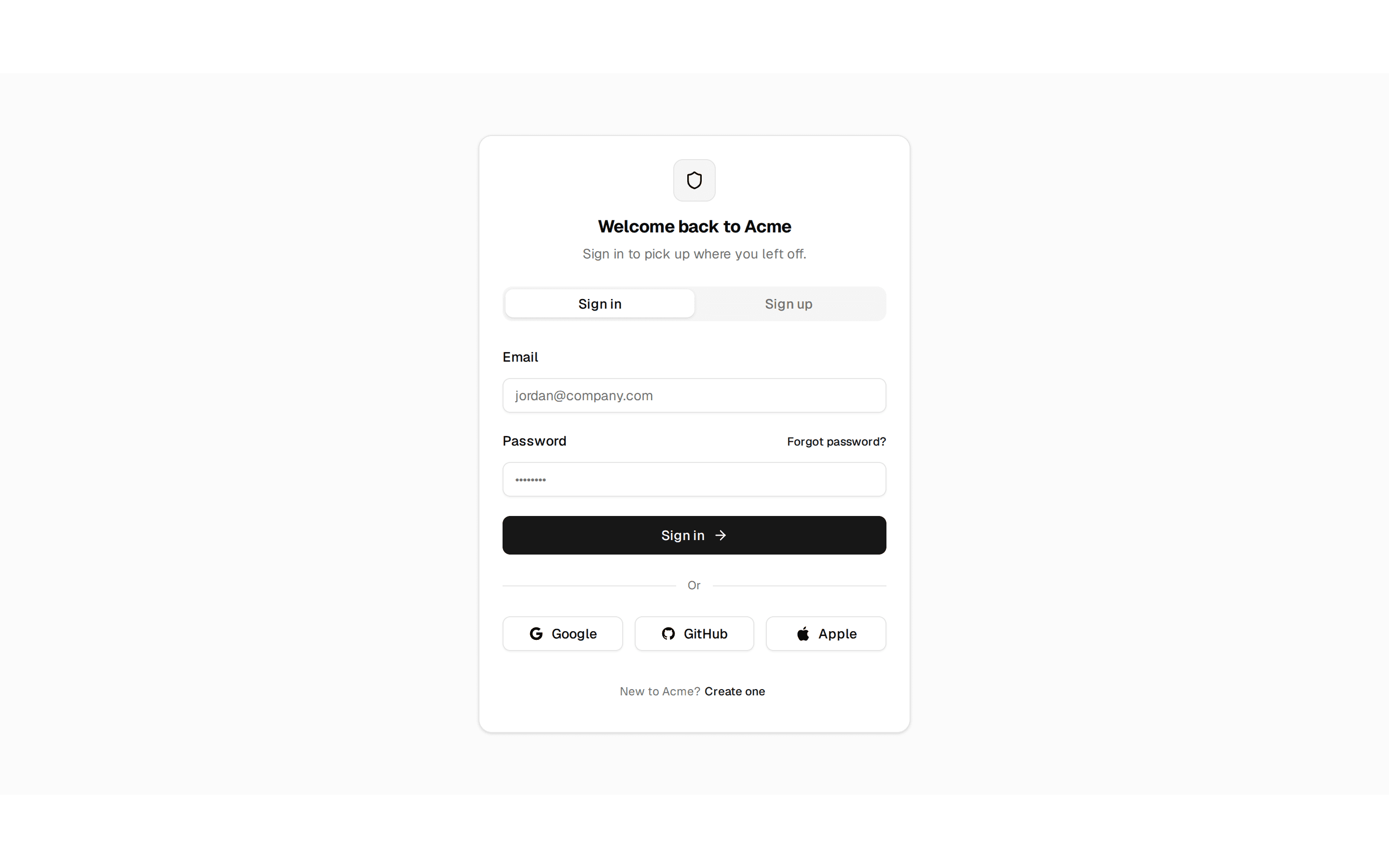
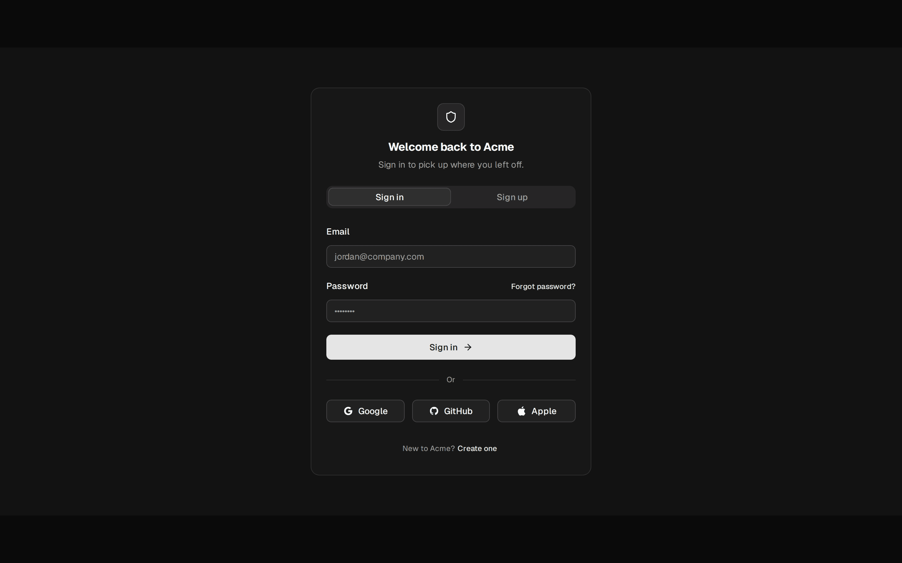
The standard email-and-password sign-in card, with remember-me and a forgot-password escape hatch.
@quill
The standard email-and-password sign-in card, with remember-me and a forgot-password escape hatch.
@quill
registry/blocks/login.tsx
import {
  Card,
  CardHeader,
  CardTitle,
  CardDescription,
  CardContent,
  CardFooter,
} from '@/components/ui/card'
import { Input } from '@/components/ui/input'
import { Label } from '@/components/ui/label'
import { Button } from '@/components/ui/button'
import { Checkbox } from '@/components/ui/checkbox'

/** The standard email-and-password sign-in card, with remember-me and a forgot-password escape hatch. */
export function Login() {
  return (
    <Card className="w-[380px]">
      <CardHeader>
        <CardTitle>Sign in</CardTitle>
        <CardDescription>Welcome back — enter your details to continue.</CardDescription>
      </CardHeader>
      <CardContent className="flex flex-col gap-4">
        <div className="flex flex-col gap-1.5">
          <Label htmlFor="login-email">Email</Label>
          <Input id="login-email" type="email" placeholder="you@example.com" />
        </div>
        <div className="flex flex-col gap-1.5">
          <Label htmlFor="login-password">Password</Label>
          <Input id="login-password" type="password" placeholder="••••••••" />
        </div>
        <div className="flex items-center gap-2">
          <Checkbox id="login-remember" />
          <Label htmlFor="login-remember" className="font-normal">
            Remember me for 30 days
          </Label>
        </div>
      </CardContent>
      <CardFooter className="flex-col gap-2">
        <Button className="w-full">Sign in</Button>
        <Button variant="link" className="w-full">
          Forgot your password?
        </Button>
      </CardFooter>
    </Card>
  )
}
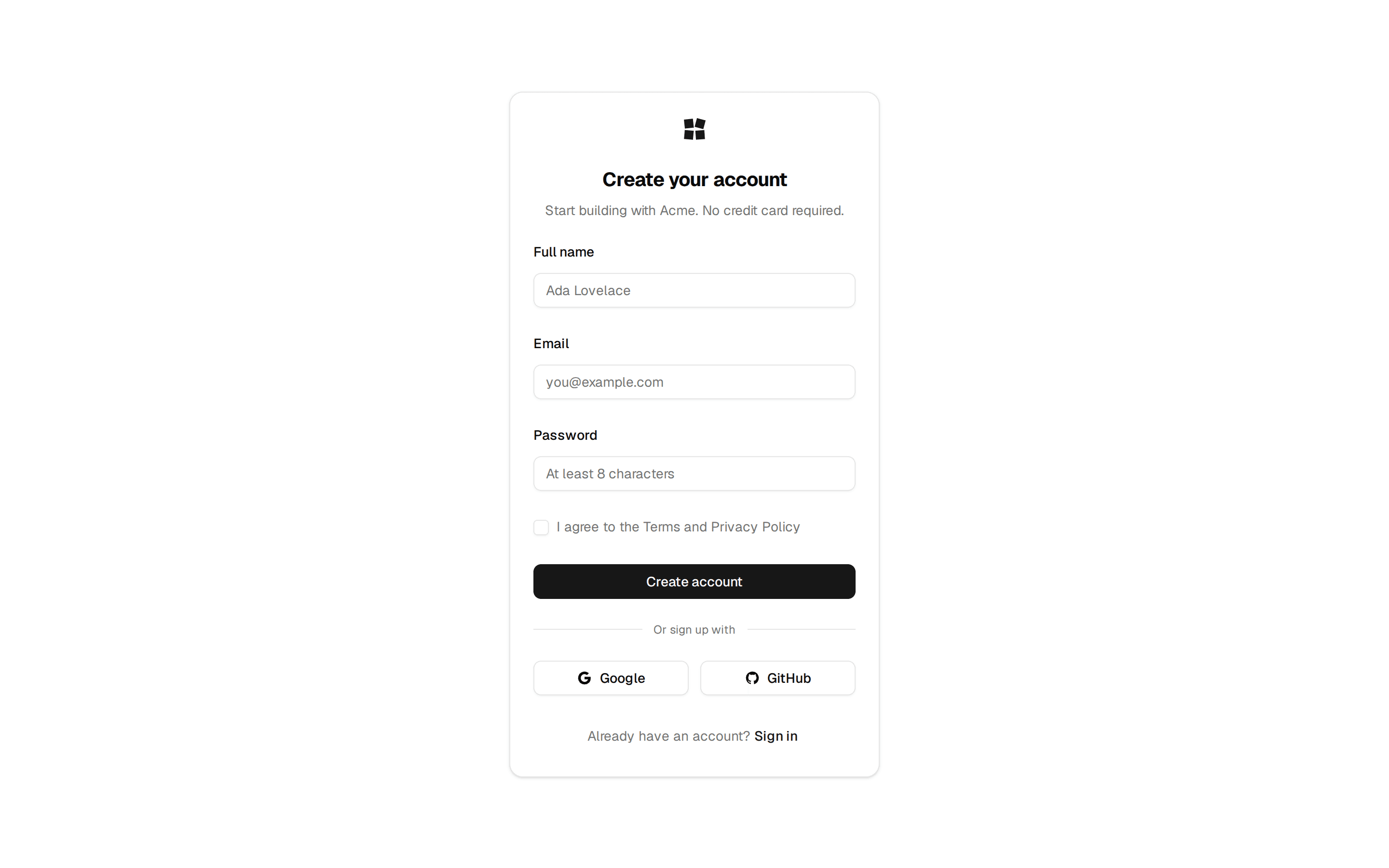
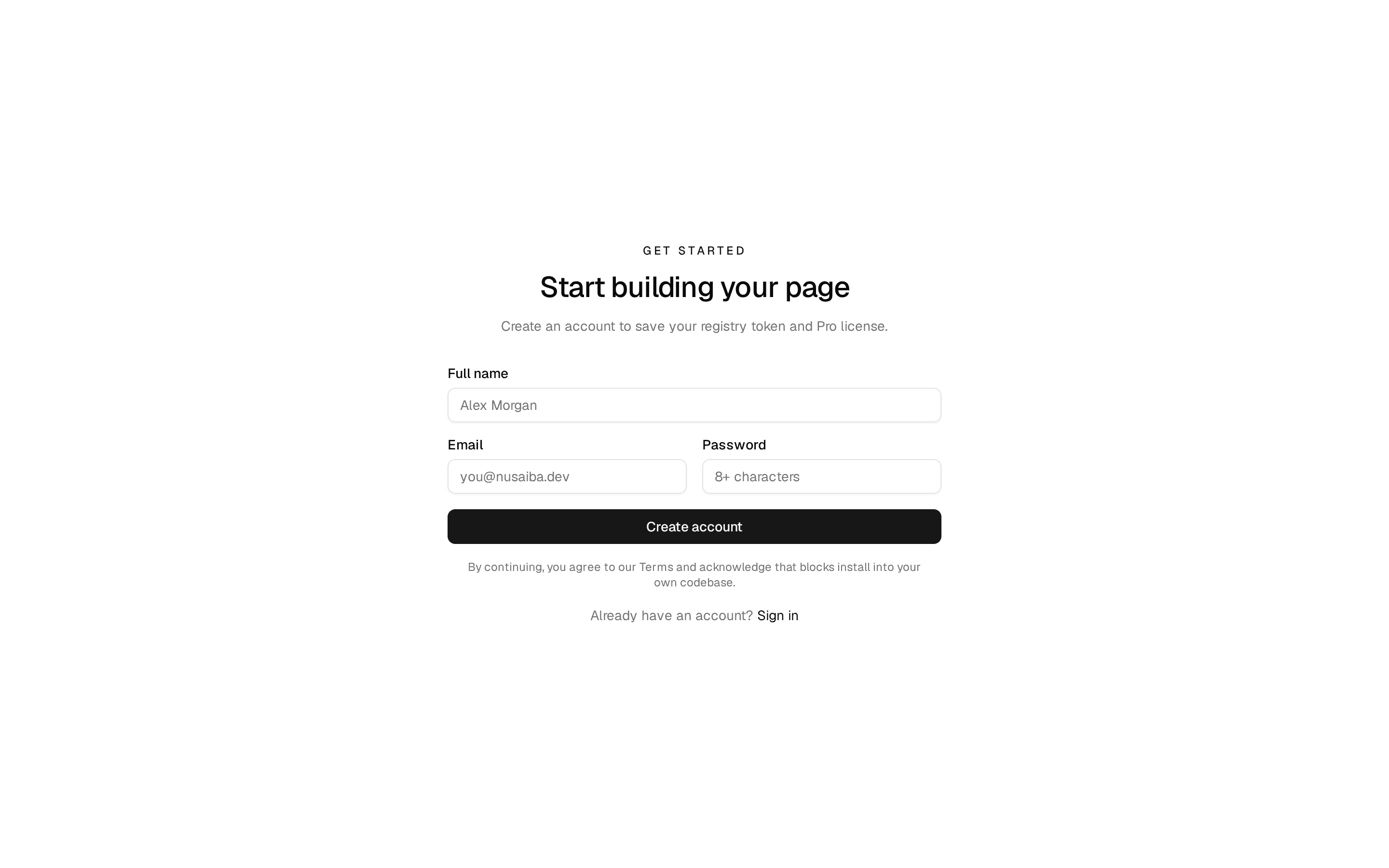
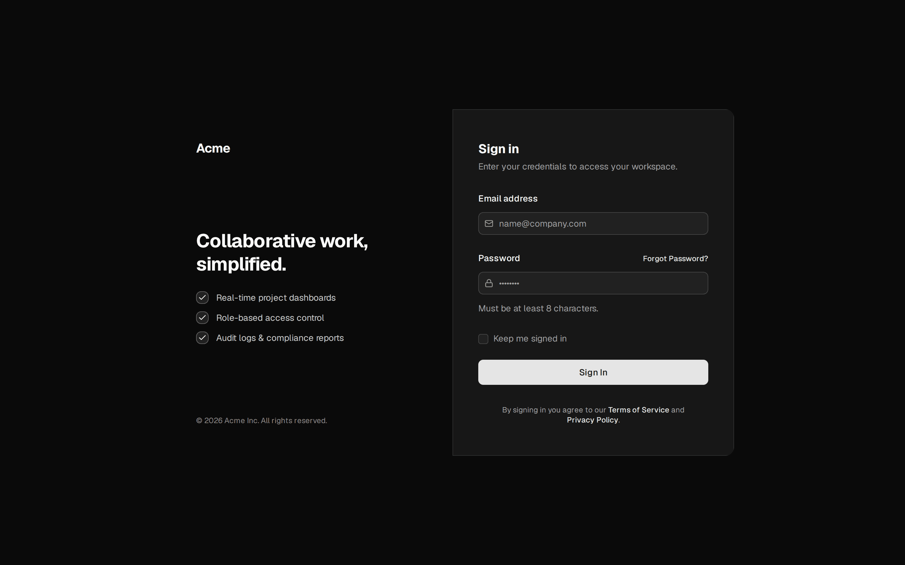
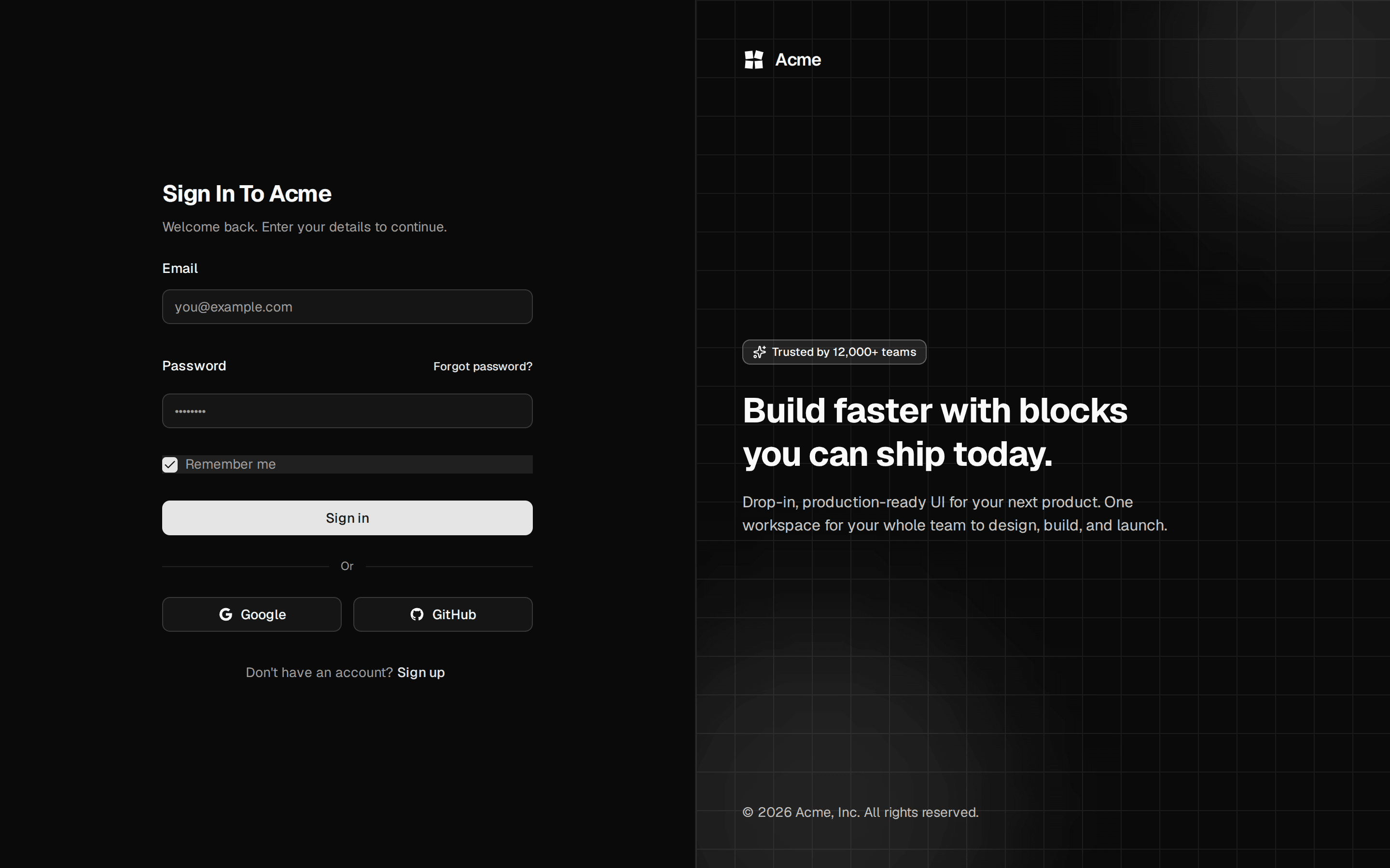
The standard email-and-password sign-in card, with remember-me and a forgot-password escape hatch. Do: Treat "Remember me" as extending session length, never as the only thing standing between a device and the account. Don't: Rely on the remember-me checkbox as a security boundary. Do: Style "Forgot your password?" as a link beneath "Sign in" — one unmistakable primary action per card. Don't: Give "Forgot your password?" the same solid button treatment as "Sign in" — now two buttons compete to be primary. Use login-split-panel when the sign-in is a full page, not an embedded card, and you want a branded testimonial panel alongside it. Use login-minimal when you want the leanest possible sign-in — a single email field for a one-time code, no password at all. Use login-oauth when most of your users sign in through Google, GitHub, or Apple rather than a password you store. Use forgot-password when the user has already clicked "Forgot your password?" — that's a separate card, not a state of this one.