Login with split panel
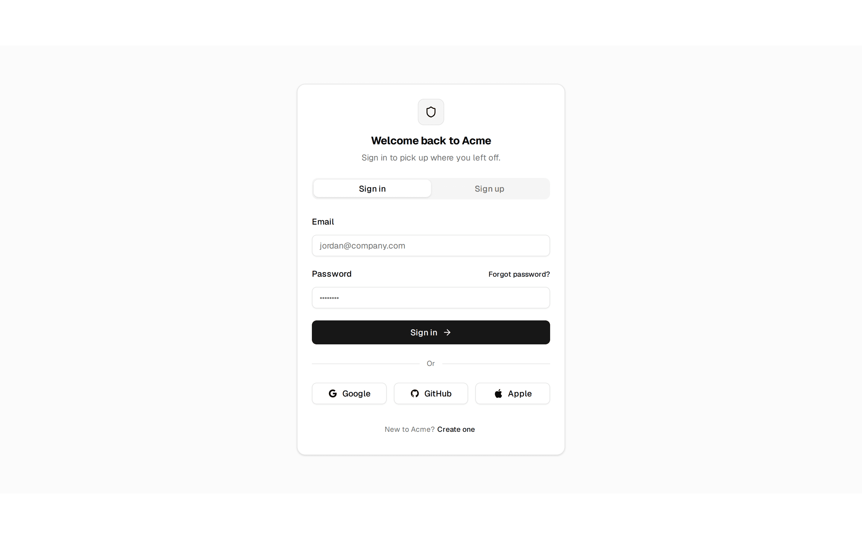
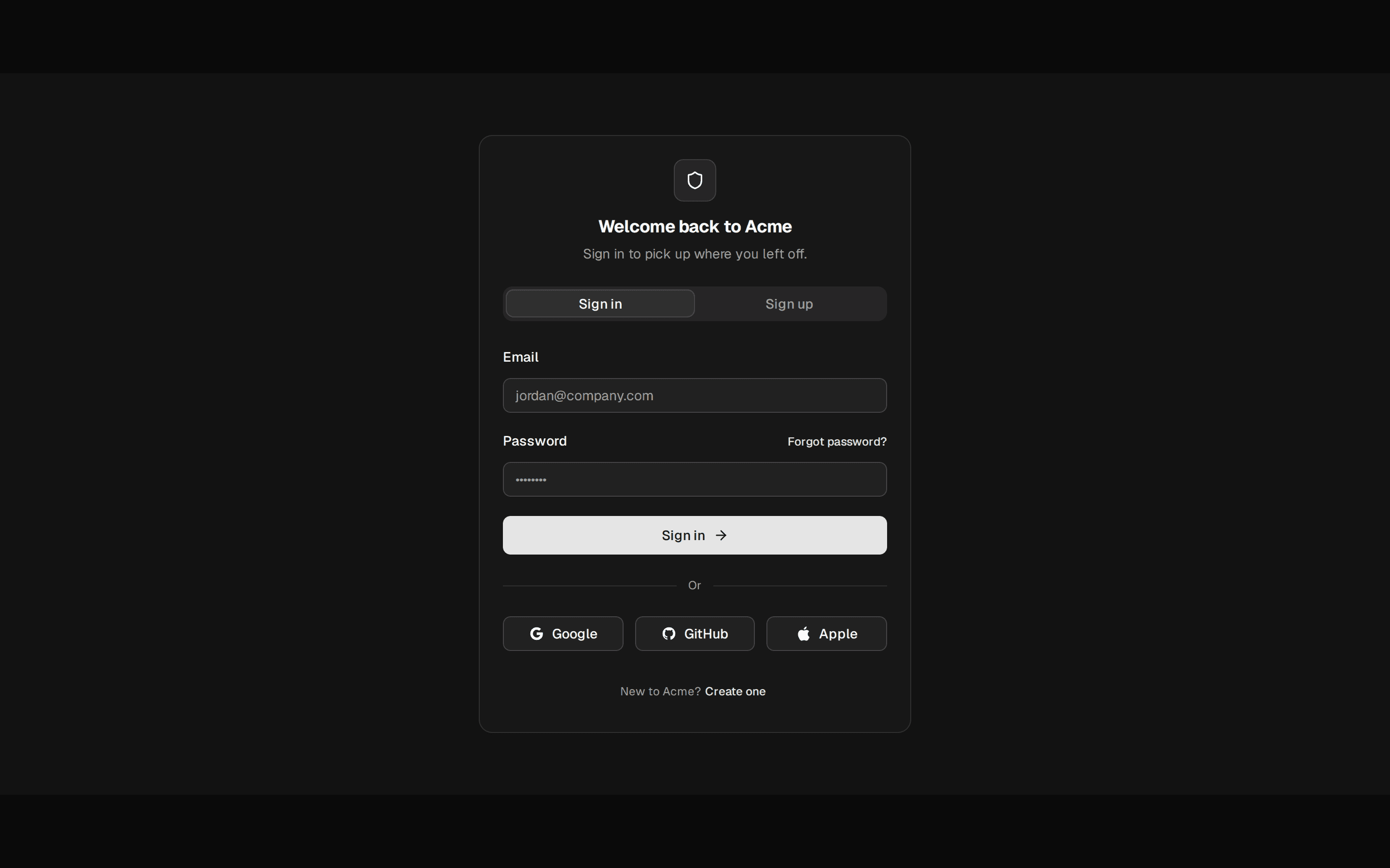
A full-page, branded sign-in — a testimonial panel beside an email/password form with a magic-link option.
@quill
A full-page, branded sign-in — a testimonial panel beside an email/password form with a magic-link option.
@quill
registry/blocks/login-split-panel.tsx
'use client'
import { Input } from '@/components/ui/input'
import { Label } from '@/components/ui/label'
import { Button } from '@/components/ui/button'
import { Separator } from '@/components/ui/separator'
import { Icon } from '@/components/ui/icon'
/** A full-page, branded sign-in — a testimonial panel beside an email/password form with a magic-link option. */
export function SplitPanel() {
return (
<div className="grid h-[560px] w-full grid-cols-2 bg-background max-md:grid-cols-1">
<div className="flex flex-col justify-between bg-primary p-8 text-primary-foreground max-md:hidden">
<span className="font-heading text-lg">Quill</span>
<blockquote className="flex flex-col gap-3">
<p className="font-heading text-xl leading-snug">
“The most crafted-feeling system we’ve ever shipped on. It reads like a
notebook, not a dashboard.”
</p>
<footer className="text-sm opacity-80">Sofia Almeida — Head of Product, Northwind</footer>
</blockquote>
</div>
<div className="flex items-center justify-center p-8">
<form className="flex w-full max-w-[340px] flex-col gap-5" onSubmit={(e) => e.preventDefault()}>
<div className="flex flex-col gap-1 text-center">
<h1 className="fraunces-text font-heading text-xl text-foreground">Welcome back</h1>
<p className="text-sm text-muted-foreground">Sign in to your team account.</p>
</div>
<div className="flex flex-col gap-1.5">
<Label htmlFor="split-email">Email</Label>
<Input id="split-email" type="email" placeholder="you@example.com" />
</div>
<div className="flex flex-col gap-1.5">
<div className="flex items-center justify-between">
<Label htmlFor="split-password">Password</Label>
<Button variant="link" size="xs" className="h-auto p-0">
Forgot?
</Button>
</div>
<Input id="split-password" type="password" placeholder="••••••••" />
</div>
<Button className="w-full">Sign in</Button>
<div className="flex items-center gap-3">
<Separator className="flex-1" />
<span className="text-xs text-muted-foreground">or</span>
<Separator className="flex-1" />
</div>
<Button variant="outline" className="w-full">
<Icon name="mail" size={16} /> Continue with a magic link
</Button>
</form>
</div>
</div>
)
}
A full-page, branded sign-in — a testimonial panel beside an email/password form with a magic-link option. Do: Let the brand panel drop out on small viewports and let the form take the full width. Don't: Force the two-column grid at phone widths — the testimonial panel has no room to be legible. Use login when the sign-in is an embedded card inside an existing page shell, not its own full page. Use login-minimal when you don't have a testimonial or brand story worth the real estate — go bare instead.