Hero — Aurora
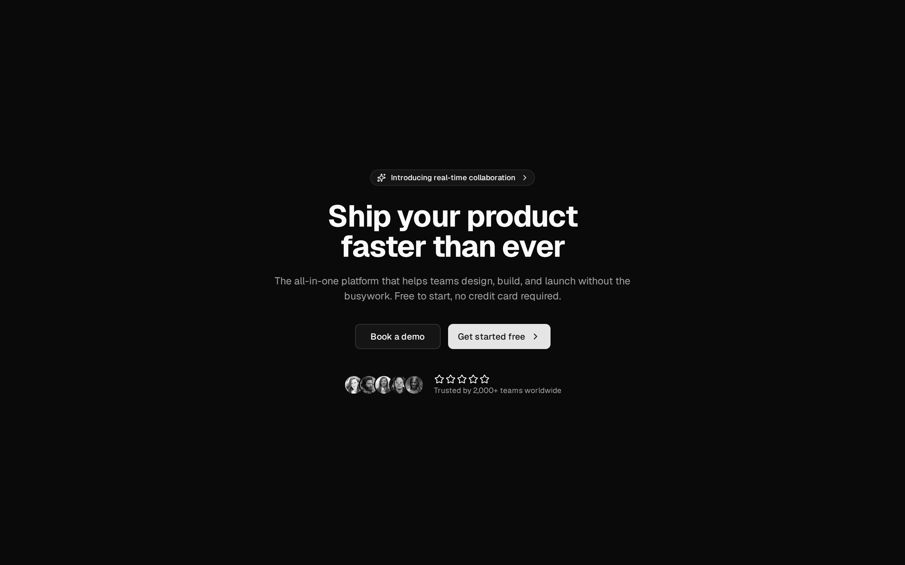
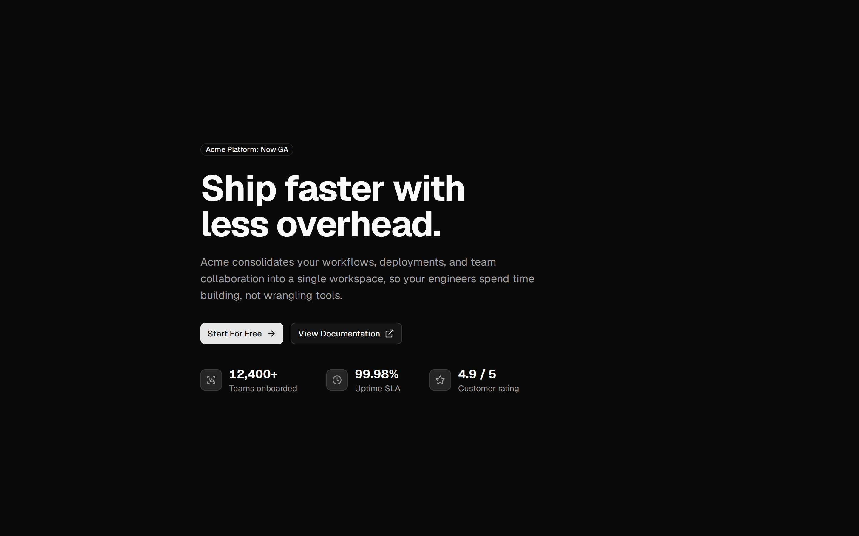
A hero section: aurora backdrop, word-by-word headline, description and two call-to-action buttons.
@mewo
A hero section: aurora backdrop, word-by-word headline, description and two call-to-action buttons.
@mewo
registry/mewo/blocks/hero-aurora.tsx
"use client"

import * as React from "react"
import { cn } from "@/lib/utils"
import { buttonVariants } from "@/components/ui/button"
import { AuroraBackground } from "@/registry/mewo/ui/aurora-background"
import { SplitText } from "@/registry/mewo/ui/split-text"

export interface HeroCta {
  label: string
  href: string
}

export interface HeroAuroraProps extends React.ComponentProps<"section"> {
  eyebrow?: string
  title?: string
  description?: string
  primaryCta?: HeroCta
  secondaryCta?: HeroCta
}

export function HeroAurora({
  eyebrow = "Now in v0.1",
  title = "Animated components for React",
  description = "Copy-paste motion for your next project. Install with the shadcn CLI and own the code.",
  primaryCta = { label: "Get started", href: "#" },
  secondaryCta = { label: "Browse components", href: "#" },
  className,
  ...props
}: HeroAuroraProps) {
  return (
    <section data-slot="hero-aurora" className={cn("relative", className)} {...props}>
      <AuroraBackground className="min-h-[80vh] px-6 py-24 text-center">
        <p className="mb-6 rounded-full border bg-background/60 px-3 py-1 text-xs font-medium text-muted-foreground backdrop-blur">
          {eyebrow}
        </p>
        <SplitText as="h1" by="words" stagger={0.06} className="max-w-3xl text-balance text-4xl font-bold tracking-tight sm:text-6xl">
          {title}
        </SplitText>
        <p className="mt-6 max-w-xl text-pretty text-lg text-muted-foreground">{description}</p>
        <div className="mt-10 flex flex-wrap items-center justify-center gap-3">
          <a href={primaryCta.href} className={buttonVariants({ size: "lg" })}>
            {primaryCta.label}
          </a>
          <a href={secondaryCta.href} className={buttonVariants({ variant: "outline", size: "lg" })}>
            {secondaryCta.label}
          </a>
        </div>
      </AuroraBackground>
    </section>
  )
}