Hero With Avatar Social Proof
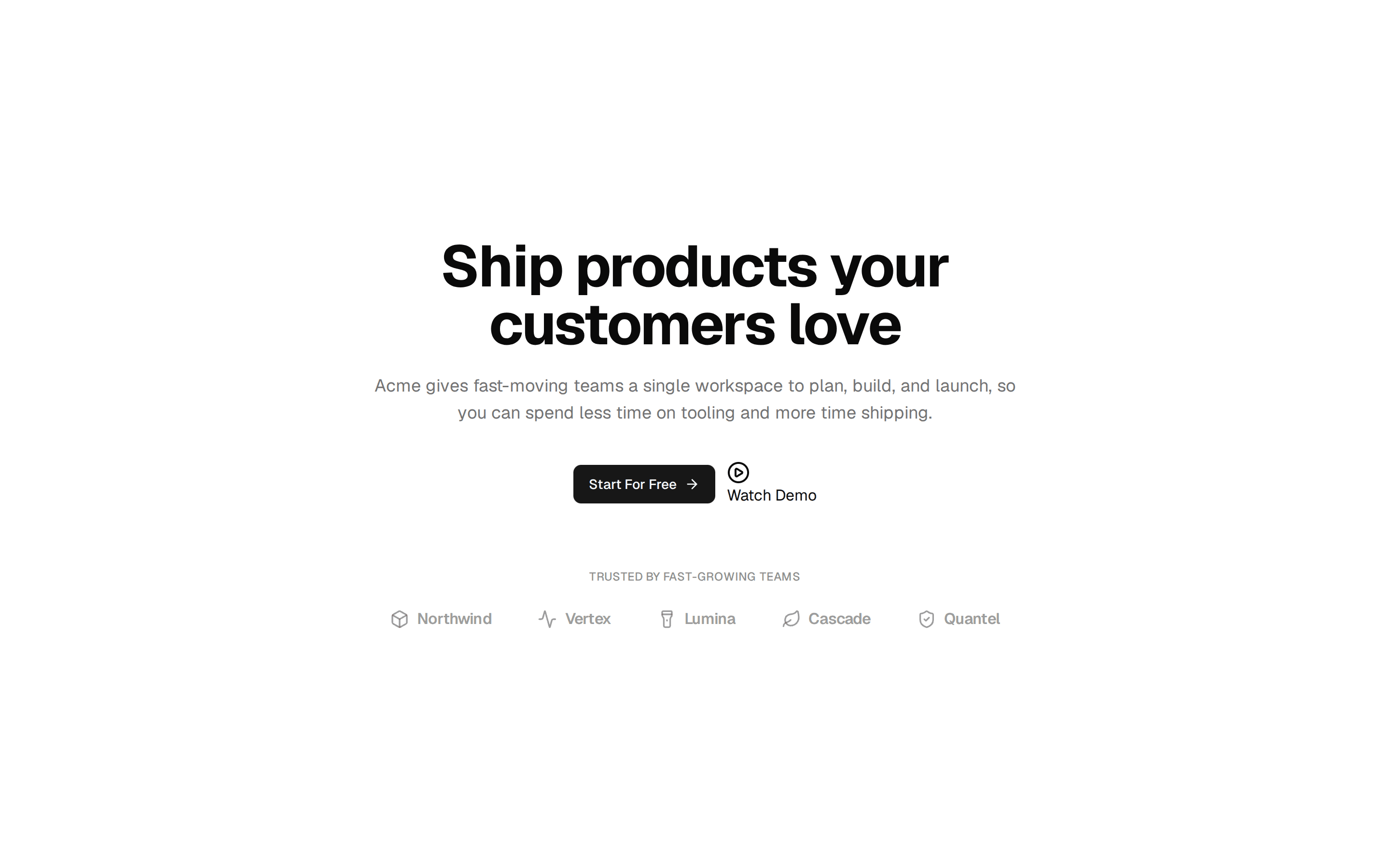
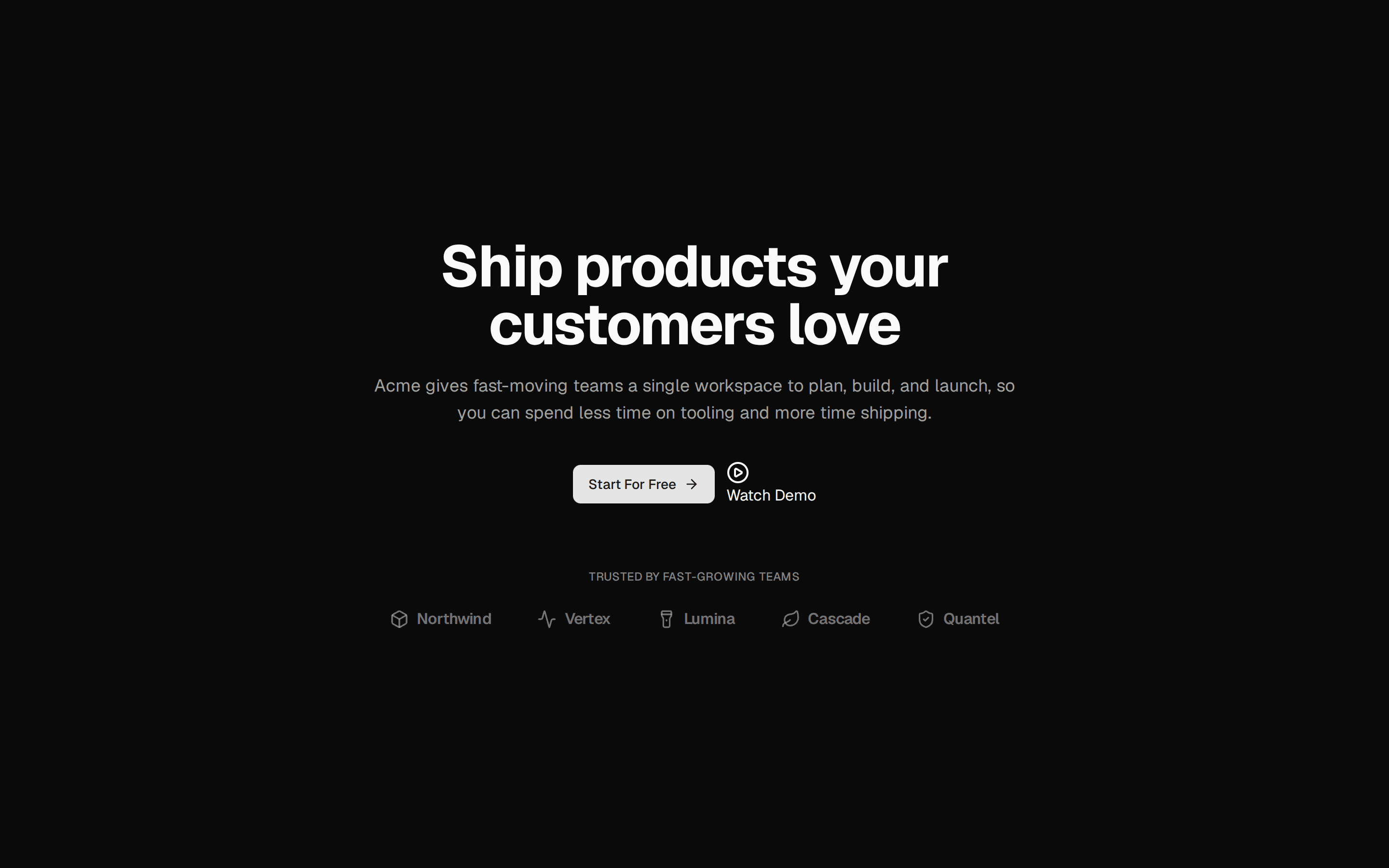
Centered hero section led by a clickable announcement pill, with dual CTAs and social proof: an overlapping avatar stack, five stars, and a trusted-by line.
@7ovr
Centered hero section led by a clickable announcement pill, with dual CTAs and social proof: an overlapping avatar stack, five stars, and a trusted-by line.
@7ovr
registry/blocks/hero/6/hero-block.tsx
import { Avatar, AvatarFallback, AvatarImage } from "@/components/ui/avatar"
import { Button } from "@/components/ui/button"
import { IconPlaceholder } from "@/components/icons/icon-placeholder"

const avatars = [
  { src: "https://i.pravatar.cc/80?img=45", name: "Elena", initials: "E" },
  { src: "https://i.pravatar.cc/80?img=13", name: "Marcus", initials: "M" },
  { src: "https://i.pravatar.cc/80?img=32", name: "Priya", initials: "P" },
  { src: "https://i.pravatar.cc/80?img=52", name: "Tomás", initials: "T" },
  { src: "https://i.pravatar.cc/80?img=27", name: "Hannah", initials: "H" },
]

export default function HeroBlock() {
  return (
    <section className="flex w-full items-center justify-center bg-background px-6 py-24 text-foreground">
      <div className="mx-auto flex max-w-2xl flex-col items-center text-center">
        <a
          href="#"
          className="group inline-flex items-center gap-2 rounded-4xl border border-border bg-muted/40 py-1 pr-2 pl-2.5 text-xs font-medium text-foreground transition-colors hover:bg-muted"
        >
          <IconPlaceholder
            lucide="Sparkles"
            tabler="IconSparkles"
            hugeicons="SparklesIcon"
            phosphor="Sparkle"
            remixicon="RiSparkling2Line"
            className="size-3.5 text-foreground"
            aria-hidden="true"
          />
          <span>Introducing real-time collaboration</span>
          <IconPlaceholder
            lucide="ChevronRight"
            tabler="IconChevronRight"
            hugeicons="ArrowRight01Icon"
            phosphor="CaretRight"
            remixicon="RiArrowRightSLine"
            className="size-3.5 transition-transform group-hover:translate-x-0.5"
            aria-hidden="true"
          />
        </a>

        <h1 className="mt-6 font-heading text-4xl font-bold tracking-tight text-balance sm:text-5xl">
          Ship your product faster than ever
        </h1>
        <p className="mt-5 max-w-xl text-base text-pretty text-muted-foreground">
          The all-in-one platform that helps teams design, build, and launch
          without the busywork. Free to start, no credit card required.
        </p>

        <div className="mt-8 flex flex-col items-center gap-3 sm:flex-row">
          <Button
            render={<a href="#" />}
            nativeButton={false}
            variant="outline"
            size="lg"
            className="active:scale-[0.97] transition-transform duration-[160ms] ease-[cubic-bezier(0.23,1,0.32,1)]"
          >
            Book a demo
          </Button>
          <Button
            render={<a href="#" />}
            nativeButton={false}
            size="lg"
            className="active:scale-[0.97] transition-transform duration-[160ms] ease-[cubic-bezier(0.23,1,0.32,1)]"
          >
            Get started free
            <IconPlaceholder
              lucide="ChevronRight"
              tabler="IconChevronRight"
              hugeicons="ArrowRight01Icon"
              phosphor="CaretRight"
              remixicon="RiArrowRightSLine"
              data-icon="inline-end"
              aria-hidden="true"
            />
          </Button>
        </div>

        <div className="mt-10 flex flex-col items-center gap-3 sm:flex-row sm:gap-4">
          <div className="flex -space-x-2">
            {avatars.map((avatar) => (
              <Avatar
                key={avatar.name}
                className="size-8 border-2 border-background"
              >
                <AvatarImage
                  src={avatar.src}
                  alt={avatar.name}
                  className="grayscale"
                />
                <AvatarFallback className="text-[10px]">
                  {avatar.initials}
                </AvatarFallback>
              </Avatar>
            ))}
          </div>
          <div className="flex flex-col items-center gap-0.5 sm:items-start">
            <div
              className="flex items-center gap-0.5"
              role="img"
              aria-label="5 out of 5"
            >
              {Array.from({ length: 5 }).map((_, index) => (
                <IconPlaceholder
                  lucide="Star"
                  tabler="IconStar"
                  hugeicons="StarIcon"
                  phosphor="Star"
                  remixicon="RiStarFill"
                  key={index}
                  className="size-4 text-foreground"
                  aria-hidden="true"
                />
              ))}
            </div>
            <span className="text-xs text-muted-foreground">
              Trusted by 2,000+ teams worldwide
            </span>
          </div>
        </div>
      </div>
    </section>
  )
}
Requires a base-* style in components.json (the shadcn init default). Legacy new-york/radix-* styles install Radix primitives, which reject the render prop this block uses.