Hero 3
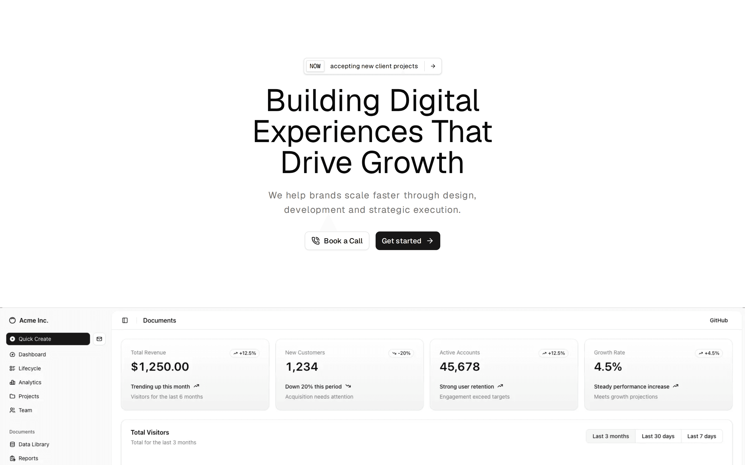
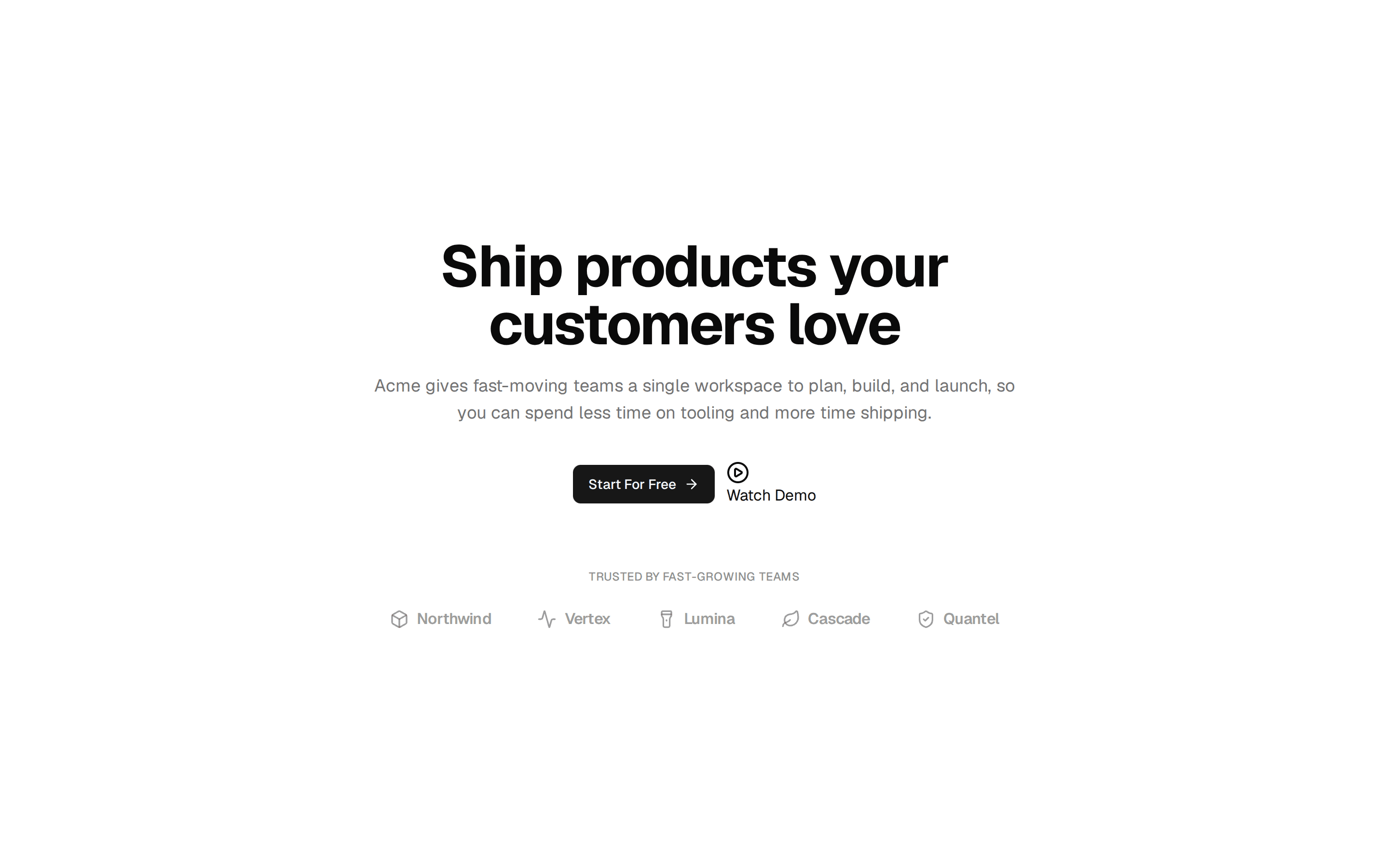
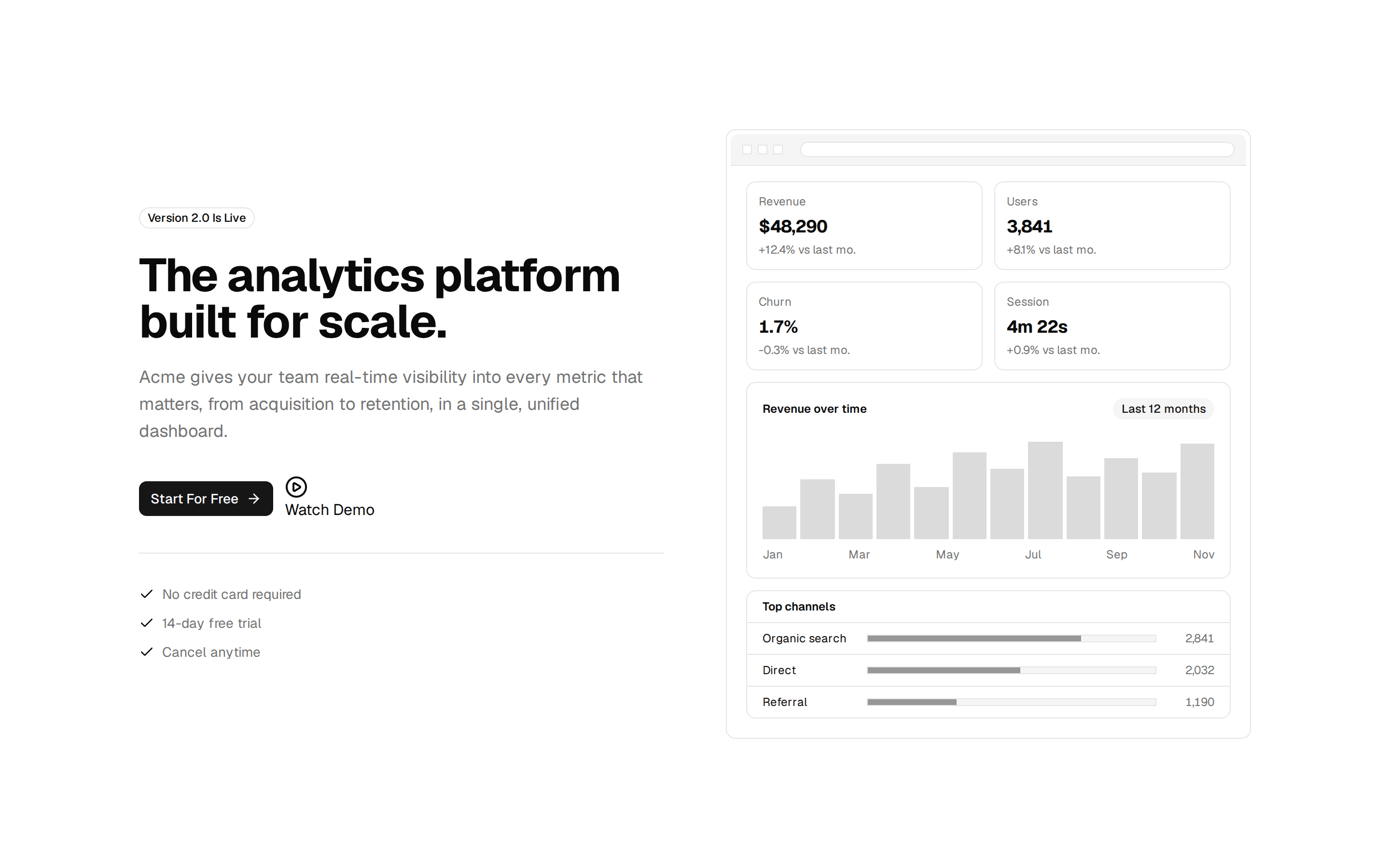
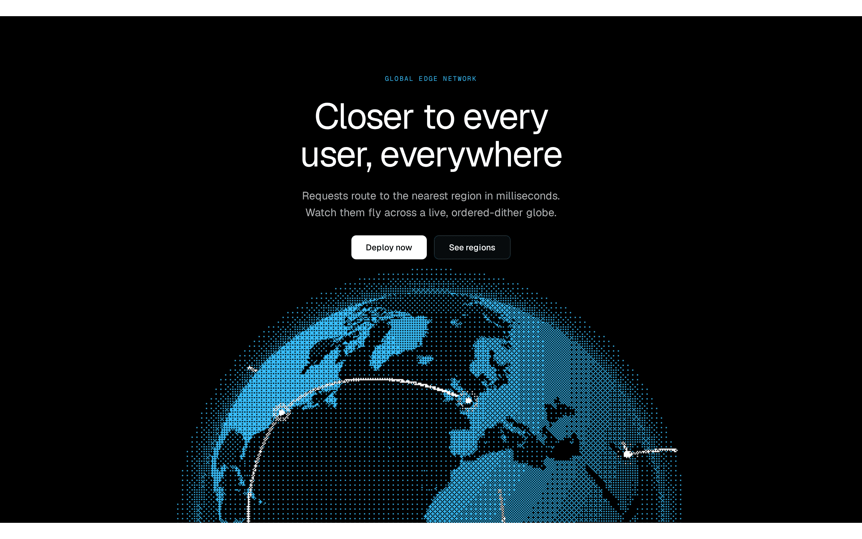
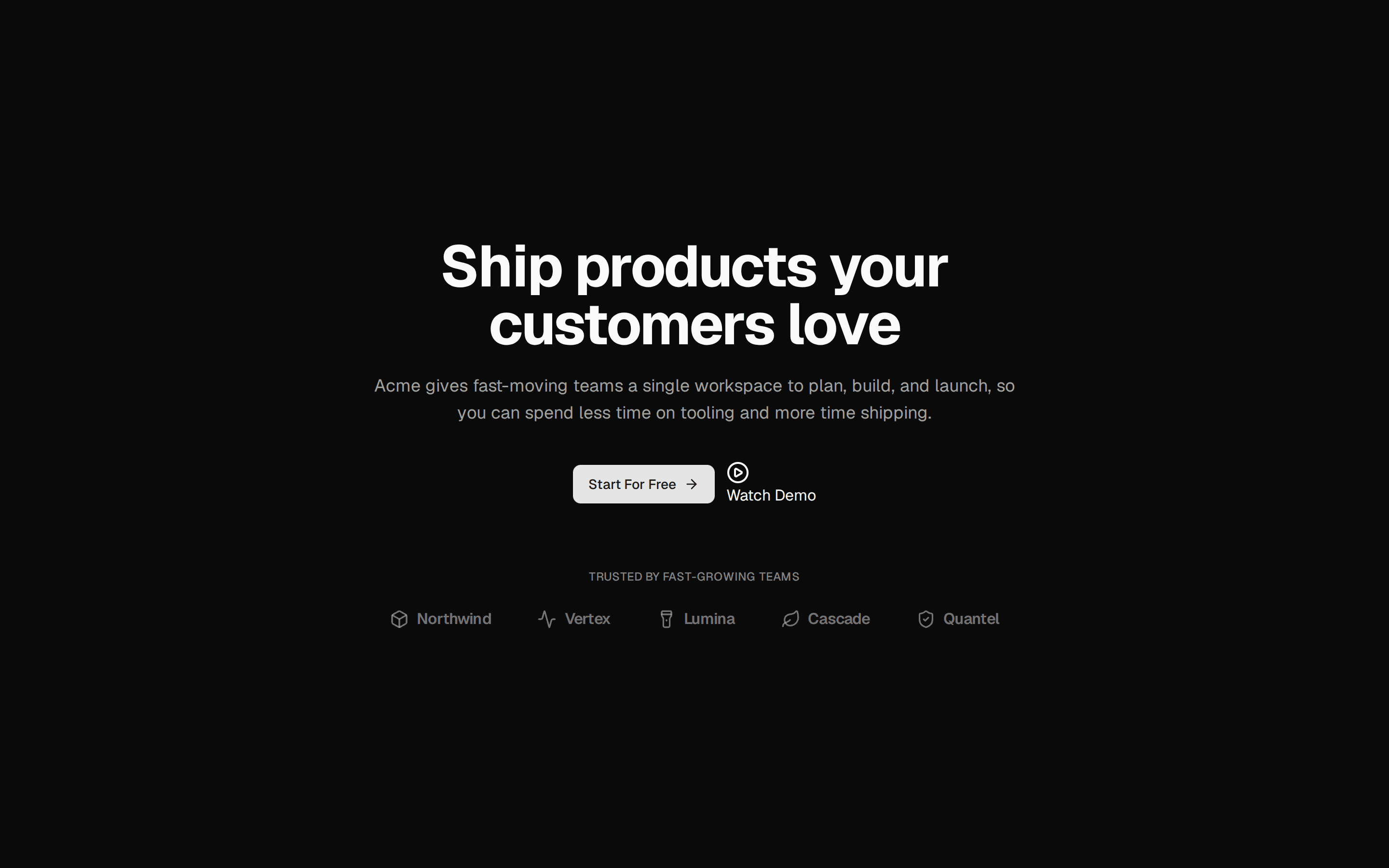
A split-screen hero section with branding, theme toggle, video, work, and contact cards.
@designali
A split-screen hero section with branding, theme toggle, video, work, and contact cards.
@designali
registry/designali/blocks/hero/hero-3.tsx
"use client"
import { Button } from "@workspace/ui/components/button"
import * as React from "react"
const images = [
{ src: "/img/hero-1.jpg", alt: "Hero 1" },
{ src: "/img/chat-1-light.jpg", alt: "Chat UI" },
{ src: "/img/hero-2.jpg", alt: "Hero 2" },
{ src: "/img/dashboard-1-dark.jpg", alt: "Dashboard" },
{ src: "/img/login-1.jpg", alt: "Login Screen" },
]
function createCSS(
direction: 1 | -1,
id: string
) {
const keyframes: string[] = []
for (let i = 0; i <= 24; i++) {
const progress = i / 24
/*
* Apparent image size.
*
* Very small at the center.
* Grows gradually as it moves toward the sides.
*/
const scale =
(2.6 / 11.25) *
Math.pow(28 / 2.6, progress)
/*
* Convert apparent size into 3D depth.
*
* This is what creates the natural zoom
* through CSS perspective.
*/
const z =
30 * (1 - 1 / scale)
/*
* Move from the center toward the side.
*/
const rail =
44 -
(44 - -11) *
Math.pow(1 - progress, 3.3)
/*
* Gradually rotate the card.
*/
const turn =
6 +
(28 - 6) * progress
keyframes.push(
`${(progress * 100).toFixed(2)}%{` +
`transform:translate3d(` +
`${(direction * rail).toFixed(2)}cqw,0,` +
`${z.toFixed(2)}cqw)` +
`rotateY(${(-direction * turn).toFixed(2)}deg)` +
`}`
)
}
const animationName =
direction === 1
? `r-${id}`
: `l-${id}`
return `
@keyframes ${animationName} {
${keyframes.join("")}
}
`
}
export function HeroSection() {
const id = React.useId().replace(
/[^a-zA-Z0-9]/g,
""
)
/*
* Create BOTH directions.
*
* This was the issue in your previous code:
* createCSS() requires direction + id.
*/
const css = React.useMemo(
() =>
`
${createCSS(1, id)}
${createCSS(-1, id)}
`,
[id]
)
return (
<section className="relative flex min-h-screen w-full flex-col justify-between overflow-hidden bg-background text-foreground">
<div className="absolute w-full h-full z-0">
<div
style={{
WebkitMaskImage: 'linear-gradient(to bottom, #000 0%, transparent 75%)',
backgroundImage: 'repeating-linear-gradient(0deg, transparent 0px, transparent 3px, var(--primary) 3px, var(--primary) 4px)',
height: '40%',
left: '0',
maskImage: 'linear-gradient(to bottom, #000 0%, transparent 75%)',
opacity: '0.5',
pointerEvents: 'none',
position: 'absolute',
top: '0',
width: '100%'
}}
/>
</div>
<div className="pointer-events-none z-10 absolute left-5 top-5 z-30 h-12 w-12 border-l-8 border-t-8 border-primary" />
<div className="pointer-events-none z-10 absolute right-5 top-5 z-30 h-12 w-12 border-r-8 border-t-8 border-primary" />
<div className="pointer-events-none z-10 absolute bottom-5 left-5 z-30 h-12 w-12 border-b-8 border-l-8 border-primary" />
<div className="pointer-events-none z-10 absolute bottom-5 right-5 z-30 h-12 w-12 border-b-8 border-r-8 border-primary" />
<style>{css}</style>
{/* 3D Corridor */}
<div
className="relative flex min-h-screen w-full flex-col justify-between pt-[7vh] pb-[6vh] sm:pt-[9vh]"
style={{
containerType: "inline-size",
}}
>
<div className="relative z-10 pt-10 flex flex-col items-center justify-center">
<div className="select-none text-center">
<h1 className="text-[10vw] font-black uppercase leading-[0.8] tracking-[-0.065em] sm:text-[9vw] lg:text-[8vw]">
DESIGNING
</h1>
<h1 className="text-[10vw] font-black uppercase leading-[0.8] tracking-[-0.065em] sm:text-[9vw] lg:text-[8vw]">
WHAT MATTERS
</h1>
</div>
<p className="mt-10 max-w-[620px] px-6 text-center text-sm text-nuted-foreground">
WE CREATE VISUAL IDENTITIES, DIGITAL EXPERIENCES,
<br className="hidden sm:block" />
AND STORIES THAT MAKE BRANDS IMPOSSIBLE TO IGNORE.
<br className="hidden sm:block" />
STRATEGY, DESIGN, AND CREATIVITY — BUILT TOGETHER.
</p>
<div className="mt-8 flex flex-wrap items-center justify-center gap-3">
<Button size="lg" className="gap-2">
Explore work
</Button>
<Button variant="outline" size="lg" className="gap-2">
Start a project
</Button>
</div>
</div>
<div
className="pointer-events-none lg:-mt-20 -mt-40 relative"
style={{
perspective: "30cqw",
perspectiveOrigin: "50% 50%",
}}
>
<div
className="absolute inset-0"
style={{
transformStyle: "preserve-3d",
}}
>
{[1, -1].map((direction) => {
const animationName =
direction === 1
? `r-${id}`
: `l-${id}`
return Array.from(
{ length: 10 },
(_, index) => {
const image =
images.length > 0
? images[index % images.length]
: null
return (
<div
key={`${animationName}-${index}`}
className="absolute left-1/2 top-1/2 h-40 w-[20cqw] -ml-[10cqw] -mt-[5.625cqw] overflow-hidden rounded-sm border shadow-2xl/10"
style={{
animation: `${animationName} 22s linear infinite`,
animationDelay: `-${(index * 22) / 10}s`,
backfaceVisibility: "hidden",
}}
>
{image && (
<img
src={image.src}
alt={image.alt}
loading="lazy"
decoding="async"
draggable={false}
className="h-full w-full select-none object-cover"
/>
)}
</div>
)
}
)
})}
</div>
</div>
{/* Footer */}
<div className="relative z-20 flex w-full items-center justify-between px-10 text-xs tracking-wide text-foreground/60 sm:px-20">
<span>
EN IN
</span>
<div className="hidden text-center sm:block">
<div className="flex tracking-[1rem] pl-4 uppercase items-center">
Scroll
</div>
</div>
<span>
EST. 2026
</span>
</div>
</div>
</section>
)
}