registry/blocks/hero-centered.tsx
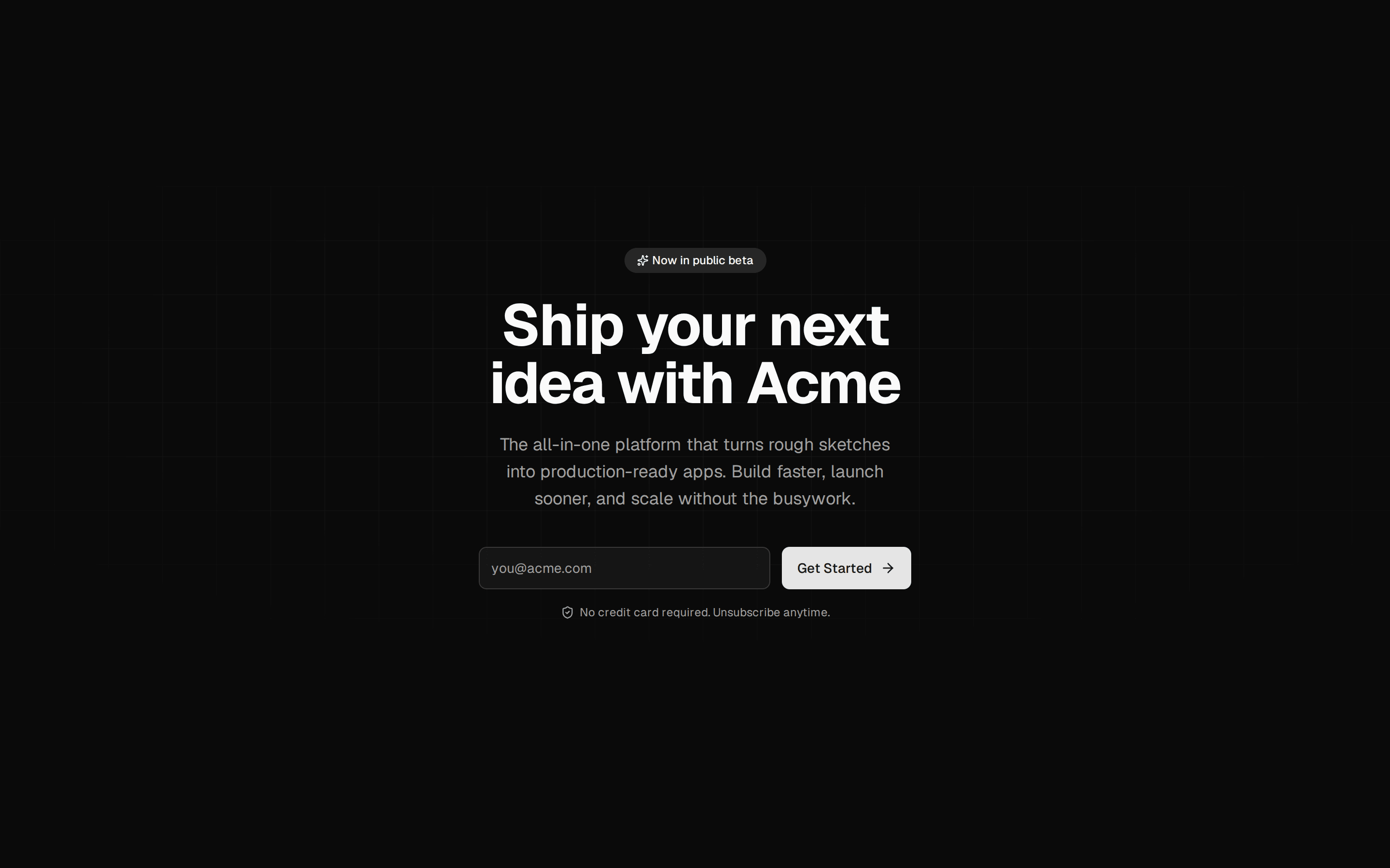
import Link from "next/link";
import { ArrowRight, Sparkles } from "lucide-react";

import { Badge } from "@/components/ui/badge";
import { Button } from "@/components/ui/button";

export default function HeroCentered() {
  return (
    <section className="relative overflow-hidden bg-background">
      <div
        aria-hidden
        className="absolute inset-0 bg-grid-lg mask-[linear-gradient(to_bottom,black_40%,transparent)]"
      />
      <div className="relative mx-auto flex w-full max-w-3xl flex-col items-center px-6 py-24 text-center sm:py-32">
        <Badge variant="secondary" className="mb-6 gap-1.5 border border-border/60">
          <Sparkles className="size-3" />
          Announcing our public beta
        </Badge>
        <h1 className="text-4xl font-semibold tracking-tight text-balance sm:text-6xl">
          Ship interfaces your users remember
        </h1>
        <p className="mt-6 max-w-xl text-lg text-pretty text-muted-foreground">
          A design system that gets out of your way. Typed, accessible and
          themable — from the first component to the last pixel.
        </p>
        <div className="mt-8 flex flex-col items-center gap-3 sm:flex-row">
          <Button size="lg" render={<Link href="#" />}>
            Start building
            <ArrowRight data-icon="inline-end" />
          </Button>
          <Button size="lg" variant="outline" render={<Link href="#" />}>
            Read the docs
          </Button>
        </div>
        <p className="mt-6 text-sm text-muted-foreground">
          Free for personal projects. No credit card required.
        </p>
      </div>
    </section>
  );
}