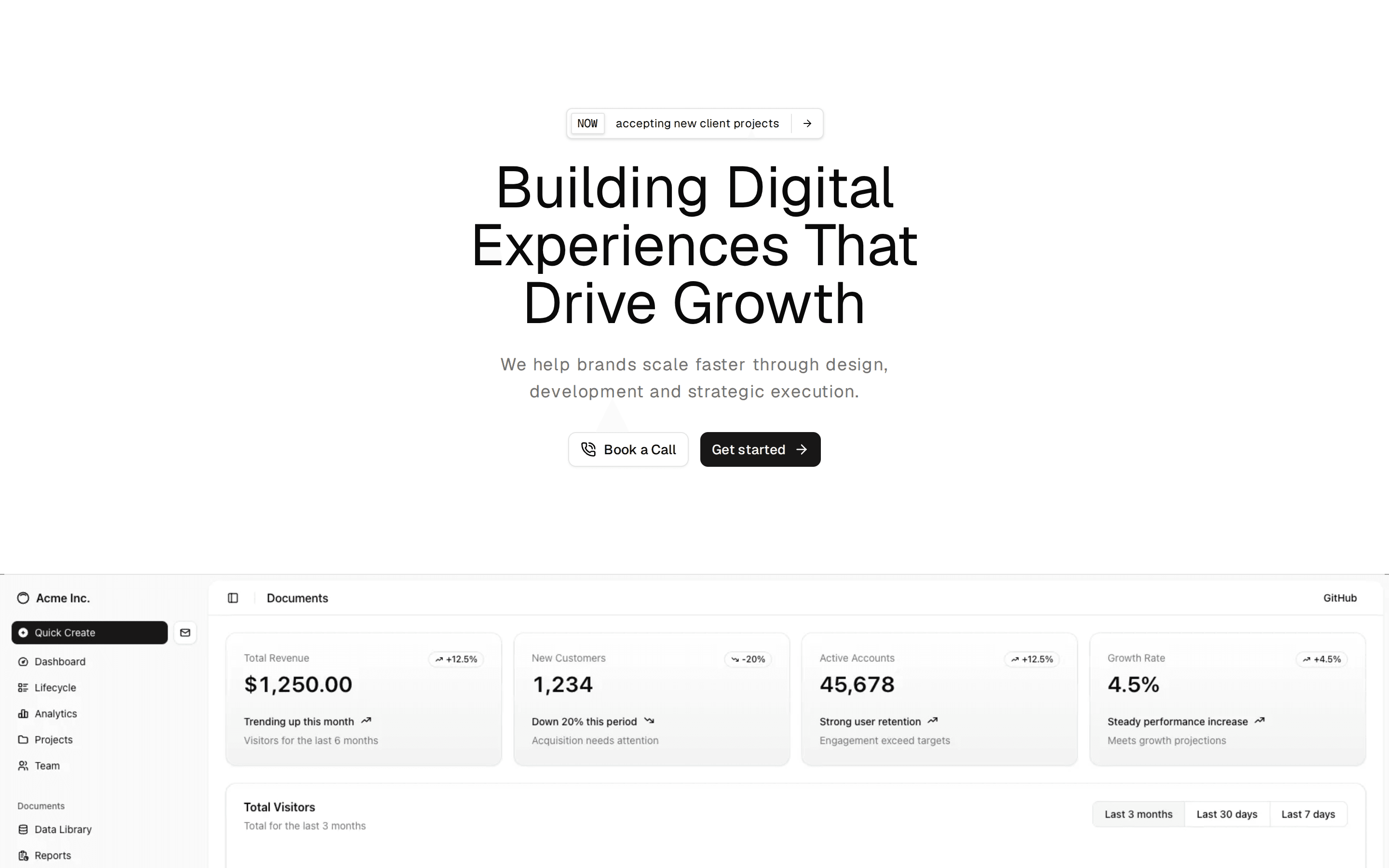
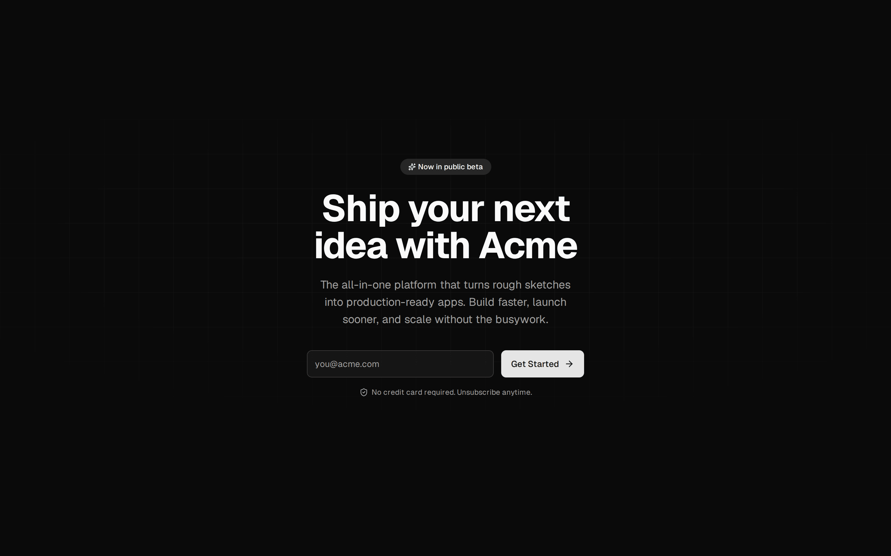
Left-Aligned Hero With Metrics
Left-aligned hero section with a release badge, headline, signup and docs CTAs, and an inline row of three icon metrics split by vertical separators.
@7ovr
Left-aligned hero section with a release badge, headline, signup and docs CTAs, and an inline row of three icon metrics split by vertical separators.
@7ovr
registry/blocks/hero/3/hero-block.tsx
import { Badge } from "@/components/ui/badge"
import { Button } from "@/components/ui/button"
import { Separator } from "@/components/ui/separator"
import { IconPlaceholder } from "@/components/icons/icon-placeholder"

type IconProps = { className?: string; size?: number | string }

const STATS = [
  {
    icon: (p: IconProps) => (
      <IconPlaceholder
        lucide="Group"
        tabler="IconUsers"
        hugeicons="GroupIcon"
        phosphor="Users"
        remixicon="RiGroupLine"
        {...p}
      />
    ),
    value: "12,400+",
    label: "Teams onboarded",
  },
  {
    icon: (p: IconProps) => (
      <IconPlaceholder
        lucide="Clock"
        tabler="IconClock"
        hugeicons="TimeIcon"
        phosphor="Clock"
        remixicon="RiTimeLine"
        {...p}
      />
    ),
    value: "99.98%",
    label: "Uptime SLA",
  },
  {
    icon: (p: IconProps) => (
      <IconPlaceholder
        lucide="Star"
        tabler="IconStar"
        hugeicons="StarIcon"
        phosphor="Star"
        remixicon="RiStarLine"
        {...p}
      />
    ),
    value: "4.9 / 5",
    label: "Customer rating",
  },
]

export default function HeroBlock() {
  return (
    <section className="flex w-full items-center justify-center bg-background px-6 py-12 text-foreground">
      <div className="mx-auto w-full max-w-3xl">
        <Badge variant="outline">Acme Platform: Now GA</Badge>

        <h1 className="mt-6 font-heading text-4xl font-bold tracking-tight sm:text-5xl md:text-6xl">
          Ship faster with
          <br className="hidden sm:block" /> less overhead.
        </h1>

        <p className="mt-5 max-w-xl text-lg text-muted-foreground">
          Acme consolidates your workflows, deployments, and team collaboration
          into a single workspace, so your engineers spend time building, not
          wrangling tools.
        </p>

        <div className="mt-8 flex flex-col gap-3 sm:flex-row sm:items-center">
          <Button
            render={<a href="#" />}
            nativeButton={false}
            className="active:scale-[0.97] transition-transform duration-[160ms] ease-[cubic-bezier(0.23,1,0.32,1)]"
          >
            Start For Free
            <IconPlaceholder
              lucide="ArrowRight"
              tabler="IconArrowRight"
              hugeicons="ArrowRightIcon"
              phosphor="ArrowRight"
              remixicon="RiArrowRightLine"
              data-icon="inline-end"
              aria-hidden="true"
            />
          </Button>
          <Button
            variant="outline"
            render={<a href="#" />}
            nativeButton={false}
            className="active:scale-[0.97] transition-transform duration-[160ms] ease-[cubic-bezier(0.23,1,0.32,1)]"
          >
            View Documentation
            <IconPlaceholder
              lucide="ExternalLink"
              tabler="IconExternalLink"
              hugeicons="ExternalLinkIcon"
              phosphor="ArrowSquareOut"
              remixicon="RiExternalLinkLine"
              data-icon="inline-end"
              aria-hidden="true"
            />
          </Button>
        </div>

        <div className="mt-10 flex flex-col gap-6 sm:flex-row sm:items-center sm:gap-0">
          {STATS.map((stat, index) => {
            const Icon = stat.icon
            return (
              <div key={stat.label} className="flex items-center gap-0">
                {index > 0 && (
                  <Separator
                    orientation="vertical"
                    className="mx-6 hidden h-10 sm:block"
                  />
                )}
                <div className="flex items-start gap-3">
                  <div className="mt-0.5 flex size-9 shrink-0 items-center justify-center rounded-md border border-border bg-muted">
                    <Icon
                      className="size-4 text-muted-foreground"
                      aria-hidden="true"
                    />
                  </div>
                  <div>
                    <p className="text-xl leading-none font-bold tabular-nums">
                      {stat.value}
                    </p>
                    <p className="mt-1 text-sm text-muted-foreground">
                      {stat.label}
                    </p>
                  </div>
                </div>
              </div>
            )
          })}
        </div>
      </div>
    </section>
  )
}
Requires a base-* style in components.json (the shadcn init default). Legacy new-york/radix-* styles install Radix primitives, which reject the render prop this block uses.