Hero Layers
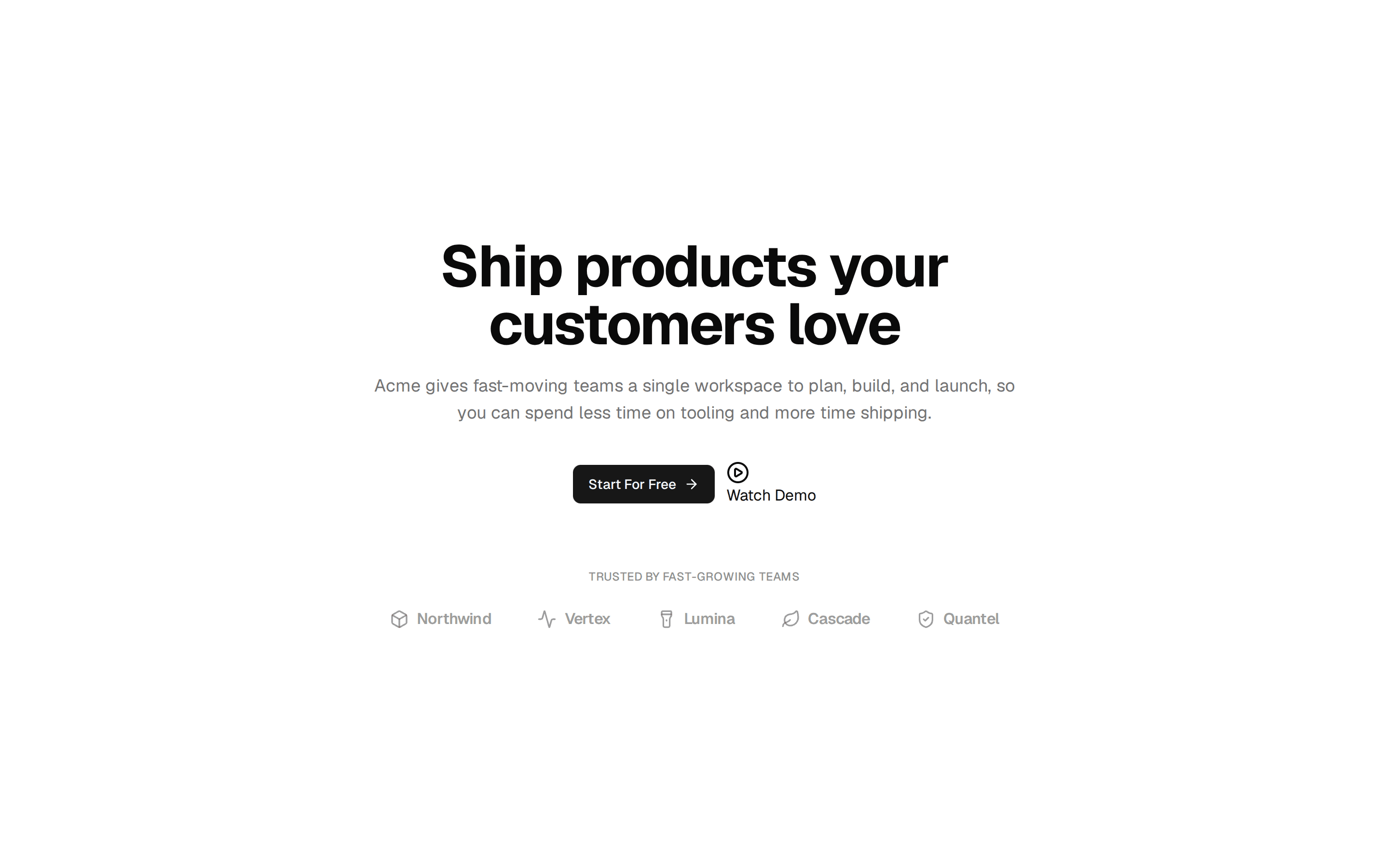
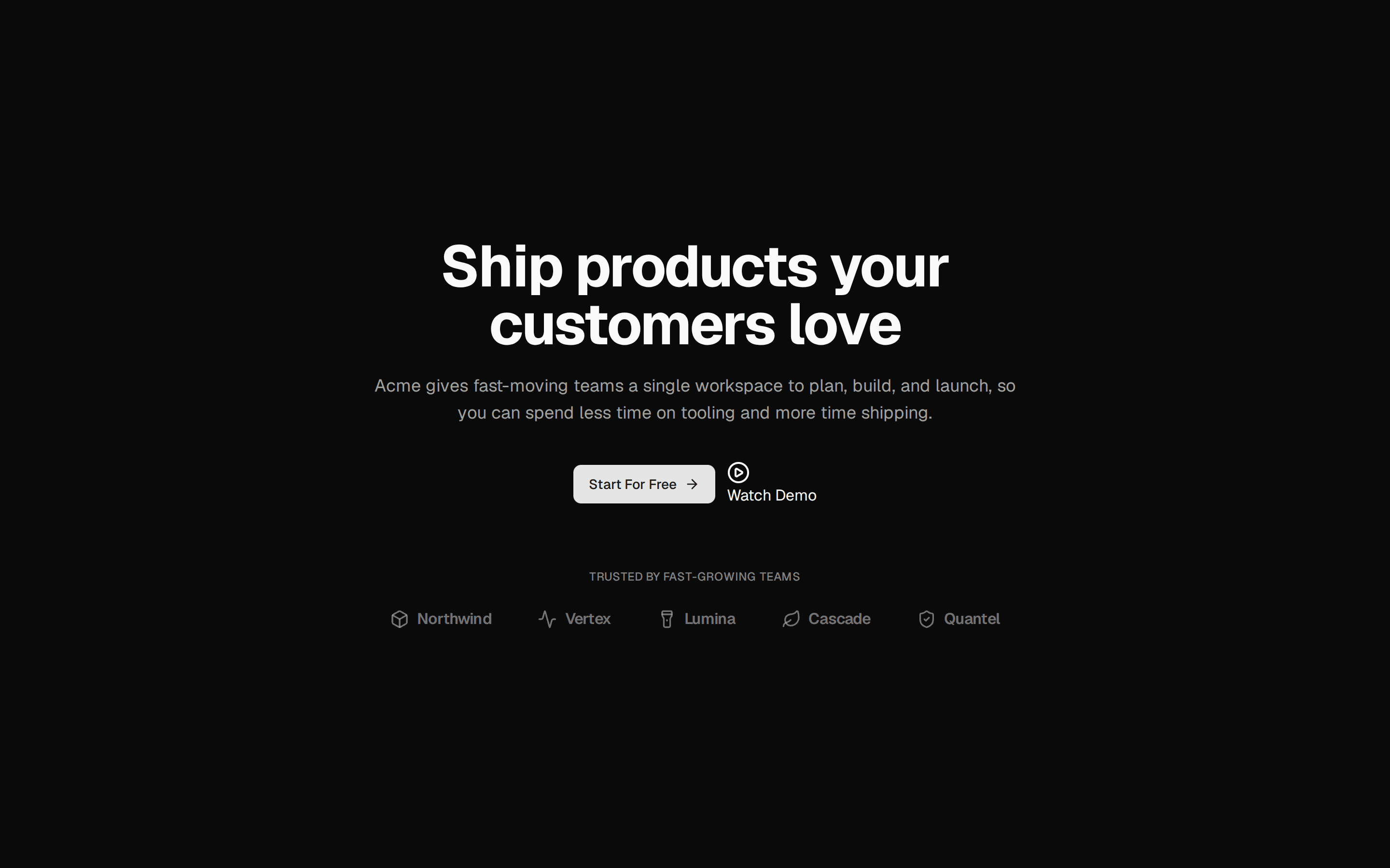
Hero com screenshots em camadas sobrepostas (Layers) — inspirado em Launch UI Hero Layers.
@lema-ds
Hero com screenshots em camadas sobrepostas (Layers) — inspirado em Launch UI Hero Layers.
@lema-ds
components/ds/ds-hero-layers.tsx
"use client"

import * as React from "react"
import { cva, type VariantProps } from "class-variance-authority"

import { cn } from "@/lib/utils"
import { Badge } from "@/components/ui/badge"
import { Skeleton } from "@/components/ui/skeleton"

// ── Types ──

export interface HeroLayersItem {
  src: string
  alt: string
}

export interface HeroLayersProps
  extends
    React.HTMLAttributes<HTMLElement>,
    VariantProps<typeof heroLayersVariants> {
  badge?: string
  title?: string
  description?: string
  actions?: React.ReactNode
  layers?: HeroLayersItem[]
  loading?: boolean
}

// ── Variants ──

export const heroLayersVariants = cva(
  "relative flex w-full flex-col items-center overflow-hidden bg-background px-4 py-12 text-center sm:px-6 sm:py-16",
  {
    variants: {
      inset: {
        true: "mx-auto max-w-6xl rounded-3xl border bg-card shadow-sm",
        false: "",
      },
    },
    defaultVariants: {
      inset: false,
    },
  }
)

// ── Component ──

export function HeroLayers({
  className,
  inset = false,
  badge = "Launch UI v2 is out!",
  title = "Give your big idea the design it deserves",
  description = "Professionally designed blocks and templates built with React, shadcn/ui and Tailwind that will help your product stand out.",
  actions,
  layers,
  loading = false,
  ...props
}: HeroLayersProps) {
  const defaultLayers: HeroLayersItem[] = [
    {
      src: "https://picsum.photos/seed/layers1/1200/700",
      alt: "Dashboard preview",
    },
    { src: "https://picsum.photos/seed/layers2/900/600", alt: "Tasks preview" },
    {
      src: "https://picsum.photos/seed/layers3/700/500",
      alt: "Mobile preview",
    },
  ]
  const items = layers ?? defaultLayers

  if (loading) {
    return (
      <section
        data-slot="hero-layers-skeleton"
        className={cn(heroLayersVariants({ inset }), className)}
        {...props}
      >
        <Skeleton className="h-6 w-40 rounded-full" />
        <Skeleton className="mt-4 h-9 w-96 max-w-full" />
        <Skeleton className="mt-3 h-4 w-[520px] max-w-full" />
        <Skeleton className="mt-6 h-10 w-32 rounded-full" />
        <div className="relative mt-10 h-64 w-full max-w-4xl">
          <Skeleton className="absolute inset-0 rounded-xl" />
        </div>
      </section>
    )
  }

  return (
    <section
      data-slot="hero-layers"
      className={cn(heroLayersVariants({ inset }), className)}
      {...props}
    >
      {badge && (
        <Badge variant="secondary" className="rounded-full px-3 py-1 text-xs">
          {badge}
        </Badge>
      )}
      <h1 className="mt-4 max-w-3xl text-3xl font-bold tracking-tight text-foreground sm:text-4xl lg:text-5xl">
        {title}
      </h1>
      <p className="mt-3 max-w-2xl text-sm leading-relaxed text-muted-foreground sm:text-base">
        {description}
      </p>
      {actions && (
        <div className="mt-6 flex flex-wrap items-center justify-center gap-3">
          {actions}
        </div>
      )}

      {/* Layers stack — inspired by Launch UI Hero Layers */}
      <div className="relative mt-10 flex w-full max-w-5xl justify-center">
        <div className="relative w-full">
          {/* base layer */}
          <div className="overflow-hidden rounded-xl border bg-card shadow-xl">
            {/* eslint-disable-next-line @next/next/no-img-element */}
            <img
              src={items[0]?.src}
              alt={items[0]?.alt ?? ""}
              width={1200}
              height={700}
              className="h-auto w-full object-cover"
              loading="lazy"
              decoding="async"
            />
          </div>
          {/* second layer — offset top right */}
          {items[1] && (
            <div className="absolute -top-4 -right-6 hidden w-[62%] overflow-hidden rounded-xl border bg-card shadow-xl md:block">
              {/* eslint-disable-next-line @next/next/no-img-element */}
              <img
                src={items[1].src}
                alt={items[1].alt}
                width={900}
                height={600}
                className="h-auto w-full object-cover"
                loading="lazy"
                decoding="async"
              />
            </div>
          )}
          {/* third layer — bottom left */}
          {items[2] && (
            <div className="absolute -bottom-6 -left-6 hidden w-[48%] overflow-hidden rounded-xl border bg-card shadow-xl md:block">
              {/* eslint-disable-next-line @next/next/no-img-element */}
              <img
                src={items[2].src}
                alt={items[2].alt}
                width={700}
                height={500}
                className="h-auto w-full object-cover"
                loading="lazy"
                decoding="async"
              />
            </div>
          )}
        </div>
      </div>
    </section>
  )
}