Loading
 suiss/ui blocksfor shadcn/ui.
124 blocks · all free · updated 20 Oct 2026
Copy-paste components, patterns, interactions, charts and blocks for React with Next.js and Vite, React Native with Expo, SwiftUI and Jetpack Compose.
New from suiss/ui
Newest first




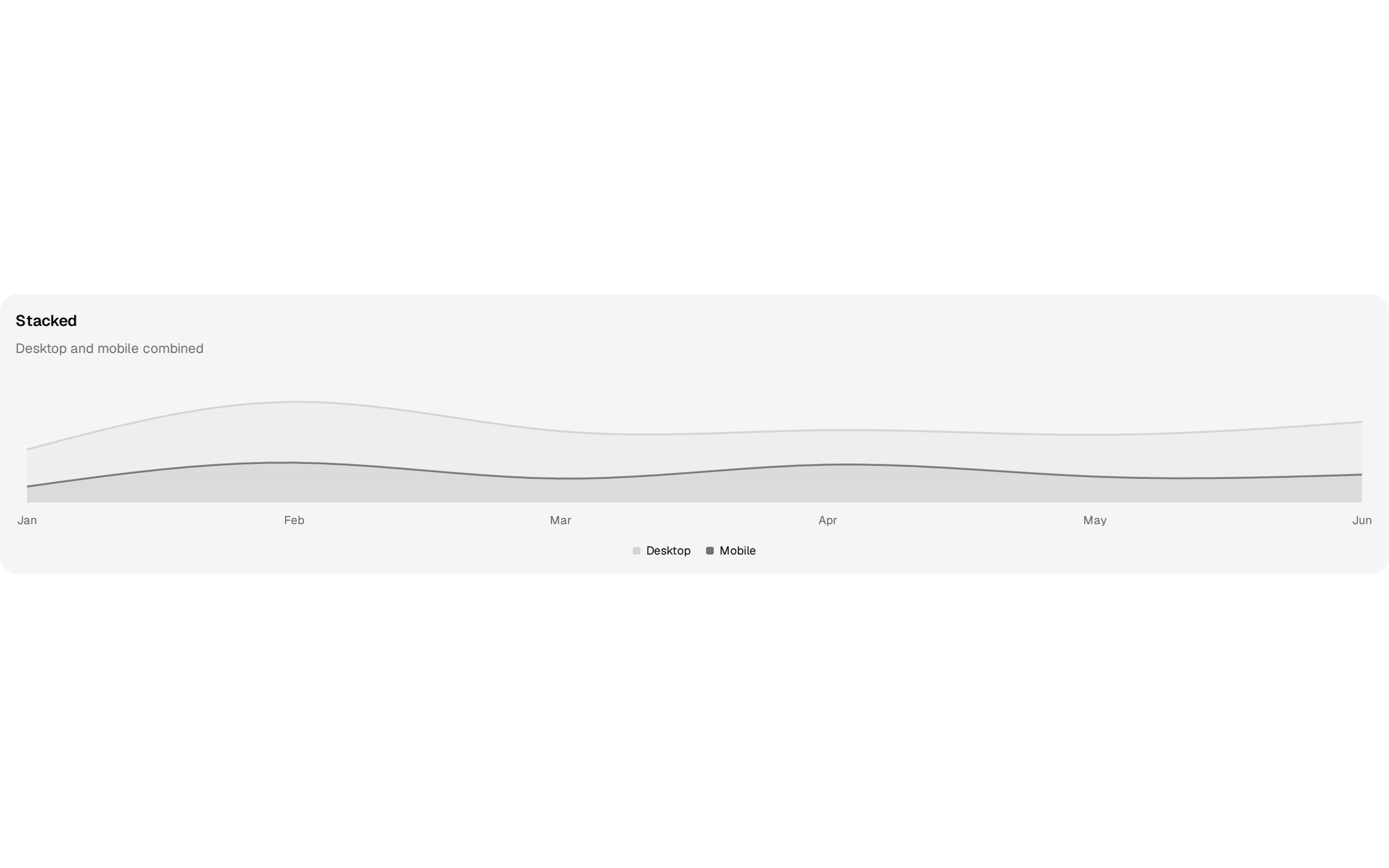

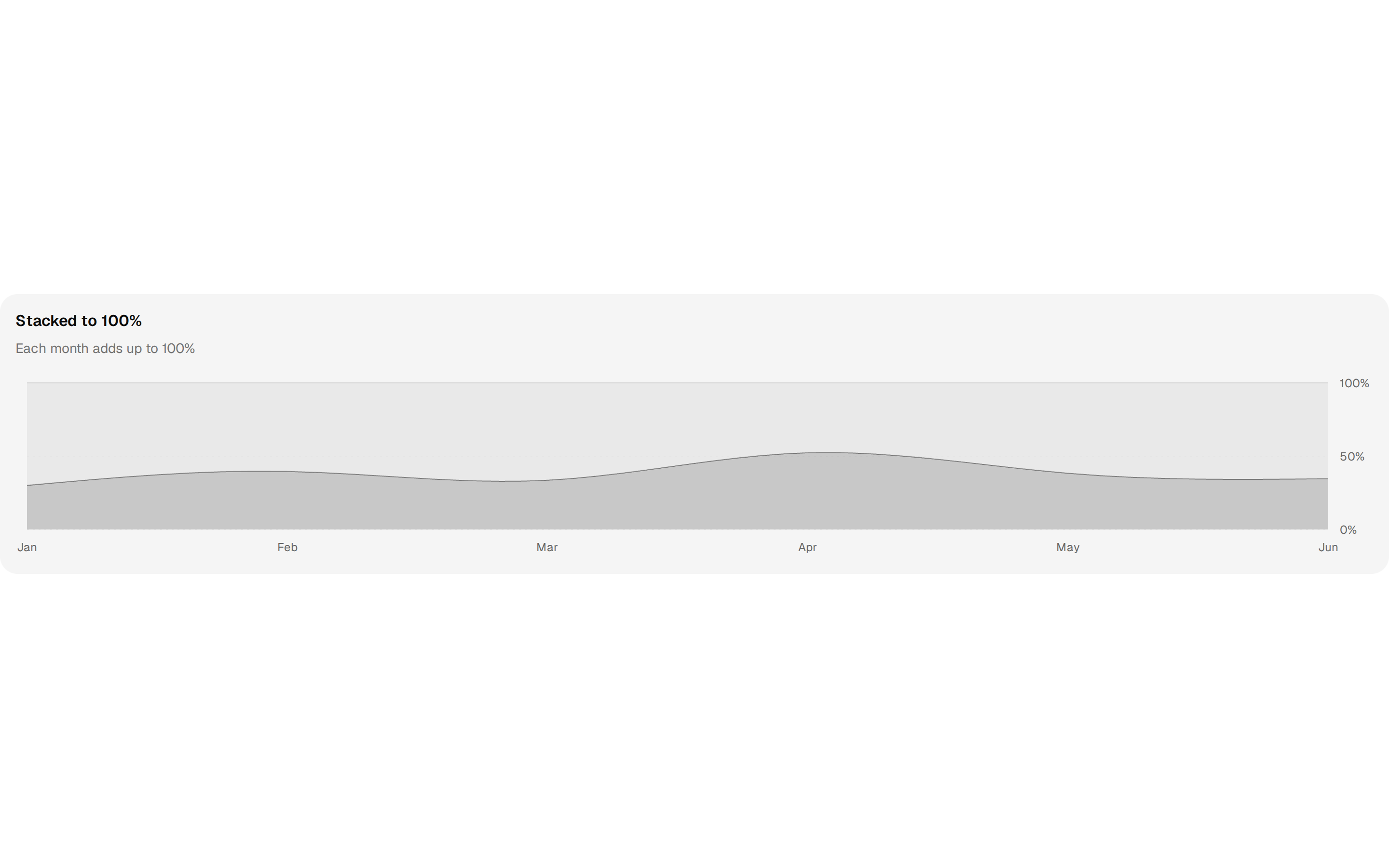

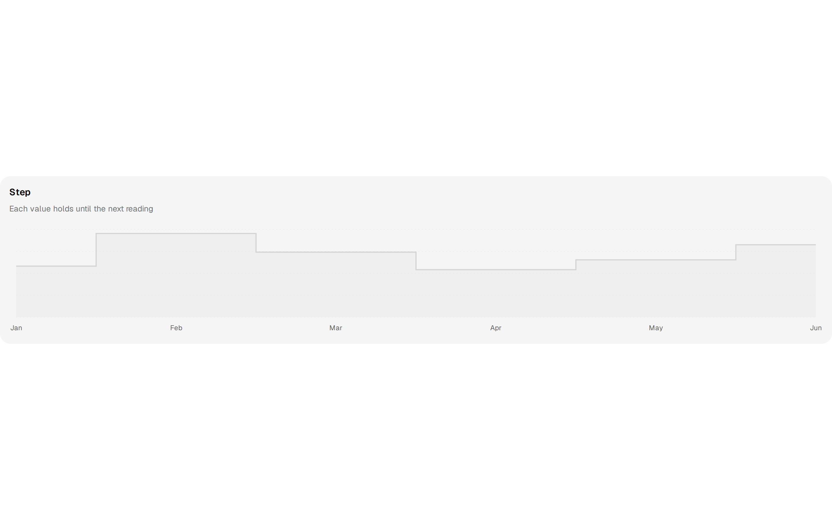

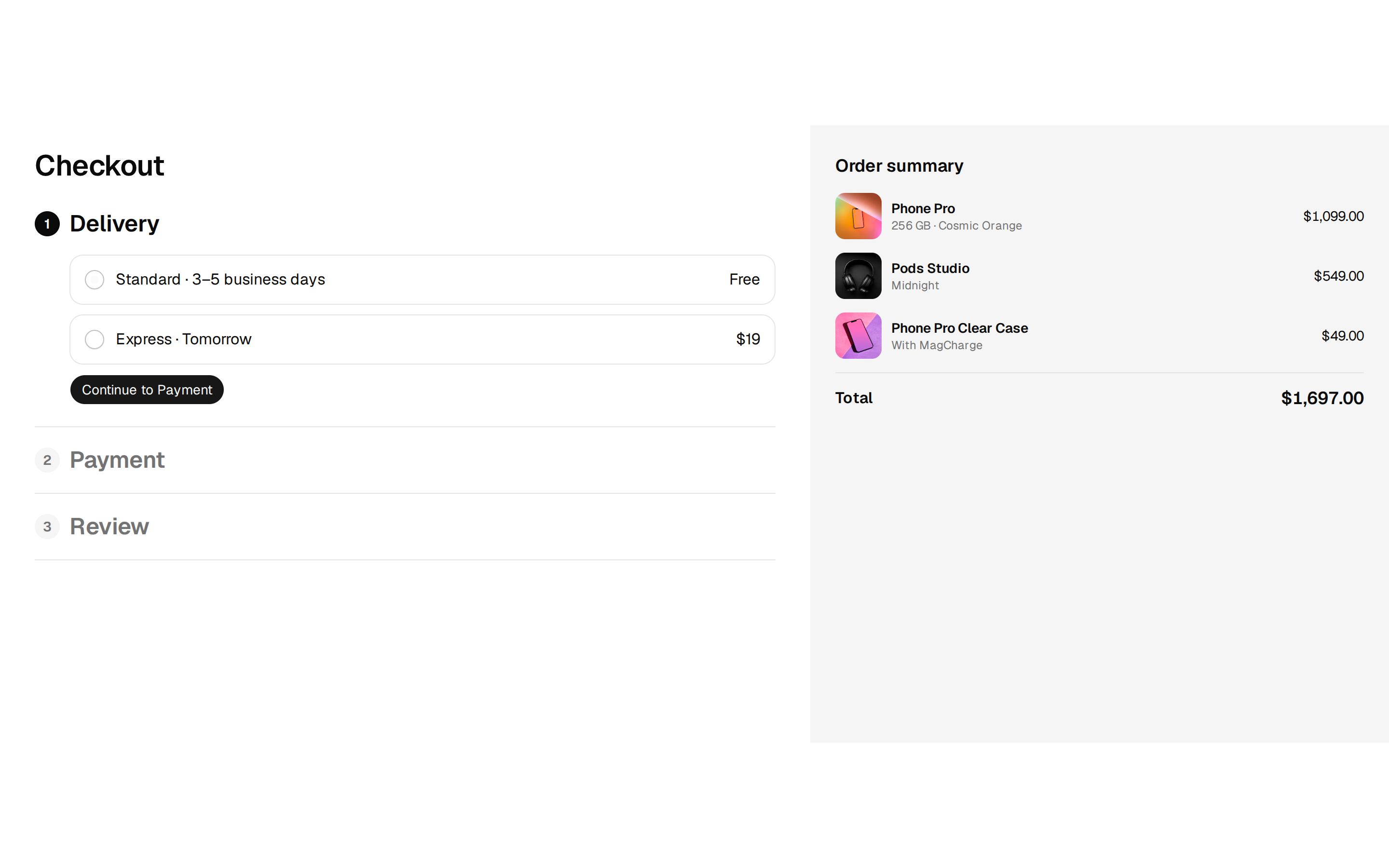










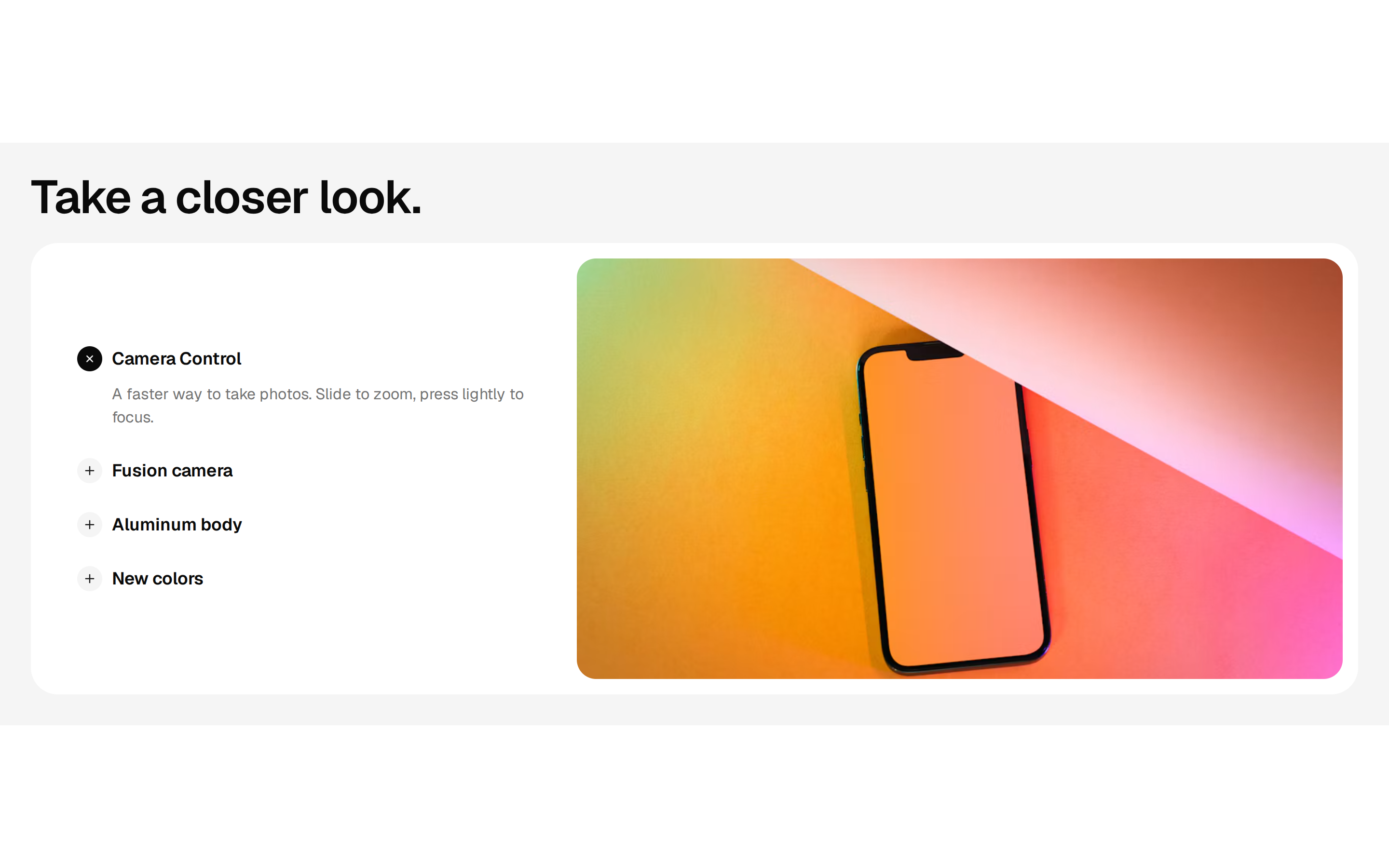

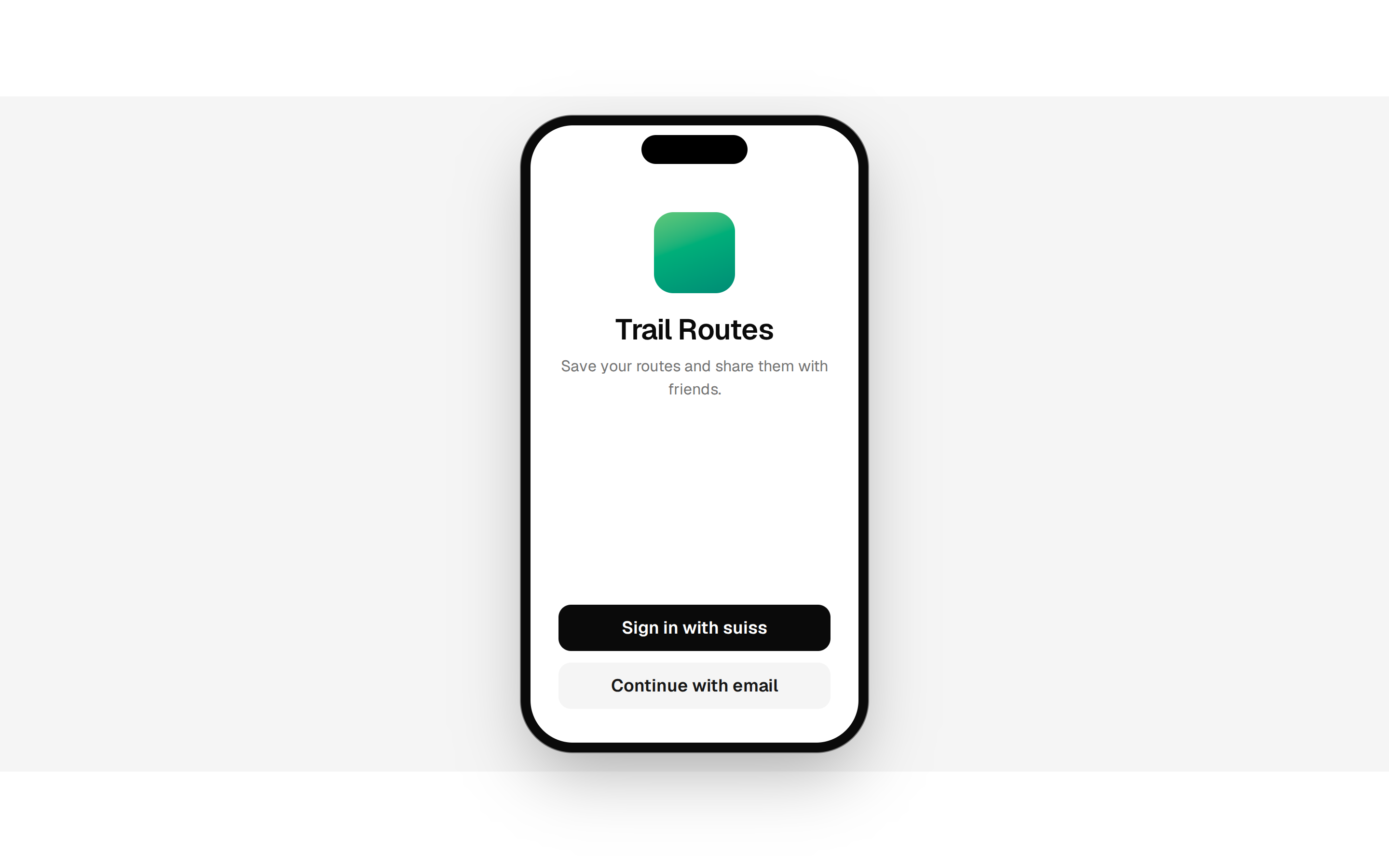
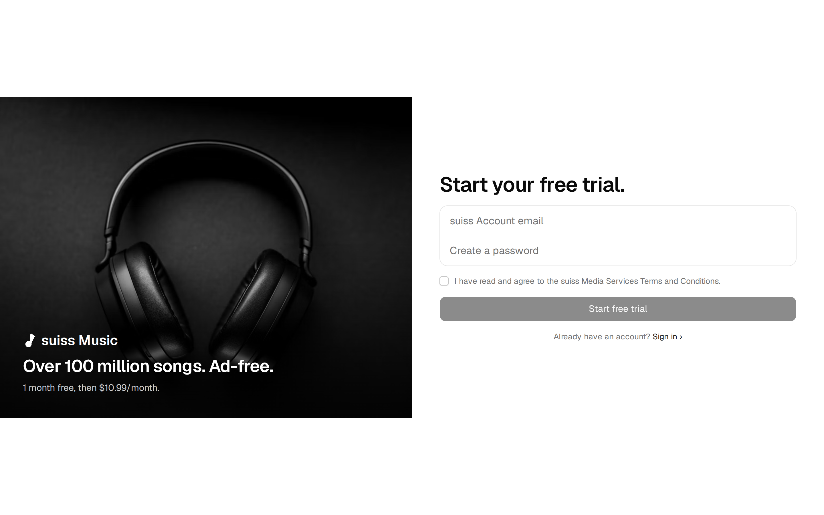
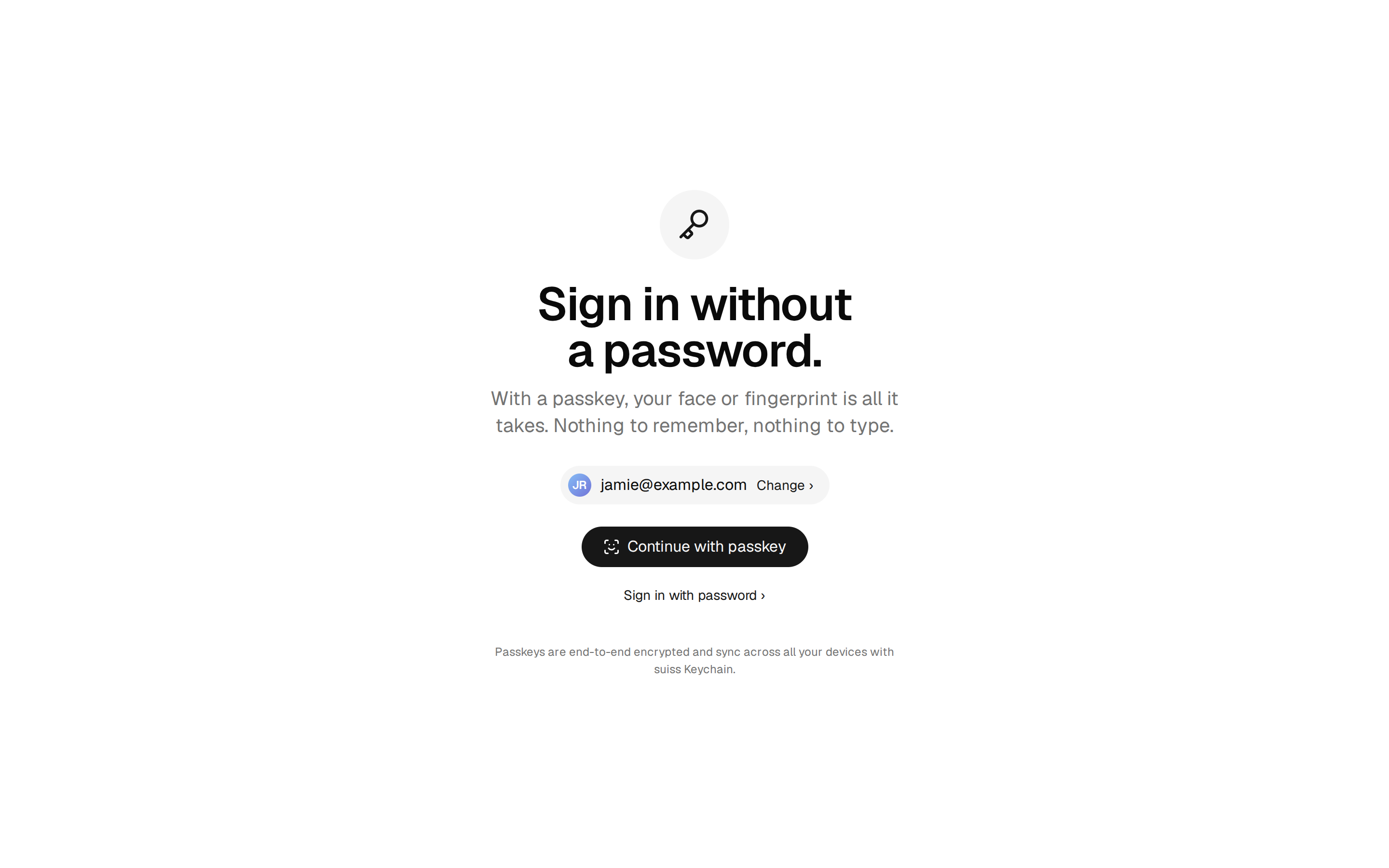
suiss/ui auth blocks
6 blocks





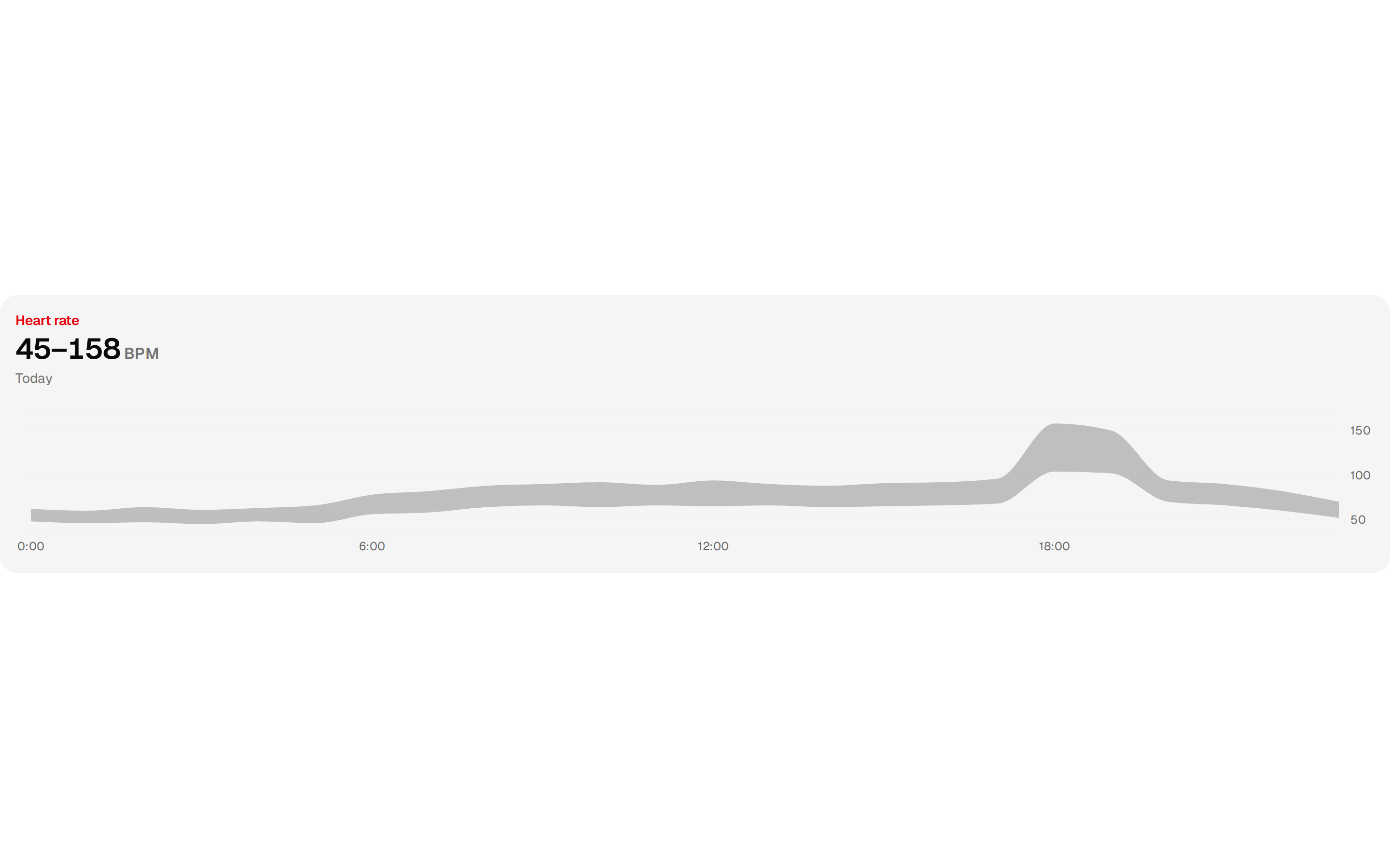
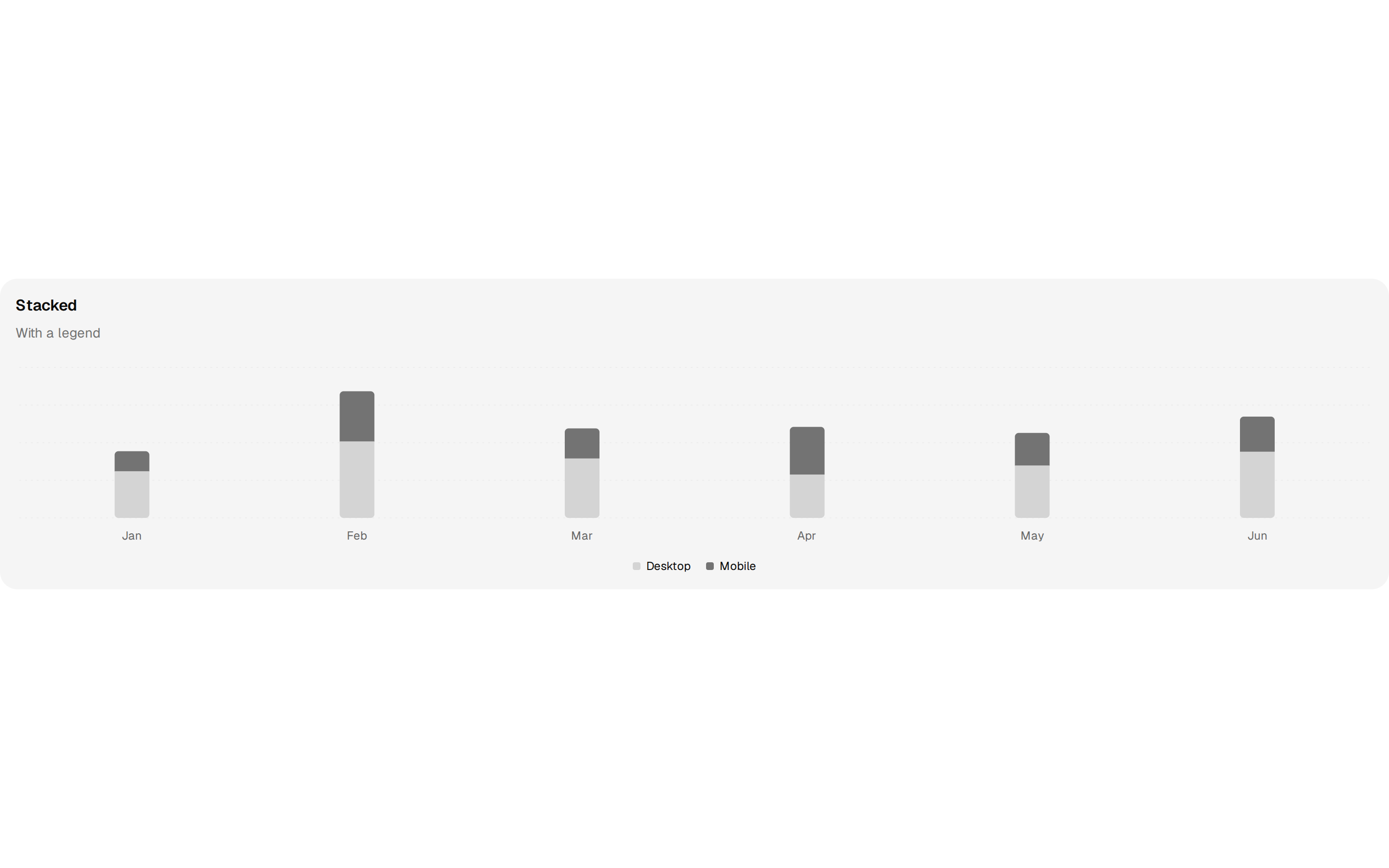
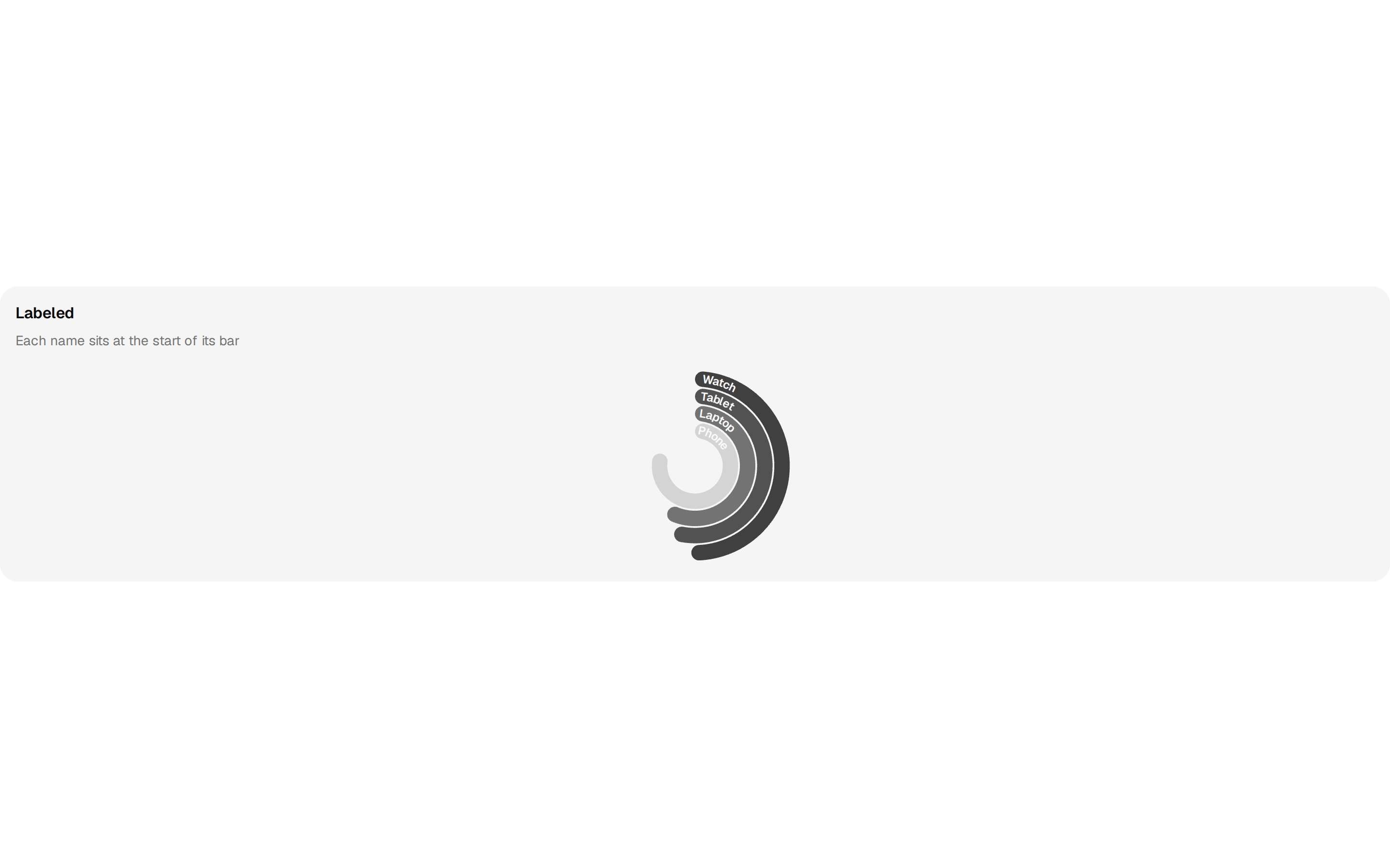
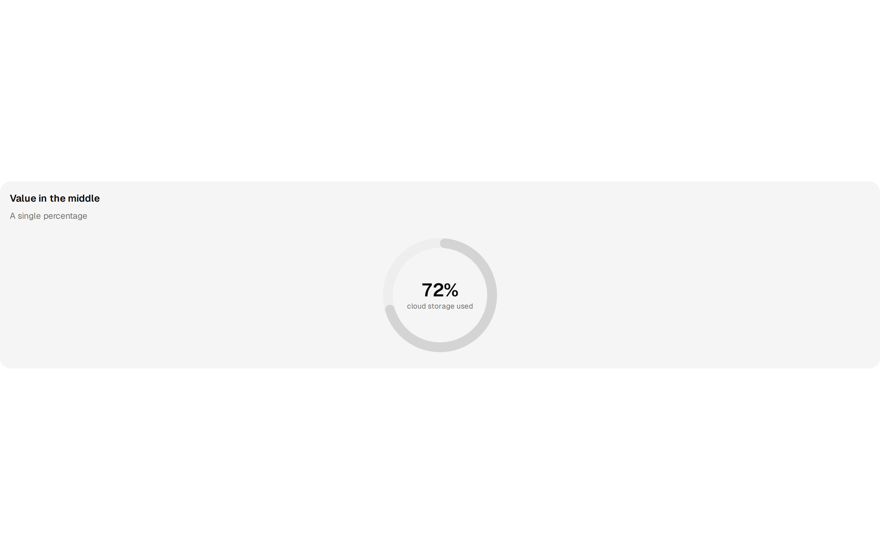
suiss/ui charts blocks
70 blocks




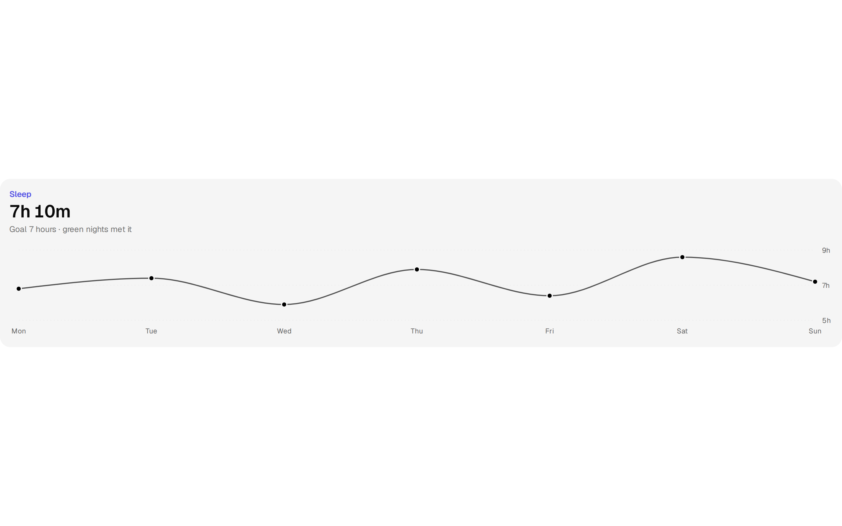


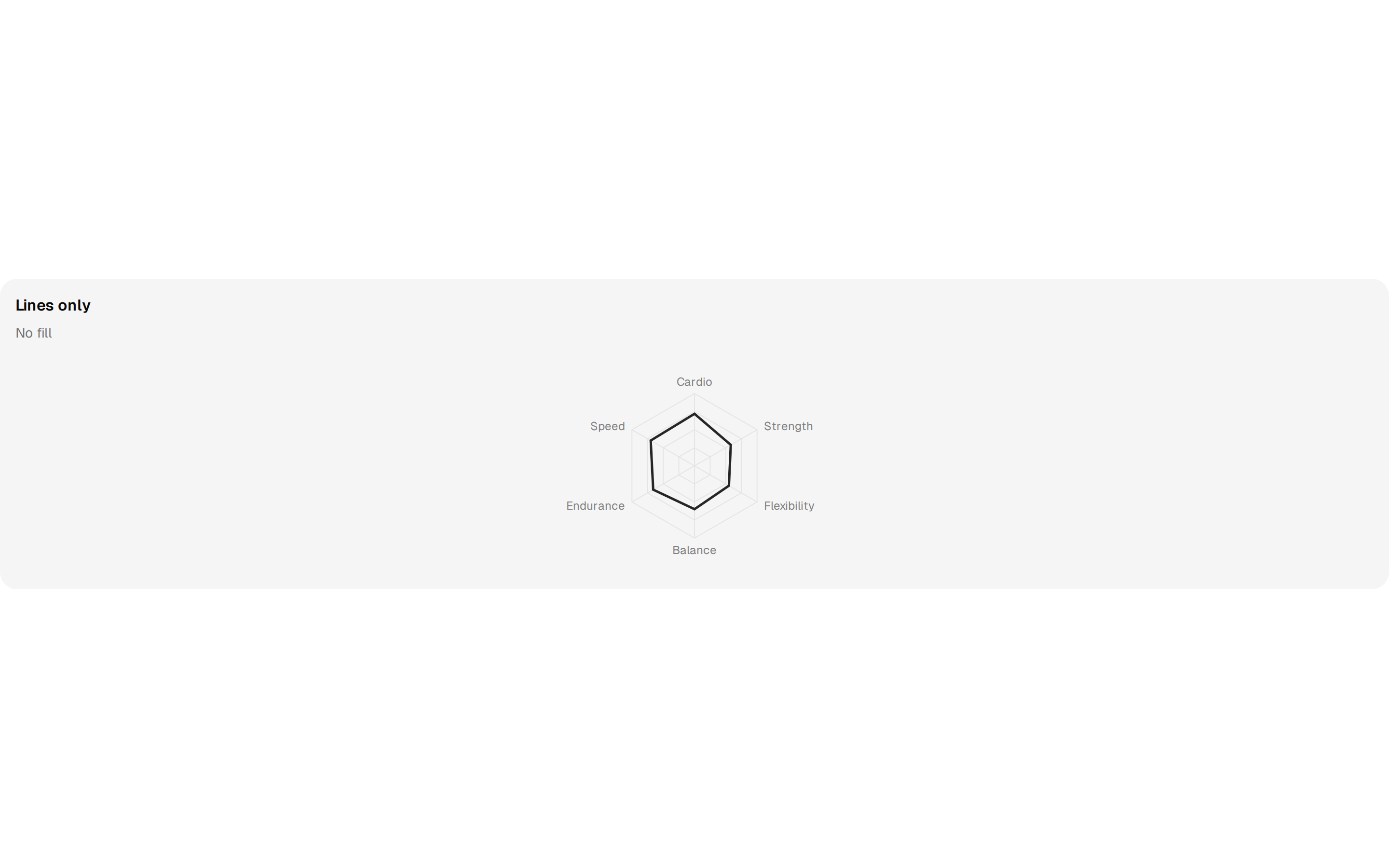




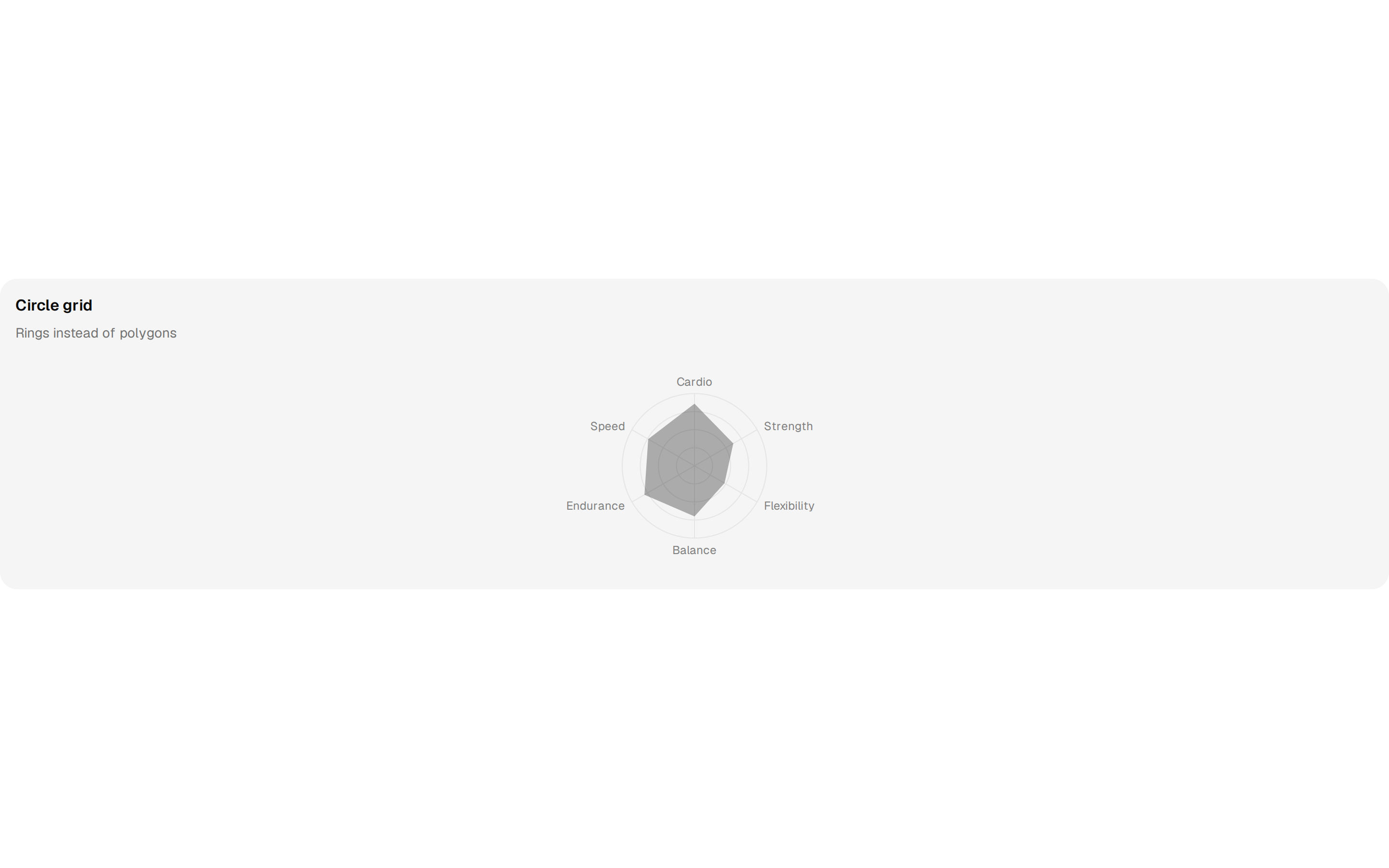

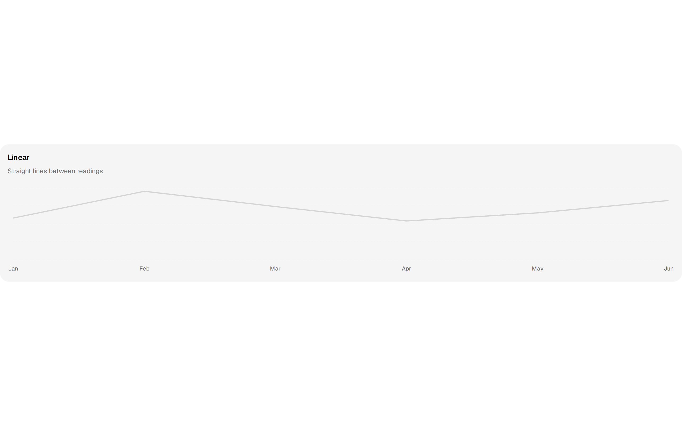

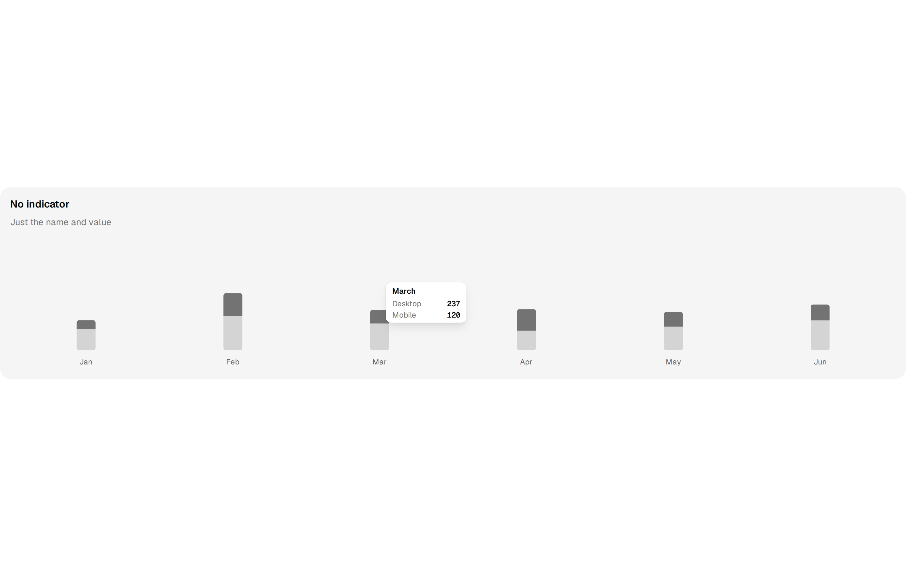

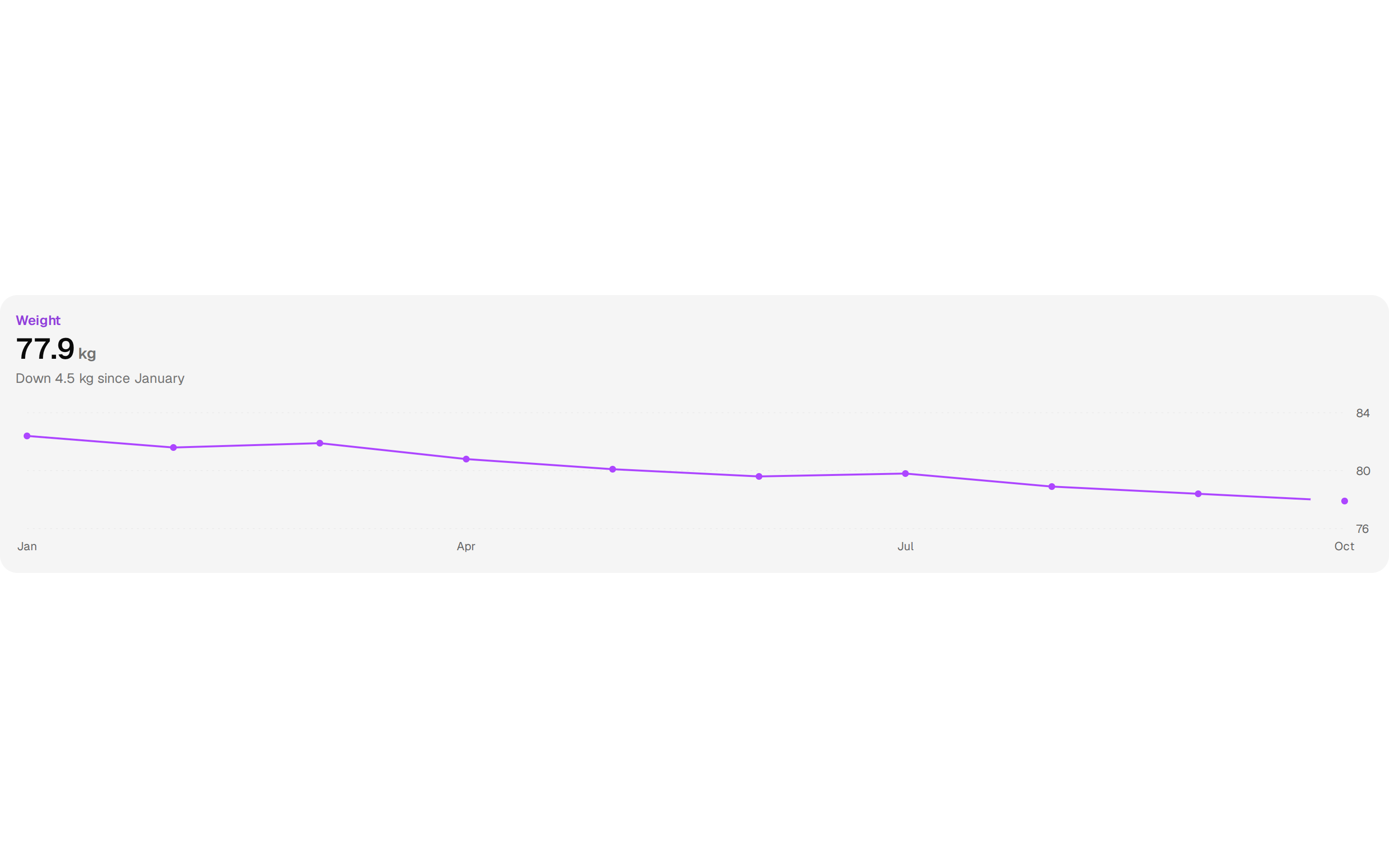

suiss/ui charts area blocks
10 blocks
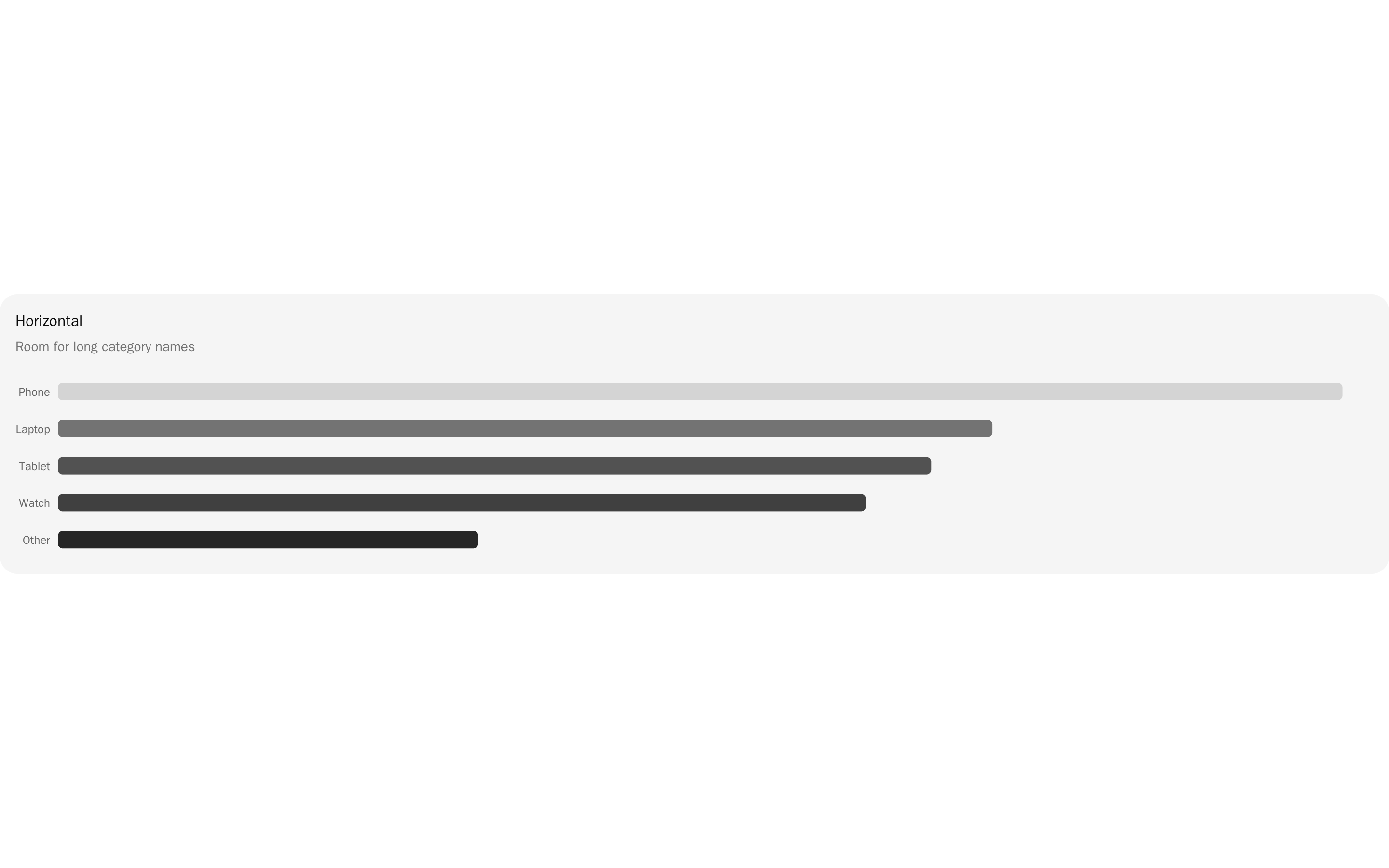
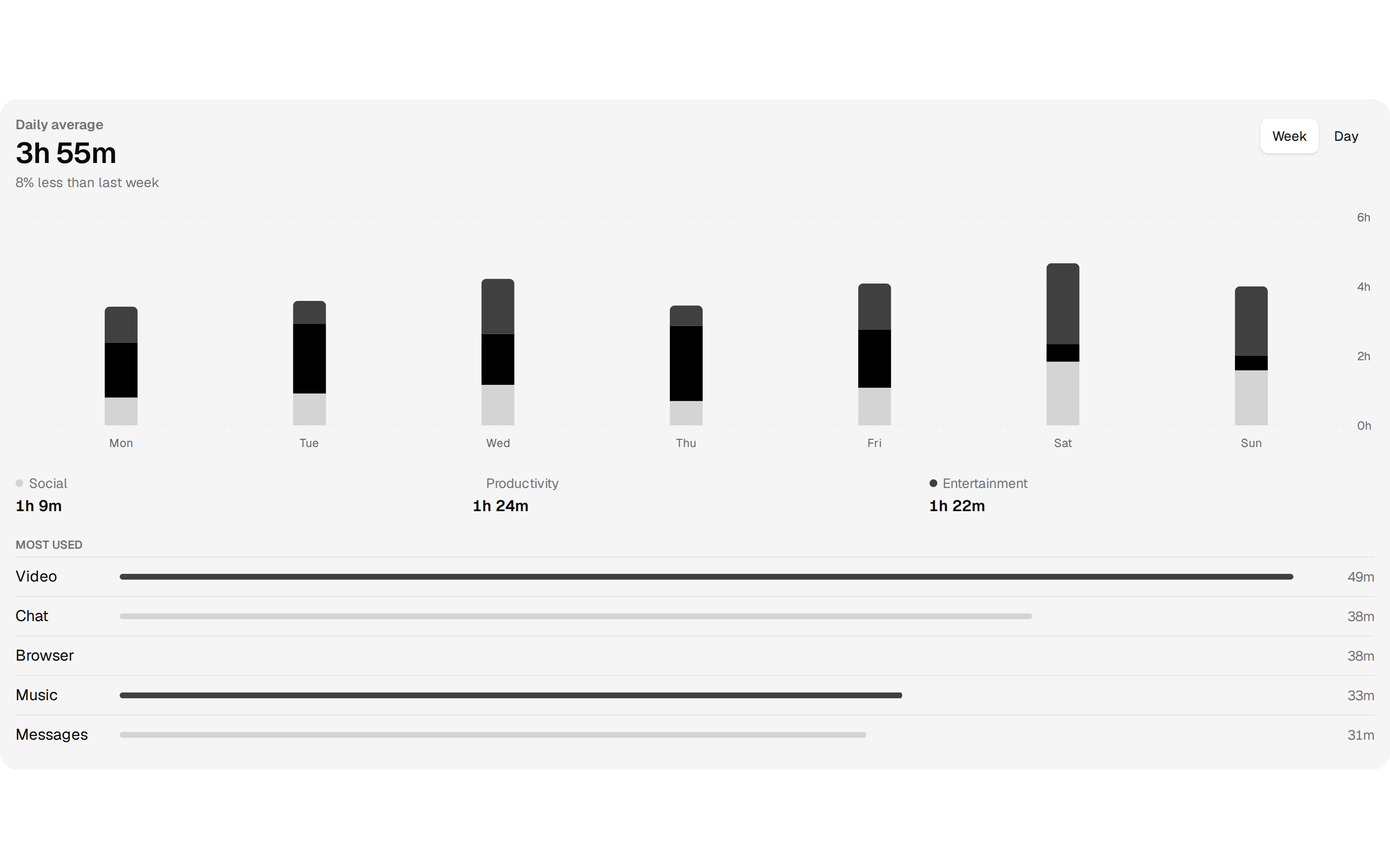
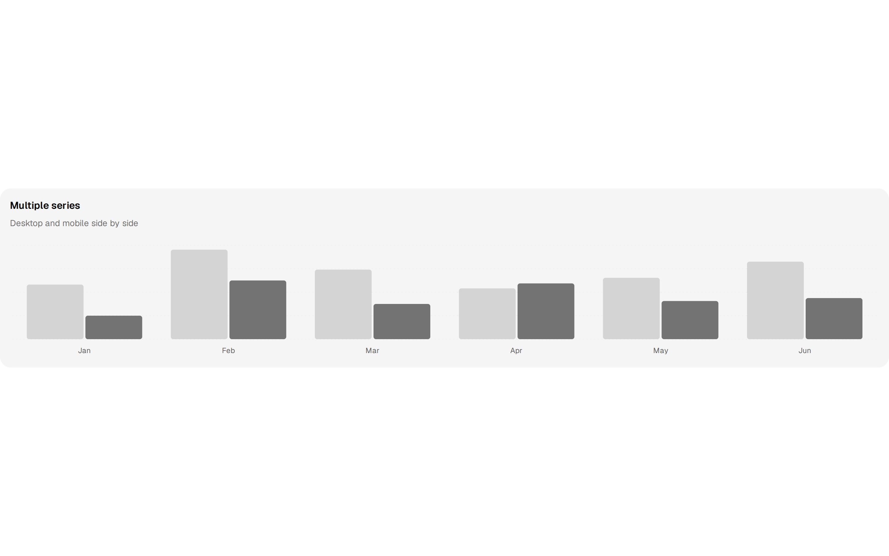
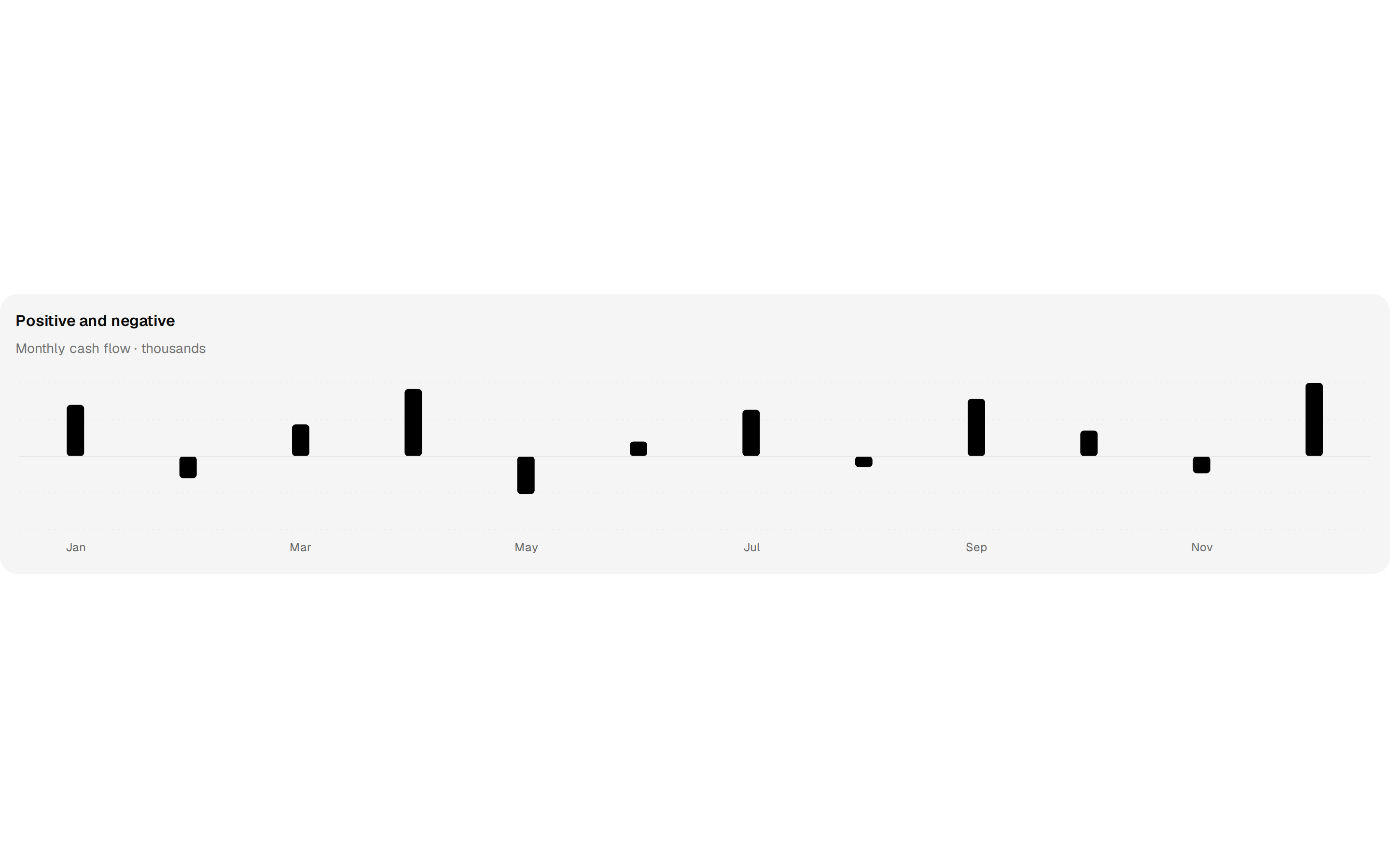
suiss/ui charts bar blocks
10 blocks
suiss/ui is an open-source, MIT-licensed collection of components with one clean, minimal design across four platforms: React with Next.js or Vite, React Native with Expo, SwiftUI and Jetpack Compose. The React versions use Tailwind CSS v4, and everything is copied into your project by its CLI rather than installed as a dependency. The library has six parts: components, patterns that adapt between desktop and mobile, interactions such as swipe actions and pull to refresh, charts styled by your theme, complete blocks, and AI pieces for messages, reasoning and tool calls.
The blocks are whole product screens with a polished retail feel, including a three-step checkout, a product configurator, bento feature grids, mail and support inboxes, analytics and store dashboards, activity logs and empty states. A Create page turns a choice of style, colors, radius and icons into a preset for setup.
More registries like suiss/ui
Auth, charts, charts area and charts bar blocks from other makers