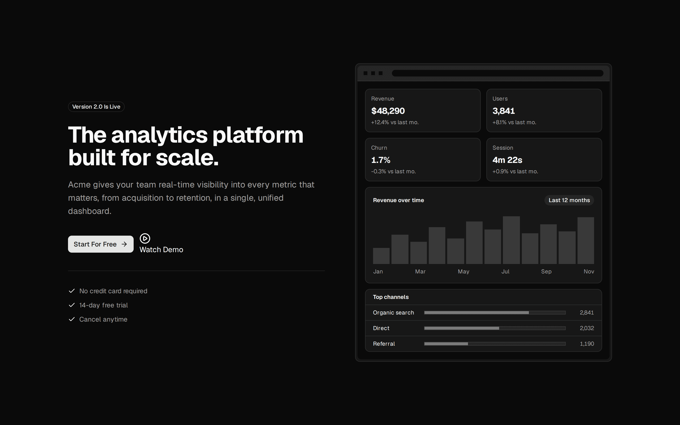
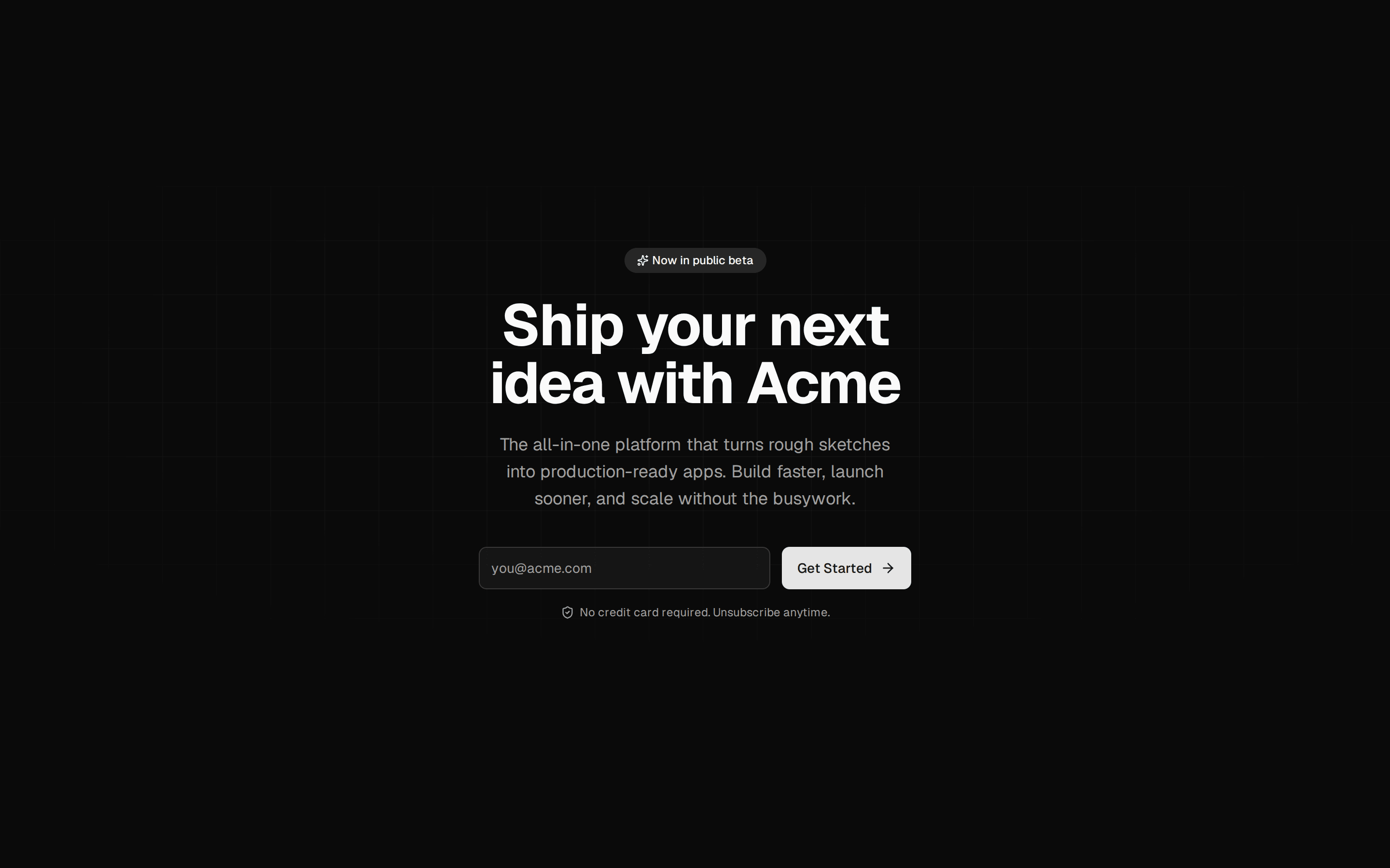
Hero With Demo Video Dialog
Centered hero section whose Watch Demo button opens a video dialog, above a trusted-by strip of five icon and wordmark company logos.
@7ovr
Centered hero section whose Watch Demo button opens a video dialog, above a trusted-by strip of five icon and wordmark company logos.
@7ovr
registry/blocks/hero/5/hero-block.tsx
"use client"
import { Button } from "@/components/ui/button"
import {
  Dialog,
  DialogContent,
  DialogDescription,
  DialogTitle,
  DialogTrigger,
} from "@/components/ui/dialog"
import { IconPlaceholder } from "@/components/icons/icon-placeholder"

type IconProps = { className?: string; size?: number | string }

const LOGOS = [
  {
    name: "Northwind",
    Icon: (p: IconProps) => (
      <IconPlaceholder
        lucide="Box"
        tabler="IconBox"
        hugeicons="BoxIcon"
        phosphor="Cube"
        remixicon="RiBox3Line"
        {...p}
      />
    ),
  },
  {
    name: "Vertex",
    Icon: (p: IconProps) => (
      <IconPlaceholder
        lucide="Activity"
        tabler="IconActivity"
        hugeicons="PulseIcon"
        phosphor="Pulse"
        remixicon="RiPulseLine"
        {...p}
      />
    ),
  },
  {
    name: "Lumina",
    Icon: (p: IconProps) => (
      <IconPlaceholder
        lucide="Flashlight"
        tabler="IconBulb"
        hugeicons="FlashlightIcon"
        phosphor="Flashlight"
        remixicon="RiFlashlightLine"
        {...p}
      />
    ),
  },
  {
    name: "Cascade",
    Icon: (p: IconProps) => (
      <IconPlaceholder
        lucide="Leaf"
        tabler="IconLeaf"
        hugeicons="LeafIcon"
        phosphor="Leaf"
        remixicon="RiLeafLine"
        {...p}
      />
    ),
  },
  {
    name: "Quantel",
    Icon: (p: IconProps) => (
      <IconPlaceholder
        lucide="ShieldCheck"
        tabler="IconShieldCheck"
        hugeicons="Shield01Icon"
        phosphor="ShieldCheck"
        remixicon="RiShieldCheckLine"
        {...p}
      />
    ),
  },
]

export default function HeroBlock() {
  return (
    <section className="flex w-full items-center justify-center bg-background px-6 py-16 text-foreground">
      <div className="mx-auto flex w-full max-w-3xl flex-col items-center text-center">
        <h1 className="font-heading text-4xl font-bold tracking-tight text-balance sm:text-5xl md:text-6xl">
          Ship products your customers love
        </h1>

        <p className="mt-5 max-w-2xl text-lg text-pretty text-muted-foreground">
          Acme gives fast-moving teams a single workspace to plan, build, and
          launch, so you can spend less time on tooling and more time shipping.
        </p>

        <div className="mt-9 flex w-full flex-col items-center gap-3 sm:w-auto sm:flex-row">
          <Button
            size="lg"
            className="w-full sm:w-auto active:scale-[0.97] transition-transform duration-[160ms] ease-[cubic-bezier(0.23,1,0.32,1)]"
            render={<a href="#" />}
            nativeButton={false}
          >
            Start For Free
            <IconPlaceholder
              lucide="ArrowRight"
              tabler="IconArrowRight"
              hugeicons="ArrowRightIcon"
              phosphor="ArrowRight"
              remixicon="RiArrowRightLine"
              data-icon="inline-end"
              aria-hidden="true"
            />
          </Button>

          <Dialog>
            <DialogTrigger
              render={
                <Button
                  size="lg"
                  variant="ghost"
                  className="w-full sm:w-auto active:scale-[0.97] transition-transform duration-[160ms] ease-[cubic-bezier(0.23,1,0.32,1)]"
                />
              }
            >
              <IconPlaceholder
                lucide="PlayCircle"
                tabler="IconPlayerPlay"
                hugeicons="PlayCircleIcon"
                phosphor="PlayCircle"
                remixicon="RiPlayCircleLine"
                data-icon="inline-start"
                aria-hidden="true"
              />
              Watch Demo
            </DialogTrigger>
            <DialogContent className="gap-0 overflow-hidden p-0 sm:max-w-2xl">
              <DialogTitle className="sr-only">Acme product demo</DialogTitle>
              <DialogDescription className="sr-only">
                A short walkthrough of how teams plan, build, and launch with
                Acme.
              </DialogDescription>
              <div className="group relative flex aspect-video w-full items-center justify-center overflow-hidden border-b border-border bg-muted">
                <div
                  aria-hidden="true"
                  className="absolute inset-0 bg-[radial-gradient(circle_at_center,var(--color-foreground)/0.08,transparent_70%)]"
                />
                <span className="relative flex size-16 items-center justify-center rounded-full bg-background/90 text-foreground ring-1 ring-foreground/10 transition-transform duration-200 group-hover:scale-105">
                  <IconPlaceholder
                    lucide="Play"
                    tabler="IconPlayerPlay"
                    hugeicons="PlayIcon"
                    phosphor="Play"
                    remixicon="RiPlayFill"
                    className="size-7"
                    aria-hidden="true"
                  />
                </span>
              </div>
              <div className="flex flex-col gap-1 p-5">
                <span className="text-sm font-semibold tracking-tight text-foreground">
                  Acme in 90 seconds
                </span>
                <span className="text-xs text-muted-foreground">
                  See how teams go from rough plan to shipped release in a
                  single workspace.
                </span>
              </div>
            </DialogContent>
          </Dialog>
        </div>

        <div className="mt-16 w-full">
          <p className="text-xs font-medium tracking-wide text-muted-foreground/80 uppercase">
            Trusted by fast-growing teams
          </p>

          <ul className="mt-6 flex flex-wrap items-center justify-center gap-x-8 gap-y-5 sm:gap-x-12">
            {LOGOS.map(({ name, Icon }) => (
              <li
                key={name}
                className="flex items-center gap-2 text-muted-foreground/70 transition-colors hover:text-foreground"
              >
                <Icon className="size-5 shrink-0" aria-hidden="true" />
                <span className="text-base font-semibold tracking-tight">
                  {name}
                </span>
              </li>
            ))}
          </ul>
        </div>
      </div>
    </section>
  )
}
Requires a base-* style in components.json (the shadcn init default). Legacy new-york/radix-* styles install Radix primitives, which reject the render prop this block uses.