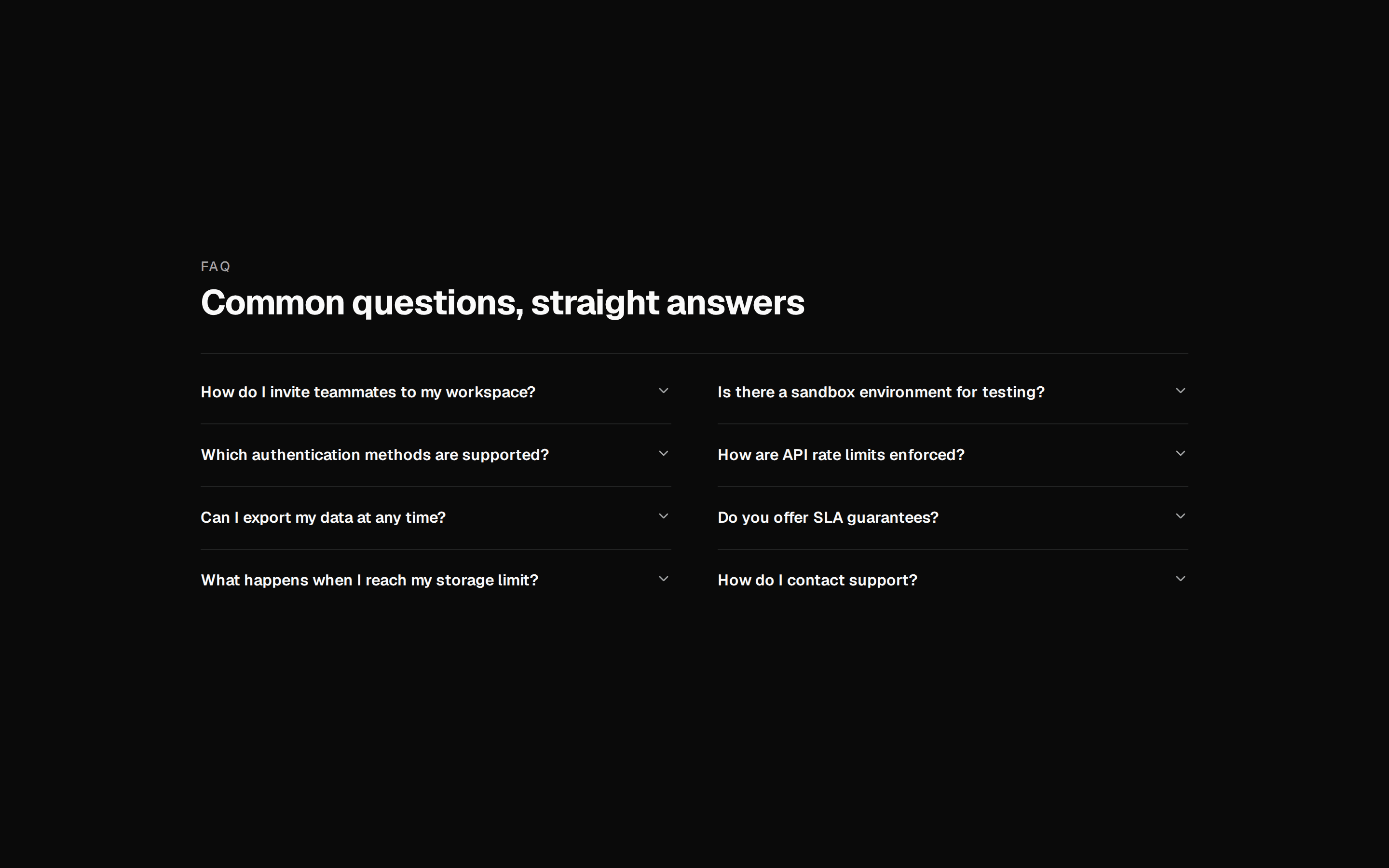
registry/designali/blocks/faqs/faqs-02.tsx
"use client"

import { Plus, X } from "lucide-react"
import { cn } from "@workspace/ui/lib/utils"
import {
  Accordion,
  AccordionContent,
  AccordionItem,
  AccordionTrigger,
} from "@workspace/ui/components/accordion"

interface FaqItem {
  title: string
  description: string
}

interface Faq02Props {
  label?: string
  title?: string
  description?: string
  items?: FaqItem[]
  className?: string
}

const defaultItems: FaqItem[] = [
  {
    title: "What is Designali?",
    description:
      "Designali is a UI library for designers and developers with production-ready components, blocks, templates, logos, icons, and design resources.",
  },
  {
    title: "Is Designali free to use?",
    description:
      "Yes. Designali provides free and open-source resources that can be used for personal and commercial projects according to the applicable license.",
  },
  {
    title: "Can I customize the components?",
    description:
      "Absolutely. The components are designed to be copied and customized. You can change the layout, styling, colors, typography, animations, and functionality.",
  },
  {
    title: "Does Designali work with shadcn/ui?",
    description:
      "Yes. Designali works alongside modern React, Tailwind CSS, and shadcn/ui workflows, making it easy to add components to your existing project.",
  },
  {
    title: "What technologies are supported?",
    description:
      "Designali components are built with modern technologies including React, TypeScript, Tailwind CSS, and accessible UI primitives.",
  },
  {
    title: "Can I use Designali for commercial projects?",
    description:
      "Yes. Designali resources can be used in commercial projects according to the license associated with the specific resource.",
  },
]

export const Faq02 = ({
  label = "FAQ",
  title = "Questions, answered.",
  description = "Everything you need to know about Designali.",
  items = defaultItems,
  className,
}: Faq02Props) => (
  <section
    className={cn(
      "relative w-full overflow-hidden py-20 md:py-28",
      className
    )}
  >
    <div className="max-w-7xl mx-auto px-4">
      {/* Header */}
      <div className="mx-auto flex max-w-2xl flex-col items-center gap-4 text-center">
        {label && (
          <p className="text-xs font-medium tracking-[0.2em] text-muted-foreground uppercase">
            {label}
          </p>
        )}

        <h2 className="text-4xl font-medium leading-tight tracking-tight md:text-5xl">
          {title}
        </h2>

        {description && (
          <p className="max-w-xl text-muted-foreground md:text-lg">
            {description}
          </p>
        )}
      </div>

      {/* FAQ Grid */}
      <Accordion
      defaultValue={["item-0"]}
        className="mx-auto mt-12 grid w-full max-w-5xl gap-3 md:grid-cols-2"
      >
        {items.map((item, index) => (
          <AccordionItem
            key={index}
            value={`item-${index}`}
            className="group relative h-fit overflow-hidden border bg-background px-6 transition-colors data-[state=open]:bg-muted/40"
          >
            <AccordionTrigger className="py-5 h-full pr-12 text-left text-base font-medium hover:no-underline md:text-lg">
              {item.title}

              <span className="absolute right-5 flex size-7 shrink-0 items-center justify-center rounded-full border bg-background">
                <Plus className="size-3.5 text-muted-foreground group-data-[state=open]:hidden" />
                <X className="hidden size-3.5 text-muted-foreground group-data-[state=open]:block" />
              </span>
            </AccordionTrigger>

            <AccordionContent className="pb-6 pr-8 text-sm leading-6 text-muted-foreground md:text-base">
              {item.description}
            </AccordionContent>
          </AccordionItem>
        ))}
      </Accordion>
    </div>
  </section>
)