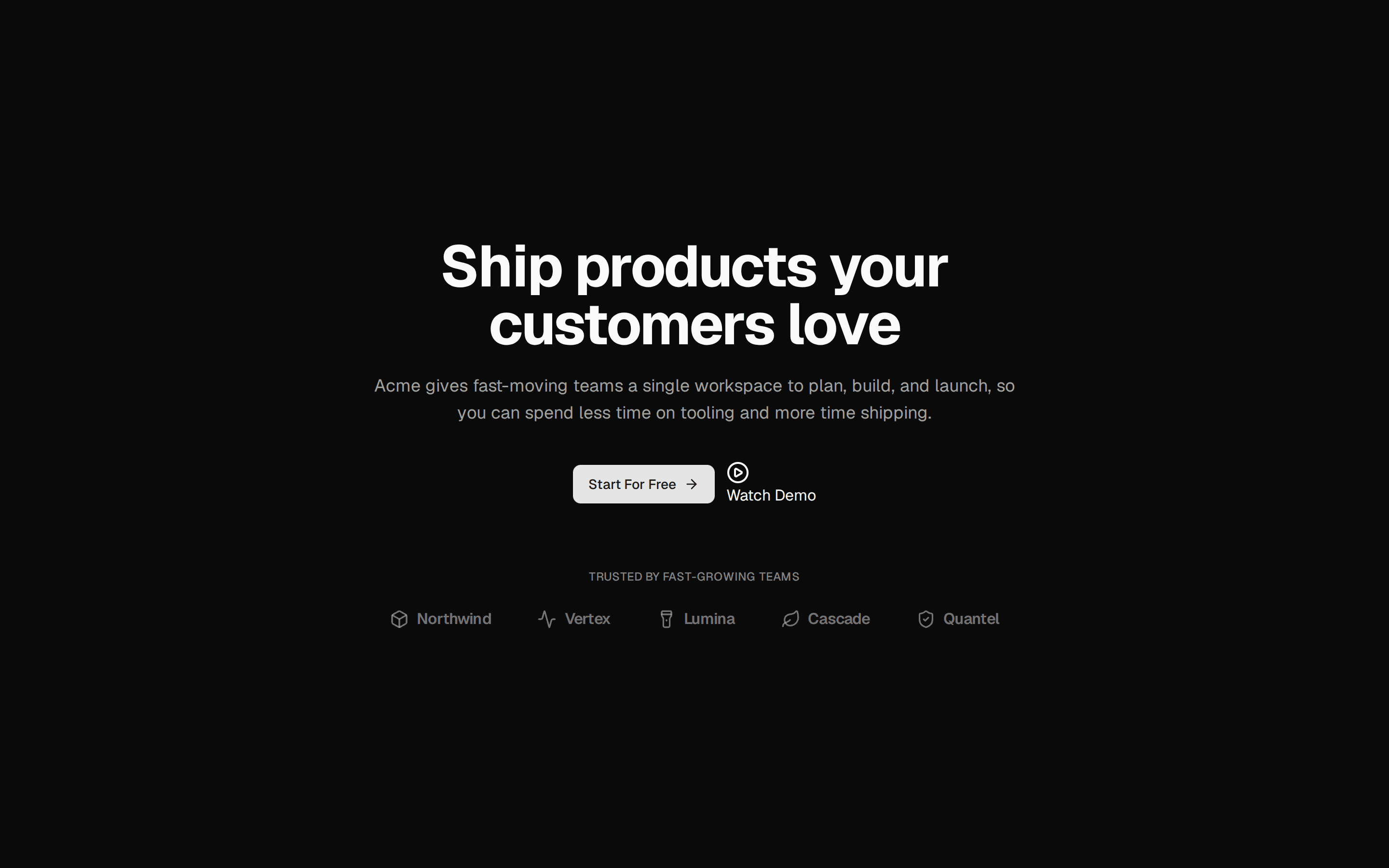
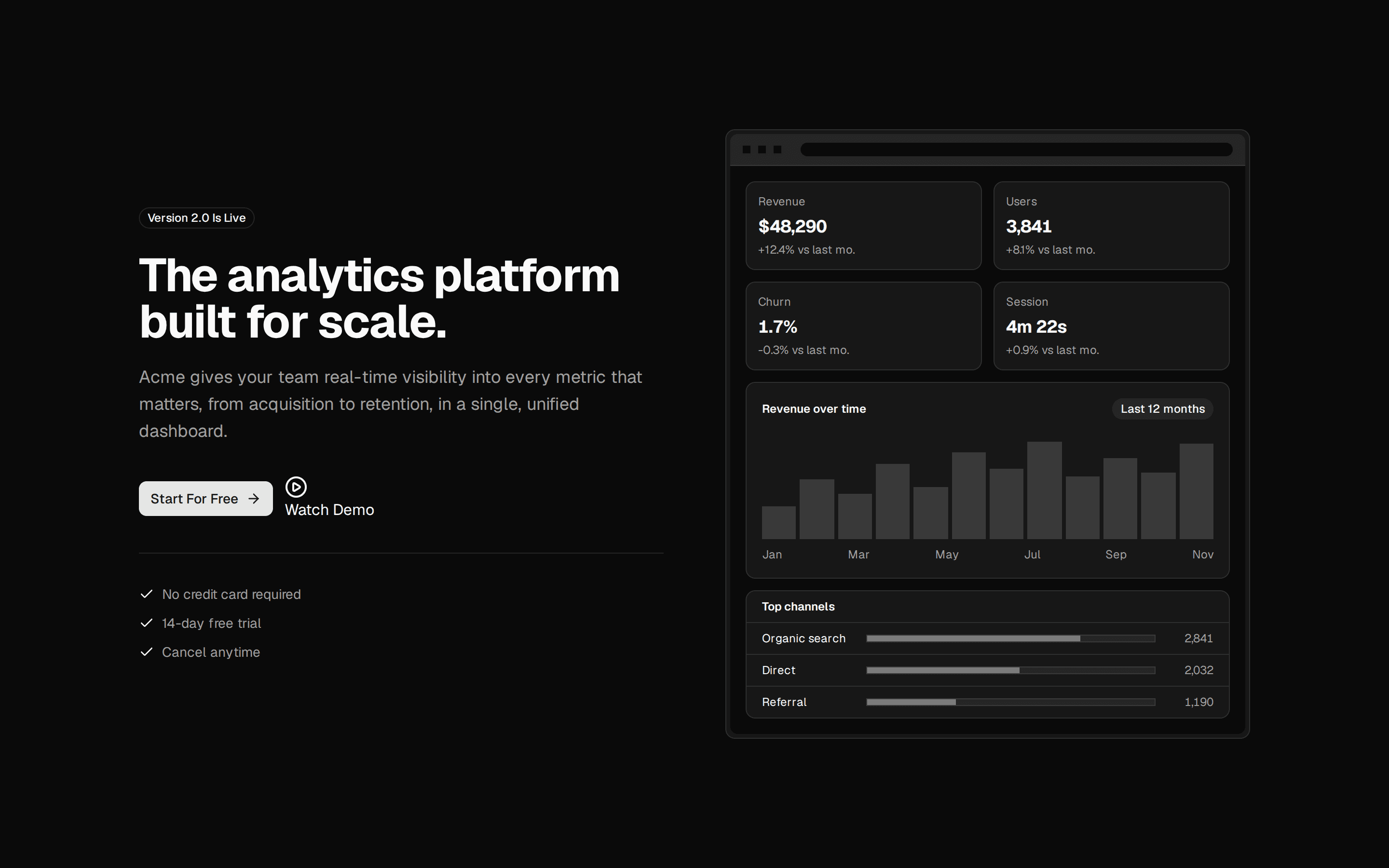
Centered Hero With Trust Logos
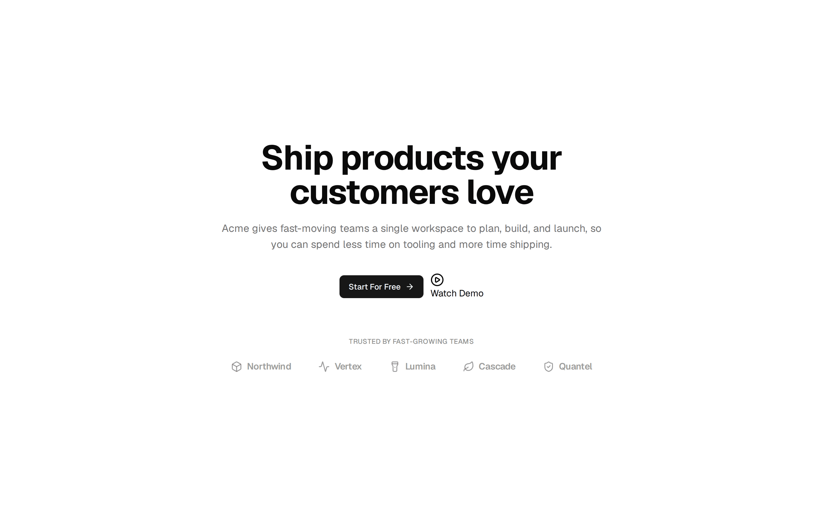
Centered hero section with a beta badge, headline, dual call-to-action buttons, and a trusted-by row of five plain-text company wordmarks.
@7ovr
Centered hero section with a beta badge, headline, dual call-to-action buttons, and a trusted-by row of five plain-text company wordmarks.
@7ovr
registry/blocks/hero/1/hero-block.tsx
import { Badge } from "@/components/ui/badge"
import { Button } from "@/components/ui/button"
import { Separator } from "@/components/ui/separator"
import { IconPlaceholder } from "@/components/icons/icon-placeholder"

const LOGOS = ["Northwind", "Vertex", "Lumina", "Cascade", "Quantel"]

export default function HeroBlock() {
  return (
    <section className="flex w-full items-center justify-center bg-background px-6 py-12 text-foreground">
      <div className="mx-auto flex max-w-3xl flex-col items-center text-center">
        <Badge variant="secondary">
          <IconPlaceholder
            lucide="Sparkles"
            tabler="IconSparkles"
            hugeicons="SparklesIcon"
            phosphor="Sparkle"
            remixicon="RiSparkling2Line"
            data-icon="inline-start"
            aria-hidden="true"
          />
          Now In Beta
        </Badge>

        <h1 className="mt-6 font-heading text-4xl font-bold tracking-tight sm:text-5xl md:text-6xl">
          Build your next product, faster
        </h1>

        <p className="mt-5 max-w-2xl text-lg text-muted-foreground">
          The all-in-one platform to design, build, and ship your ideas, with
          everything your team needs in one place.
        </p>

        <div className="mt-8 flex flex-col items-center gap-3 sm:flex-row">
          <Button
            render={<a href="#" />}
            nativeButton={false}
            className="active:scale-[0.97] transition-transform duration-[160ms] ease-[cubic-bezier(0.23,1,0.32,1)]"
          >
            Get Started
            <IconPlaceholder
              lucide="ArrowRight"
              tabler="IconArrowRight"
              hugeicons="ArrowRightIcon"
              phosphor="ArrowRight"
              remixicon="RiArrowRightLine"
              data-icon="inline-end"
              aria-hidden="true"
            />
          </Button>
          <Button
            variant="outline"
            render={<a href="#" />}
            nativeButton={false}
            className="active:scale-[0.97] transition-transform duration-[160ms] ease-[cubic-bezier(0.23,1,0.32,1)]"
          >
            Learn More
            <IconPlaceholder
              lucide="ArrowUpRight"
              tabler="IconArrowUpRight"
              hugeicons="ArrowUpRightIcon"
              phosphor="ArrowUpRight"
              remixicon="RiArrowRightUpLine"
              data-icon="inline-end"
              aria-hidden="true"
            />
          </Button>
        </div>

        <Separator className="mt-12 w-full max-w-md" />

        <p className="mt-6 text-sm text-muted-foreground">
          Trusted by thousands of teams around the world.
        </p>

        <ul className="mt-5 flex flex-wrap items-center justify-center gap-x-8 gap-y-3">
          {LOGOS.map((logo) => (
            <li
              key={logo}
              className="text-base font-bold tracking-tight text-muted-foreground/70 transition-colors hover:text-foreground"
            >
              {logo}
            </li>
          ))}
        </ul>
      </div>
    </section>
  )
}
Requires a base-* style in components.json (the shadcn init default). Legacy new-york/radix-* styles install Radix primitives, which reject the render prop this block uses.