registry/blocks/bento-feature-cells.tsx
import { Boxes, Fingerprint, Gauge, Palette } from "lucide-react";

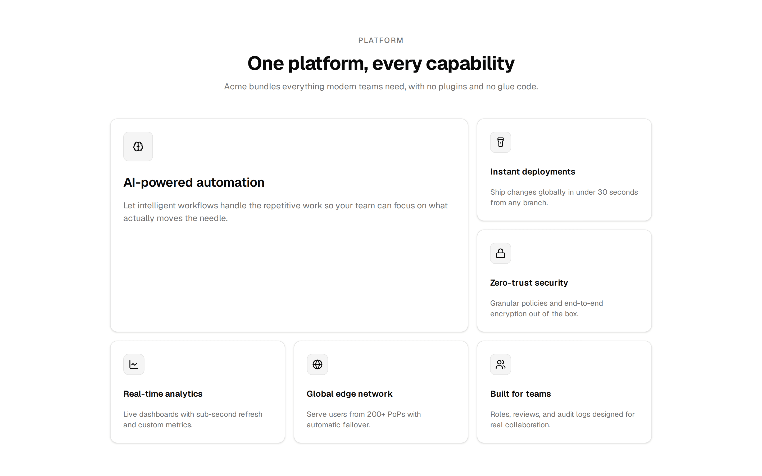
const cells = [
  {
    icon: Gauge,
    title: "Fast by default",
    description:
      "Server components, edge caching and zero client JS where none is needed.",
    span: true,
  },
  {
    icon: Palette,
    title: "Yours to theme",
    description: "Semantic tokens — change five variables, rebrand everything.",
    span: false,
  },
  {
    icon: Fingerprint,
    title: "Accessible",
    description: "Keyboard, screen readers and focus states handled for you.",
    span: false,
  },
  {
    icon: Boxes,
    title: "Composable",
    description:
      "Every section is a standalone component. Stack, reorder, remove — nothing breaks.",
    span: true,
  },
];

export default function BentoFeatureCells() {
  return (
    <section className="bg-background">
      <div className="mx-auto w-full max-w-5xl px-6 py-20 sm:py-24">
        <div className="mb-12 text-center">
          <h2 className="text-2xl font-semibold tracking-tight text-balance sm:text-3xl">
            Built on decisions, not defaults
          </h2>
          <p className="mt-2 text-muted-foreground">
            Four principles behind every component we ship.
          </p>
        </div>

        <div className="grid gap-4 sm:grid-cols-3">
          {cells.map((cell) => (
            <div
              key={cell.title}
              className={
                cell.span
                  ? "rounded-xl border border-border/60 bg-card p-6 sm:col-span-2"
                  : "rounded-xl border border-border/60 bg-card p-6"
              }
            >
              <cell.icon className="size-5" />
              <h3 className="mt-4 text-sm font-medium">{cell.title}</h3>
              <p className="mt-1.5 text-sm text-muted-foreground">
                {cell.description}
              </p>
            </div>
          ))}
        </div>
      </div>
    </section>
  );
}