Hero 1: split with product visual
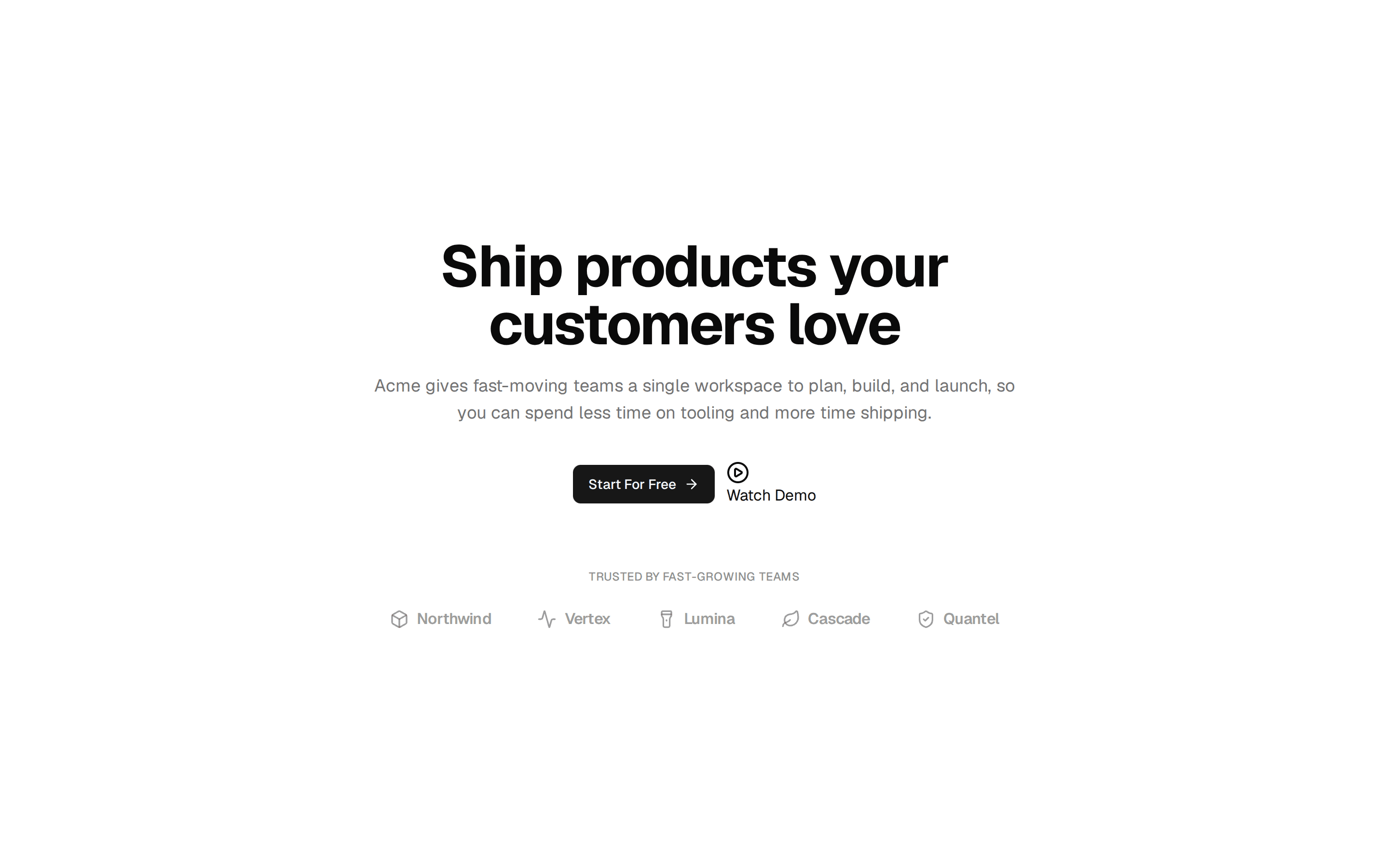
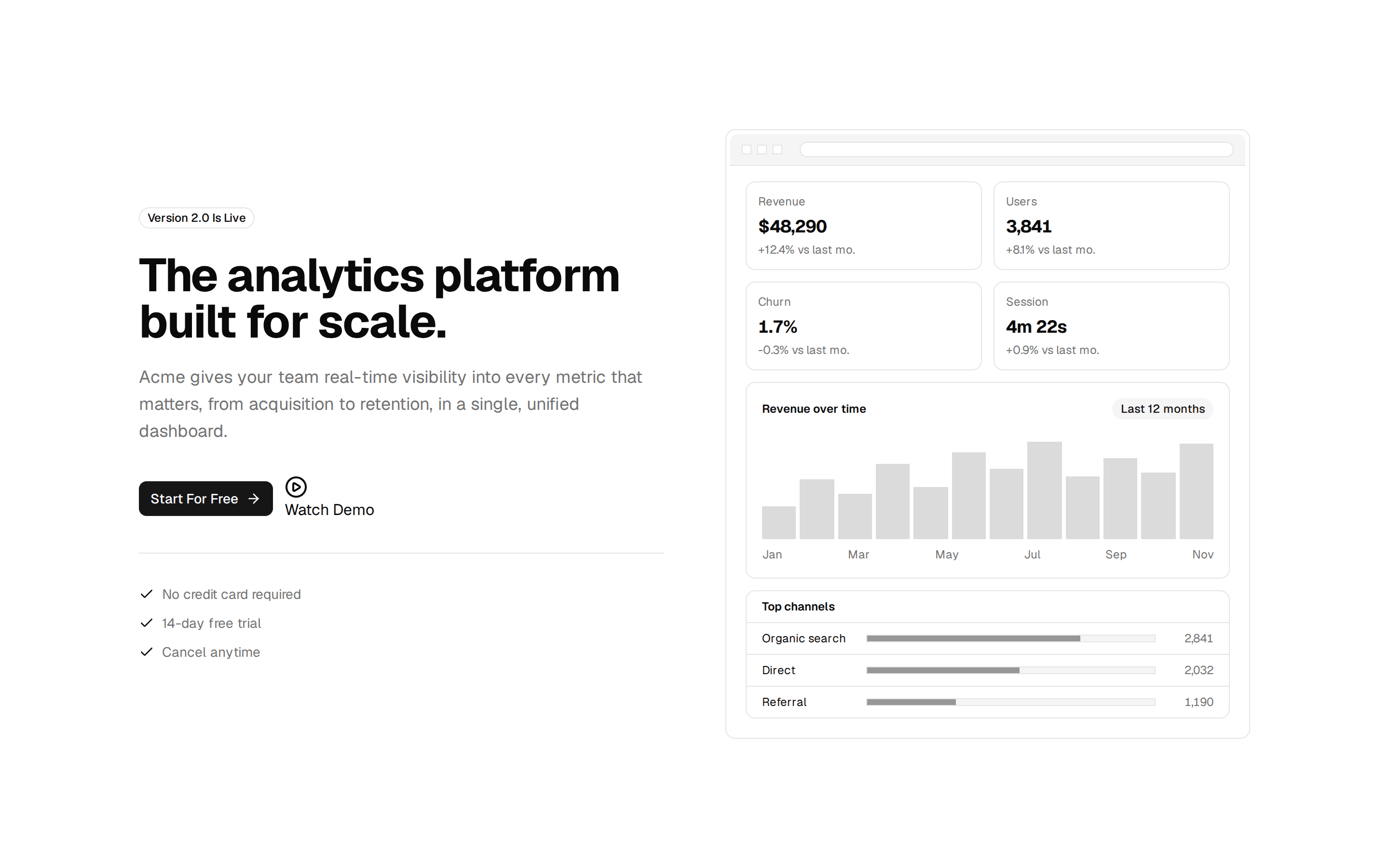
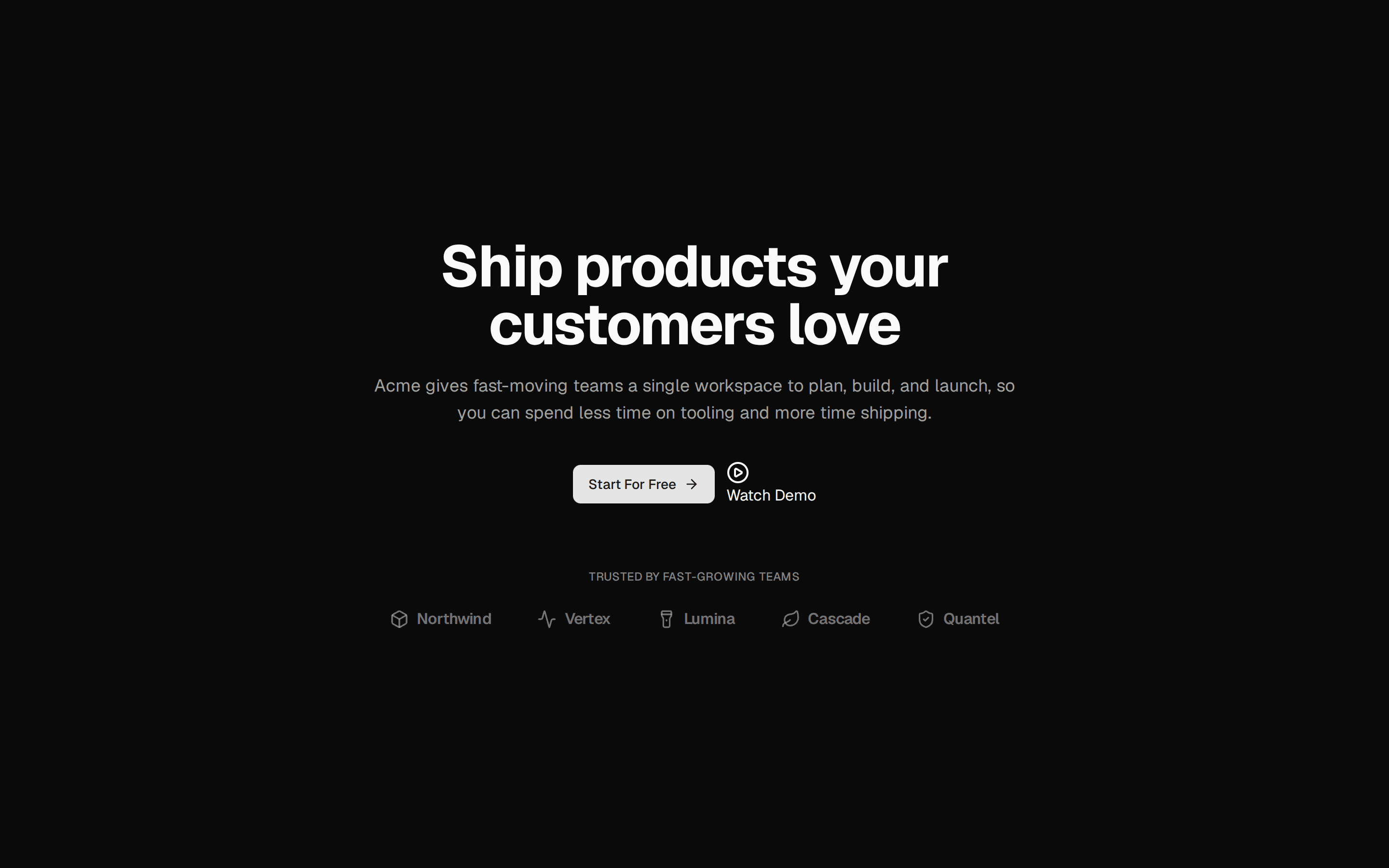
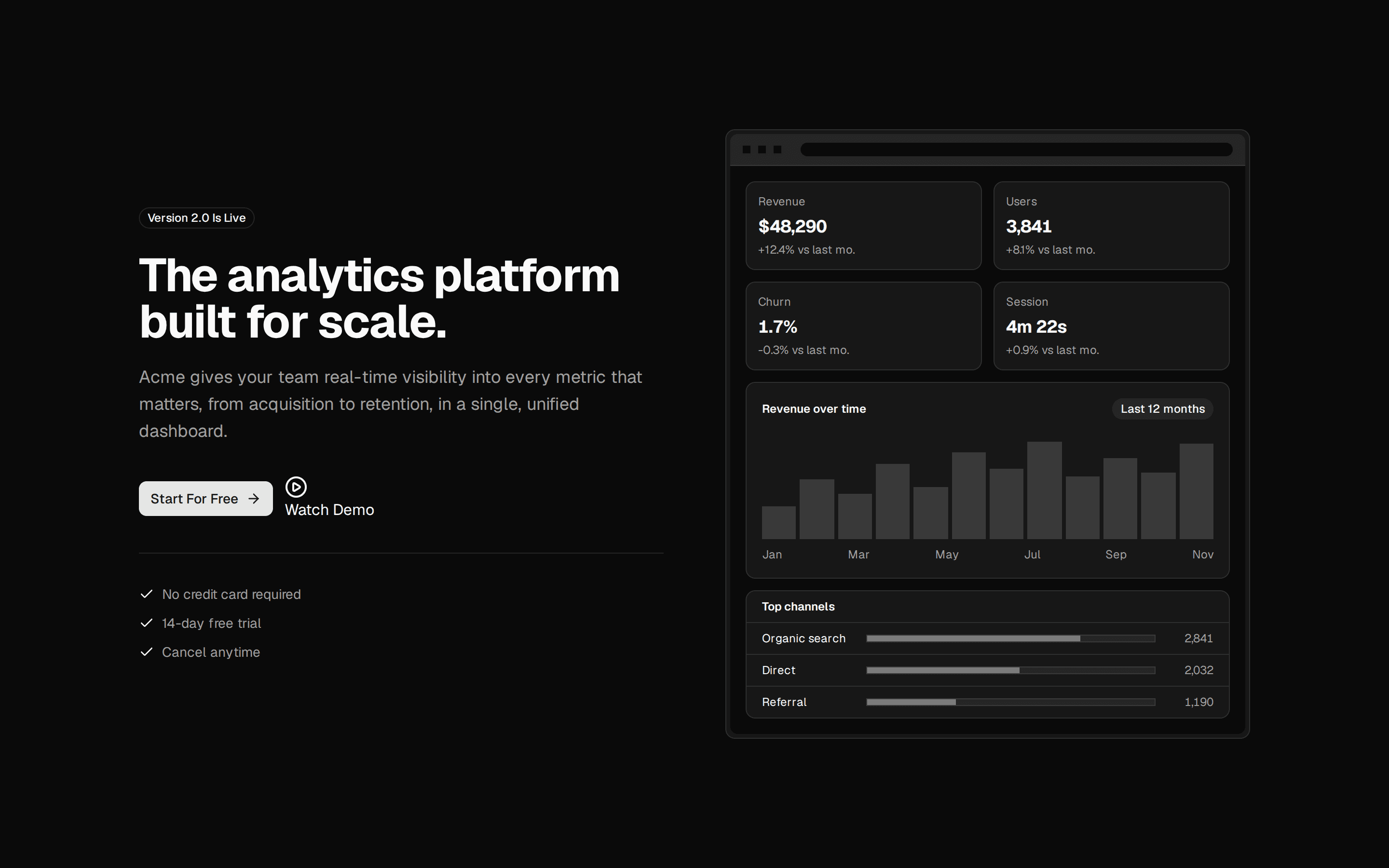
Split hero: badge, word-by-word headline, two calls to action and proof points on the left, a live product summary card on the right, over an animated grid.
@ballmac
Split hero: badge, word-by-word headline, two calls to action and proof points on the left, a live product summary card on the right, over an animated grid.
@ballmac
registry/ballmac/components/blocks/hero-1/hero-1.tsx
// Ballmac UI: Hero 1. https://ui.ballmac.com/blocks/hero-1
import * as React from "react"
import { ArrowRight, Check } from "lucide-react"

import { AnimatedGrid } from "@/components/ballmac/animated-grid"
import { Badge } from "@/components/ballmac/badge"
import { buttonVariants } from "@/components/ballmac/button"
import { NumberTicker } from "@/components/ballmac/number-ticker"
import { TextReveal } from "@/components/ballmac/text-reveal"
import { cn } from "@/lib/utils"
import { Media, type MediaSource } from "@/components/ballmac/media"

type Action = { label: string; href: string }

type Hero1Props = Omit<React.ComponentProps<"section">, "title"> & {
  /** Short label above the headline, e.g. a release note. */
  eyebrow?: string
  /** The headline. Revealed word by word. */
  title?: string
  /** One or two sentences under the headline. */
  description?: string
  /** Main call to action. */
  primaryAction?: Action
  /** Secondary call to action. */
  secondaryAction?: Action
  /** Short proof points under the buttons. */
  highlights?: string[]
  /** Your product image instead of the sample deploy card. An image URL (give it mediaAlt), an object with alt text and a dark-mode file, or your own element. */
  media?: MediaSource
  /** Describes `media` when it is a plain URL. */
  mediaAlt?: string
}

function Hero1({
  eyebrow = "New · Deploy previews for every branch",
  title = "Ship with confidence, not guesswork.",
  description = "Every change gets a live preview, a performance budget and a rollback button. Your team reviews real behavior, not screenshots.",
  primaryAction = { label: "Start free", href: "#" },
  secondaryAction = { label: "Book a demo", href: "#" },
  highlights = ["No credit card", "SOC 2 Type II", "Cancel anytime"],
  media,
  mediaAlt,
  className,
  ...props
}: Hero1Props) {
  return (
    <section data-slot="hero-1" className={cn("relative isolate overflow-hidden", className)} {...props}>
      <AnimatedGrid className="absolute inset-0 -z-10 [mask-image:radial-gradient(ellipse_70%_60%_at_30%_30%,#000_30%,transparent_75%)]" />
      <div className="mx-auto grid max-w-6xl items-center gap-14 px-4 py-20 sm:px-6 md:py-28 lg:grid-cols-[1.05fr_1fr]">
        <div>
          <Badge variant="outline" className="rounded-full px-3 py-1">
            {eyebrow}
          </Badge>
          <TextReveal as="h1" className="mt-6 text-4xl font-semibold tracking-[-0.04em] text-balance sm:text-5xl lg:text-6xl">
            {title}
          </TextReveal>
          <p className="mt-6 max-w-xl text-lg leading-relaxed text-pretty text-muted-foreground">{description}</p>
          <div className="mt-8 flex flex-wrap gap-3">
            <a className={buttonVariants({ size: "lg", shape: "pill" })} href={primaryAction.href}>
              {primaryAction.label} <ArrowRight  className="rtl:rotate-180"/>
            </a>
            <a className={buttonVariants({ variant: "outline", size: "lg", shape: "pill" })} href={secondaryAction.href}>{secondaryAction.label}</a>
          </div>
          <ul className="mt-8 flex flex-wrap gap-x-6 gap-y-2 text-sm text-muted-foreground">
            {highlights.map((h) => (
              <li key={h} className="flex items-center gap-2">
                <Check className="size-4 text-foreground" aria-hidden="true" />
                {h}
              </li>
            ))}
          </ul>
        </div>
        <Media media={media} alt={mediaAlt} frame priority fallback={<HeroVisual />} />
      </div>
    </section>
  )
}

/** Product visual: a deploy summary card built from Ballmac components. */
function HeroVisual() {
  const stats = [
    { label: "Previews this week", value: 1284 },
    { label: "Median build", value: 42, suffix: "s" },
    { label: "Rollbacks avoided", value: 17 },
  ]
  return (
    <div className="relative rounded-2xl border bg-card p-6 shadow-[0_30px_80px_-40px_rgb(0_0_0/0.35)] sm:p-8">
      <div className="flex items-center justify-between gap-4">
        <div>
          <p className="font-mono text-xs text-muted-foreground">feat/checkout-v2</p>
          <p className="mt-1 font-medium">Preview ready</p>
        </div>
        <Badge status="success">Passing</Badge>
      </div>
      <dl className="mt-8 grid grid-cols-3 gap-px overflow-hidden rounded-xl border bg-border">
        {stats.map((s) => (
          <div key={s.label} className="bg-card p-4">
            <dt className="text-xs text-muted-foreground">{s.label}</dt>
            <dd className="mt-2 text-2xl font-semibold tracking-tight">
              <NumberTicker value={s.value} />
              {s.suffix}
            </dd>
          </div>
        ))}
      </dl>
      <ol className="mt-6 space-y-3 text-sm">
        {["Build", "Tests", "Performance budget", "Preview deployed"].map((step) => (
          <li key={step} className="flex items-center justify-between rounded-lg border px-3 py-2">
            <span>{step}</span>
            <Check className="size-4 text-chart-2" aria-label="Done" />
          </li>
        ))}
      </ol>
    </div>
  )
}

export { Hero1, type Hero1Props }