Settings
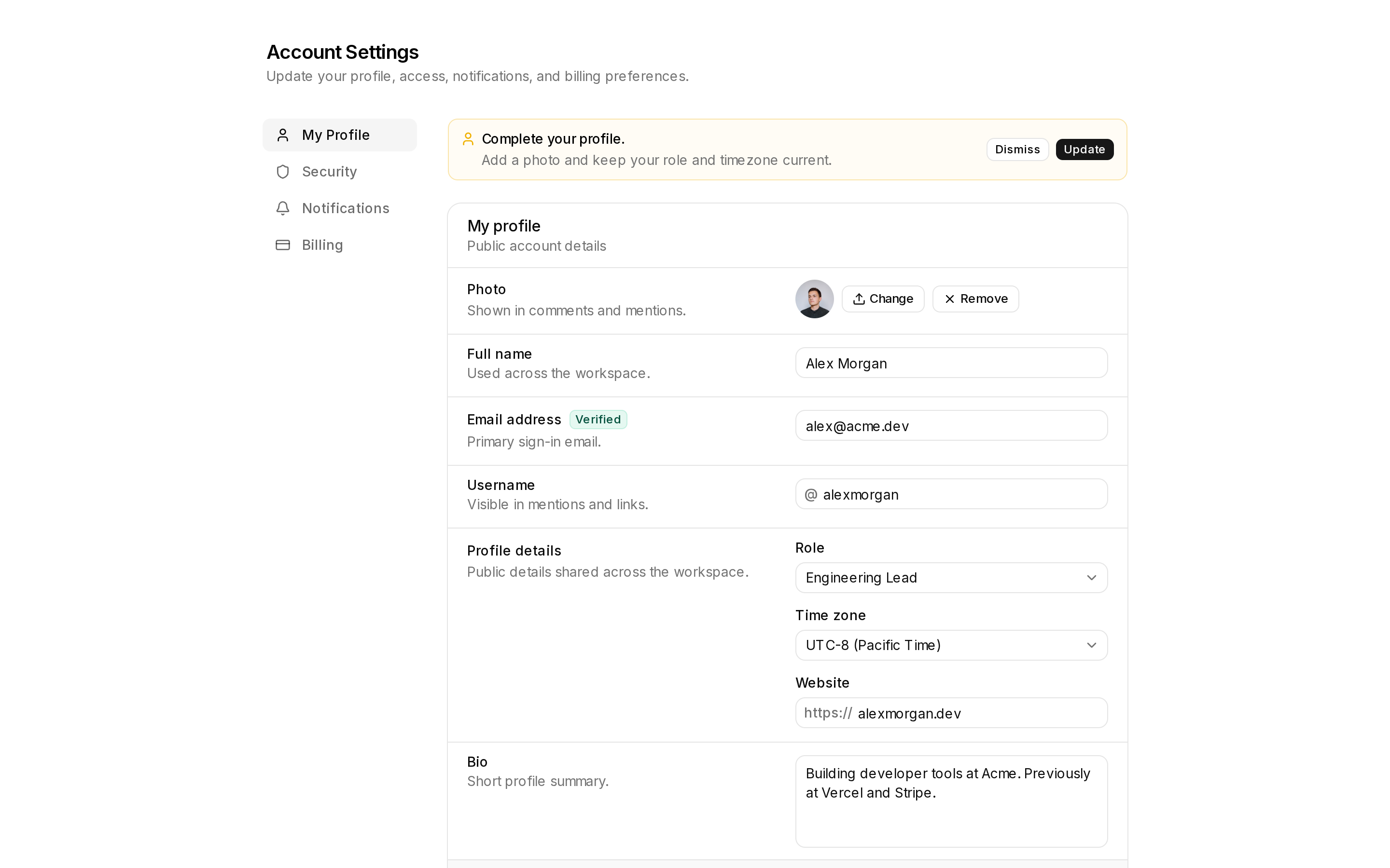
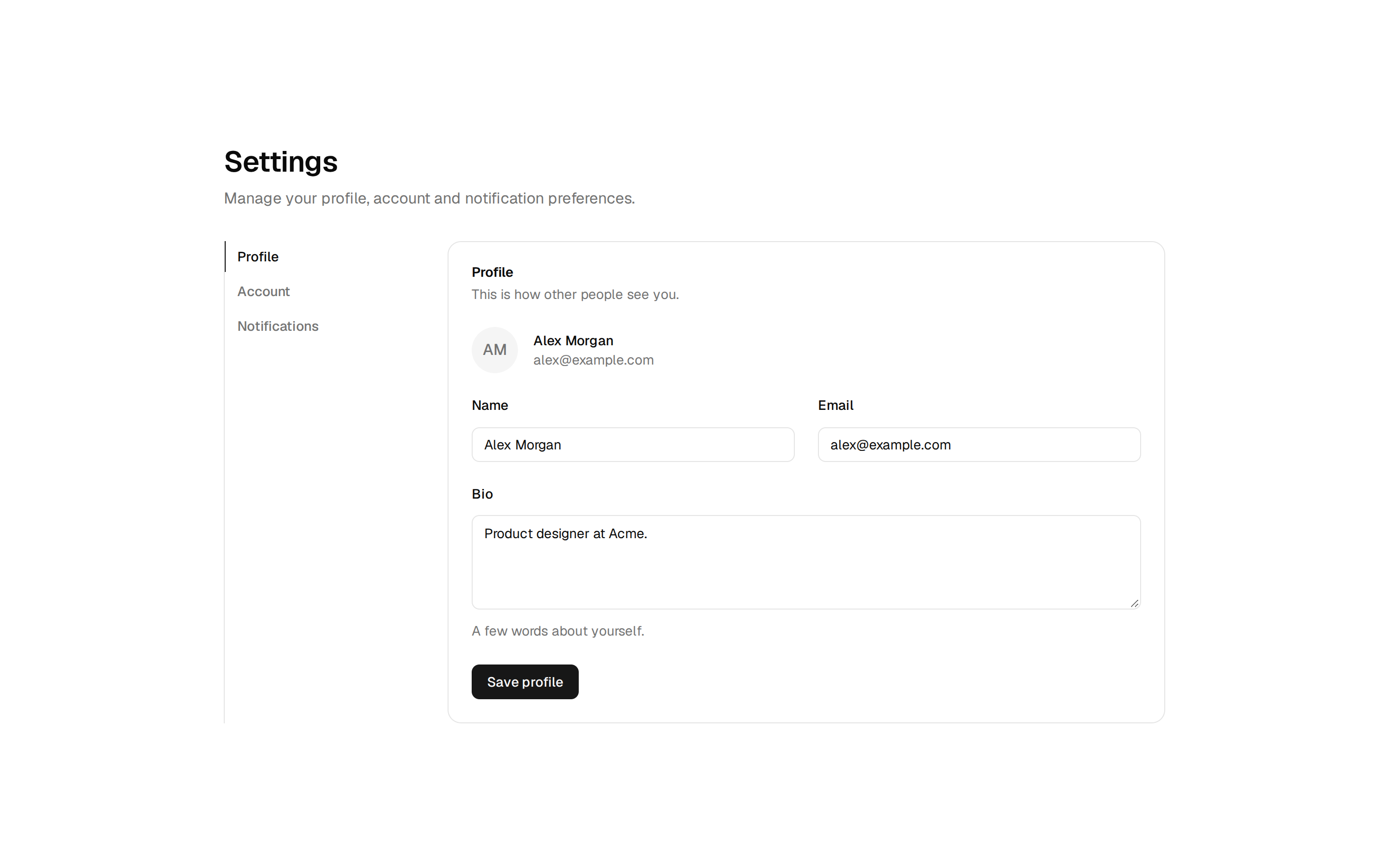
An account settings page: a section list beside profile, notification switches, density radio cards and a danger zone. Renders in any Satori UI design system (cueit, skita, folio or a generated one): install a system first.
An account settings page: a section list beside profile, notification switches, density radio cards and a danger zone. Renders in any Satori UI design system (cueit, skita, folio or a generated one): install a system first.
design-systems/blocks/settings-01.tsx
import * as React from "react";
import { Bell, CreditCard, Palette, ShieldCheck, TriangleAlert, User } from "lucide-react";
import { Avatar, AvatarFallback } from "@/components/ui/avatar";
import { Button } from "@/components/ui/button";
import {
  Card,
  CardContent,
  CardDescription,
  CardFooter,
  CardHeader,
  CardTitle,
} from "@/components/ui/card";
import { Input } from "@/components/ui/input";
import { Label } from "@/components/ui/label";
import { RadioGroup, RadioGroupItem } from "@/components/ui/radio-group";
import { Separator } from "@/components/ui/separator";
import { Switch } from "@/components/ui/switch";
import { Textarea } from "@/components/ui/textarea";
import { cn } from "@/lib/utils";

/**
 * An account settings page: a section list beside profile, notification,
 * appearance and danger-zone cards.
 *
 * Written against the block contract only, so it takes the look of
 * whichever design system scopes it. Every control is uncontrolled with a
 * default; wire `name`s into your form action or swap in controlled state.
 */

const SECTIONS = [
  { id: "profile", label: "Profile", icon: User },
  { id: "notifications", label: "Notifications", icon: Bell },
  { id: "appearance", label: "Appearance", icon: Palette },
  { id: "security", label: "Security", icon: ShieldCheck },
  { id: "billing", label: "Billing", icon: CreditCard },
];

const NOTIFICATIONS = [
  { id: "mentions", label: "Mentions", description: "When someone @mentions you in a comment.", on: true },
  { id: "digest", label: "Weekly digest", description: "A Monday summary of what changed.", on: true },
  { id: "billing", label: "Billing", description: "Receipts, failed payments and renewals.", on: true },
  { id: "product", label: "Product news", description: "New features, at most twice a month.", on: false },
];

export function Settings01({ className, ...props }: React.ComponentProps<"div">) {
  return (
    <div className={cn("@container/settings w-full", className)} {...props}>
      <div className="mb-6">
        <h1 className="ds-title text-foreground">Settings</h1>
        <p className="ds-subtitle mt-1">Your profile, how we reach you, and how the app looks.</p>
      </div>

      <div className="grid gap-6 @3xl/settings:grid-cols-[13rem_1fr]">
        <nav aria-label="Settings sections" className="flex gap-0.5 overflow-x-auto @3xl/settings:flex-col">
          {SECTIONS.map(({ id, label, icon: Icon }, i) => (
            <a
              key={id}
              href={`#${id}`}
              aria-current={i === 0 ? "page" : undefined}
              className="ds-nav-item flex h-8 shrink-0 items-center gap-2.5 px-2.5"
            >
              <Icon className="size-4 shrink-0" aria-hidden="true" />
              {label}
            </a>
          ))}
        </nav>

        <div className="flex min-w-0 flex-col gap-5">
          <Card id="profile" className="gap-5">
            <CardHeader>
              <CardTitle>Profile</CardTitle>
              <CardDescription>Shown to people in your workspace.</CardDescription>
            </CardHeader>
            <CardContent className="flex flex-col gap-5">
              <div className="flex items-center gap-4">
                <Avatar className="size-12">
                  <AvatarFallback>MK</AvatarFallback>
                </Avatar>
                <div className="flex gap-2">
                  <Button variant="outline" size="sm">
                    Upload photo
                  </Button>
                  <Button variant="ghost" size="sm">
                    Remove
                  </Button>
                </div>
              </div>
              <div className="grid gap-4 @xl/settings:grid-cols-2">
                <div className="flex flex-col gap-2">
                  <Label htmlFor="settings-name">Full name</Label>
                  <Input id="settings-name" name="name" defaultValue="Mara Kim" autoComplete="name" />
                </div>
                <div className="flex flex-col gap-2">
                  <Label htmlFor="settings-email">Email</Label>
                  <Input
                    id="settings-email"
                    name="email"
                    type="email"
                    defaultValue="mara@northwind.co"
                    autoComplete="email"
                  />
                </div>
              </div>
              <div className="flex flex-col gap-2">
                <Label htmlFor="settings-bio">Bio</Label>
                <Textarea
                  id="settings-bio"
                  name="bio"
                  rows={3}
                  defaultValue="Design lead. Ask me about the billing flow."
                  aria-describedby="settings-bio-hint"
                />
                <p id="settings-bio-hint" className="ds-small text-muted-foreground">
                  A sentence or two. Markdown is not supported.
                </p>
              </div>
            </CardContent>
            <CardFooter className="justify-end gap-2 border-t pt-5">
              <Button variant="ghost" size="sm">
                Cancel
              </Button>
              <Button size="sm">Save profile</Button>
            </CardFooter>
          </Card>

          <Card id="notifications" className="gap-4">
            <CardHeader>
              <CardTitle>Notifications</CardTitle>
              <CardDescription>Email only. In-app notifications are always on.</CardDescription>
            </CardHeader>
            <CardContent className="flex flex-col">
              {NOTIFICATIONS.map((n, i) => (
                <React.Fragment key={n.id}>
                  {i > 0 && <Separator />}
                  <div className="flex items-center justify-between gap-6 py-3">
                    <div className="min-w-0">
                      <Label htmlFor={`notify-${n.id}`}>{n.label}</Label>
                      <p className="ds-small mt-0.5 text-muted-foreground">{n.description}</p>
                    </div>
                    <Switch id={`notify-${n.id}`} name={`notify-${n.id}`} defaultChecked={n.on} />
                  </div>
                </React.Fragment>
              ))}
            </CardContent>
          </Card>

          <Card id="appearance" className="gap-4">
            <CardHeader>
              <CardTitle>Density</CardTitle>
              <CardDescription>How much fits on a screen. Applies to tables and lists.</CardDescription>
            </CardHeader>
            <CardContent>
              <RadioGroup name="density" defaultValue="comfortable" className="grid gap-3 @xl/settings:grid-cols-2">
                {[
                  { value: "comfortable", label: "Comfortable", hint: "More space between rows." },
                  { value: "compact", label: "Compact", hint: "Fits about a third more." },
                ].map((o) => (
                  <Label
                    key={o.value}
                    htmlFor={`density-${o.value}`}
                    className="ds-tile ds-hover flex cursor-pointer items-start gap-3 p-4"
                  >
                    <RadioGroupItem id={`density-${o.value}`} value={o.value} className="mt-0.5" />
                    <span className="min-w-0">
                      <span className="block">{o.label}</span>
                      <span className="ds-small mt-0.5 block font-normal text-muted-foreground">{o.hint}</span>
                    </span>
                  </Label>
                ))}
              </RadioGroup>
            </CardContent>
          </Card>

          <Card className="gap-4">
            <CardHeader>
              <CardTitle className="flex items-center gap-2">
                <TriangleAlert className="size-4 text-destructive" aria-hidden="true" />
                Delete account
              </CardTitle>
              <CardDescription>
                Removes your profile and every document you own. Workspaces you share stay with their
                other members. This cannot be undone.
              </CardDescription>
            </CardHeader>
            <CardFooter className="justify-end">
              <Button variant="destructive" size="sm">
                Delete account
              </Button>
            </CardFooter>
          </Card>
        </div>
      </div>
    </div>
  );
}