registry/blocks/feature-section.tsx
import { Icon, type IconName } from '@/components/ui/icon'

const features: { icon: IconName; title: string; body: string }[] = [
  { icon: 'palette', title: 'Design tokens', body: 'One source of truth flows to code and design files alike.' },
  { icon: 'dashboard', title: 'Composable', body: 'Build screens fast from accessible, themeable components.' },
  { icon: 'check_circle', title: 'Accessible', body: 'WCAG 2.1 AA out of the box, verified in CI.' },
]

/** A marketing section with an editorial heading and a three-column feature grid. */
export function FeatureSection() {
  return (
    <section className="flex flex-col items-center gap-10 bg-background py-12">
      <div className="flex max-w-xl flex-col items-center gap-2 text-center">
        <span className="text-xs font-medium uppercase tracking-eyebrow text-ink-muted">Why Quill</span>
        <h2 className="font-heading text-3xl text-balance">
          A calm, editorial design system
        </h2>
        <p className="text-sm text-muted-foreground">
          Everything connected to tokens, so it stays consistent as it grows.
        </p>
      </div>
      <div className="grid grid-cols-1 gap-8 md:grid-cols-3">
        {features.map((f) => (
          <div key={f.title} className="flex flex-col gap-2">
            <div className="flex size-10 items-center justify-center rounded-lg bg-muted text-primary">
              <Icon name={f.icon} size={22} />
            </div>
            <h3 className="text-lg font-medium">{f.title}</h3>
            <p className="text-sm text-muted-foreground">{f.body}</p>
          </div>
        ))}
      </div>
    </section>
  )
}
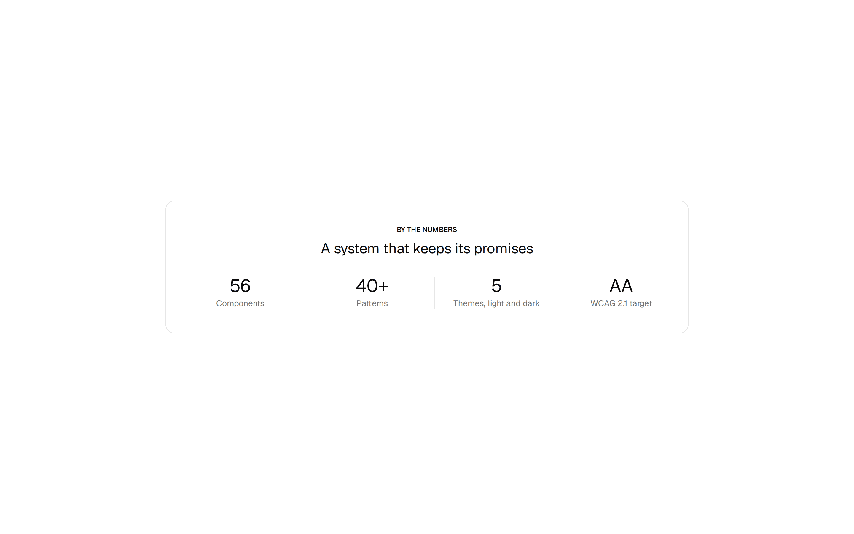
A marketing section with an editorial heading and a three-column feature grid. Do: Keep the grid to three (or a multiple of three) features so it reads evenly across the row. Don't: Let an uneven feature count leave a dangling, unbalanced last row on wide screens. Use stats-band when you're presenting numbers, not descriptive feature callouts with icons and body text. Use pricing when the features are tied to specific paid tiers, not the product as a whole.