Login Form
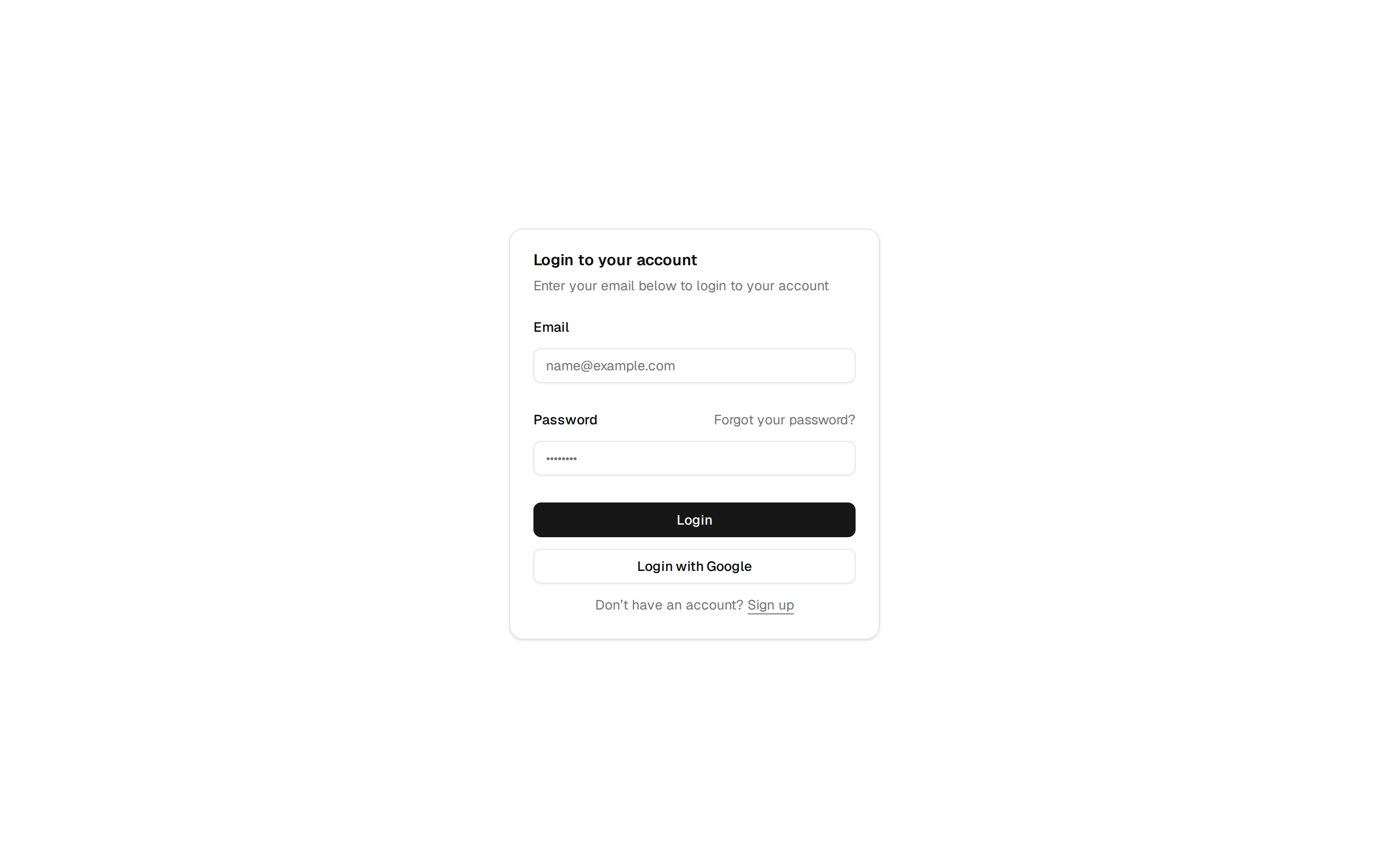
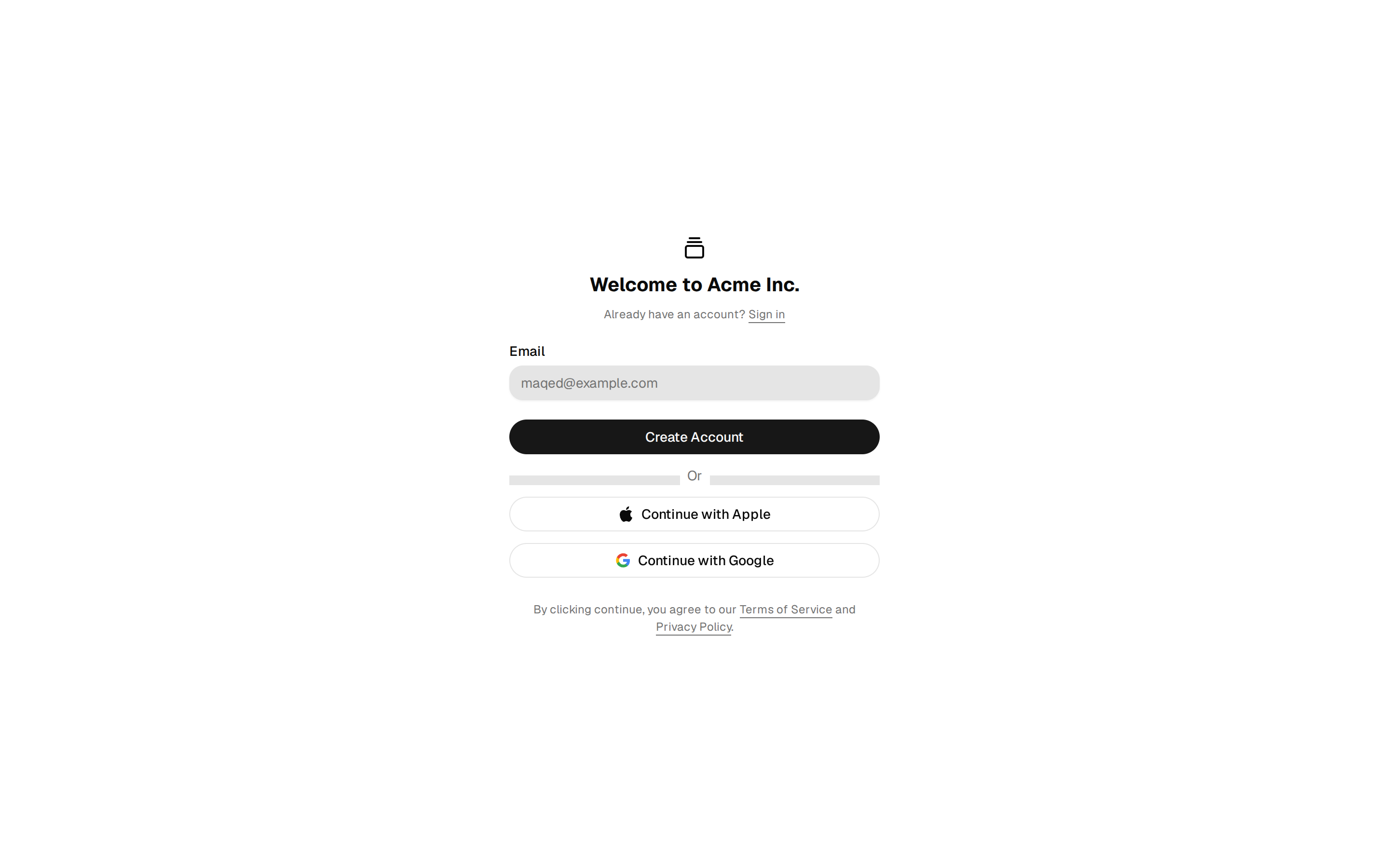
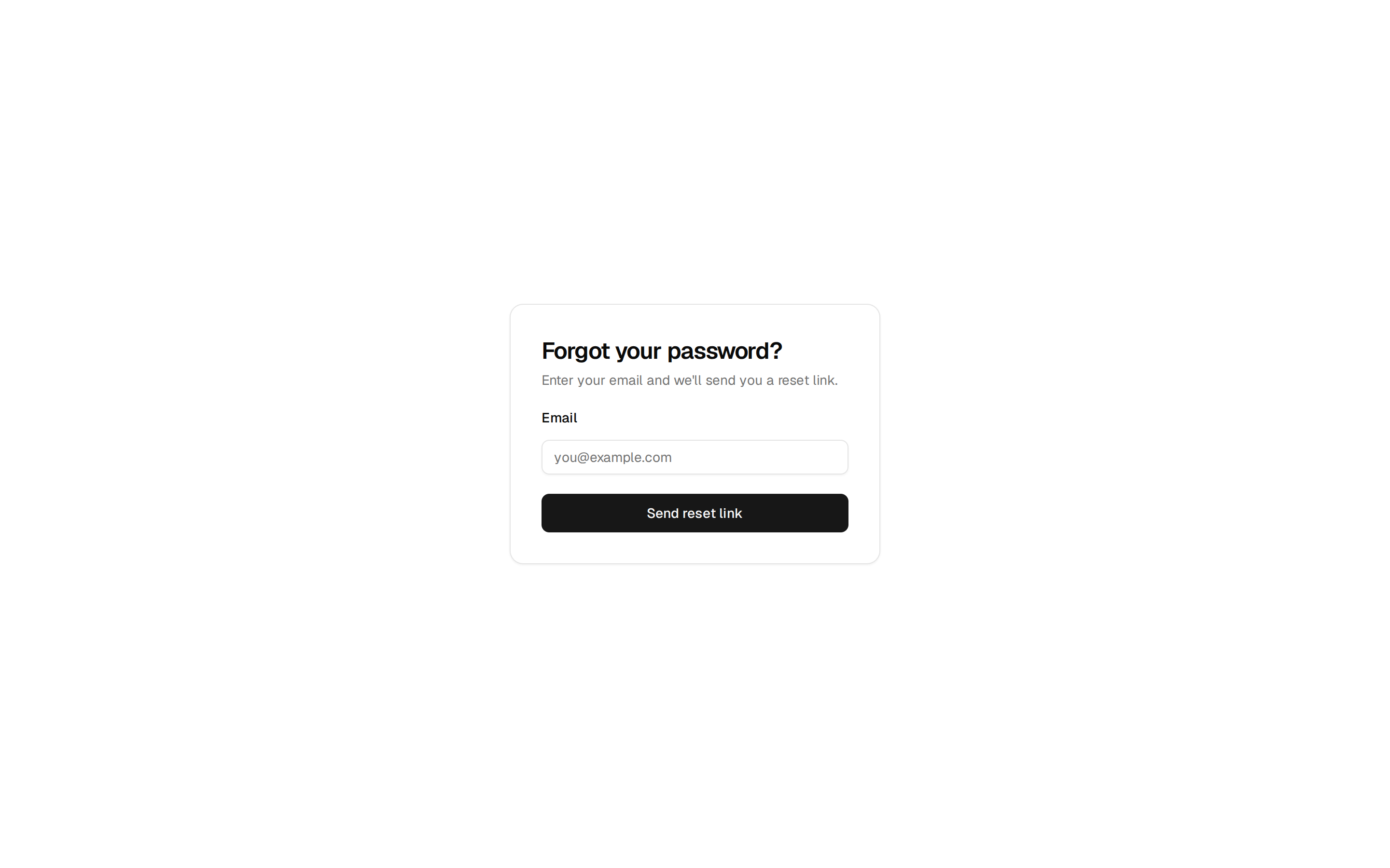
A login with labels that stay visible and inline errors, in three forms: beside a calm brand panel with a password you can reveal, one card on a grey ground, or email only with a check-your-inbox screen.
A login with labels that stay visible and inline errors, in three forms: beside a calm brand panel with a password you can reveal, one card on a grey ground, or email only with a check-your-inbox screen.
import type * as React from "react"
import { cn } from "@/registry/miseui/lib/utils"
import { LoginFields, SignUpLine, type LoginFieldsProps } from "./login-form-credentials"
import { LoginFormMagic, type LoginMagicProps } from "./login-form-magic"
import type { LoginProvider, LoginValues } from "./login-form-parts"
import { BrandPanel, InvoiceFragments } from "./login-form-visual"

type LoginFormVariant = "split" | "centered" | "magic"

const PREVIEW_DELAY_MS = 1200
const DEFAULT_PROVIDERS: readonly LoginProvider[] = [
  { id: "google", label: "Google" },
  { id: "github", label: "GitHub" },
]
/** Scoped to touch, on this design only: the shared fields stay at 36 px with a mouse. */
const LINK_TOUCH_CLASS = "pointer-coarse:[&_a]:relative pointer-coarse:[&_a]:after:absolute pointer-coarse:[&_a]:after:-inset-x-1 pointer-coarse:[&_a]:after:-inset-y-3"
const TOUCH_TARGETS_CLASS = "pointer-coarse:[&_[data-slot=button]]:h-10 pointer-coarse:[&_[data-slot=button]]:min-w-10 pointer-coarse:[&_input]:h-10"

/** Stands in until you pass onSubmit, so the preview shows the loading and error states. Replace it. */
function previewSubmit() {
  return new Promise<void>((_, reject) => {
    window.setTimeout(() => reject(new Error("That password does not match this email.")), PREVIEW_DELAY_MS)
  })
}

interface LoginFormProps extends Omit<React.ComponentProps<"section">, "onSubmit">, LoginMagicProps {
  /** `split` the form beside a brand panel, `centered` one card on the grey ground, `magic` email only, then check your inbox. */
  variant?: LoginFormVariant
  /** Called once the fields pass the basic checks. Return a promise to get the loading state; a rejection's message is shown inline. */
  onSubmit?: (values: LoginValues) => void | Promise<void>
  /** An error you already know about, such as a locked account. Shown under the last field. */
  error?: string
  /** Forces the loading state, if you track the request yourself. */
  pending?: boolean
  brandName?: string
  /** The one product sentence on the panel, on `split`. Keep it true; this is no place for a testimonial. */
  tagline?: string
  /** The muted second sentence of the heading. */
  headingNote?: string
  /** Small pieces of your real product for the panel, on `split`. The default is a sample invoice; null leaves only the sentence. */
  visual?: React.ReactNode
  forgotPasswordHref?: string
  /** Where "Create an account" goes. Null removes the line, for invite-only products. */
  signUpHref?: string | null
  /** Pass an empty list if you only support email. `magic` shows none unless you pass some. */
  socialProviders?: readonly LoginProvider[]
  onSocial?: (id: string) => void
}

type LoginShellProps = Omit<React.ComponentProps<"section">, "onSubmit"> & {
  brandName: string
  headingNote: string
  signUpHref: string | null
  fields: LoginFieldsProps
}

function LoginSplit({ brandName, headingNote, signUpHref, fields, tagline, visual, className, ...props }: LoginShellProps & { tagline: string; visual: React.ReactNode }) {
  return (
    <section data-slot="login-form" data-variant="split" className={cn("@container flex w-full flex-col bg-background", className)} {...props}>
      <div className="grid min-h-[640px] flex-1 grid-cols-1 @3xl:grid-cols-2">
        <div className="flex items-center justify-center px-6 py-12 @3xl:px-12">
          <div className="flex w-full max-w-sm flex-col gap-8">
            <h2 className="text-display text-3xl leading-[1.12]! text-balance @2xl:text-4xl">
              Log in to {brandName}. <span className="text-muted-foreground">{headingNote}</span>
            </h2>
            <LoginFields {...fields} />
            <SignUpLine href={signUpHref} />
          </div>
        </div>
        <BrandPanel brandName={brandName} tagline={tagline} visual={visual} />
      </div>
    </section>
  )
}

/** The sign-up line sits outside the card: it is for people who do not belong in the card yet. */
function LoginCentered({ brandName, headingNote, signUpHref, fields, className, ...props }: LoginShellProps) {
  return (
    <section data-slot="login-form" data-variant="centered" className={cn("@container flex w-full flex-col bg-muted dark:bg-background", className)} {...props}>
      <div className={cn("flex min-h-[640px] flex-1 flex-col items-center justify-center gap-6 px-4 py-12 @md:px-6", LINK_TOUCH_CLASS)}>
        <div className={cn("flex w-full max-w-sm flex-col gap-6 rounded-2xl border bg-background p-6 @md:p-8 dark:bg-card", TOUCH_TARGETS_CLASS)}>
          <h2 className="text-display text-2xl leading-[1.12]! text-balance">
            Log in to {brandName}. <span className="text-muted-foreground">{headingNote}</span>
          </h2>
          <LoginFields {...fields} />
        </div>
        <SignUpLine href={signUpHref} />
      </div>
    </section>
  )
}

function LoginForm({
  variant,
  onSendLink,
  resendAfterSeconds,
  sentNote,
  onSubmit = previewSubmit,
  error,
  pending = false,
  brandName = "Paperline",
  tagline = "Invoices that chase themselves, so you do not have to.",
  headingNote,
  visual = <InvoiceFragments />,
  forgotPasswordHref = "#forgot-password",
  signUpHref,
  socialProviders,
  onSocial,
  ...props
}: LoginFormProps) {
  if (variant === "magic") {
    return (
      <LoginFormMagic
        {...{ onSendLink, resendAfterSeconds, sentNote, error, pending, brandName, headingNote, signUpHref, socialProviders, onSocial }}
        {...props}
      />
    )
  }
  const fields = { onSubmit, error, pending, forgotPasswordHref, socialProviders: socialProviders ?? DEFAULT_PROVIDERS, onSocial }
  const shell = { brandName, headingNote: headingNote ?? "Your invoices are where you left them.", signUpHref: signUpHref === undefined ? "#sign-up" : signUpHref, fields }
  if (variant === "centered") return <LoginCentered {...shell} {...props} />
  return <LoginSplit {...shell} tagline={tagline} visual={visual} {...props} />
}

export { LoginForm, type LoginFormProps, type LoginFormVariant, type LoginProvider, type LoginValues }