Loading
 NavUI blocksfor shadcn/ui.
39 blocks · all free · updated 13 Oct 2026
shadcn-compatible components, blocks, and illustrations that adapt to your existing design configuration.
Best from NavUI
Hand-picked, best first










New from NavUI
Newest first
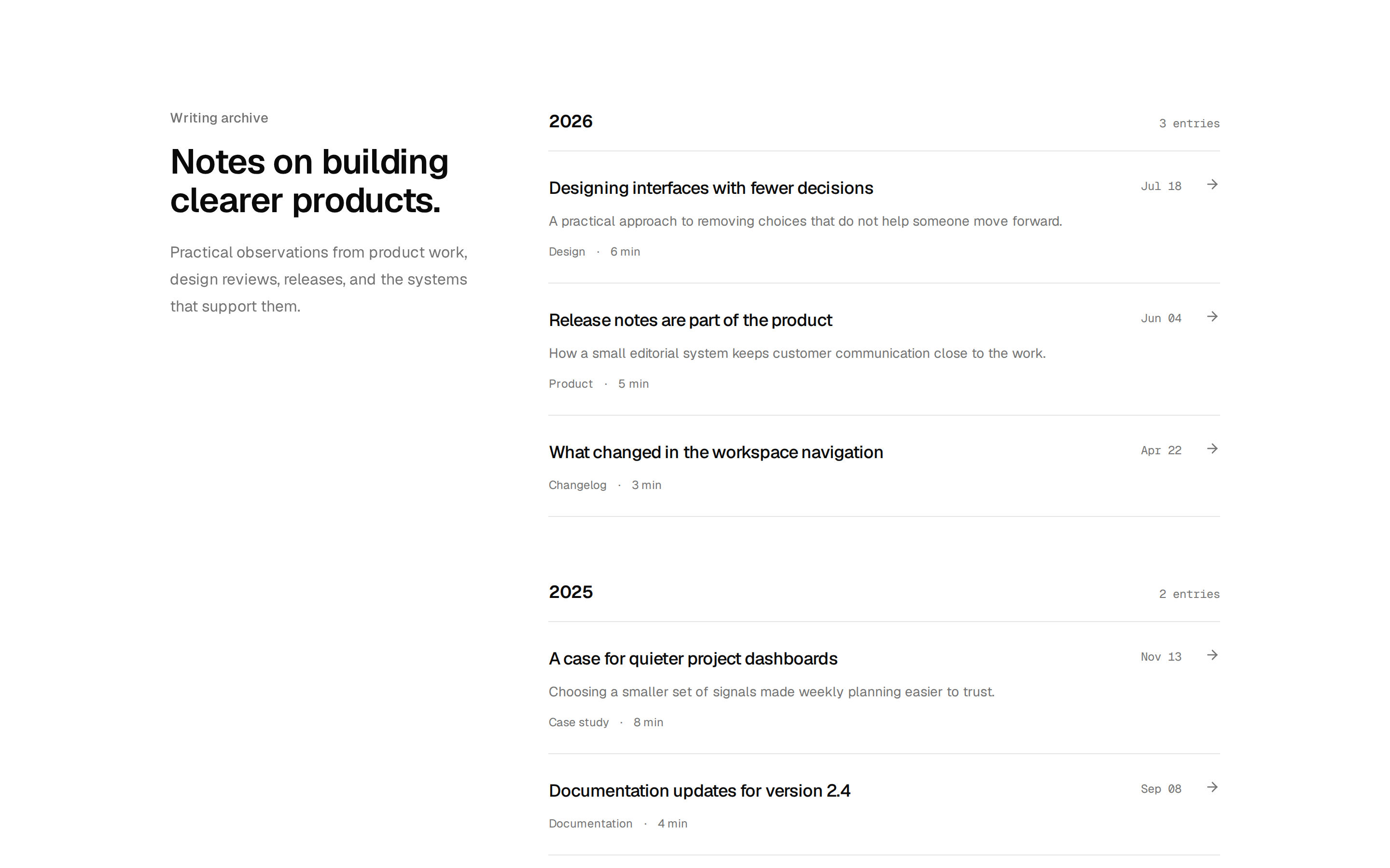


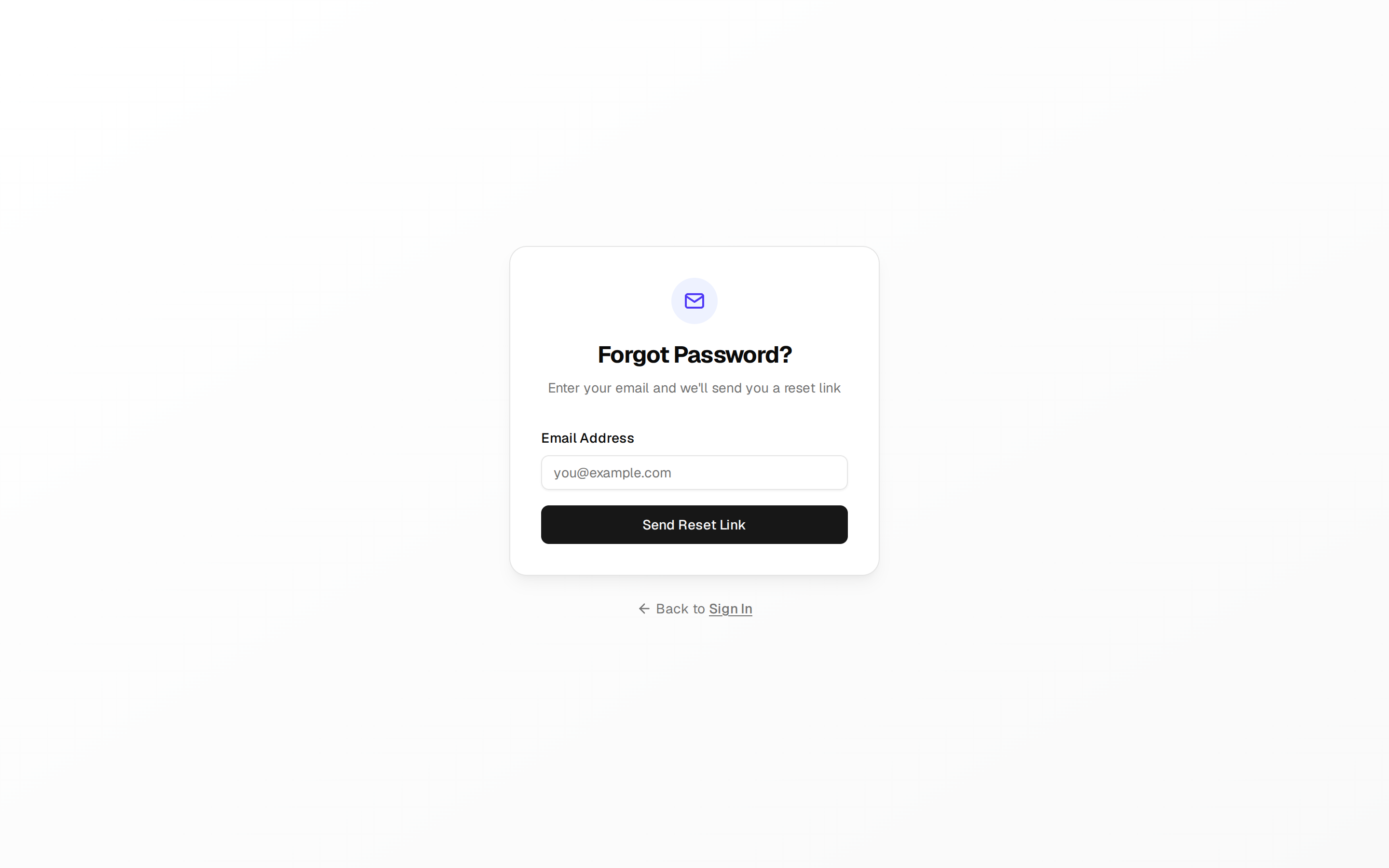



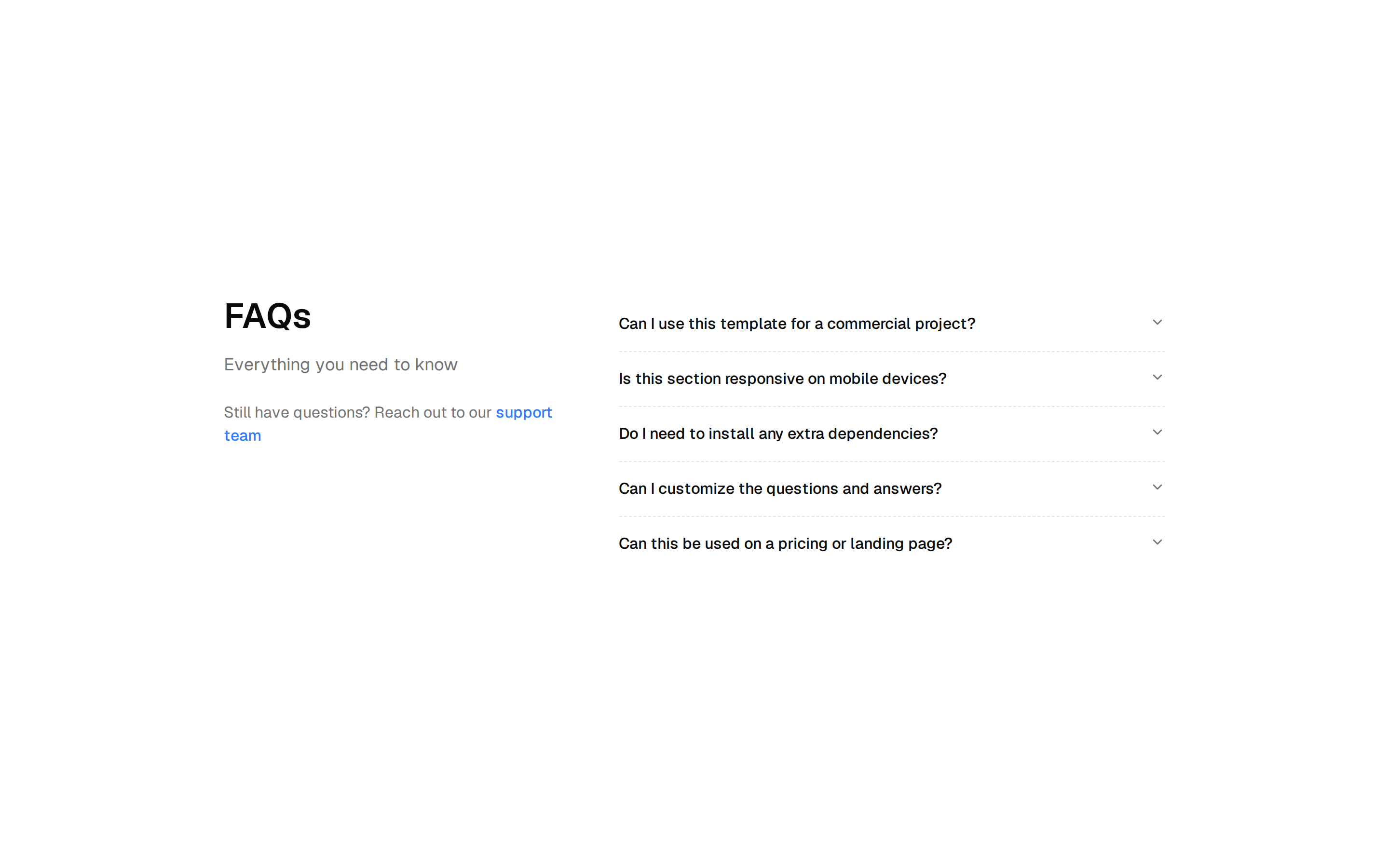
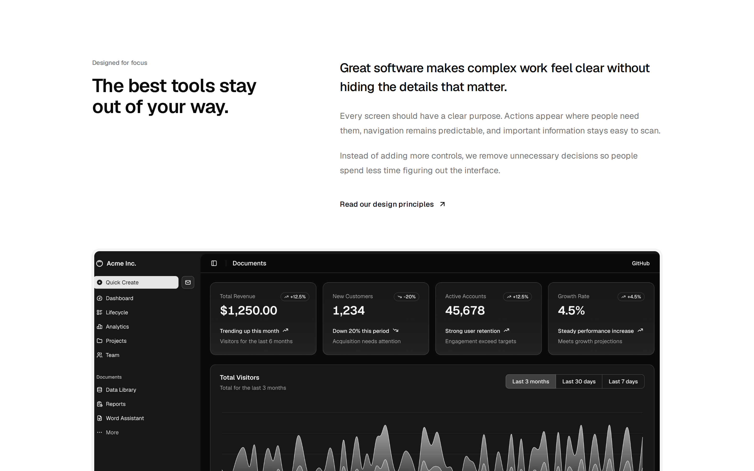
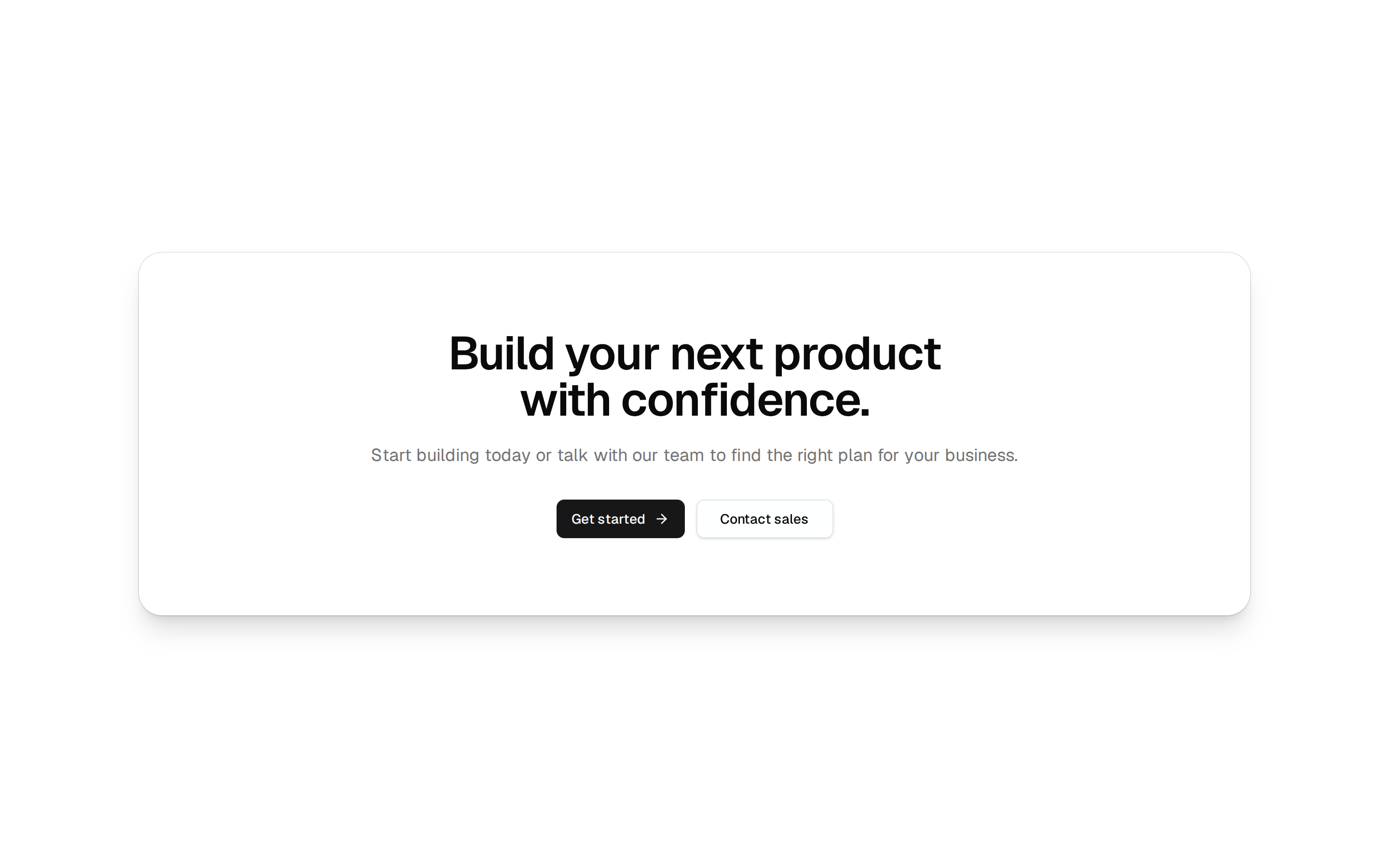
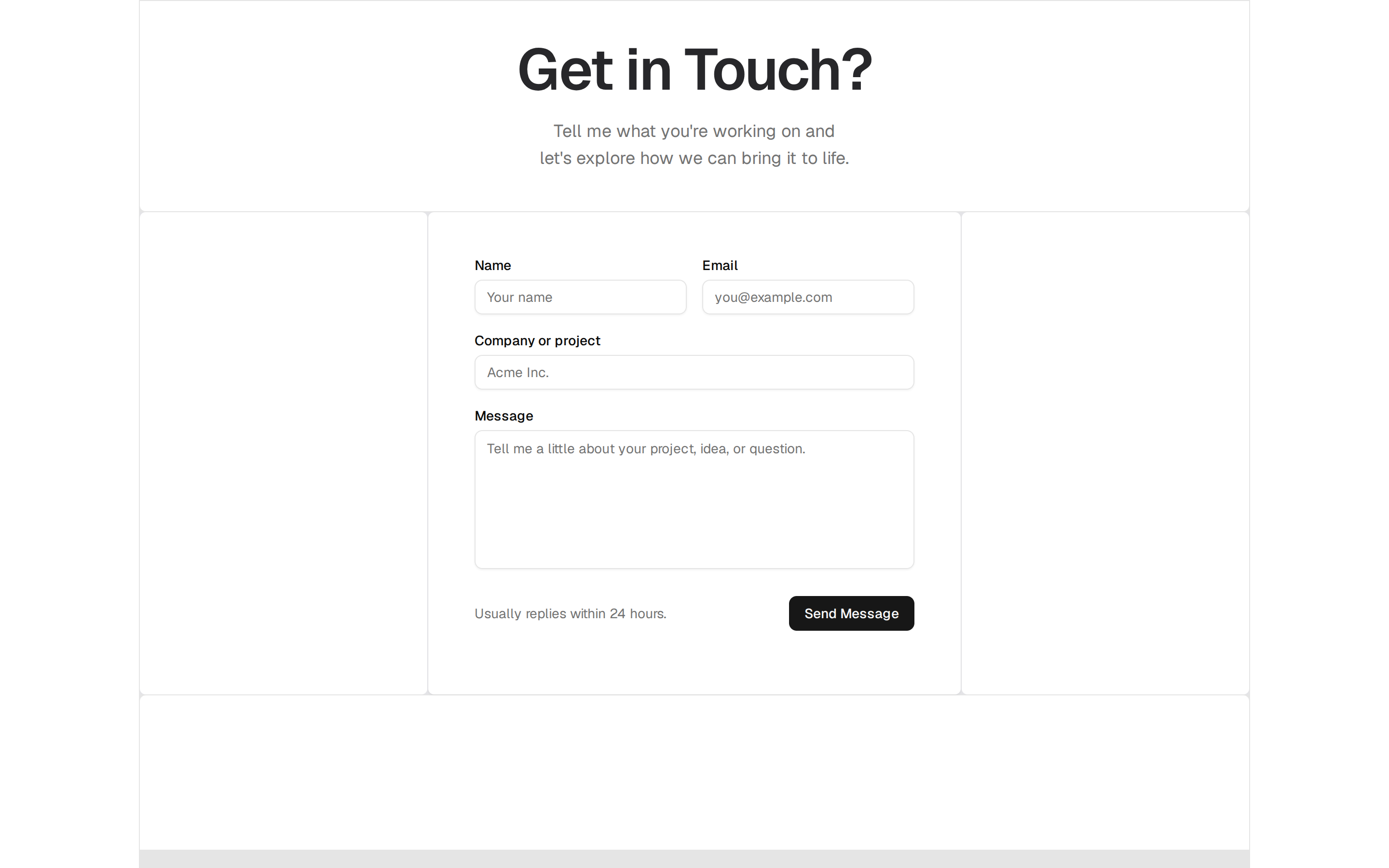
NavUI is a shadcn-compatible library of React components, blocks and illustrations by Navdeep Singh, built with TypeScript, Tailwind CSS and careful motion. Its blocks are page sections for real products: headers, heroes, content sections, team grids, logo clouds, pricing, stats, FAQs, contact, blog, call to action and footers, plus sign-up and forgot-password screens.
The components are where the motion shows, with number counters that animate in with locale formatting, tabs with a moving pill, an expandable card with shared-layout transitions, a magnetic button, a sidebar whose guide lines stretch toward the pointer, a keyboard shortcut display that reacts to each key, and a contribution graph. Every item has a live preview and a source drawer, and installs from the registry with the shadcn CLI. The code is on GitHub.
More registries like NavUI
Blocks from other makers