Navbar Floating
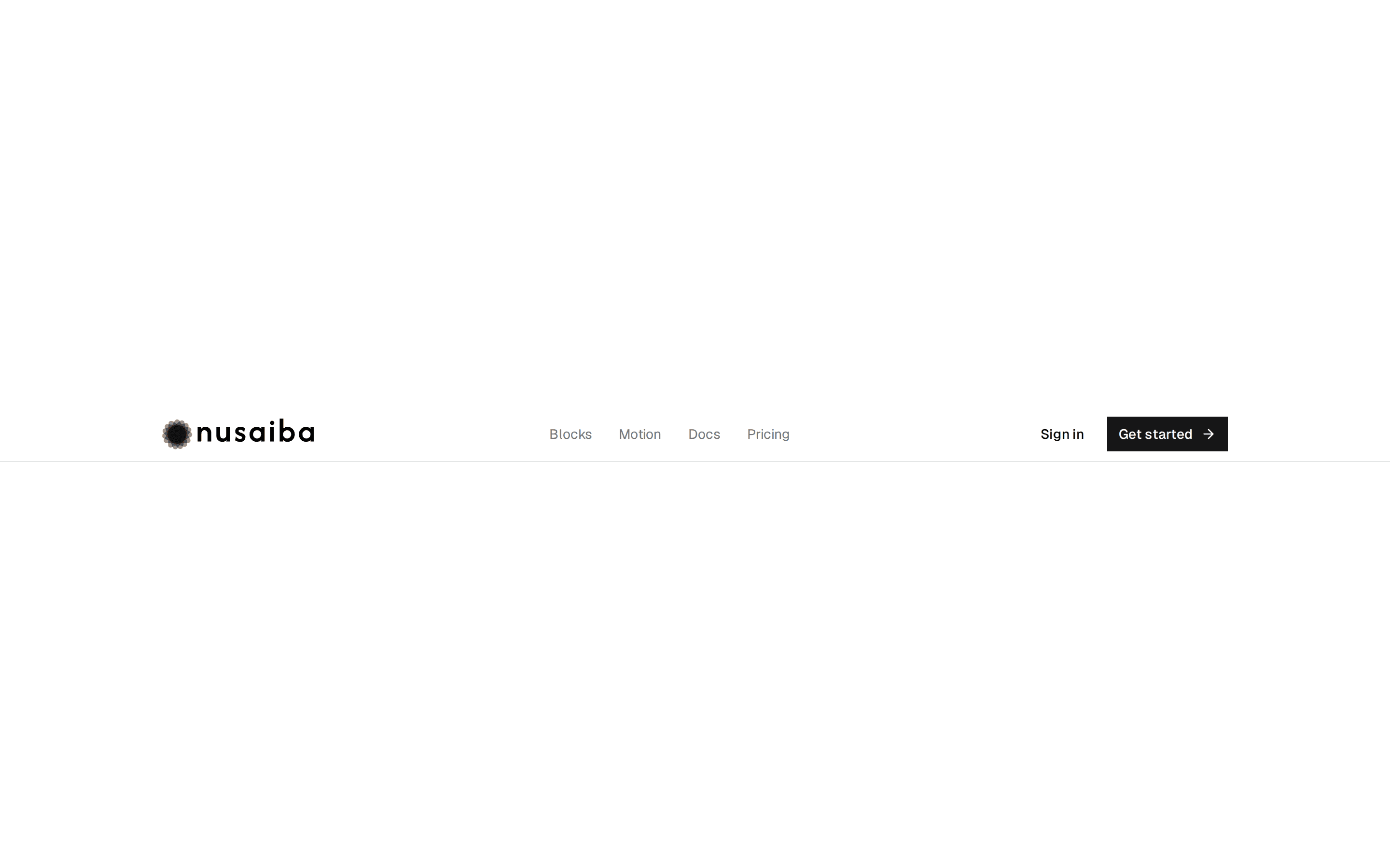
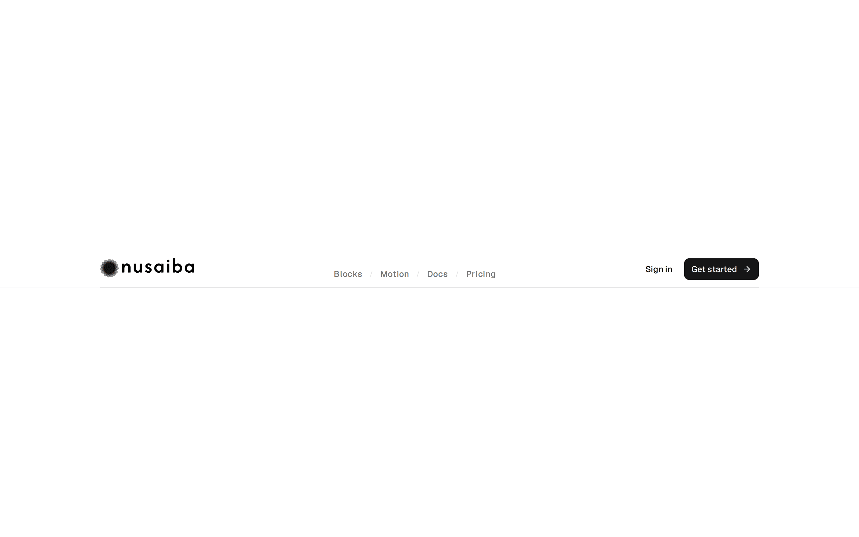
Navbar flutuante com blur, borda e menu mobile — inspirado em Launch UI Navbar Floating.
@lema-ds
Navbar flutuante com blur, borda e menu mobile — inspirado em Launch UI Navbar Floating.
@lema-ds
components/ds/ds-navbar-floating.tsx
"use client"

import * as React from "react"
import { cva, type VariantProps } from "class-variance-authority"
import { MenuIcon, XIcon } from "lucide-react"

import { cn } from "@/lib/utils"
import { Button } from "@/components/ui/button"
import { Skeleton } from "@/components/ui/skeleton"

// ── Types ──

export interface NavbarFloatingLink {
  label: string
  href: string
  active?: boolean
}

export interface NavbarFloatingProps
  extends
    React.HTMLAttributes<HTMLElement>,
    VariantProps<typeof navbarFloatingVariants> {
  brand?: React.ReactNode
  links?: NavbarFloatingLink[]
  actions?: React.ReactNode
  loading?: boolean
}

// ── Variants ──

export const navbarFloatingVariants = cva(
  "mx-auto flex w-full max-w-5xl items-center justify-between gap-4 rounded-2xl border bg-card/80 px-4 py-2 shadow-sm backdrop-blur-md",
  {
    variants: {
      variant: {
        default: "",
        muted: "bg-muted/70",
      },
      size: {
        sm: "h-12",
        md: "h-14",
        lg: "h-16",
      },
    },
    defaultVariants: {
      variant: "default",
      size: "md",
    },
  }
)

// ── Component ──

export function NavbarFloating({
  className,
  variant = "default",
  size = "md",
  brand = <span className="text-sm font-bold tracking-tight">Launch UI</span>,
  links = [
    { label: "Getting started", href: "#" },
    { label: "Components", href: "#" },
    { label: "Documentation", href: "#" },
  ],
  actions,
  loading = false,
  ...props
}: NavbarFloatingProps) {
  const [open, setOpen] = React.useState(false)

  if (loading) {
    return (
      <div className="w-full p-4">
        <Skeleton
          className={cn(navbarFloatingVariants({ variant, size }), "w-full")}
        />
      </div>
    )
  }

  return (
    <header
      data-slot="navbar-floating"
      role="banner"
      className={cn("sticky top-4 z-40 w-full px-4", className)}
      {...props}
    >
      <nav
        aria-label="Main navigation"
        className={cn(navbarFloatingVariants({ variant, size }))}
      >
        <a
          href="#"
          className="flex items-center gap-2 focus-visible:ring-2 focus-visible:ring-ring focus-visible:outline-none"
        >
          {brand}
        </a>

        <div className="hidden items-center gap-1 md:flex">
          {links.map((link) => (
            <a
              key={link.label}
              href={link.href}
              aria-current={link.active ? "page" : undefined}
              className={cn(
                "rounded-full px-3 py-1.5 text-sm font-medium transition-colors hover:bg-accent hover:text-accent-foreground focus-visible:ring-2 focus-visible:ring-ring focus-visible:outline-none",
                link.active && "bg-accent text-accent-foreground"
              )}
            >
              {link.label}
            </a>
          ))}
        </div>

        <div className="flex items-center gap-2">
          <div className="hidden items-center gap-2 md:flex">
            {actions ?? (
              <>
                <Button variant="ghost" size="sm" className="rounded-full">
                  Sign in
                </Button>
                <Button size="sm" className="rounded-full">
                  Get Started
                </Button>
              </>
            )}
          </div>

          <Button
            variant="ghost"
            size="icon-sm"
            className="md:hidden"
            aria-label={open ? "Close menu" : "Open menu"}
            aria-expanded={open}
            aria-controls="navbar-floating-mobile"
            onClick={() => setOpen((v) => !v)}
          >
            {open ? (
              <XIcon className="size-4" />
            ) : (
              <MenuIcon className="size-4" />
            )}
          </Button>
        </div>
      </nav>

      {open && (
        <div
          id="navbar-floating-mobile"
          className="mx-auto mt-2 max-w-5xl rounded-2xl border bg-card p-4 shadow-lg md:hidden"
        >
          <div className="flex flex-col gap-2">
            {links.map((link) => (
              <a
                key={link.label}
                href={link.href}
                className="rounded-lg px-3 py-2 text-sm font-medium hover:bg-accent"
                onClick={() => setOpen(false)}
              >
                {link.label}
              </a>
            ))}
            <div className="mt-2 flex flex-col gap-2 border-t pt-3">
              {actions ?? (
                <>
                  <Button variant="outline" className="w-full rounded-full">
                    Sign in
                  </Button>
                  <Button className="w-full rounded-full">Get Started</Button>
                </>
              )}
            </div>
          </div>
        </div>
      )}
    </header>
  )
}