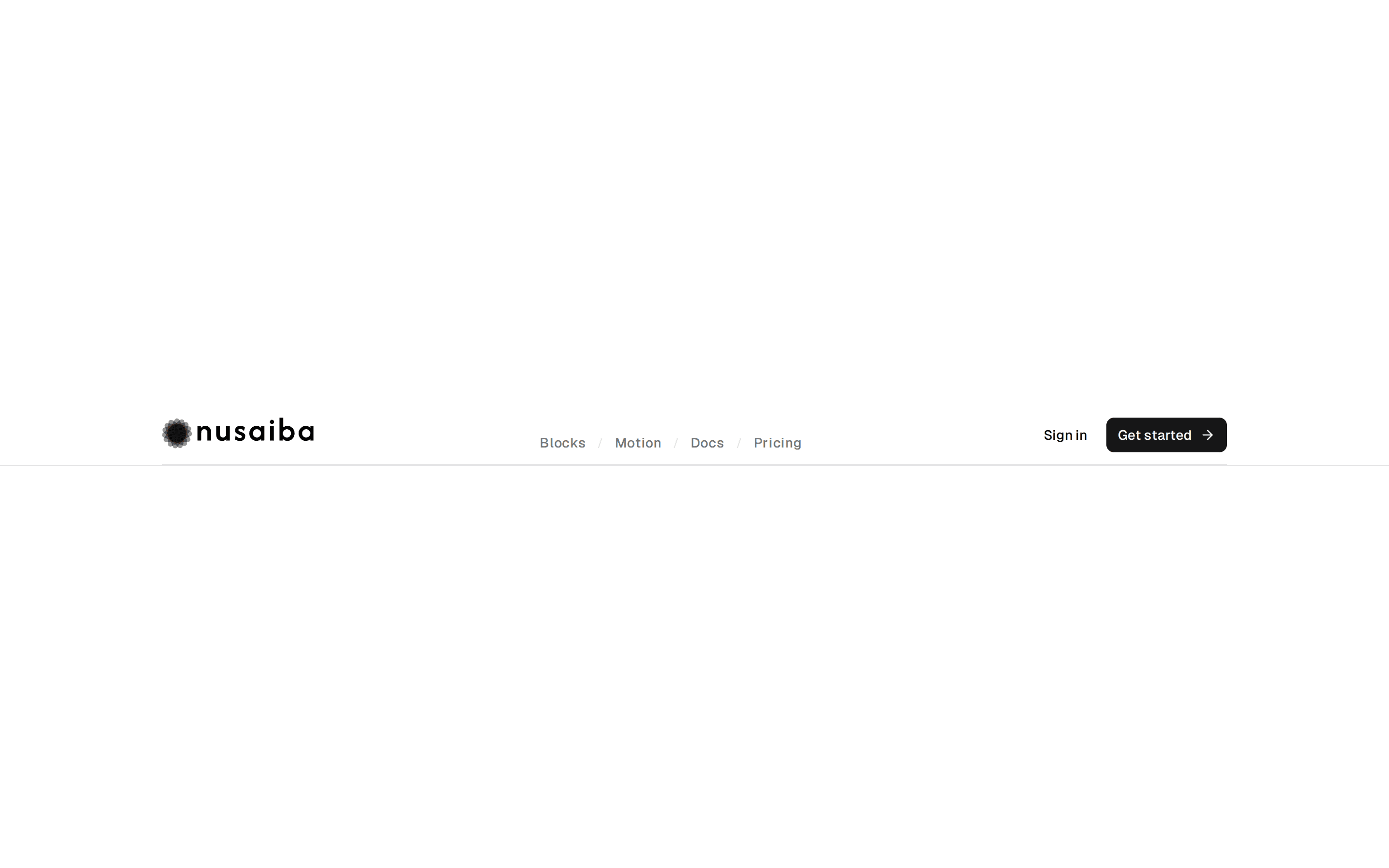
// Header 02 from Hirael <https://hirael.com/blocks/header/header-02>
// MIT · Mohammad Shehadeh · https://github.com/MohammadShehadeh/hirael

'use client';

import * as React from 'react';
import { Menu, X } from 'lucide-react';
import {
  AnimatePresence,
  type HTMLMotionProps,
  motion,
  useMotionValueEvent,
  useReducedMotion,
  useScroll,
} from 'motion/react';

import { cn } from '@/lib/utils';
import { Button } from '@/registry/hirael/bases/radix/ui/button';

interface NavLink {
  label: string;
  href: string;
}

const NAV: readonly NavLink[] = [
  { label: 'Components', href: '#' },
  { label: 'Blocks', href: '#' },
  { label: 'Templates', href: '#' },
  { label: 'Changelog', href: '#' },
];

const SHRINK_AT = 100;

const SPRING = { type: 'spring', stiffness: 220, damping: 40 } as const;

const EASE = [0.22, 1, 0.36, 1] as const;

const focusRing = 'focus-visible:outline-none focus-visible:ring-2 focus-visible:ring-ring';

interface BrandMarkProps {
  className?: string;
}

const BrandMark = ({ className }: BrandMarkProps) => {
  return (
    <svg viewBox="0 0 24 24" fill="currentColor" aria-hidden className={cn('size-6 text-primary', className)}>
      <path d="M2.3 12h2.4v10.95h6.2V14.6h4.6v8.35h6.2V12h-2.4V1.05h-6.2V9.4H8.5V1.05H2.3Z" />
    </svg>
  );
};

interface HeaderContextValue {
  isShrunk: boolean;
  reduce: boolean;
}

const HeaderContext = React.createContext<HeaderContextValue | null>(null);

const useHeader = () => {
  const context = React.useContext(HeaderContext);
  if (context === null) {
    throw new Error('Header parts must be used within <Header>');
  }

  return context;
};

export interface HeaderProps extends HTMLMotionProps<'header'> {
  /**
   * Scroll container to watch. Defaults to the window; pass a ref when the
   * header lives inside its own scrolling element.
   */
  scrollRef?: React.RefObject<HTMLElement | null>;
  /** Scroll offset, in px, after which the bar shrinks. */
  shrinkAt?: number;
}

const Header = ({ scrollRef, shrinkAt = SHRINK_AT, className, children, ...props }: HeaderProps) => {
  const reduce = useReducedMotion() ?? false;
  const [isShrunk, setIsShrunk] = React.useState(false);
  const { scrollY } = useScroll(scrollRef ? { container: scrollRef } : {});

  useMotionValueEvent(scrollY, 'change', (y) => {
    const isPastShrink = y > shrinkAt;
    if (isPastShrink !== isShrunk) setIsShrunk(isPastShrink);
  });

  return (
    <HeaderContext.Provider value={{ isShrunk, reduce }}>
      <motion.header
        data-slot="header"
        data-state={isShrunk ? 'shrunk' : 'expanded'}
        initial={false}
        className={cn('sticky inset-x-0 top-2 z-50 w-full px-2', className)}
        {...props}
      >
        {children}
      </motion.header>
    </HeaderContext.Provider>
  );
};

const HeaderBar = ({ className, ...props }: HTMLMotionProps<'div'>) => {
  const { isShrunk, reduce } = useHeader();

  return (
    <motion.div
      data-slot="header-bar"
      animate={{
        width: isShrunk ? '44%' : '100%',
        y: isShrunk ? 12 : 0,
      }}
      transition={reduce ? { duration: 0 } : SPRING}
      className={cn(
        'relative mx-auto hidden max-w-none min-w-[720px] items-center justify-between rounded-full border px-3 py-2 backdrop-blur-md transition-[background-color,border-color,box-shadow] duration-300 lg:flex',
        isShrunk ? 'border-border bg-card/80 shadow-lg' : 'border-transparent bg-transparent',
        className,
      )}
      {...props}
    />
  );
};

interface HeaderNavProps extends React.ComponentProps<'nav'> {
  items: readonly NavLink[];
  onItemClick?: () => void;
}

const HeaderNav = ({ items, onItemClick, className, ...props }: HeaderNavProps) => {
  const [hoveredIndex, setHoveredIndex] = React.useState<number | null>(null);
  const { reduce } = useHeader();
  const layoutId = React.useId();

  return (
    <nav
      data-slot="header-nav"
      onMouseLeave={() => setHoveredIndex(null)}
      className={cn('flex flex-1 items-center justify-center text-sm font-medium', className)}
      {...props}
    >
      {items.map((item, i) => (
        <a
          key={item.label}
          href={item.href}
          onMouseEnter={() => setHoveredIndex(i)}
          onFocus={() => setHoveredIndex(i)}
          onClick={onItemClick}
          className={cn(
            'relative rounded-full px-3.5 py-2 text-muted-foreground transition-colors hover:text-foreground',
            focusRing,
          )}
        >
          {hoveredIndex === i ? (
            <motion.span
              aria-hidden
              layoutId={layoutId}
              transition={reduce ? { duration: 0 } : SPRING}
              className="absolute inset-0 rounded-full bg-muted"
            />
          ) : null}
          <span className="relative z-10 whitespace-nowrap">{item.label}</span>
        </a>
      ))}
    </nav>
  );
};

const HeaderMobile = ({ className, ...props }: React.ComponentProps<'div'>) => {
  const { isShrunk } = useHeader();

  return (
    <div
      data-slot="header-mobile"
      className={cn(
        'relative mx-auto flex w-full flex-col rounded-3xl border px-3 py-2 backdrop-blur-md transition-[background-color,border-color] duration-300 lg:hidden',
        isShrunk ? 'border-border bg-card/80' : 'border-transparent',
        className,
      )}
      {...props}
    />
  );
};

interface HeaderMobileMenuProps extends React.ComponentProps<'div'> {
  open: boolean;
}

// Drops in below the bar as an opaque panel: opacity and transform only, so
// opening it never reflows the page or repaints a backdrop blur.
const HeaderMobileMenu = ({ open, className, children, ...props }: HeaderMobileMenuProps) => {
  const { reduce } = useHeader();

  return (
    <AnimatePresence initial={false}>
      {open ? (
        <motion.div
          data-slot="header-mobile-menu"
          initial={reduce ? false : { opacity: 0, y: -8, scale: 0.98 }}
          animate={{ opacity: 1, y: 0, scale: 1 }}
          exit={reduce ? undefined : { opacity: 0, y: -8, scale: 0.98 }}
          transition={{ duration: 0.2, ease: EASE }}
          className="absolute inset-x-0 top-full mt-2 origin-top rounded-3xl border border-border bg-popover p-2 text-popover-foreground shadow-lg"
        >
          <div className={cn('flex flex-col gap-1', className)} {...props}>
            {children}
          </div>
        </motion.div>
      ) : null}
    </AnimatePresence>
  );
};

const Brand = () => {
  return (
    <a
      href="#"
      className={cn(
        'inline-flex items-center gap-2 ps-1 text-sm font-semibold tracking-tight text-foreground',
        focusRing,
      )}
    >
      <BrandMark className="size-5" />
      Hirael
    </a>
  );
};

type Header02Props = Pick<HeaderProps, 'scrollRef' | 'shrinkAt'>;

const Header02 = ({ scrollRef, shrinkAt }: Header02Props) => {
  const [open, setOpen] = React.useState(false);

  return (
    <Header
      scrollRef={scrollRef}
      shrinkAt={shrinkAt}
      className="animate-in duration-500 ease-[cubic-bezier(0.22,1,0.36,1)] fill-mode-both fade-in motion-reduce:animate-none"
    >
      <HeaderBar>
        <Brand />
        <HeaderNav items={NAV} />
        <div className="flex items-center gap-1.5">
          <Button asChild variant="ghost" size="sm">
            <a href="#">Sign in</a>
          </Button>
          <Button asChild size="sm">
            <a href="#">Get started</a>
          </Button>
        </div>
      </HeaderBar>

      <HeaderMobile>
        <div className="flex items-center justify-between">
          <Brand />
          <Button
            variant="ghost"
            size="icon"
            aria-label={open ? 'Close menu' : 'Open menu'}
            aria-expanded={open}
            onClick={() => setOpen((o) => !o)}
          >
            {open ? <X /> : <Menu />}
          </Button>
        </div>
        <HeaderMobileMenu open={open}>
          {NAV.map((item) => (
            <a
              key={item.label}
              href={item.href}
              onClick={() => setOpen(false)}
              className={cn(
                'rounded-md px-3 py-2 text-sm text-muted-foreground transition-colors hover:bg-muted hover:text-foreground',
                focusRing,
              )}
            >
              {item.label}
            </a>
          ))}
          <div className="mt-2 flex gap-2">
            <Button asChild variant="outline" className="flex-1">
              <a href="#">Sign in</a>
            </Button>
            <Button asChild className="flex-1">
              <a href="#">Get started</a>
            </Button>
          </div>
        </HeaderMobileMenu>
      </HeaderMobile>
    </Header>
  );
};

// The preview frame grows to fit its content, so the window never scrolls. A
// fixed-height scroll box gives the header something to shrink against.
const Header02Preview = () => {
  const scrollRef = React.useRef<HTMLDivElement>(null);

  return (
    <div ref={scrollRef} data-slot="header-02-preview" className="relative h-160 w-full overflow-y-auto bg-background">
      <Header02 scrollRef={scrollRef} />
      <div aria-hidden className="mx-auto grid max-w-[1480px] gap-4 px-4 py-20 sm:grid-cols-2">
        {Array.from({ length: 8 }, (_, i) => (
          <div key={i} className="h-40 rounded-lg border border-border bg-card" />
        ))}
      </div>
    </div>
  );
};

export { Header, HeaderBar, HeaderNav, HeaderMobile, HeaderMobileMenu, Header02 };

export default Header02Preview;