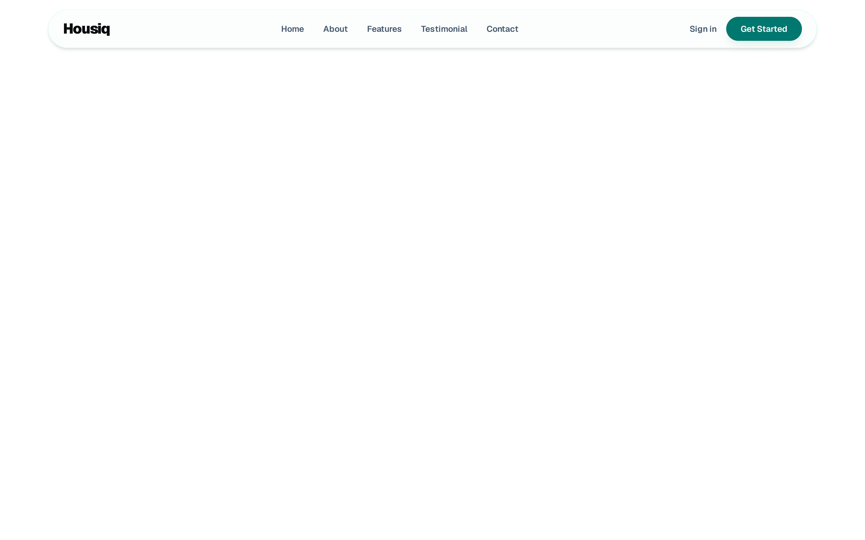
Navbar with mobile menu
Sticky navigation bar that turns translucent on scroll, with an accessible mobile menu.
@balick
Sticky navigation bar that turns translucent on scroll, with an accessible mobile menu.
@balick
registry/balick/blocks/navbar-01/navbar-01.tsx
"use client"

import * as React from "react"
import { Menu, Triangle, X } from "lucide-react"

import { Button } from "@/components/ui/button"
import { cn } from "@/lib/utils"
import { Container } from "@/registry/balick/ui/section"

const brand = { name: "Acme", href: "#" }

const links = [
  { label: "Features", href: "#" },
  { label: "Pricing", href: "#" },
  { label: "Customers", href: "#" },
  { label: "Changelog", href: "#" },
  { label: "Docs", href: "#" },
]

const actions = {
  secondary: { label: "Sign in", href: "#" },
  primary: { label: "Get started", href: "#" },
}

/** True once the page has scrolled past `offset` pixels. */
function useScrolled(offset = 8) {
  const [scrolled, setScrolled] = React.useState(false)

  React.useEffect(() => {
    const update = () => setScrolled(window.scrollY > offset)
    update()
    window.addEventListener("scroll", update, { passive: true })
    return () => window.removeEventListener("scroll", update)
  }, [offset])

  return scrolled
}

export function Navbar01() {
  const [open, setOpen] = React.useState(false)
  const scrolled = useScrolled()
  const menuId = React.useId()

  React.useEffect(() => {
    if (!open) return
    const onKeyDown = (event: KeyboardEvent) => {
      if (event.key === "Escape") setOpen(false)
    }
    // The menu only exists below the md breakpoint.
    const desktop = window.matchMedia("(min-width: 768px)")
    const onResize = () => desktop.matches && setOpen(false)
    document.addEventListener("keydown", onKeyDown)
    desktop.addEventListener("change", onResize)
    return () => {
      document.removeEventListener("keydown", onKeyDown)
      desktop.removeEventListener("change", onResize)
    }
  }, [open])

  return (
    <header
      className={cn(
        "sticky top-0 z-50 w-full border-b transition-colors duration-300",
        scrolled || open
          ? "border-border bg-background/80 backdrop-blur-md supports-[backdrop-filter]:bg-background/60"
          : "border-transparent bg-transparent"
      )}
    >
      <Container className="flex h-16 items-center gap-8">
        <a
          href={brand.href}
          className="flex items-center gap-2 font-semibold tracking-tight"
        >
          <Triangle className="size-5 fill-current" />
          {brand.name}
        </a>

        <nav aria-label="Main" className="hidden md:block">
          <ul className="flex items-center gap-1">
            {links.map((link) => (
              <li key={link.label}>
                <a
                  href={link.href}
                  className="rounded-md px-3 py-2 text-sm text-muted-foreground transition-colors hover:text-foreground"
                >
                  {link.label}
                </a>
              </li>
            ))}
          </ul>
        </nav>

        <div className="ml-auto hidden items-center gap-2 md:flex">
          <Button variant="ghost" size="sm" asChild>
            <a href={actions.secondary.href}>{actions.secondary.label}</a>
          </Button>
          <Button size="sm" asChild>
            <a href={actions.primary.href}>{actions.primary.label}</a>
          </Button>
        </div>

        <Button
          variant="ghost"
          size="icon"
          aria-label={open ? "Close menu" : "Open menu"}
          aria-expanded={open}
          aria-controls={menuId}
          onClick={() => setOpen(!open)}
          className="ml-auto md:hidden"
        >
          {open ? <X className="size-5" /> : <Menu className="size-5" />}
        </Button>
      </Container>

      <div
        id={menuId}
        inert={!open}
        className={cn(
          "grid transition-[grid-template-rows] duration-300 ease-out motion-reduce:transition-none md:hidden",
          open ? "grid-rows-[1fr]" : "grid-rows-[0fr]"
        )}
      >
        <div className="overflow-hidden">
          <Container className="flex flex-col gap-6 pt-2 pb-6">
            <nav aria-label="Mobile">
              <ul className="flex flex-col">
                {links.map((link) => (
                  <li key={link.label}>
                    <a
                      href={link.href}
                      onClick={() => setOpen(false)}
                      className="block border-b py-3 text-base text-muted-foreground transition-colors hover:text-foreground"
                    >
                      {link.label}
                    </a>
                  </li>
                ))}
              </ul>
            </nav>
            <div className="grid grid-cols-1 gap-2">
              <Button variant="outline" asChild>
                <a href={actions.secondary.href}>{actions.secondary.label}</a>
              </Button>
              <Button asChild>
                <a href={actions.primary.href}>{actions.primary.label}</a>
              </Button>
            </div>
          </Container>
        </div>
      </div>
    </header>
  )
}