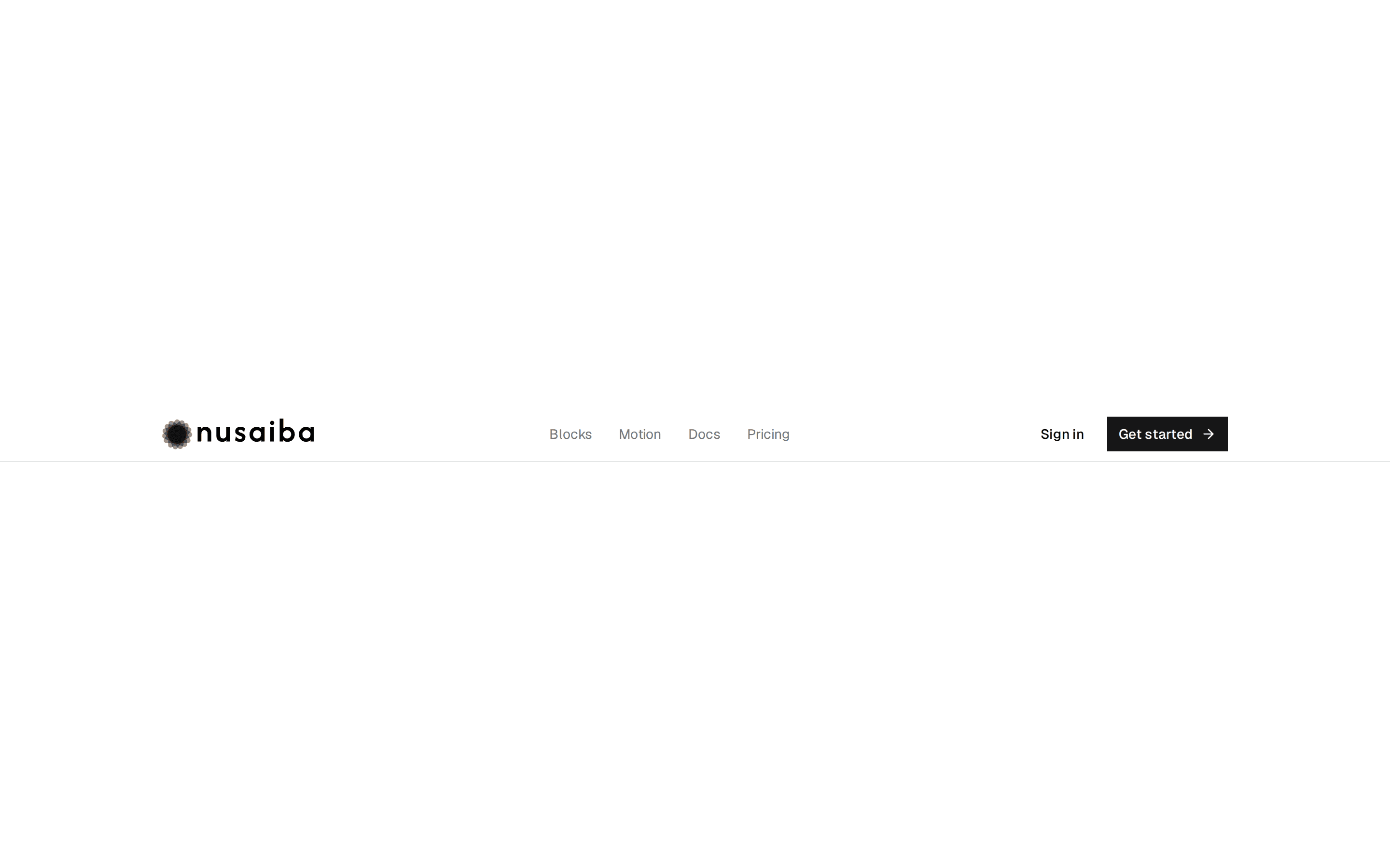
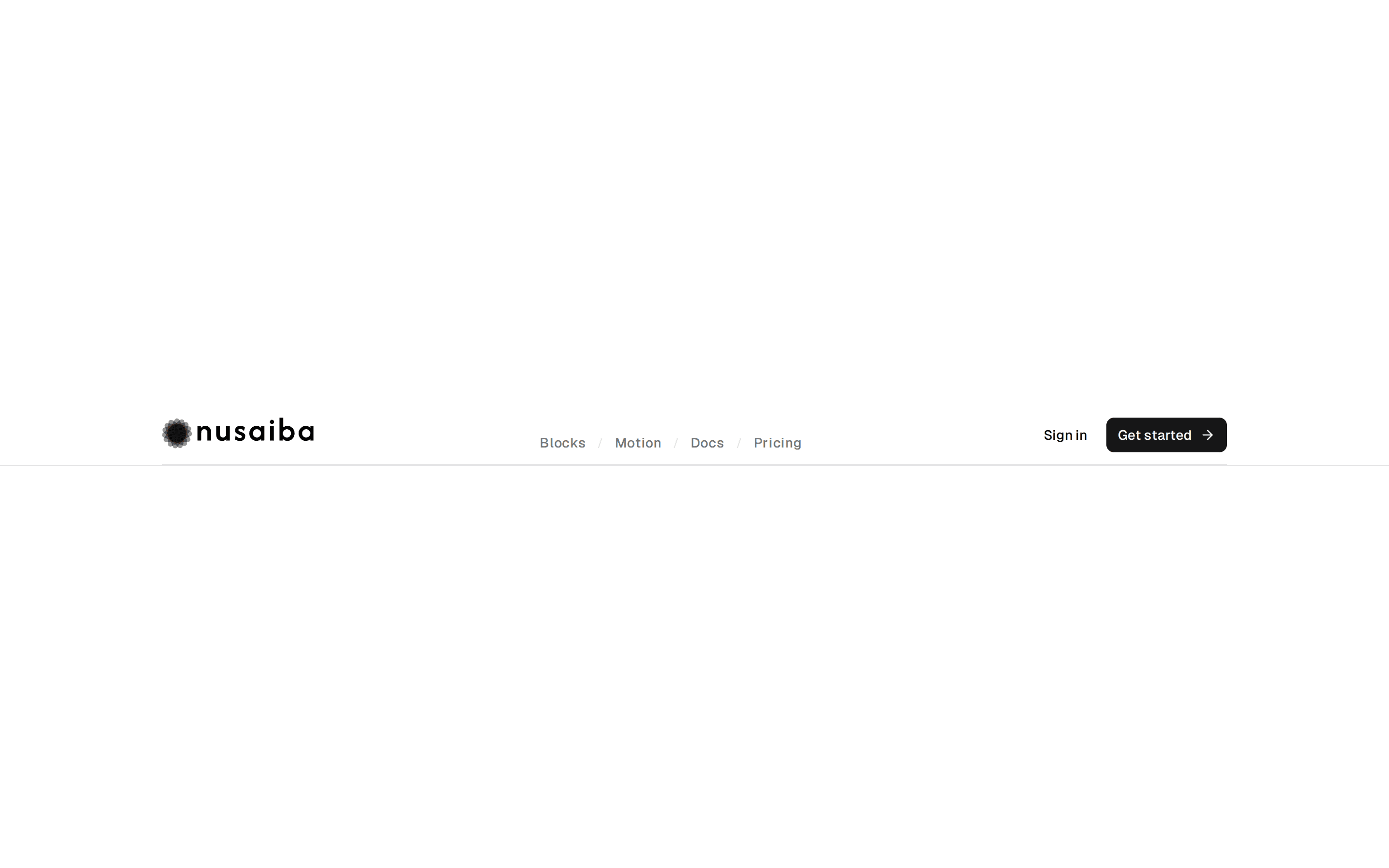
Product Dropdown Menu
Header with a Product navigation menu dropdown listing Analytics, Automations, and Integrations, plus inline links, sign-in and CTA buttons, and a mobile sheet.
@7ovr
Header with a Product navigation menu dropdown listing Analytics, Automations, and Integrations, plus inline links, sign-in and CTA buttons, and a mobile sheet.
@7ovr
registry/blocks/header/4/header-block.tsx
"use client"
import { Button } from "@/components/ui/button"
import {
  NavigationMenu,
  NavigationMenuContent,
  NavigationMenuItem,
  NavigationMenuLink,
  NavigationMenuList,
  NavigationMenuTrigger,
} from "@/components/ui/navigation-menu"
import {
  Sheet,
  SheetClose,
  SheetContent,
  SheetHeader,
  SheetTitle,
  SheetTrigger,
} from "@/components/ui/sheet"
import { IconPlaceholder } from "@/components/icons/icon-placeholder"

const productLinks = [
  { title: "Analytics", description: "Understand your traffic" },
  { title: "Automations", description: "Put workflows on autopilot" },
  { title: "Integrations", description: "Connect your stack" },
]

const navLinks = ["Docs", "Pricing", "Customers"]

function Logo({ className }: { className?: string }) {
  return (
    <svg
      viewBox="0 0 24 24"
      fill="currentColor"
      aria-hidden="true"
      className={className}
    >
      <rect x="3" y="3" width="8" height="8" transform="rotate(-6 7 7)" />
      <rect x="3" y="13" width="8" height="8" transform="rotate(5 7 17)" />
      <rect x="13" y="13" width="8" height="8" transform="rotate(-4 17 17)" />
      <rect x="13" y="3" width="8" height="8" transform="rotate(15 17 7)" />
    </svg>
  )
}

export default function HeaderBlock() {
  return (
    <header className="sticky top-0 z-50 flex h-16 w-full items-center gap-6 border-b border-border bg-background/85 px-4 text-foreground backdrop-blur sm:px-6">
      <a href="#" className="flex items-center gap-2">
        <Logo className="size-6 text-primary" />
        <span className="text-lg font-bold tracking-tight">Acme</span>
      </a>

      <NavigationMenu className="hidden md:flex">
        <NavigationMenuList>
          <NavigationMenuItem>
            <NavigationMenuTrigger className="h-9 gap-1 px-2.5 text-sm font-medium text-muted-foreground hover:text-foreground data-popup-open:text-foreground">
              Product
            </NavigationMenuTrigger>
            <NavigationMenuContent>
              <ul className="flex w-64 flex-col p-1">
                {productLinks.map((link) => (
                  <li key={link.title}>
                    <NavigationMenuLink
                      href="#"
                      className="flex-col items-start gap-0.5 p-2.5"
                    >
                      <span className="text-sm font-medium text-foreground">
                        {link.title}
                      </span>
                      <span className="text-xs text-muted-foreground">
                        {link.description}
                      </span>
                    </NavigationMenuLink>
                  </li>
                ))}
              </ul>
            </NavigationMenuContent>
          </NavigationMenuItem>
          {navLinks.map((link) => (
            <NavigationMenuItem key={link}>
              <NavigationMenuLink
                href="#"
                className="h-9 items-center px-2.5 text-sm font-medium text-muted-foreground hover:text-foreground data-active:text-foreground"
              >
                {link}
              </NavigationMenuLink>
            </NavigationMenuItem>
          ))}
        </NavigationMenuList>
      </NavigationMenu>

      <div className="ml-auto flex items-center gap-2">
        <Button
          variant="ghost"
          render={<a href="#" />}
          nativeButton={false}
          className="hidden md:inline-flex"
        >
          Sign in
        </Button>
        <Button
          render={<a href="#" />}
          nativeButton={false}
          className="hidden md:inline-flex"
        >
          Get Started
          <IconPlaceholder
            lucide="ChevronRight"
            tabler="IconChevronRight"
            hugeicons="ArrowRight01Icon"
            phosphor="CaretRight"
            remixicon="RiArrowRightSLine"
            data-icon="inline-end"
            aria-hidden="true"
          />
        </Button>

        <Sheet>
          <SheetTrigger
            render={
              <Button variant="outline" size="icon" className="md:hidden" />
            }
            aria-label="Open menu"
          >
            <IconPlaceholder
              lucide="Menu"
              tabler="IconMenu"
              hugeicons="MenuIcon"
              phosphor="List"
              remixicon="RiMenuLine"
              aria-hidden="true"
            />
          </SheetTrigger>
          <SheetContent side="right" className="w-full sm:max-w-xs">
            <SheetHeader>
              <SheetTitle className="flex items-center gap-2">
                <Logo className="size-5 text-primary" />
                Acme
              </SheetTitle>
            </SheetHeader>
            <nav className="flex flex-col px-2">
              <span className="px-2 pt-2 pb-1 text-[10px] font-semibold tracking-widest text-muted-foreground uppercase">
                Product
              </span>
              {productLinks.map((link) => (
                <SheetClose
                  key={link.title}
                  render={<a href="#" />}
                  nativeButton={false}
                  className="rounded-md px-2 py-2 text-sm font-medium text-muted-foreground transition-colors hover:bg-muted hover:text-foreground"
                >
                  {link.title}
                </SheetClose>
              ))}
              {navLinks.map((link) => (
                <SheetClose
                  key={link}
                  render={<a href="#" />}
                  nativeButton={false}
                  className="rounded-md px-2 py-2.5 text-sm font-medium text-muted-foreground transition-colors hover:bg-muted hover:text-foreground"
                >
                  {link}
                </SheetClose>
              ))}
            </nav>
            <div className="mt-auto p-4">
              <Button
                render={<a href="#" />}
                nativeButton={false}
                className="w-full"
              >
                Get Started
              </Button>
            </div>
          </SheetContent>
        </Sheet>
      </div>
    </header>
  )
}
Requires a base-* style in components.json (the shadcn init default). Legacy new-york/radix-* styles install Radix primitives, which reject the render prop this block uses.