Hero Tiles
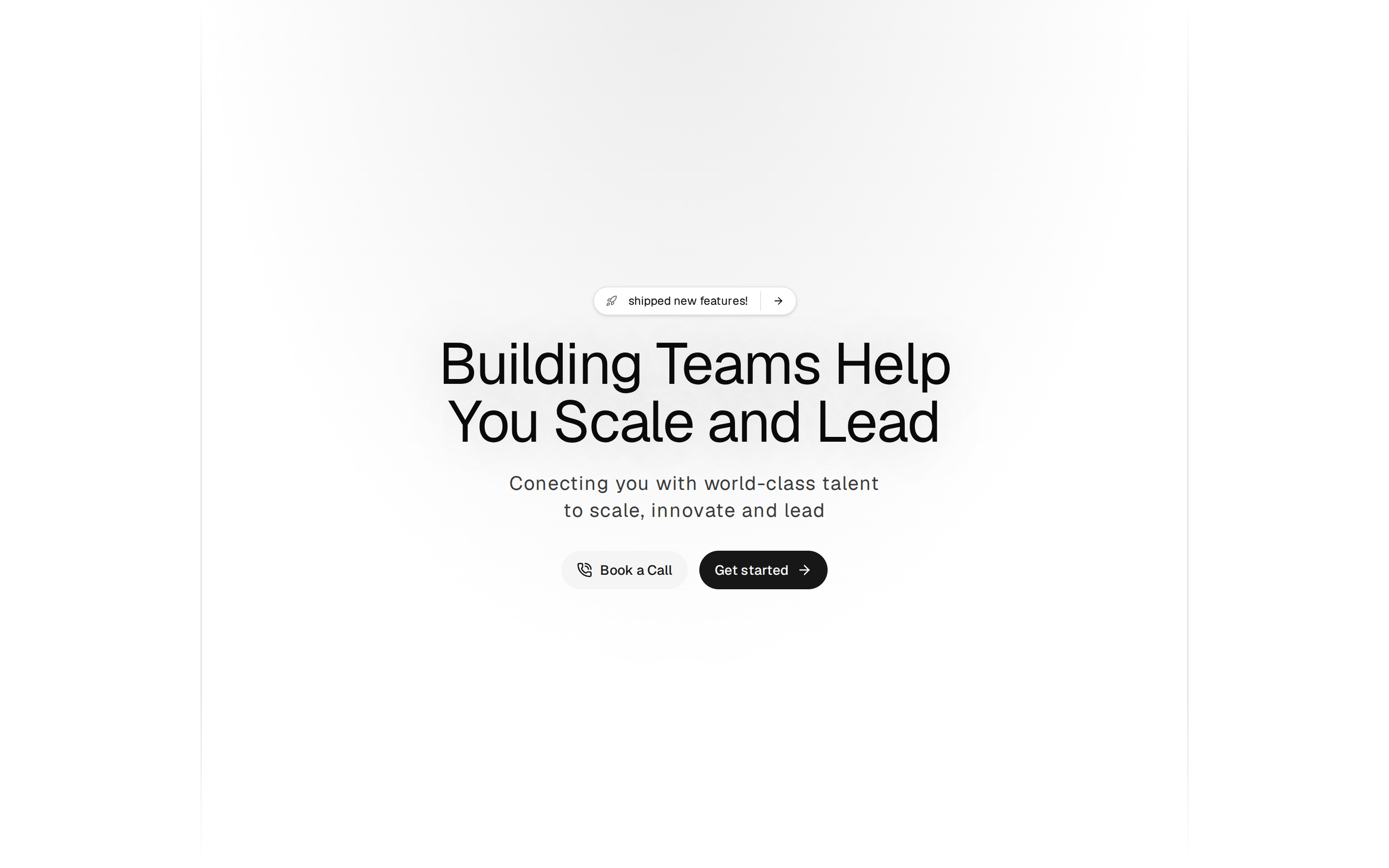
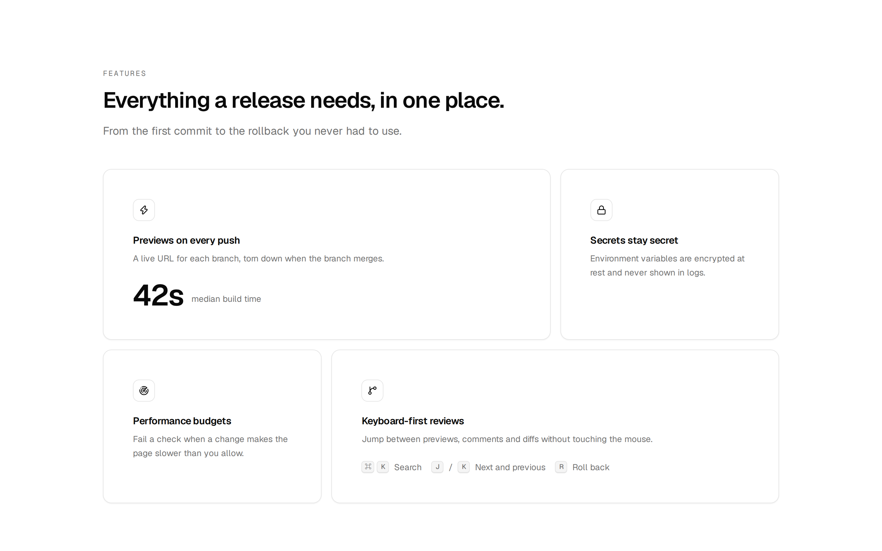
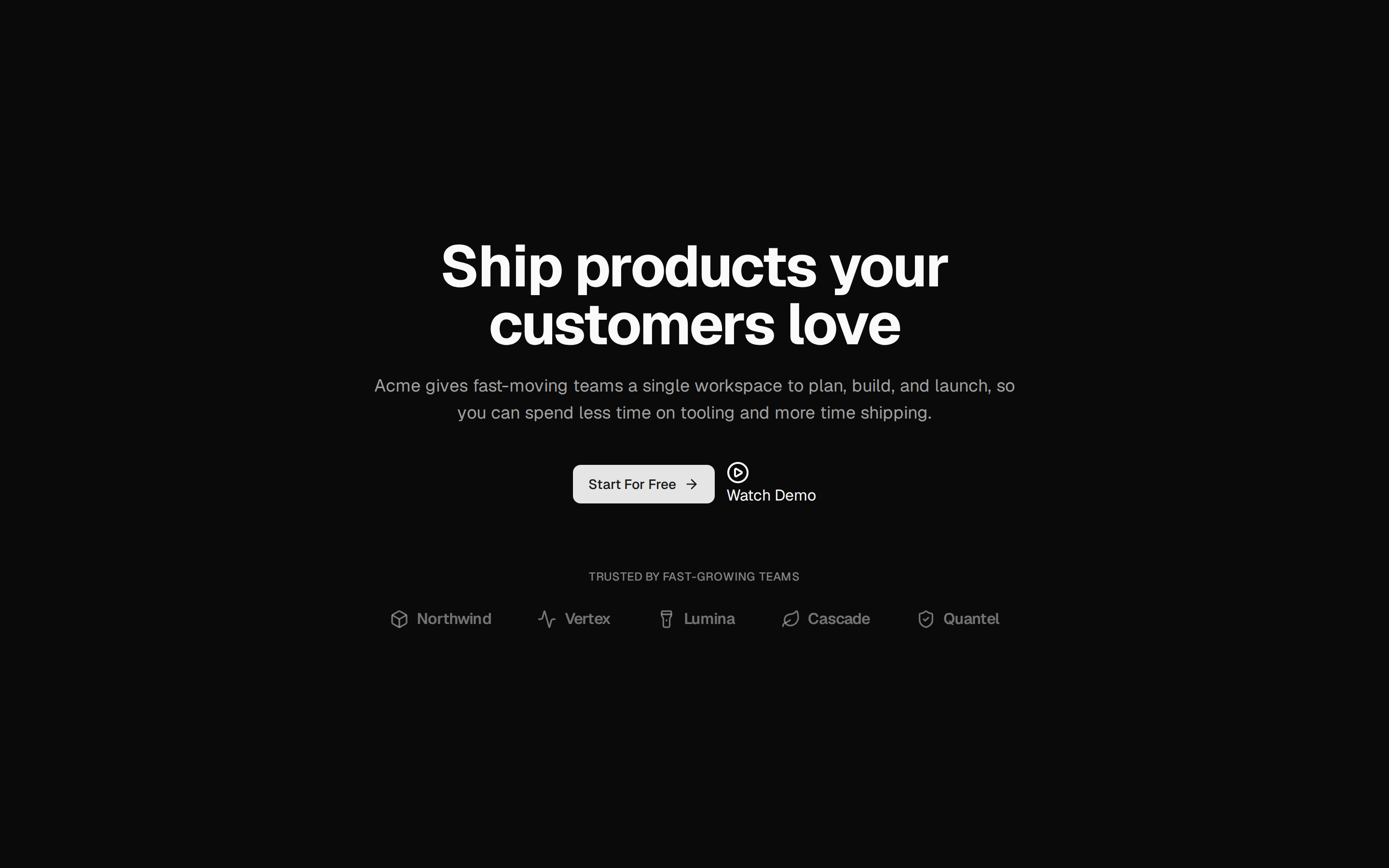
A pair of promotional hero tiles, each with a title, tagline, two actions, and a product image.
@esuiss
A pair of promotional hero tiles, each with a title, tagline, two actions, and a product image.
@esuiss
components/blocks/hero-tiles.tsx
import { Button } from "@/components/ui/button"
import { cn } from "@/lib/utils"

const photo = (id: string) =>
  `https://images.unsplash.com/photo-${id}?w=1600&q=80&auto=format&fit=crop`

const tiles = [
  {
    title: "Book Air",
    text: "So thin. So capable. Now with S5.",
    image: photo("1750056393331-82e69d28c9d9"),
    alt: "A laptop between plants on a wooden desk",
    dark: false,
  },
  {
    title: "Watch",
    text: "Series 11. Smarter. Brighter. Mightier.",
    image: photo("1696688713460-de12ac76ebc6"),
    alt: "A smartwatch on a dark table",
    dark: true,
  },
]

export function HeroTiles() {
  return (
    <section className="grid gap-3 bg-background p-3 md:grid-cols-2">
      {tiles.map((tile) => (
        <article
          key={tile.title}
          className={cn(
            "flex min-w-0 flex-col items-center overflow-hidden bg-muted pt-11 text-center text-foreground",
            tile.dark && "dark bg-background"
          )}
        >
          <div className="flex flex-col items-center gap-1 px-6">
            <h2 className="text-4xl font-semibold tracking-tight">
              {tile.dark && <span className="me-1.5">suiss</span>}
              {tile.title}
            </h2>
            <p className="text-xl text-balance">{tile.text}</p>
          </div>
          <div className="mt-4.5 flex flex-wrap justify-center gap-3.5 px-6">
            <Button>Learn more</Button>
            <Button
              variant="outline"
              className="border-primary bg-transparent text-primary hover:bg-primary/10 dark:hover:bg-primary/20 hover:text-primary dark:bg-transparent"
            >
              Buy
            </Button>
          </div>
          <img
            src={tile.image}
            alt={tile.alt}
            className="mt-4.5 aspect-[1.4] w-full bg-secondary object-cover"
          />
        </article>
      ))}
    </section>
  )
}