Empty Bag
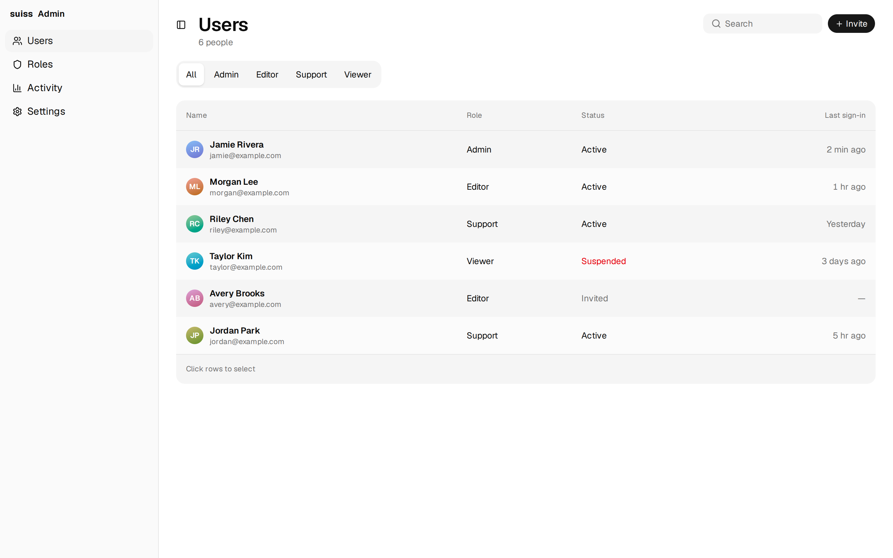
An empty shopping bag state with sign-in and shopping actions above a row of recommended products.
@esuiss
An empty shopping bag state with sign-in and shopping actions above a row of recommended products.
@esuiss
components/blocks/empty-bag.tsx
"use client"

import * as React from "react"

import { IconPlaceholder } from "@/app/(create)/components/icon-placeholder"
import { Button } from "@/components/ui/button"
import {
  Empty,
  EmptyContent,
  EmptyDescription,
  EmptyHeader,
  EmptyMedia,
  EmptyTitle,
} from "@/components/ui/empty"

const photo = (id: string) =>
  `https://images.unsplash.com/photo-${id}?w=500&q=80&auto=format&fit=crop`

const recommended = [
  {
    name: "Pods Studio",
    price: "$549",
    image: photo("1599669454699-248893623440"),
  },
  {
    name: "Sport Band",
    price: "$49",
    image: photo("1624096104992-9b4fa3a279dd"),
  },
  {
    name: "Phone Pro Clear Case",
    price: "$49",
    image: photo("1703676311066-34caf2cbee33"),
  },
]

export function EmptyBag() {
  const [added, setAdded] = React.useState<string[]>([])
  const count = added.length

  return (
    <section className="flex flex-col items-center gap-5.5 px-5 py-10 md:px-12">
      <Empty className="gap-5 p-0">
        <EmptyHeader className="max-w-md gap-2.5">
          <EmptyMedia className="relative mb-1">
            <IconPlaceholder
              lucide="HandbagIcon"
              tabler="IconShoppingBag"
              hugeicons="ShoppingBag01Icon"
              phosphor="HandbagIcon"
              remixicon="RiHandbagLine"
              className="size-11.5"
            />
            {count > 0 && (
              <span className="absolute -end-1.5 -bottom-0.5 flex size-5 items-center justify-center rounded-full bg-foreground text-xs font-semibold text-background tabular-nums transition-[scale] duration-300 ease-[cubic-bezier(0.3,1.25,0.5,1)] starting:scale-0">
                {count}
              </span>
            )}
          </EmptyMedia>
          <EmptyTitle className="text-4xl tracking-tight" aria-live="polite">
            {count
              ? `There ${count === 1 ? "is 1 item" : `are ${count} items`} in your bag.`
              : "Your bag is empty."}
          </EmptyTitle>
          <EmptyDescription className="text-lg/normal">
            {count
              ? "Check out now or keep browsing."
              : "Sign in to see items you saved."}
          </EmptyDescription>
        </EmptyHeader>
        <EmptyContent className="flex-row flex-wrap justify-center gap-3.5">
          <Button size="lg">{count ? "Check Out" : "Sign In"}</Button>
          <Button size="lg" variant="outline">
            Continue Shopping
          </Button>
        </EmptyContent>
      </Empty>
      <div className="mt-3.5 flex w-full max-w-190 flex-col gap-4">
        <h2 className="text-lg font-semibold">You may also like</h2>
        <ul className="grid grid-cols-1 gap-4 sm:grid-cols-3">
          {recommended.map((item) => {
            const inBag = added.includes(item.name)
            return (
              <li key={item.name} className="flex flex-col gap-2.5">
                <img
                  src={item.image}
                  alt=""
                  className="aspect-[1.2] w-full rounded-2xl bg-secondary object-cover"
                />
                <div className="flex items-center gap-2">
                  <div className="flex flex-1 flex-col">
                    <span className="text-base font-semibold">{item.name}</span>
                    <span className="text-sm text-muted-foreground">
                      {item.price}
                    </span>
                  </div>
                  <Button
                    size="icon-sm"
                    aria-pressed={inBag}
                    aria-label={
                      inBag
                        ? `Remove ${item.name} from bag`
                        : `Add ${item.name} to bag`
                    }
                    onClick={() =>
                      setAdded((current) =>
                        inBag
                          ? current.filter((name) => name !== item.name)
                          : [...current, item.name]
                      )
                    }
                    data-in-bag={inBag ? "" : undefined}
                    className="relative size-7.5 transition-colors duration-250 after:absolute after:-inset-1.75 after:content-[''] data-in-bag:bg-[color-mix(in_oklab,var(--color-green-500),var(--foreground)_40%)] dark:data-in-bag:bg-[color-mix(in_oklab,var(--color-green-500),black_45%)]"
                  >
                    {inBag ? (
                      <IconPlaceholder
                        lucide="CheckIcon"
                        tabler="IconCheck"
                        hugeicons="Tick02Icon"
                        phosphor="CheckIcon"
                        remixicon="RiCheckLine"
                        className="size-3.75"
                      />
                    ) : (
                      <IconPlaceholder
                        lucide="PlusIcon"
                        tabler="IconPlus"
                        hugeicons="PlusSignIcon"
                        phosphor="PlusIcon"
                        remixicon="RiAddLine"
                        className="size-3.75"
                      />
                    )}
                  </Button>
                </div>
              </li>
            )
          })}
        </ul>
      </div>
    </section>
  )
}