Icon Bento With Hero Tile
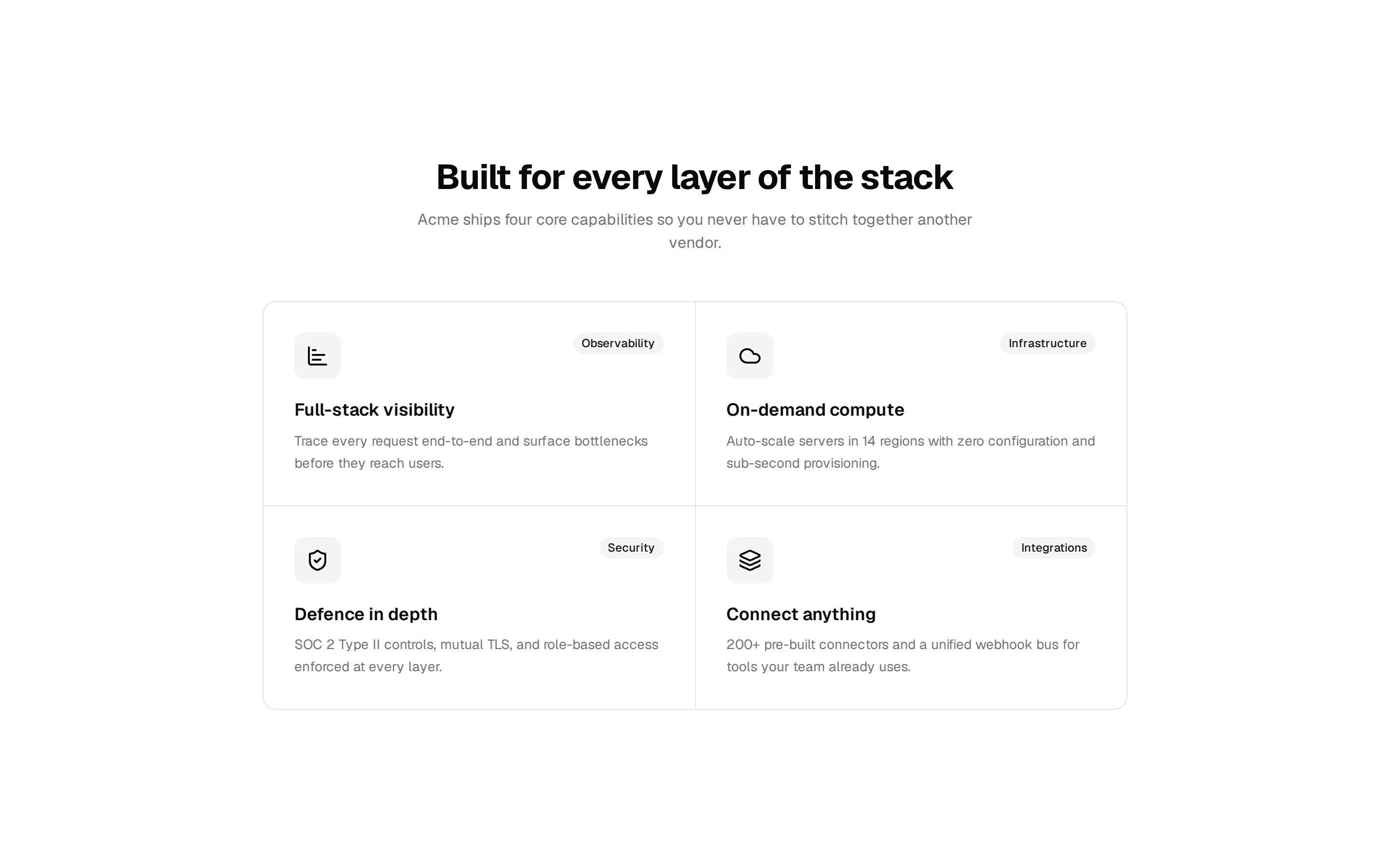
Bento grid of feature cards where one tile spans two columns and rows, each carrying an icon, title, and short capability description.
@7ovr
Bento grid of feature cards where one tile spans two columns and rows, each carrying an icon, title, and short capability description.
@7ovr
registry/blocks/bento/1/bento-block.tsx
import {
  Card,
  CardDescription,
  CardHeader,
  CardTitle,
} from "@/components/ui/card"
import { IconPlaceholder } from "@/components/icons/icon-placeholder"

type IconProps = { className?: string; size?: number | string }

const tiles = [
  {
    id: "lead",
    icon: (p: IconProps) => (
      <IconPlaceholder
        lucide="Brain"
        tabler="IconBrain"
        hugeicons="BrainIcon"
        phosphor="Brain"
        remixicon="RiBrainLine"
        {...p}
      />
    ),
    title: "AI-powered automation",
    description:
      "Let intelligent workflows handle the repetitive work so your team can focus on what actually moves the needle.",
    span: "md:col-span-2 md:row-span-2",
    iconSize: "size-10 md:size-14",
    titleSize: "text-base md:text-2xl",
    descSize: "text-sm md:text-base",
  },
  {
    id: "speed",
    icon: (p: IconProps) => (
      <IconPlaceholder
        lucide="Flashlight"
        tabler="IconBulb"
        hugeicons="FlashlightIcon"
        phosphor="Flashlight"
        remixicon="RiFlashlightLine"
        {...p}
      />
    ),
    title: "Instant deployments",
    description: "Ship changes globally in under 30 seconds from any branch.",
    span: "",
    iconSize: "size-10",
    titleSize: "text-base",
    descSize: "text-sm",
  },
  {
    id: "security",
    icon: (p: IconProps) => (
      <IconPlaceholder
        lucide="Lock"
        tabler="IconLockPassword"
        hugeicons="LockPasswordIcon"
        phosphor="Lock"
        remixicon="RiLockPasswordLine"
        {...p}
      />
    ),
    title: "Zero-trust security",
    description: "Granular policies and end-to-end encryption out of the box.",
    span: "",
    iconSize: "size-10",
    titleSize: "text-base",
    descSize: "text-sm",
  },
  {
    id: "analytics",
    icon: (p: IconProps) => (
      <IconPlaceholder
        lucide="LineChart"
        tabler="IconChartLine"
        hugeicons="ChartLineIcon"
        phosphor="ChartLine"
        remixicon="RiLineChartLine"
        {...p}
      />
    ),
    title: "Real-time analytics",
    description: "Live dashboards with sub-second refresh and custom metrics.",
    span: "",
    iconSize: "size-10",
    titleSize: "text-base",
    descSize: "text-sm",
  },
  {
    id: "global",
    icon: (p: IconProps) => (
      <IconPlaceholder
        lucide="Globe"
        tabler="IconGlobe"
        hugeicons="GlobalIcon"
        phosphor="Globe"
        remixicon="RiGlobalLine"
        {...p}
      />
    ),
    title: "Global edge network",
    description: "Serve users from 200+ PoPs with automatic failover.",
    span: "",
    iconSize: "size-10",
    titleSize: "text-base",
    descSize: "text-sm",
  },
  {
    id: "teams",
    icon: (p: IconProps) => (
      <IconPlaceholder
        lucide="Users"
        tabler="IconUsersGroup"
        hugeicons="UserGroupIcon"
        phosphor="UsersThree"
        remixicon="RiTeamLine"
        {...p}
      />
    ),
    title: "Built for teams",
    description:
      "Roles, reviews, and audit logs designed for real collaboration.",
    span: "",
    iconSize: "size-10",
    titleSize: "text-base",
    descSize: "text-sm",
  },
]

export default function BentoBlock() {
  return (
    <section className="flex w-full items-center justify-center bg-background px-6 py-16 text-foreground">
      <div className="mx-auto w-full max-w-5xl">
        <div className="mx-auto max-w-2xl text-center">
          <span className="text-sm font-medium tracking-widest text-muted-foreground uppercase">
            Platform
          </span>
          <h2 className="mt-3 font-heading text-3xl font-bold tracking-tight sm:text-4xl">
            One platform, every capability
          </h2>
          <p className="mt-3 text-muted-foreground">
            Acme bundles everything modern teams need, with no plugins and no
            glue code.
          </p>
        </div>

        <div className="mt-12 grid grid-cols-1 gap-4 sm:grid-cols-2 md:grid-cols-3 md:grid-rows-[auto_auto]">
          {tiles.map(
            ({
              id,
              icon: Icon,
              title,
              description,
              span,
              iconSize,
              titleSize,
              descSize,
            }) => (
              <Card
                key={id}
                className={["flex flex-col justify-between p-6", span]
                  .filter(Boolean)
                  .join(" ")}
              >
                <CardHeader className="p-0">
                  <span
                    className={[
                      "flex items-center justify-center rounded-lg border border-border bg-muted",
                      iconSize,
                    ].join(" ")}
                  >
                    <Icon className="size-5" aria-hidden="true" />
                  </span>
                  <CardTitle
                    className={["mt-4 font-semibold", titleSize].join(" ")}
                  >
                    {title}
                  </CardTitle>
                  <CardDescription className={["mt-2", descSize].join(" ")}>
                    {description}
                  </CardDescription>
                </CardHeader>
              </Card>
            )
          )}
        </div>
      </div>
    </section>
  )
}