Bento With Static Chart Visuals
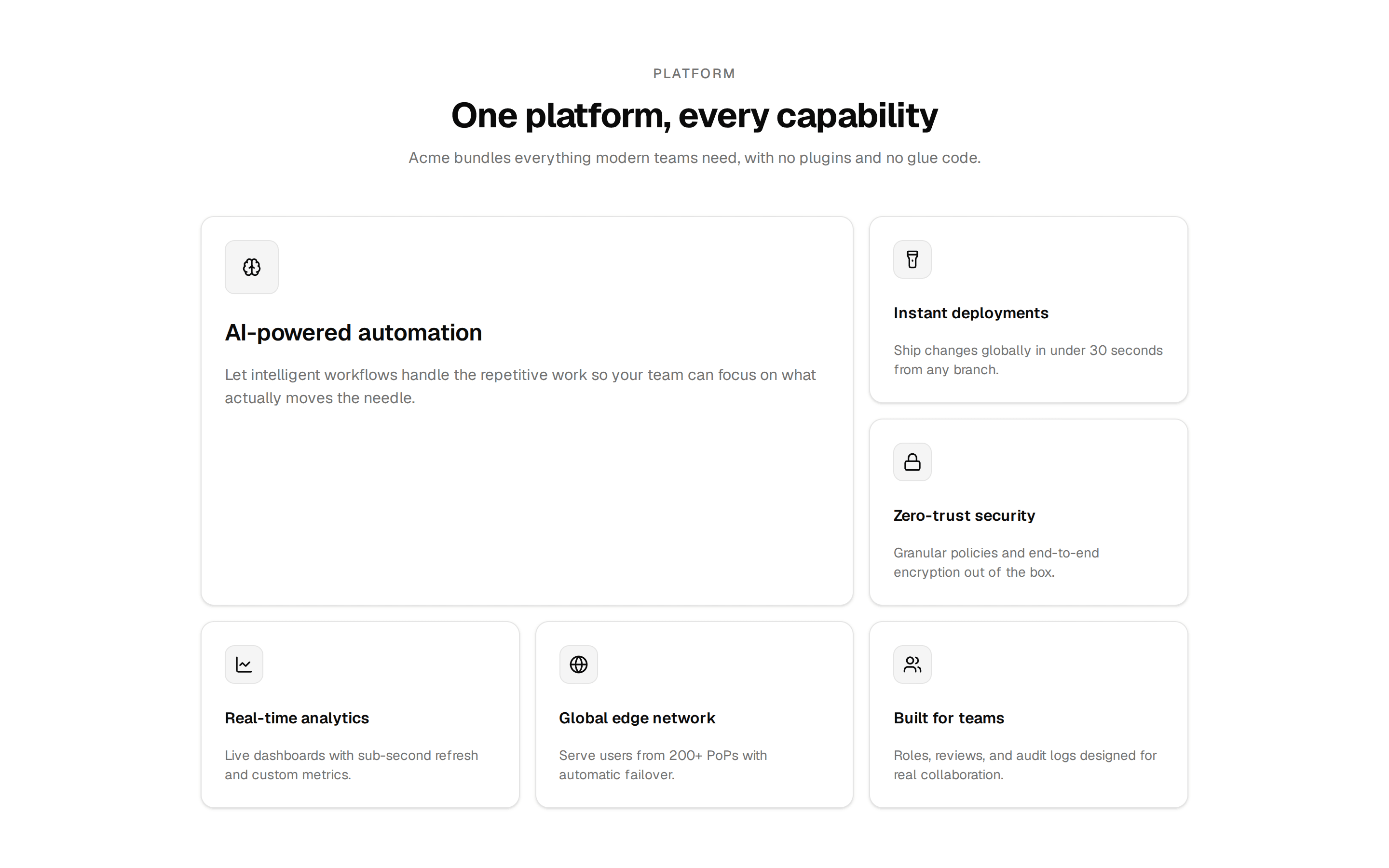
Bento grid whose hero automation tile carries a bar-chart visual, with supporting tiles showing deploy times, progress bars, and headline numbers.
@7ovr
Bento grid whose hero automation tile carries a bar-chart visual, with supporting tiles showing deploy times, progress bars, and headline numbers.
@7ovr
registry/blocks/bento/4/bento-block.tsx
import { Card } from "@/components/ui/card"
import { cn } from "@/lib/utils"
import { IconPlaceholder } from "@/components/icons/icon-placeholder"
import type * as React from "react"

type IconProps = { className?: string; size?: number | string }

type IconRenderer = (props: IconProps) => React.ReactNode

export default function BentoBlock() {
  return (
    <section className="flex w-full items-center justify-center bg-muted/30 px-6 py-16 text-foreground">
      <div className="mx-auto w-full max-w-6xl">
        <div className="max-w-2xl">
          <span className="text-sm font-medium tracking-widest text-muted-foreground uppercase">
            Capabilities
          </span>
          <h2 className="mt-3 font-heading text-3xl font-bold tracking-tight sm:text-4xl">
            Everything Acme runs on, in one grid
          </h2>
          <p className="mt-3 text-muted-foreground">
            A composable platform that scales from your first deploy to your
            millionth request, without changing tools.
          </p>
        </div>

        <div className="mt-12 grid grid-cols-1 gap-4 sm:grid-cols-2 md:grid-cols-4 md:grid-rows-[repeat(2,minmax(0,1fr))_auto]">
          <Card className="relative flex flex-col justify-between gap-8 overflow-hidden rounded-lg border-border p-8 sm:col-span-2 md:col-span-2 md:row-span-2">
            <div className="flex flex-col gap-4">
              <span className="flex size-12 items-center justify-center rounded-lg border border-border bg-primary text-primary-foreground">
                <IconPlaceholder
                  lucide="Sparkles"
                  tabler="IconSparkles"
                  hugeicons="SparklesIcon"
                  phosphor="Sparkle"
                  remixicon="RiSparklingLine"
                  className="size-6"
                  aria-hidden="true"
                />
              </span>
              <div>
                <h3 className="font-heading text-2xl font-semibold tracking-tight">
                  Intelligent automation engine
                </h3>
                <p className="mt-3 max-w-sm text-muted-foreground">
                  Define workflows once and let Acme orchestrate retries,
                  scaling, and rollbacks across every environment automatically.
                </p>
              </div>
            </div>
            <div className="flex items-end gap-1.5" aria-hidden="true">
              {[28, 40, 33, 52, 45, 66, 54, 78, 64, 92].map((h, i, arr) => (
                <div
                  key={i}
                  className={cn(
                    "flex-1",
                    i === arr.length - 1 ? "bg-primary" : "bg-primary/25"
                  )}
                  style={{ height: `${h}px` }}
                />
              ))}
            </div>
          </Card>

          <Tile
            icon={(p: IconProps) => (
              <IconPlaceholder
                lucide="Clock"
                tabler="IconClock"
                hugeicons="TimeIcon"
                phosphor="Clock"
                remixicon="RiTimeLine"
                {...p}
              />
            )}
            title="Sub-second deploys"
            description="Ship globally in under 30 seconds from any branch."
          >
            <div className="mt-5 flex items-center gap-2" aria-hidden="true">
              <span className="text-3xl font-bold tracking-tight">0.4</span>
              <span className="text-sm text-muted-foreground">sec avg</span>
            </div>
          </Tile>

          <Tile
            icon={(p: IconProps) => (
              <IconPlaceholder
                lucide="ShieldCheck"
                tabler="IconShieldCheck"
                hugeicons="Shield01Icon"
                phosphor="ShieldCheck"
                remixicon="RiShieldCheckLine"
                {...p}
              />
            )}
            title="Zero-trust security"
            description="Granular policies and encryption on by default."
          >
            <div className="mt-5 space-y-2" aria-hidden="true">
              {[92, 74, 88].map((w, i) => (
                <div key={i} className="flex items-center gap-2">
                  <span className="size-2.5 shrink-0 bg-primary" />
                  <span className="h-1.5 flex-1 bg-muted">
                    <span
                      className="block h-full bg-primary/40"
                      style={{ width: `${w}%` }}
                    />
                  </span>
                </div>
              ))}
            </div>
          </Tile>

          <Tile
            icon={(p: IconProps) => (
              <IconPlaceholder
                lucide="ChartBar"
                tabler="IconChartBar"
                hugeicons="BarChartIcon"
                phosphor="ChartBar"
                remixicon="RiBarChartBoxLine"
                {...p}
              />
            )}
            title="Live analytics"
            description="Custom metrics with sub-second refresh."
          >
            <div className="mt-5 flex items-end gap-1.5" aria-hidden="true">
              {[34, 50, 40, 60, 48, 74].map((h, i, arr) => (
                <div
                  key={i}
                  className={cn(
                    "flex-1",
                    i === arr.length - 1 ? "bg-primary" : "bg-primary/30"
                  )}
                  style={{ height: `${h}px` }}
                />
              ))}
            </div>
          </Tile>

          <Tile
            icon={(p: IconProps) => (
              <IconPlaceholder
                lucide="Cpu"
                tabler="IconCpu"
                hugeicons="CpuIcon"
                phosphor="Cpu"
                remixicon="RiCpuLine"
                {...p}
              />
            )}
            title="Elastic compute"
            description="Scale to zero, burst to thousands of cores."
          >
            <div className="mt-5 space-y-1.5" aria-hidden="true">
              <div className="h-2 w-full rounded-sm bg-muted">
                <div className="h-full w-3/4 rounded-lg bg-primary/40" />
              </div>
              <div className="h-2 w-full rounded-sm bg-muted">
                <div className="h-full w-1/2 rounded-sm bg-primary/40" />
              </div>
            </div>
          </Tile>

          <Tile
            className="sm:col-span-2 md:col-span-4"
            icon={(p: IconProps) => (
              <IconPlaceholder
                lucide="GitBranch"
                tabler="IconGitBranch"
                hugeicons="GitBranchIcon"
                phosphor="GitBranch"
                remixicon="RiGitBranchLine"
                {...p}
              />
            )}
            title="Preview every branch"
            description="Each pull request gets an isolated, shareable environment with its own URL and data snapshot."
          >
            <div className="mt-5 flex items-center gap-3" aria-hidden="true">
              <span className="size-3 rounded-md bg-primary" />
              <span className="h-px flex-1 bg-border" />
              <span className="size-2.5 rounded-sm border border-border bg-muted" />
              <span className="h-px flex-1 bg-border" />
              <span className="size-2.5 rounded-sm border border-border bg-muted" />
            </div>
          </Tile>
        </div>
      </div>
    </section>
  )
}

function Tile({
  icon: Icon,
  title,
  description,
  className,
  children,
}: {
  icon: IconRenderer
  title: string
  description: string
  className?: string
  children?: React.ReactNode
}) {
  return (
    <Card
      className={cn("flex flex-col rounded-lg border-border p-6", className)}
    >
      <span className="flex size-10 items-center justify-center rounded-md border border-border bg-muted">
        <Icon className="size-5" aria-hidden="true" />
      </span>
      <h3 className="mt-4 font-heading font-semibold tracking-tight">
        {title}
      </h3>
      <p className="mt-2 text-sm text-muted-foreground">{description}</p>
      {children}
    </Card>
  )
}