Dismissible Getting Started Widget
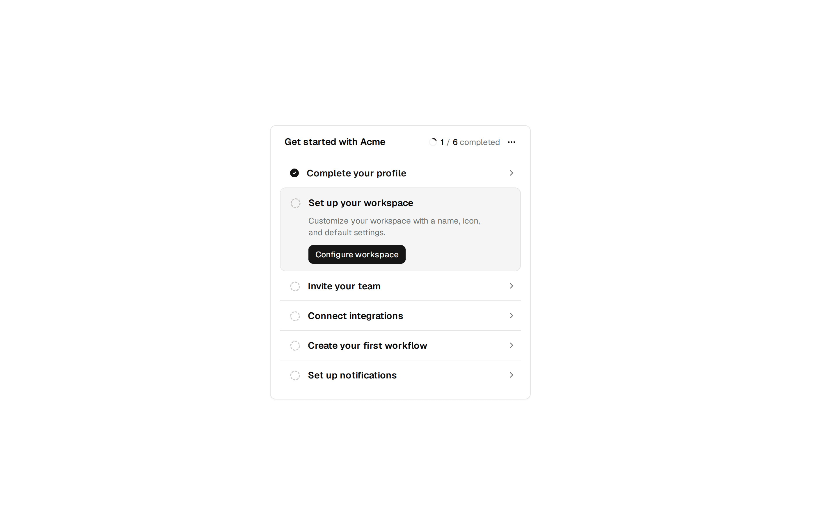
Compact getting-started widget with a dismiss button, progress bar, and a five-step checklist showing completed steps struck through.
@7ovr
Compact getting-started widget with a dismiss button, progress bar, and a five-step checklist showing completed steps struck through.
@7ovr
registry/blocks/onboarding/6/onboarding-block.tsx
"use client"

import { useState } from "react"
import { cn } from "@/lib/utils"
import { Progress } from "@/components/ui/progress"
import { IconPlaceholder } from "@/components/icons/icon-placeholder"

const steps = [
  { label: "Create your account", done: true },
  { label: "Set up your workspace", done: true },
  { label: "Invite your team", done: false },
  { label: "Connect an integration", done: false },
  { label: "Create your first project", done: false },
]

export default function OnboardingBlock() {
  const [open, setOpen] = useState(true)
  if (!open) return null

  const completed = steps.filter((step) => step.done).length
  const percent = Math.round((completed / steps.length) * 100)

  return (
    <section className="flex min-h-svh w-full items-center justify-center bg-muted/30 px-6 py-16 text-foreground">
      <div className="w-full max-w-sm rounded-xl border border-border bg-background">
        <div className="flex items-start justify-between gap-3 border-b border-border p-4">
          <div className="flex flex-col gap-2">
            <h2 className="font-heading text-sm font-semibold tracking-tight">
              Getting started
            </h2>
            <span className="text-xs text-muted-foreground tabular-nums">
              {completed} of {steps.length} complete
            </span>
          </div>
          <button
            type="button"
            onClick={() => setOpen(false)}
            aria-label="Dismiss"
            className="text-muted-foreground transition-colors hover:text-foreground"
          >
            <IconPlaceholder
              lucide="X"
              tabler="IconX"
              hugeicons="Cancel01Icon"
              phosphor="X"
              remixicon="RiCloseLine"
              className="size-4"
              aria-hidden="true"
            />
          </button>
        </div>

        <div className="px-4 pt-4">
          <Progress value={percent} className="h-1.5" />
        </div>

        <ul className="flex flex-col p-2">
          {steps.map((step) => (
            <li key={step.label}>
              <button
                type="button"
                className="flex w-full items-center gap-3 rounded-md px-2 py-2 text-left text-sm transition-colors hover:bg-muted/60"
              >
                <span
                  className={cn(
                    "flex size-5 shrink-0 items-center justify-center rounded-full border",
                    step.done
                      ? "border-foreground bg-foreground text-background"
                      : "border-border"
                  )}
                >
                  {step.done && (
                    <IconPlaceholder
                      lucide="Check"
                      tabler="IconCheck"
                      hugeicons="Tick02Icon"
                      phosphor="Check"
                      remixicon="RiCheckLine"
                      className="size-3"
                      aria-hidden="true"
                    />
                  )}
                </span>
                <span
                  className={cn(
                    "flex-1",
                    step.done
                      ? "text-muted-foreground line-through"
                      : "text-foreground"
                  )}
                >
                  {step.label}
                </span>
                {!step.done && (
                  <IconPlaceholder
                    lucide="ArrowRight"
                    tabler="IconArrowRight"
                    hugeicons="ArrowRightIcon"
                    phosphor="ArrowRight"
                    remixicon="RiArrowRightLine"
                    className="size-4 text-muted-foreground"
                    aria-hidden="true"
                  />
                )}
              </button>
            </li>
          ))}
        </ul>
      </div>
    </section>
  )
}