Three-Card Setup Steps
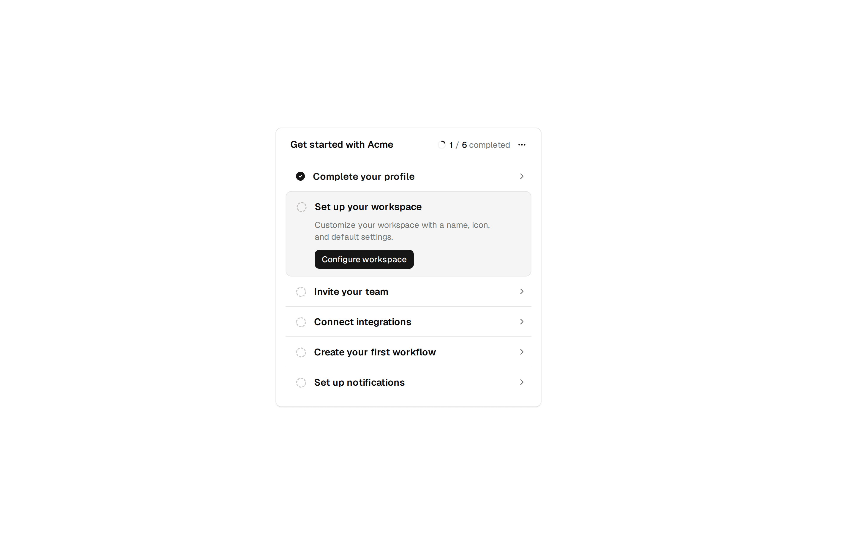
Onboarding laid out as three numbered step cards for importing data, inviting teammates, and customizing the workspace, each toggling to complete.
@7ovr
Onboarding laid out as three numbered step cards for importing data, inviting teammates, and customizing the workspace, each toggling to complete.
@7ovr
registry/blocks/onboarding/2/onboarding-block.tsx
"use client"

import * as React from "react"
import { Button } from "@/components/ui/button"
import {
  Card,
  CardDescription,
  CardFooter,
  CardHeader,
  CardTitle,
} from "@/components/ui/card"
import { Progress } from "@/components/ui/progress"
import { cn } from "@/lib/utils"
import { IconPlaceholder } from "@/components/icons/icon-placeholder"

type IconProps = { className?: string; size?: number | string }

const SETUP_CARDS = [
  {
    id: "import",
    icon: (p: IconProps) => (
      <IconPlaceholder
        lucide="UploadCloud"
        tabler="IconCloudUpload"
        hugeicons="CloudUploadIcon"
        phosphor="CloudArrowUp"
        remixicon="RiUploadCloud2Line"
        {...p}
      />
    ),
    step: "Step 1",
    title: "Import your data",
    description:
      "Connect a data source or upload a CSV to bring your existing records into Acme instantly.",
  },
  {
    id: "invite",
    icon: (p: IconProps) => (
      <IconPlaceholder
        lucide="Users"
        tabler="IconUsersGroup"
        hugeicons="UserGroupIcon"
        phosphor="UsersThree"
        remixicon="RiTeamLine"
        {...p}
      />
    ),
    step: "Step 2",
    title: "Invite teammates",
    description:
      "Add colleagues by email and assign roles (admin, editor, or viewer) to collaborate right away.",
  },
  {
    id: "customize",
    icon: (p: IconProps) => (
      <IconPlaceholder
        lucide="Palette"
        tabler="IconPalette"
        hugeicons="PaintBoardIcon"
        phosphor="Palette"
        remixicon="RiPaletteLine"
        {...p}
      />
    ),
    step: "Step 3",
    title: "Customize your workspace",
    description:
      "Set your brand colors, default language, and notification preferences to match your workflow.",
  },
]

export default function OnboardingBlock() {
  const [done, setDone] = React.useState<Record<string, boolean>>({})

  const completed = SETUP_CARDS.filter((c) => done[c.id]).length
  const total = SETUP_CARDS.length
  const pct = Math.round((completed / total) * 100)

  function toggleDone(id: string) {
    setDone((prev) => ({ ...prev, [id]: !prev[id] }))
  }

  return (
    <section className="flex w-full items-center justify-center bg-background px-6 py-12 text-foreground">
      <div className="flex w-full max-w-4xl flex-col gap-6">
        <div className="flex flex-col gap-4">
          <div className="flex flex-col gap-1">
            <h1 className="font-heading text-lg font-semibold tracking-tight">
              Get started with Acme
            </h1>
            <p className="text-sm text-muted-foreground">
              Complete these three steps to finish setting up your account.
            </p>
          </div>
          <div className="flex flex-col gap-2">
            <div className="flex items-center justify-between text-xs">
              <span className="font-medium text-foreground">
                Setup progress
              </span>
              <span className="text-muted-foreground tabular-nums">
                <span className="font-medium text-foreground">{completed}</span>{" "}
                of {total} complete
              </span>
            </div>
            <Progress
              value={pct}
              aria-label={`${completed} of ${total} steps complete`}
            />
          </div>
        </div>

        <div className="grid grid-cols-1 gap-4 sm:grid-cols-3">
          {SETUP_CARDS.map((card) => {
            const Icon = card.icon
            const isDone = !!done[card.id]
            return (
              <Card
                key={card.id}
                className={cn(
                  "flex flex-col gap-4 transition-colors",
                  isDone && "border-primary/40 bg-primary/5"
                )}
              >
                <CardHeader>
                  <div
                    className={cn(
                      "flex size-9 items-center justify-center rounded-md transition-colors",
                      isDone
                        ? "bg-primary text-primary-foreground"
                        : "bg-muted text-muted-foreground"
                    )}
                  >
                    {isDone ? (
                      <IconPlaceholder
                        lucide="Check"
                        tabler="IconCheck"
                        hugeicons="Tick02Icon"
                        phosphor="Check"
                        remixicon="RiCheckLine"
                        className="size-4"
                        aria-hidden="true"
                      />
                    ) : (
                      <Icon className="size-4" aria-hidden="true" />
                    )}
                  </div>
                  <span className="mt-3 text-[10px] font-medium tracking-widest text-muted-foreground uppercase">
                    {card.step}
                  </span>
                  <CardTitle className="text-sm font-semibold">
                    {card.title}
                  </CardTitle>
                  <CardDescription>{card.description}</CardDescription>
                </CardHeader>

                <CardFooter className="mt-auto">
                  {isDone ? (
                    <Button
                      size="sm"
                      variant="secondary"
                      className="w-full"
                      onClick={() => toggleDone(card.id)}
                    >
                      <IconPlaceholder
                        lucide="Check"
                        tabler="IconCheck"
                        hugeicons="Tick02Icon"
                        phosphor="Check"
                        remixicon="RiCheckLine"
                        data-icon="inline-start"
                        aria-hidden="true"
                      />
                      Completed
                    </Button>
                  ) : (
                    <Button
                      size="sm"
                      variant="outline"
                      className="w-full"
                      onClick={() => toggleDone(card.id)}
                    >
                      Start
                      <IconPlaceholder
                        lucide="ArrowRight"
                        tabler="IconArrowRight"
                        hugeicons="ArrowRightIcon"
                        phosphor="ArrowRight"
                        remixicon="RiArrowRightLine"
                        data-icon="inline-end"
                        aria-hidden="true"
                      />
                    </Button>
                  )}
                </CardFooter>
              </Card>
            )
          })}
        </div>
      </div>
    </section>
  )
}