Welcome Checklist Card
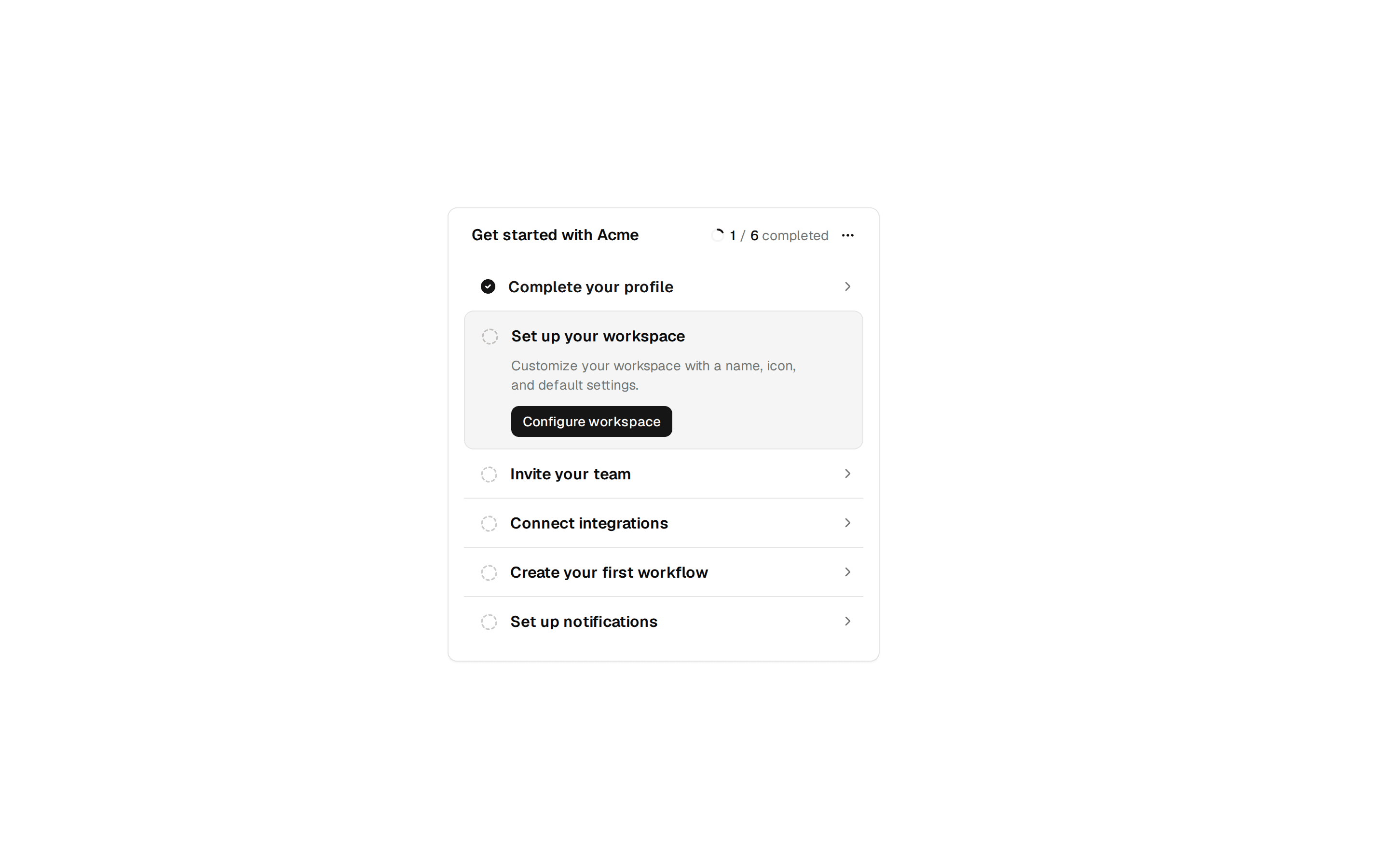
Onboarding welcome card with a setup progress bar and three checkbox steps for reading docs, inviting the team, and configuring the workspace.
@7ovr
Onboarding welcome card with a setup progress bar and three checkbox steps for reading docs, inviting the team, and configuring the workspace.
@7ovr
registry/blocks/onboarding/1/onboarding-block.tsx
"use client"
import * as React from "react"
import { Button } from "@/components/ui/button"
import {
Card,
CardContent,
CardDescription,
CardFooter,
CardHeader,
CardTitle,
} from "@/components/ui/card"
import { Checkbox } from "@/components/ui/checkbox"
import { Progress } from "@/components/ui/progress"
import { Separator } from "@/components/ui/separator"
import { cn } from "@/lib/utils"
import { IconPlaceholder } from "@/components/icons/icon-placeholder"
type IconProps = { className?: string; size?: number | string }
const STEPS = [
{
id: "docs",
icon: (p: IconProps) => (
<IconPlaceholder
lucide="BookOpen"
tabler="IconBook2"
hugeicons="BookOpenIcon"
phosphor="BookOpen"
remixicon="RiBookOpenLine"
{...p}
/>
),
title: "Read the docs",
description:
"Explore guides and API references to understand the platform.",
},
{
id: "team",
icon: (p: IconProps) => (
<IconPlaceholder
lucide="Users"
tabler="IconUsersGroup"
hugeicons="UserGroupIcon"
phosphor="UsersThree"
remixicon="RiTeamLine"
{...p}
/>
),
title: "Invite your team",
description: "Bring your colleagues on board and assign roles.",
},
{
id: "workspace",
icon: (p: IconProps) => (
<IconPlaceholder
lucide="Settings"
tabler="IconSettings"
hugeicons="SettingsIcon"
phosphor="GearSix"
remixicon="RiSettings4Line"
{...p}
/>
),
title: "Configure your workspace",
description: "Set up integrations, notifications, and preferences.",
},
]
export default function OnboardingBlock() {
const [done, setDone] = React.useState<Record<string, boolean>>({
docs: true,
})
const completed = STEPS.filter((s) => done[s.id]).length
const total = STEPS.length
const pct = Math.round((completed / total) * 100)
const allDone = completed === total
function toggle(id: string, checked: boolean) {
setDone((prev) => ({ ...prev, [id]: checked }))
}
return (
<section className="flex w-full items-center justify-center bg-background px-6 py-12 text-foreground">
<Card className="w-full max-w-md">
<CardHeader>
<CardTitle className="text-base font-semibold">
Welcome To Acme
</CardTitle>
<CardDescription>
Let's get your workspace ready in just a few steps. Complete
the checklist below to unlock everything Acme has to offer.
</CardDescription>
<div className="mt-3 flex flex-col gap-2">
<div className="flex items-center justify-between text-xs">
<span className="font-medium text-foreground">
Setup progress
</span>
<span className="text-muted-foreground tabular-nums">
<span className="font-medium text-foreground">{completed}</span>{" "}
of {total}
</span>
</div>
<Progress
value={pct}
aria-label={`${completed} of ${total} steps completed`}
/>
</div>
</CardHeader>
<CardContent className="flex flex-col gap-0">
<Separator />
{STEPS.map((step, index) => {
const Icon = step.icon
const isDone = !!done[step.id]
return (
<div key={step.id}>
<label className="flex cursor-pointer items-start gap-3 py-4">
<div
className={cn(
"flex size-8 shrink-0 items-center justify-center rounded-lg",
isDone
? "bg-primary text-primary-foreground"
: "bg-muted text-muted-foreground"
)}
>
<Icon className="size-4" aria-hidden="true" />
</div>
<div className="flex flex-1 flex-col gap-0.5">
<span
className={cn(
"text-xs font-medium",
isDone
? "text-muted-foreground line-through"
: "text-foreground"
)}
>
{step.title}
</span>
<span className="text-xs text-muted-foreground">
{step.description}
</span>
</div>
<Checkbox
checked={isDone}
onCheckedChange={(checked) =>
toggle(step.id, checked === true)
}
aria-label={`Mark "${step.title}" complete`}
className="mt-0.5"
/>
</label>
{index < STEPS.length - 1 && <Separator />}
</div>
)
})}
<Separator />
</CardContent>
<CardFooter>
<Button className="w-full" disabled={!allDone}>
{allDone ? "Finish Setup" : "Get Started"}
<IconPlaceholder
lucide="ArrowRight"
tabler="IconArrowRight"
hugeicons="ArrowRightIcon"
phosphor="ArrowRight"
remixicon="RiArrowRightLine"
data-icon="inline-end"
aria-hidden="true"
/>
</Button>
</CardFooter>
</Card>
</section>
)
}