Invite Your Team Step
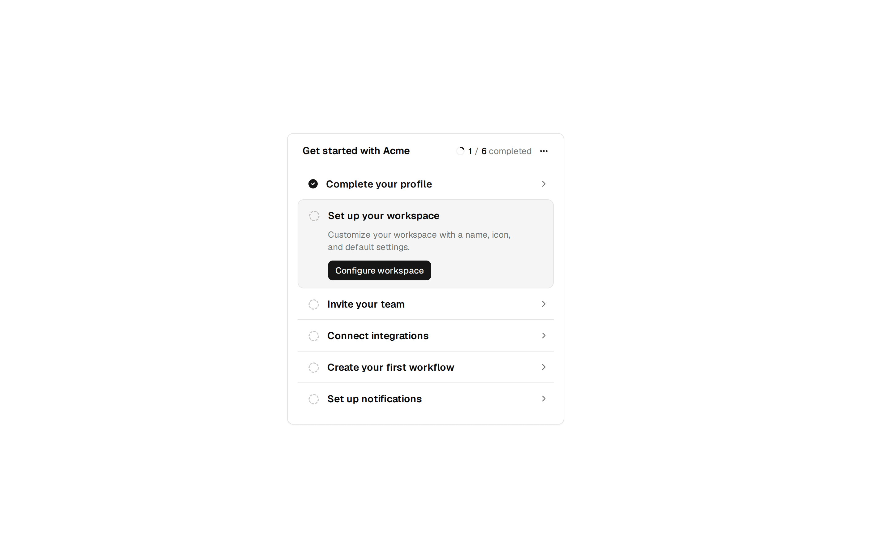
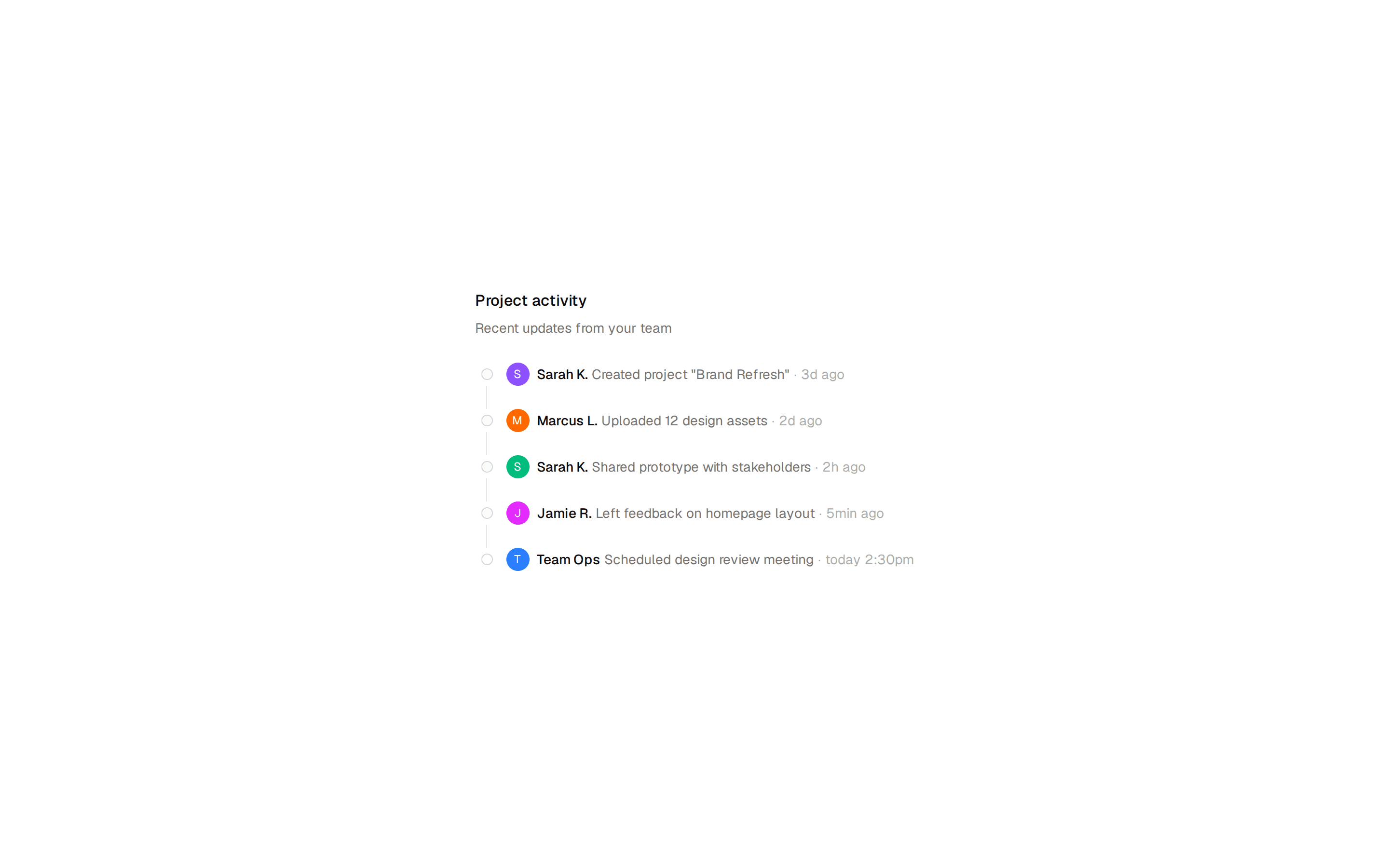
Invite-teammates onboarding step marked 3 of 4, with add and remove email rows, a role select per invite, and skip or send actions.
@7ovr
Invite-teammates onboarding step marked 3 of 4, with add and remove email rows, a role select per invite, and skip or send actions.
@7ovr
registry/blocks/onboarding/5/onboarding-block.tsx
"use client"

import { useState } from "react"
import { Button } from "@/components/ui/button"
import { Input } from "@/components/ui/input"
import {
  Select,
  SelectContent,
  SelectItem,
  SelectTrigger,
  SelectValue,
} from "@/components/ui/select"
import { Separator } from "@/components/ui/separator"
import { IconPlaceholder } from "@/components/icons/icon-placeholder"

type Invite = { id: number; email: string; role: string }

let counter = 3

export default function OnboardingBlock() {
  const [invites, setInvites] = useState<Invite[]>([
    { id: 1, email: "", role: "Member" },
    { id: 2, email: "", role: "Member" },
  ])

  const addRow = () =>
    setInvites((prev) => [
      ...prev,
      { id: ++counter, email: "", role: "Member" },
    ])
  const removeRow = (id: number) =>
    setInvites((prev) => prev.filter((invite) => invite.id !== id))
  const update = (id: number, patch: Partial<Invite>) =>
    setInvites((prev) =>
      prev.map((invite) =>
        invite.id === id ? { ...invite, ...patch } : invite
      )
    )

  return (
    <section className="flex min-h-svh w-full items-center justify-center bg-muted/30 px-6 py-16 text-foreground">
      <div className="w-full max-w-lg rounded-xl border border-border bg-background p-8">
        <div className="inline-flex w-fit items-center gap-2 text-xs font-medium tracking-widest text-muted-foreground uppercase">
          <span>Step 3 of 4</span>
          <Separator className="flex-1" />
        </div>
        <h1 className="mt-4 font-heading text-2xl font-bold tracking-tight">
          Invite your team
        </h1>
        <p className="mt-2 text-sm text-muted-foreground">
          Acme is better together. Add teammates now, or skip and invite them
          later.
        </p>

        <div className="mt-6 flex flex-col gap-3">
          {invites.map((invite) => (
            <div key={invite.id} className="flex items-center gap-2">
              <div className="relative flex-1">
                <IconPlaceholder
                  lucide="Mail"
                  tabler="IconMail"
                  hugeicons="MailIcon"
                  phosphor="Envelope"
                  remixicon="RiMailLine"
                  className="pointer-events-none absolute top-1/2 left-2.5 size-4 -translate-y-1/2 text-muted-foreground"
                  aria-hidden="true"
                />
                <Input
                  type="email"
                  value={invite.email}
                  onChange={(event) =>
                    update(invite.id, { email: event.target.value })
                  }
                  placeholder="name@company.com"
                  className="pl-8"
                  aria-label="Teammate email"
                />
              </div>
              <Select
                value={invite.role}
                onValueChange={(value) =>
                  update(invite.id, { role: value as string })
                }
              >
                <SelectTrigger className="w-28" aria-label="Role">
                  <SelectValue />
                </SelectTrigger>
                <SelectContent alignItemWithTrigger={false}>
                  <SelectItem value="Admin">Admin</SelectItem>
                  <SelectItem value="Member">Member</SelectItem>
                  <SelectItem value="Viewer">Viewer</SelectItem>
                </SelectContent>
              </Select>
              <Button
                variant="ghost"
                size="icon"
                aria-label="Remove invite"
                onClick={() => removeRow(invite.id)}
                disabled={invites.length === 1}
              >
                <IconPlaceholder
                  lucide="X"
                  tabler="IconX"
                  hugeicons="Cancel01Icon"
                  phosphor="X"
                  remixicon="RiCloseLine"
                  className="size-4"
                  aria-hidden="true"
                />
              </Button>
            </div>
          ))}
        </div>

        <Button variant="outline" size="sm" className="mt-3" onClick={addRow}>
          <IconPlaceholder
            lucide="Plus"
            tabler="IconPlus"
            hugeicons="Add01Icon"
            phosphor="Plus"
            remixicon="RiAddLine"
            data-icon="inline-start"
            aria-hidden="true"
          />
          Add another
        </Button>

        <div className="mt-8 flex items-center justify-between">
          <Button variant="ghost" render={<a href="#" />} nativeButton={false}>
            Skip for now
          </Button>
          <Button>Send invites</Button>
        </div>
      </div>
    </section>
  )
}
Requires a base-* style in components.json (the shadcn init default). Legacy new-york/radix-* styles install Radix primitives, which reject the render prop this block uses.