Loading
 Tween UI blocksfor shadcn/ui.
33 blocks · all free · updated 20 Oct 2026
GSAP & CSS animated React components and blocks. One file each, no shared runtime, reduced-motion handled.
New from Tween UI
Newest first


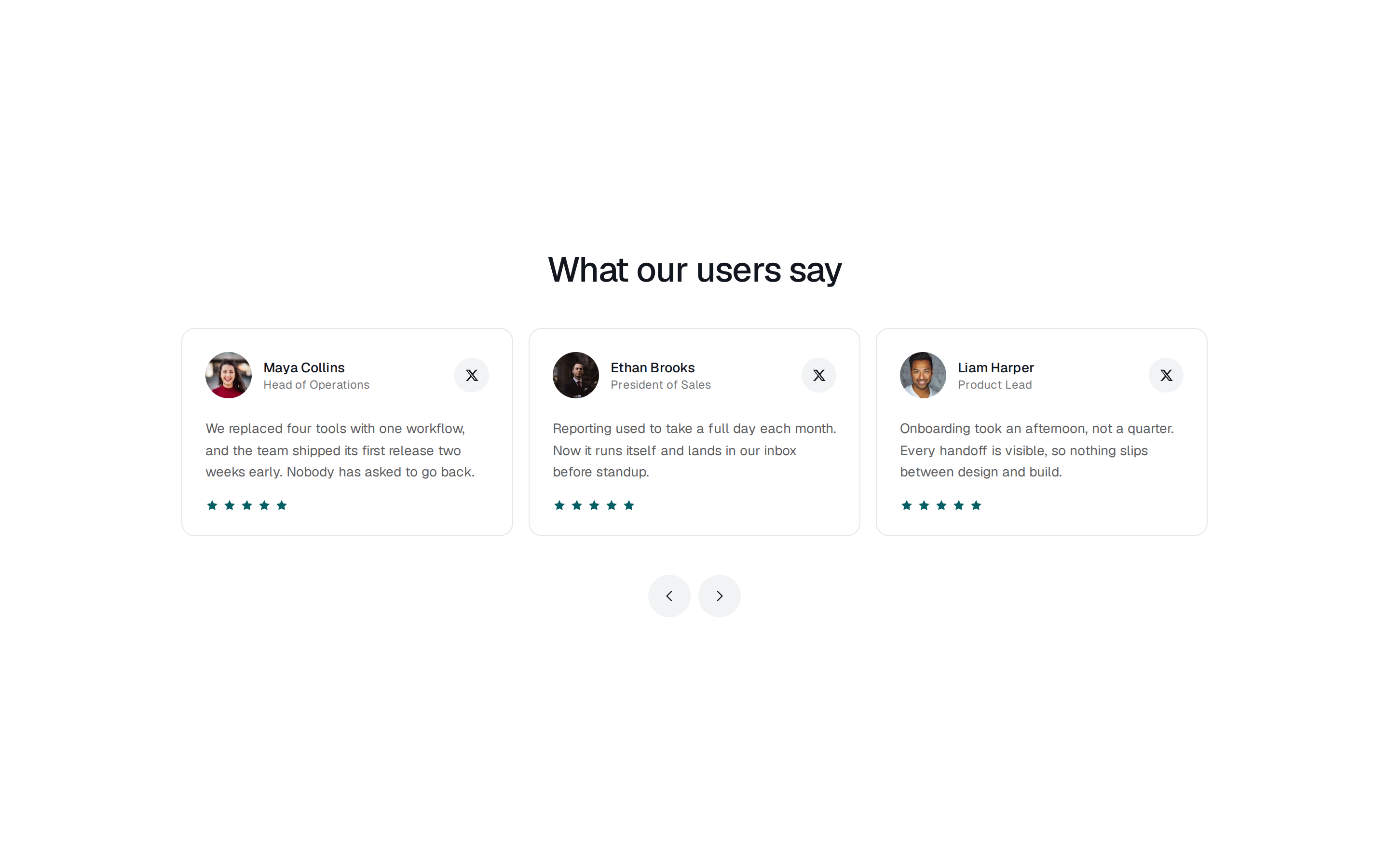


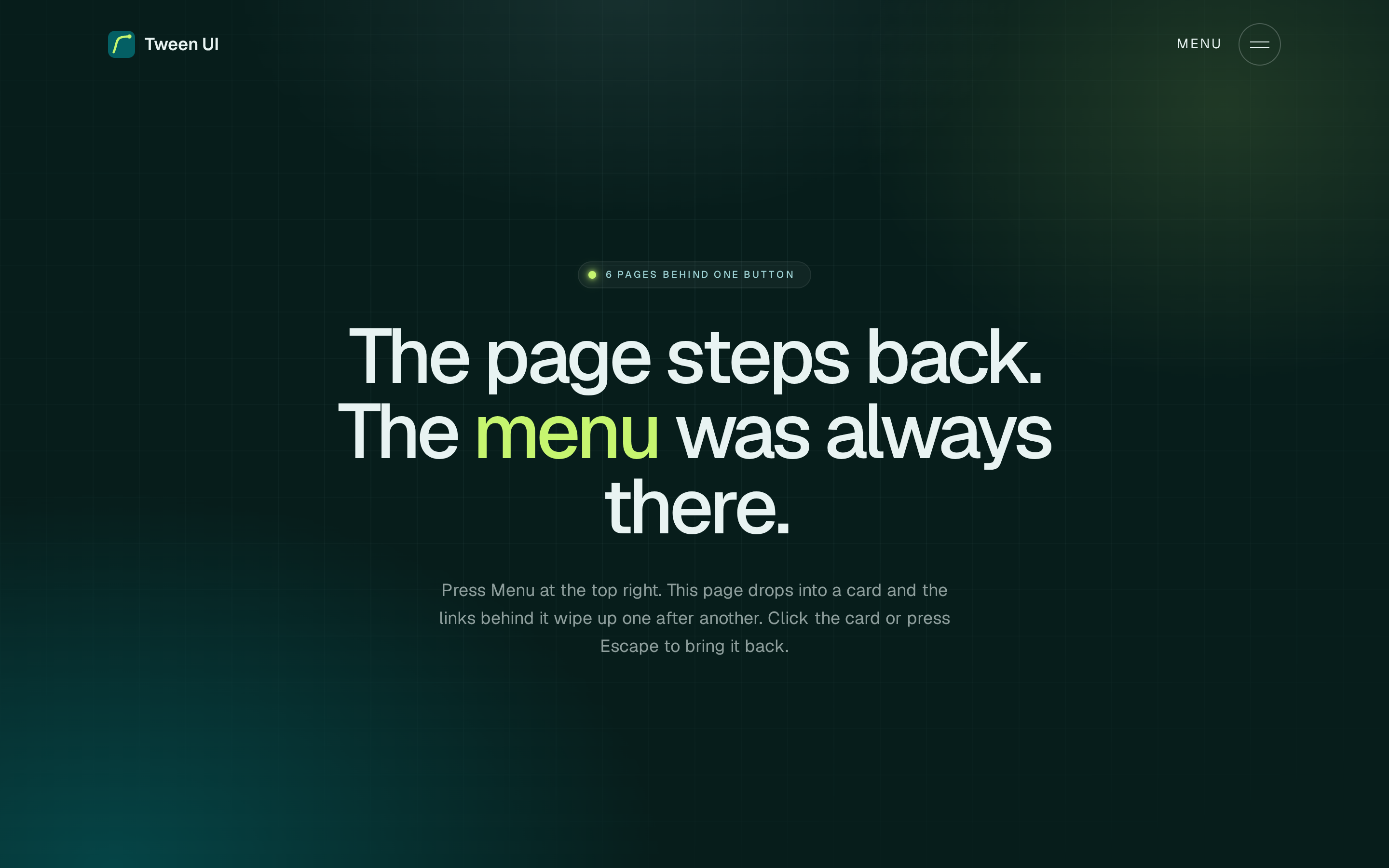


Tween UI is a set of animated React components and blocks driven by GSAP and plain CSS. GSAP handles the sequenced work through timelines, ScrollTrigger and SplitText, and anything simpler stays a CSS transition. The blocks are full page sections built around one motion idea each: a tab wipe, a pricing plan switch and a usage slider, calls to action where stars fall or photos fan out, sticky process steps, testimonial rings and reels, an integration hub, navbars that glide or push, footers whose wordmark rises, and a gyro gallery.
The components include buttons with chevron trails and rolling text, sliding tabs, a 3D flip card, a logo orbit and number counters. Each item is a single .tsx file for React 19 and Tailwind CSS v4 that the shadcn CLI writes into your project, and under reduced-motion settings it shows its finished state instead of animating.
More registries like Tween UI
Blocks from other makers