"use client";

import { Braces, Cpu, Keyboard } from "lucide-react";
import React, { useState } from "react";
import { cn } from "cn";

import { Badge } from "@/components/ui/badge";
import { Separator } from "@/components/ui/separator";

type HeroFeatureSliderImage = Image & {
  label?: string;
};
interface HeroFeatureSliderFeature {
  title: string;
  description: string;
  icon: ElementType<{ className?: string }>;
  color?: string;
  href?: string;
}
interface Image {
  src: string;
  alt: string;
  srcDark?: string;
}

interface HeroFeatureSliderProps {
  badge?: string;
  heading: string;
  features?: HeroFeatureSliderFeature[];
  images: [HeroFeatureSliderImage, ...HeroFeatureSliderImage[]];
  className?: string;
}

interface Hero45Props extends HeroFeatureSliderProps {}
type Props = Partial<Hero45Props>;

const defaultProps: Hero45Props = {
  badge: "Platform",
  heading: "Shadcn UI Components built for the modern stack.",
  features: [
    {
      title: "Composable patterns",
      description:
        "Ship faster with structured sections and consistent spacing.",
      icon: Braces,
    },
    {
      title: "Design tokens",
      description:
        "Theme and scale colors, type, and radii from a single coherent system.",
      icon: Cpu,
    },
    {
      title: "Accessible defaults",
      description:
        "Keyboard and screen-reader friendly building blocks out of the box.",
      icon: Keyboard,
    },
  ],
  images: [
    {
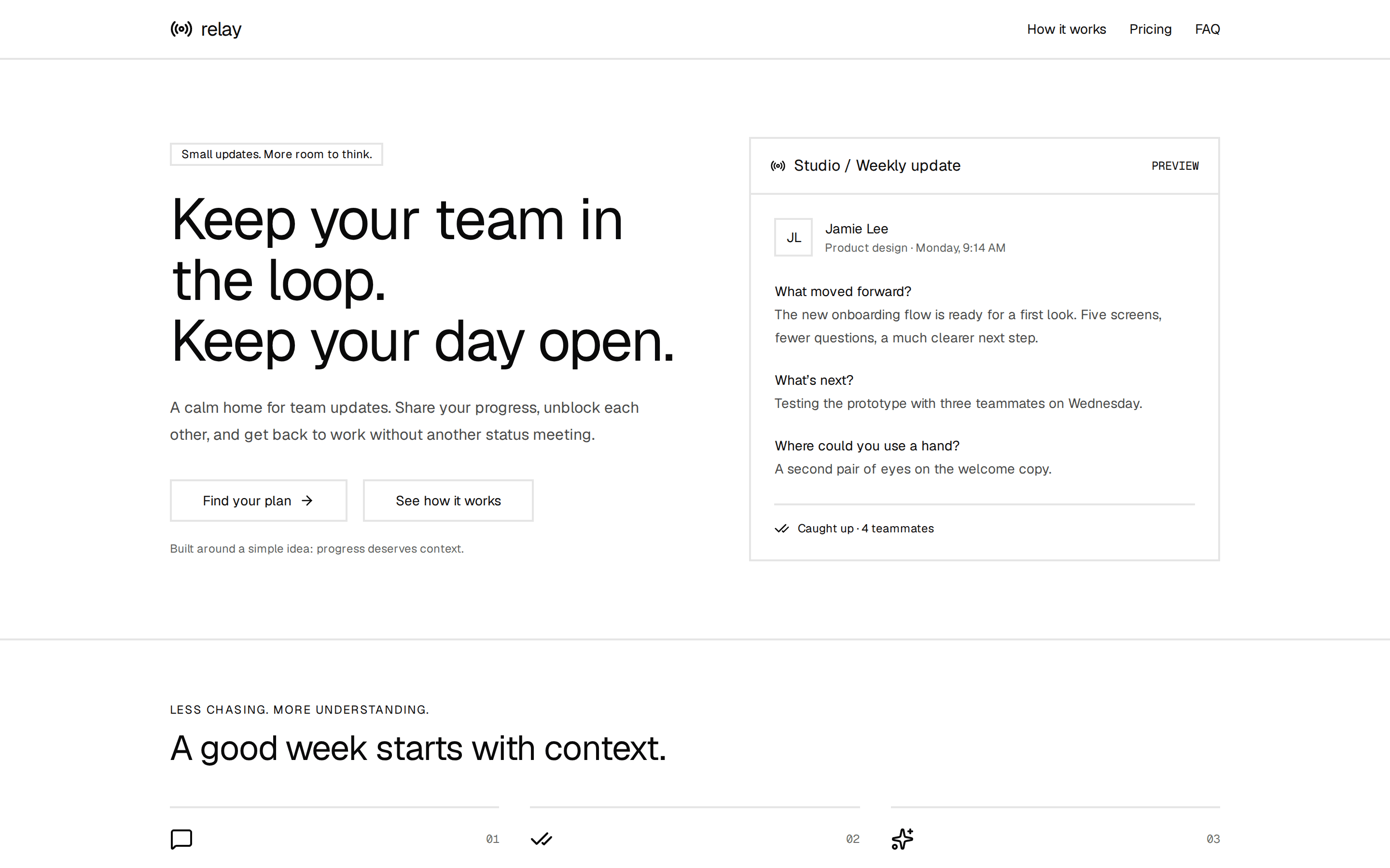
      src: "https://cdn.shadcnblocks.com/shadcnblocks/image-set/modern/saas-hero/saas-hero-2-16x9.png",
      srcDark: "https://cdn.shadcnblocks.com/shadcnblocks/image-set/modern/saas-hero/saas-hero-2-16x9-dark.png",
      alt: "Product preview",
      label: "Overview",
    },
    {
      src: "https://cdn.shadcnblocks.com/shadcnblocks/image-set/modern/saas-hero/saas-hero-3-16x9.png",
      srcDark: "https://cdn.shadcnblocks.com/shadcnblocks/image-set/modern/saas-hero/saas-hero-3-16x9-dark.png",
      alt: "Product detail",
      label: "Workflow",
    },
    {
      src: "https://cdn.shadcnblocks.com/shadcnblocks/image-set/modern/saas-hero/saas-hero-4-16x9.png",
      srcDark: "https://cdn.shadcnblocks.com/shadcnblocks/image-set/modern/saas-hero/saas-hero-4-16x9-dark.png",
      alt: "Product context",
      label: "Insights",
    },
  ],
};

/** Horizontal feature row; three columns in default layout. */
const MAX_FEATURES = 3;

const Hero45 = (props: Props) => {
  const { badge, heading, features, images, className } = {
    ...defaultProps,
    ...props,
  };

  const visibleFeatures = (features ?? []).slice(0, MAX_FEATURES);
  const featureCount = visibleFeatures.length;
  const [activeImageIndex, setActiveImageIndex] = useState(0);

  return (
    <section className={cn("py-32", className)}>
      <div className="container mx-auto overflow-hidden">
        <div className="mb-20 flex flex-col items-center gap-6 text-center">
          <Badge variant="outline">{badge}</Badge>
          <h1 className="max-w-3xl text-4xl font-semibold tracking-tight text-pretty lg:text-5xl">
            {heading}
          </h1>
        </div>
        <div className="relative mx-auto max-w-5xl">
          <div className="relative aspect-video max-h-[500px] w-full">
            <div className="absolute inset-0 overflow-hidden rounded-xl">
              {Array.from({ length: Math.max(featureCount, 1) }, (_, i) => {
                const heroImage = images[Math.min(i, images.length - 1)];
                const isActive = activeImageIndex === i;
                return (
                  <div
                    key={`${heroImage.src}-${i}`}
                    className={cn(
                      "absolute inset-0 transition-opacity duration-500 ease-out",
                      isActive
                        ? "z-10 opacity-100"
                        : "pointer-events-none z-0 opacity-0",
                    )}
                    aria-hidden={!isActive}
                  >
                    {heroImage.srcDark ? (
                      <>
                        <img
                          src={heroImage.src}
                          alt={heroImage.alt}
                          className="absolute inset-0 size-full rounded-xl border border-border object-cover object-top dark:hidden"
                        />
                        <img
                          src={heroImage.srcDark}
                          alt={heroImage.alt}
                          className="absolute inset-0 hidden size-full rounded-xl border border-border object-cover object-top dark:block"
                        />
                      </>
                    ) : (
                      <img
                        src={heroImage.src}
                        alt={heroImage.alt}
                        className="absolute inset-0 size-full rounded-xl border border-border object-cover object-top"
                      />
                    )}
                  </div>
                );
              })}
            </div>
            <div className="pointer-events-none absolute inset-0 z-20 rounded-xl bg-linear-to-t from-background via-transparent to-transparent" />
            <div className="pointer-events-none absolute -top-28 -right-28 -z-10 aspect-video h-72 w-96 mask-[radial-gradient(ellipse_50%_50%_at_50%_50%,#000_20%,transparent_100%)] bg-size-[12px_12px] opacity-40 sm:bg-[radial-gradient(hsl(var(--muted-foreground))_1px,transparent_1px)]" />
            <div className="pointer-events-none absolute -top-28 -left-28 -z-10 aspect-video h-72 w-96 mask-[radial-gradient(ellipse_50%_50%_at_50%_50%,#000_20%,transparent_100%)] bg-size-[12px_12px] opacity-40 sm:bg-[radial-gradient(hsl(var(--muted-foreground))_1px,transparent_1px)]" />
          </div>
        </div>
        <div
          className="mx-auto mt-10 flex max-w-5xl flex-col md:flex-row"
          onMouseLeave={() => setActiveImageIndex(0)}
        >
          {visibleFeatures.map((feature, index) => (
            <React.Fragment key={feature.title}>
              {index > 0 && (
                <Separator
                  orientation="vertical"
                  className="mx-6 hidden h-auto w-0.5 bg-linear-to-b from-muted via-transparent to-muted md:block"
                />
              )}
              <div
                className="flex grow basis-0 cursor-default flex-col rounded-md bg-background p-4 transition-colors hover:bg-muted/40"
                onMouseEnter={() => setActiveImageIndex(index)}
              >
                <div className="mb-6 flex size-10 items-center justify-center rounded-full bg-background drop-shadow-lg">
                  <feature.icon className="h-auto w-5" />
                </div>
                <h3 className="mb-2 font-semibold tracking-tight text-foreground">
                  {feature.title}
                </h3>
                <p className="text-sm text-balance text-muted-foreground">
                  {feature.description}
                </p>
              </div>
            </React.Fragment>
          ))}
        </div>
      </div>
    </section>
  );
};

export { Hero45 };