Combobox Grouped 3 - Nested/Hierarchical Groups
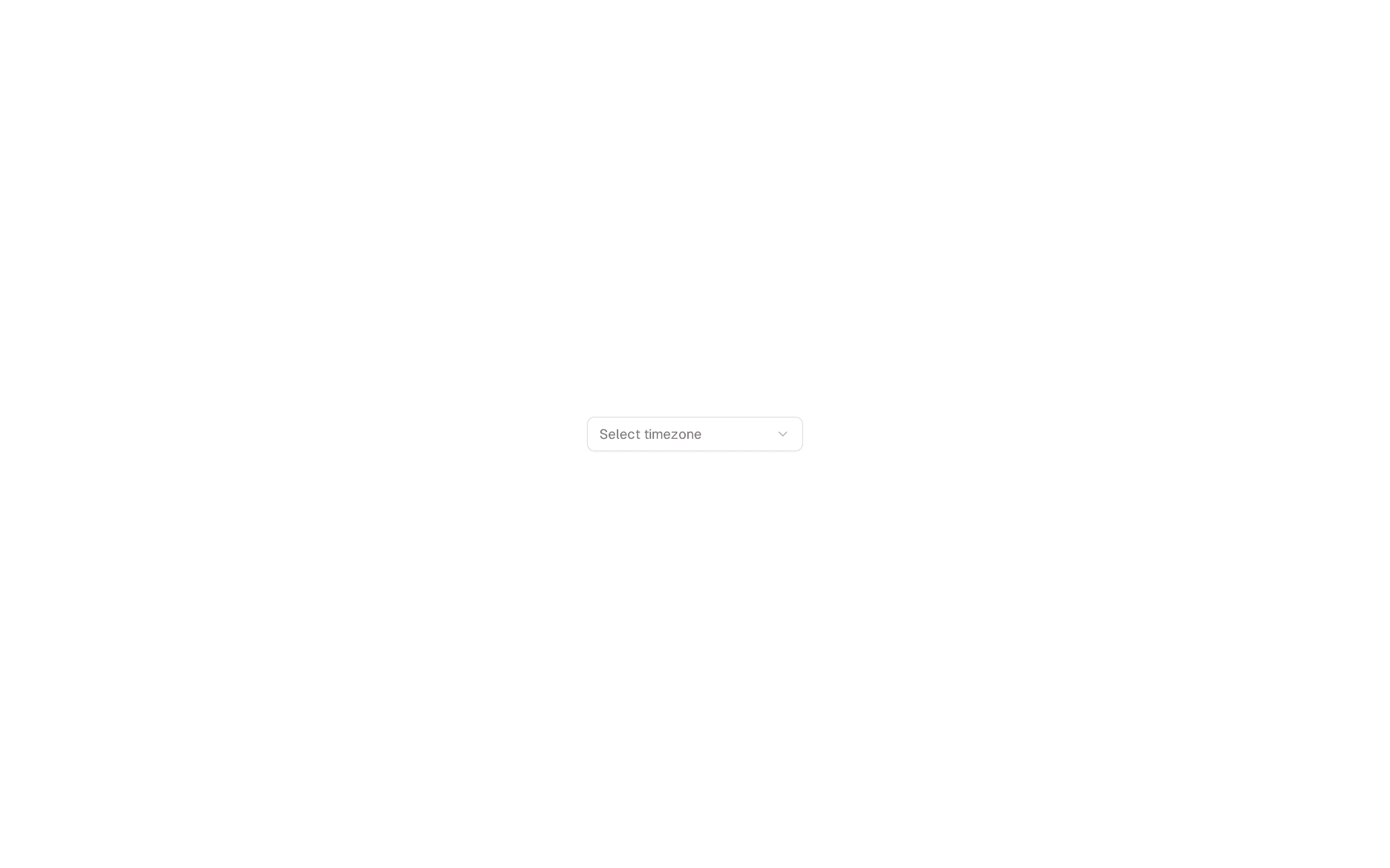
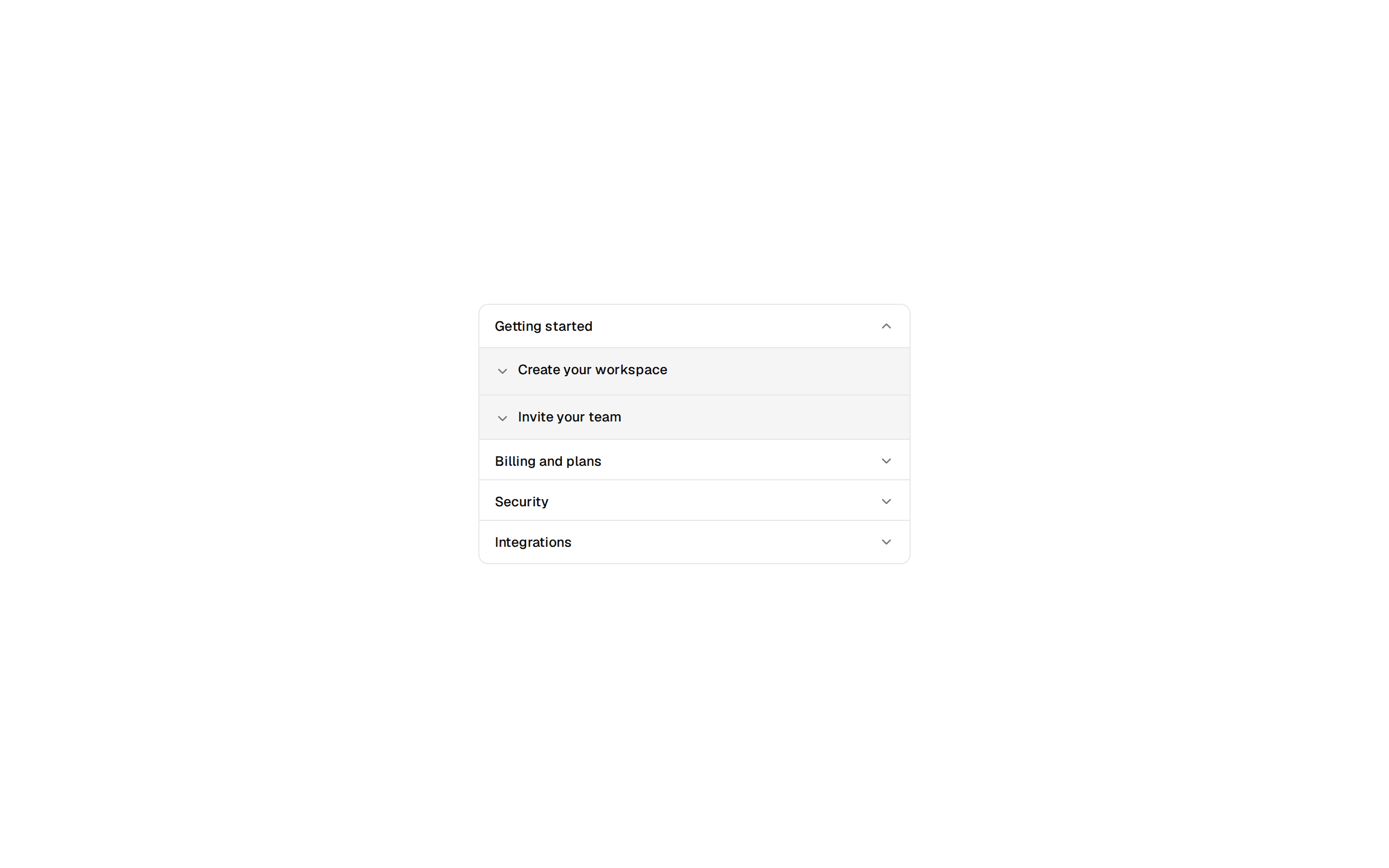
Nested/Hierarchical Groups combobox using shadcn Command and Popover.
@shadcnblocks
Nested/Hierarchical Groups combobox using shadcn Command and Popover.
@shadcnblocks
example/combobox/combobox-grouped-3.tsx
"use client";

import { Check, ChevronRight, ChevronsUpDown } from "lucide-react";
import { useState } from "react";
import { cn } from "cn";

import { Button } from "@/components/ui/button";
import {
  Command,
  CommandEmpty,
  CommandGroup,
  CommandInput,
  CommandItem,
  CommandList,
} from "@/components/ui/command";
import {
  Popover,
  PopoverContent,
  PopoverTrigger,
} from "@/components/ui/popover";

export const title = "Nested/Hierarchical Groups";

const regions = {
  "North America": [
    { value: "us", label: "United States" },
    { value: "ca", label: "Canada" },
    { value: "mx", label: "Mexico" },
  ],
  Europe: [
    { value: "uk", label: "United Kingdom" },
    { value: "de", label: "Germany" },
    { value: "fr", label: "France" },
  ],
  Asia: [
    { value: "jp", label: "Japan" },
    { value: "cn", label: "China" },
    { value: "in", label: "India" },
  ],
};

const Example = () => {
  const [open, setOpen] = useState(false);
  const [value, setValue] = useState("");

  return (
    <Popover onOpenChange={setOpen} open={open}>
      <PopoverTrigger asChild>
        <Button
          aria-expanded={open}
          className="w-[250px] justify-between"
          role="combobox"
          variant="outline"
        >
          {value
            ? Object.values(regions)
                .flat()
                .find((item) => item.value === value)?.label
            : "Select country..."}
          <ChevronsUpDown className="ml-2 size-4 shrink-0 opacity-50" />
        </Button>
      </PopoverTrigger>
      <PopoverContent className="w-[250px] p-0">
        <Command>
          <CommandInput placeholder="Search country..." />
          <CommandList>
            <CommandEmpty>No country found.</CommandEmpty>
            {Object.entries(regions).map(([region, countries]) => (
              <CommandGroup heading={region} key={region}>
                {countries.map((country) => (
                  <CommandItem
                    key={country.value}
                    onSelect={(currentValue) => {
                      setValue(currentValue === value ? "" : currentValue);
                      setOpen(false);
                    }}
                    value={country.value}
                  >
                    <Check
                      className={cn(
                        "mr-2 size-4",
                        value === country.value ? "opacity-100" : "opacity-0",
                      )}
                    />
                    <ChevronRight className="mr-2 size-3 opacity-50" />
                    {country.label}
                  </CommandItem>
                ))}
              </CommandGroup>
            ))}
          </CommandList>
        </Command>
      </PopoverContent>
    </Popover>
  );
};

export default Example;