c-popover-11.tsx
"use client"

import { useState } from "react"

import { Button } from "@/components/ui/button"
import {
  Popover,
  PopoverContent,
  PopoverTrigger,
} from "@/components/ui/popover"
import { IconPlaceholder } from "@/app/(create)/components/icon-placeholder"

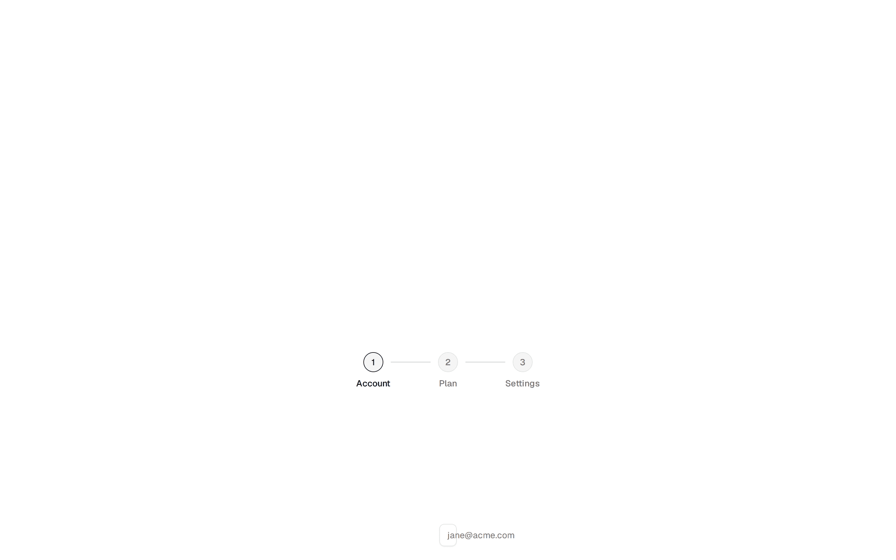
const steps = [
  {
    title: "Invite Your Team",
    description:
      "Add team members by email to collaborate on projects in real time. Assign roles and manage permissions from the team settings.",
  },
  {
    title: "Create a Project",
    description:
      "Set up your first project with a name, description, and timeline. Choose from templates or start from scratch.",
  },
  {
    title: "Connect Integrations",
    description:
      "Link tools like GitHub, Slack, and Figma to streamline your workflow and keep everything in sync.",
  },
  {
    title: "Set Up Notifications",
    description:
      "Customize which events trigger alerts — mentions, due dates, status changes, and deployment updates.",
  },
]

export function Pattern() {
  const [currentStep, setCurrentStep] = useState(0)

  const handleNext = () => {
    if (currentStep < steps.length - 1) {
      setCurrentStep(currentStep + 1)
    }
  }

  const handlePrev = () => {
    if (currentStep > 0) {
      setCurrentStep(currentStep - 1)
    }
  }

  const isFirst = currentStep === 0
  const isLast = currentStep === steps.length - 1

  return (
    <div className="flex min-h-[100px] items-center justify-center">
      <Popover>
        <PopoverTrigger render={<Button variant="outline" />}>
          <IconPlaceholder
            lucide="CompassIcon"
            tabler="IconCompass"
            hugeicons="Navigation04Icon"
            phosphor="CompassIcon"
            remixicon="RiCompassLine"
            aria-hidden="true"
          />
          Feature Tour
        </PopoverTrigger>
        <PopoverContent
          className="w-72 gap-2 px-3 pt-3 pb-2"
          side="top"
          sideOffset={8}
        >
          <div className="space-y-2">
            <p className="leading-tight font-medium">
              {steps[currentStep].title}
            </p>
            <p className="text-muted-foreground">
              {steps[currentStep].description}
            </p>
          </div>
          <div className="flex items-center justify-between">
            <span className="text-muted-foreground">
              {currentStep + 1} of {steps.length}
            </span>
            <div className="flex gap-0.5">
              <Button
                aria-label="Previous step"
                className="size-6"
                disabled={isFirst}
                onClick={handlePrev}
                size="icon"
                variant="ghost"
              >
                <IconPlaceholder
                  lucide="ArrowLeftIcon"
                  tabler="IconArrowLeft"
                  hugeicons="ArrowLeft02Icon"
                  phosphor="ArrowLeftIcon"
                  remixicon="RiArrowLeftLine"
                  className="size-3.5"
                  aria-hidden="true"
                />
              </Button>
              <Button
                aria-label="Next step"
                className="size-6"
                disabled={isLast}
                onClick={handleNext}
                size="icon"
                variant="ghost"
              >
                <IconPlaceholder
                  lucide="ArrowRightIcon"
                  tabler="IconArrowRight"
                  hugeicons="ArrowRight02Icon"
                  phosphor="ArrowRightIcon"
                  remixicon="RiArrowRightLine"
                  className="size-3.5"
                  aria-hidden="true"
                />
              </Button>
            </div>
          </div>
        </PopoverContent>
      </Popover>
    </div>
  )
}