"use client";
import * as React from "react";
import { cn } from "@/lib/utils";
import {
useControllableState,
useDisclosure,
useReducedMotion,
type StatusTone,
} from "@/lib/motiq";
import {
LivePresenceStack,
type PresenceUser,
} from "@/components/motiq/live-presence-stack";
import {
TypingAndPresence,
type Participant,
} from "@/components/motiq/typing-and-presence";
import {
ApprovalWorkflow,
type ApprovalWorkflowData,
type ApprovalStatus,
type ActionContext,
type Reviewer,
type WorkflowStage,
type Decision,
} from "@/components/motiq/approval-workflow";
import {
CommentThread,
type Comment,
type CommentAuthor,
} from "@/components/motiq/comment-thread";
import {
ActivityStream,
type ActivityEvent,
} from "@/components/motiq/activity-stream";
/* --------------------------------------------------------------------------
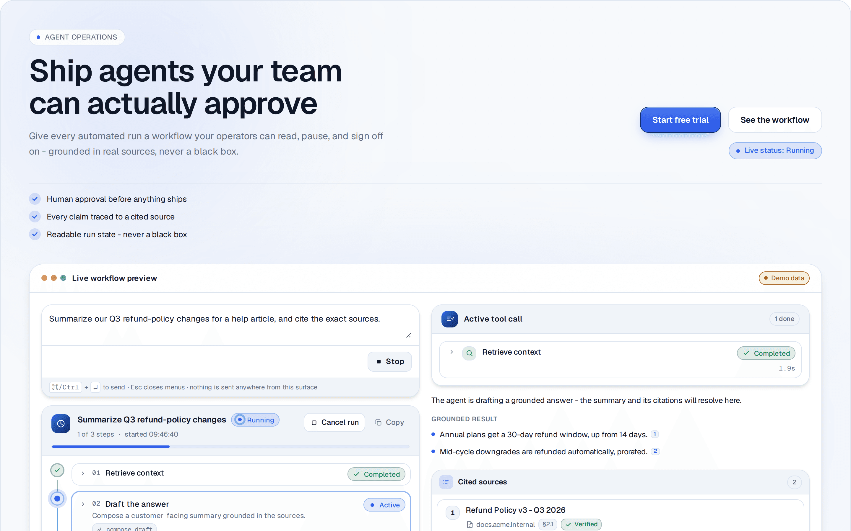
* CollaborativeLaunchHero — an editable hero block for collaboration / review
* products. A wide copy band (eyebrow, outcome headline, copy, two CTAs, current
* phase) sits above a full-width collaboration window that composes five released
* components at *reduced* complexity to tell one story: people are here
* (LivePresenceStack), someone is writing right now (TypingAndPresence), a short
* review is underway (ActivityStream), there is one change request in the thread
* (CommentThread), and one decision is pending (ApprovalWorkflow). In a wide
* container the surface tiles into two columns (the decision · the discussion)
* so the hero holds a calm height. It is deliberately not a generic social feed
* — the surface always resolves to a single approaching outcome.
*
* RESPONSIVENESS IS CONTAINER-BASED, NOT VIEWPORT-BASED. The block is a
* `@container/hero`, and every layout decision below queries that container, so
* the hero composes correctly inside a narrow content column on a wide screen
* (a docs preview, a two-column marketing page, a CMS slot) — not just at
* full-bleed viewport width. Thresholds (measured on the container's CONTENT
* box, which is how container queries resolve):
*
* @lg/hero 512px past-phone chrome: type ramp, roomier gaps, intrinsic
* CTA widths, the window's own padding + subtitle.
* @2xl/hero 672px the outer gutter steps to 48px — below this a 48px
* inset eats the surface it is meant to frame.
* @[1000px]/hero the split: copy + CTA rail side by side, and the
* surface tiles two-up. Chosen from content, not device
* names — 1000px is the first width where both tiles
* still clear ~420px, which is what the composed cards
* need to stay legible (their own threshold is 400px).
* Below it the hero stacks and folds discussion +
* activity behind one disclosure.
*
* The composed children carry their OWN container contexts, so a tile reacts to
* the tile, never to the hero and never to the viewport.
*
* The seven review phases are a controlled prop; the app owns the state. Acting
* on the approval controls advances the phase so the hero also reads as
* interactive. All data is clearly fictional and deterministic. Clean-room.
* ----------------------------------------------------------------------- */
const MIN = 60_000;
const HOUR = 3_600_000;
const DAY = 86_400_000;
const MINUTE_MS = 60_000;
/** Fixed epoch anchoring the demo timeline on the first (SSR) render — never
* Date.now during render/init so server and client markup match. Re-anchored to
* the real clock (quantized to the minute) in a mount effect so relative
* timestamps read naturally without introducing sub-minute render drift.
* Chosen minute-aligned so the initial and re-anchored markup share precision. */
const T0 = 1_800_000_000_000;
const VIEWER_ID = "you";
export type CollabHeroPhase =
| "review-open"
| "commenting"
| "changes-requested"
| "approval-pending"
| "approved"
| "rejected"
| "resolved";
export const COLLAB_HERO_PHASES: CollabHeroPhase[] = [
"review-open",
"commenting",
"changes-requested",
"approval-pending",
"approved",
"rejected",
"resolved",
];
export interface CollabHeroCta {
label: string;
href?: string;
onClick?: () => void;
}
export interface HeroPerson {
id: string;
name: string;
role: string;
}
export interface CollabHeroDataset {
/** The reviewed thing — used as the workflow + activity subject. */
reviewTitle: string;
/** Fictional cast. The first entry is treated as the viewer ("you"). */
people: HeroPerson[];
}
/* -- fictional, deterministic default dataset ---------------------------- */
const DEFAULT_DATASET: CollabHeroDataset = {
reviewTitle: "Autumn launch - pricing page refresh",
people: [
{ id: VIEWER_ID, name: "You", role: "Frontend" },
{ id: "priya", name: "Priya Nandakumar", role: "Product lead" },
{ id: "devon", name: "Devon Achebe", role: "Design" },
{ id: "rosa", name: "Rosa Whitfield", role: "Content" },
],
};
/* -- phase presentation vocabulary --------------------------------------- */
interface PhaseMeta {
label: string;
/** Non-color status glyph, so state never reads by color alone. */
glyph: string;
tone: StatusTone;
note: string;
}
const PHASE_META: Record<CollabHeroPhase, PhaseMeta> = {
"review-open": { label: "Review open", glyph: "○", tone: "active", note: "The team is reviewing the launch now." },
commenting: { label: "In discussion", glyph: "…", tone: "info", note: "An open comment thread is in progress." },
"changes-requested": { label: "Changes requested", glyph: "!", tone: "warning", note: "One change was requested before sign-off." },
"approval-pending": { label: "Awaiting your decision", glyph: "◆", tone: "active", note: "Design approved - the launch is waiting on you." },
approved: { label: "Approved to ship", glyph: "✓", tone: "success", note: "Every reviewer signed off - clear to launch." },
rejected: { label: "Sent back", glyph: "✕", tone: "error", note: "The launch was sent back for another pass." },
resolved: { label: "Resolved", glyph: "✓", tone: "success", note: "Discussion resolved and the launch is approved." },
};
/* -- cast helpers -------------------------------------------------------- */
function personMap(people: HeroPerson[]): Record<string, HeroPerson> {
return Object.fromEntries(people.map((p) => [p.id, p]));
}
/** Which of the reviewer decisions each phase encodes for lead + viewer. */
type Decisions = { lead: Reviewer["decision"]; you: Reviewer["decision"] };
function phaseDecisions(phase: CollabHeroPhase): Decisions {
switch (phase) {
case "changes-requested":
return { lead: "changes_requested", you: "pending" };
case "approval-pending":
return { lead: "approved", you: "pending" };
case "approved":
case "resolved":
return { lead: "approved", you: "approved" };
case "rejected":
return { lead: "approved", you: "rejected" };
default:
return { lead: "pending", you: "pending" };
}
}
function stageStatus(phase: CollabHeroPhase, d: Decisions): ApprovalStatus {
if (phase === "changes-requested") return "changes_requested";
if (d.you === "approved" && d.lead === "approved") return "approved";
if (d.you === "rejected") return "rejected";
return "in_review";
}
function buildWorkflow(
phase: CollabHeroPhase,
anchor: number,
dataset: CollabHeroDataset,
): ApprovalWorkflowData {
const p = personMap(dataset.people);
const lead = p["priya"] ?? dataset.people[1];
const you = p[VIEWER_ID] ?? dataset.people[0];
const d = phaseDecisions(phase);
const status = stageStatus(phase, d);
const terminal = status === "approved" || status === "rejected";
const decidedNote =
phase === "changes-requested"
? "The CTA copy overflows on the narrow breakpoint."
: d.lead === "approved"
? "Layout and hierarchy look right."
: undefined;
const stage: WorkflowStage = {
id: "stage-launch",
name: "Launch sign-off",
description: "Approve the refreshed pricing page for release.",
status,
mode: "all",
completedAt: status === "approved" ? anchor - 8 * MIN : undefined,
reviewers: [
{
id: lead.id,
name: lead.name,
role: lead.role,
decision: d.lead,
decidedAt: d.lead !== "pending" ? anchor - 22 * MIN : undefined,
note: decidedNote,
},
{
id: you.id,
name: "You",
role: you.role,
decision: d.you,
decidedAt: d.you !== "pending" ? anchor - 4 * MIN : undefined,
note: phase === "rejected" ? "Holding - the hero image regresses LCP." : undefined,
},
],
};
const history: Decision[] = [];
if (d.lead === "approved") {
history.push({
id: "h-lead",
action: "approve",
actorId: lead.id,
actorName: lead.name,
stageId: stage.id,
stageName: stage.name,
comment: "Layout and hierarchy look right.",
timestamp: anchor - 22 * MIN,
});
}
if (phase === "changes-requested") {
history.push({
id: "h-changes",
action: "request_changes",
actorId: lead.id,
actorName: lead.name,
stageId: stage.id,
stageName: stage.name,
comment: "The CTA copy overflows on the narrow breakpoint.",
timestamp: anchor - 22 * MIN,
});
}
if (phase === "approved" || phase === "resolved") {
history.push({
id: "h-you-approve",
action: "approve",
actorId: you.id,
actorName: "You",
stageId: stage.id,
stageName: stage.name,
timestamp: anchor - 4 * MIN,
});
}
if (phase === "rejected") {
history.push({
id: "h-you-reject",
action: "reject",
actorId: you.id,
actorName: "You",
stageId: stage.id,
stageName: stage.name,
comment: "Holding - the hero image regresses LCP.",
timestamp: anchor - 4 * MIN,
});
}
return {
id: "wf-launch",
title: dataset.reviewTitle,
description: "One sign-off stands between the refreshed pricing page and release.",
requester: { id: lead.id, name: lead.name, role: lead.role },
status,
priority: "high",
createdAt: anchor - 1 * DAY,
deadline: anchor + 6 * HOUR,
currentStageId: terminal ? undefined : stage.id,
stages: [stage],
history,
};
}
/* -- presence + typing per phase ----------------------------------------- */
function buildPresence(phase: CollabHeroPhase, dataset: CollabHeroDataset): PresenceUser[] {
const busy = phase !== "approved" && phase !== "rejected" && phase !== "resolved";
const [you, lead, design, content] = dataset.people;
return [
{ id: you.id, name: "You", status: "editing" },
{ id: lead.id, name: lead.name, status: busy ? "active" : "viewing" },
{ id: design.id, name: design.name, status: busy ? "active" : "idle" },
{ id: content.id, name: content.name, status: busy ? "viewing" : "idle" },
];
}
function buildTypers(phase: CollabHeroPhase, dataset: CollabHeroDataset): Participant[] {
const design = dataset.people[2];
const typing = phase === "review-open" || phase === "commenting" || phase === "approval-pending";
return [
{
id: design.id,
displayName: design.name,
presenceState: "active",
typingState: typing ? "typing" : "stopped",
role: design.role,
},
];
}
/* -- comment thread (compact, one change request) ------------------------ */
function author(person: HeroPerson): CommentAuthor {
return { id: person.id, name: person.name, role: person.role };
}
function buildComments(
phase: CollabHeroPhase,
anchor: number,
dataset: CollabHeroDataset,
): Comment[] {
const [you, lead, design] = dataset.people;
const base: Comment = {
id: "c-open",
author: author(lead),
body: "Opened the pricing refresh for a final look. The new plan grid is in - flag anything before we ship.",
createdAt: anchor - 26 * MIN,
reactions: [{ emoji: "👍", count: 2, label: "thumbs up" }],
};
if (phase === "changes-requested") {
return [
base,
{
id: "c-change",
author: author(design),
body: "Requesting one change: the primary CTA copy wraps under 360px. Tighten it and I'm happy to re-approve.",
createdAt: anchor - 22 * MIN,
},
];
}
if (phase === "commenting") {
return [
base,
{
id: "c-reply",
author: author(design),
body: "Plan grid reads well. One question on the annual toggle - is the savings badge final?",
createdAt: anchor - 3 * MIN,
parentId: "c-open",
},
];
}
if (phase === "rejected") {
return [
base,
{
id: "c-reject",
author: { id: you.id, name: "You", role: you.role },
body: "Sending this back - the hero image pushed LCP to 3.1s. Let's optimize it and re-open.",
createdAt: anchor - 4 * MIN,
},
];
}
if (phase === "resolved") {
return [{ ...base, resolved: true, status: "resolved" }];
}
return [base];
}
/* -- activity stream (review underway, few items) ------------------------ */
function buildEvents(
phase: CollabHeroPhase,
anchor: number,
dataset: CollabHeroDataset,
): ActivityEvent[] {
const [you, lead, design] = dataset.people;
const events: ActivityEvent[] = [
{
id: "e-open",
type: "created",
actor: { id: lead.id, name: lead.name },
target: "the pricing refresh review",
timestamp: anchor - 26 * MIN,
},
{
id: "e-upload",
type: "uploaded",
actor: { id: design.id, name: design.name },
target: "pricing-grid-v3.fig",
timestamp: anchor - 18 * MIN,
metadata: { size: "4.1 MB" },
},
];
if (phase === "changes-requested") {
events.unshift({
id: "e-changes",
type: "rejected",
actor: { id: design.id, name: design.name },
action: "requested changes on",
target: "Launch sign-off",
preview: "CTA copy overflows on the narrow breakpoint.",
timestamp: anchor - 22 * MIN,
});
} else if (phase === "approval-pending") {
events.unshift({
id: "e-lead-approve",
type: "approved",
actor: { id: lead.id, name: lead.name },
target: "Launch sign-off",
timestamp: anchor - 22 * MIN,
});
} else if (phase === "approved" || phase === "resolved") {
events.unshift(
{
id: "e-you-approve",
type: "approved",
actor: { id: you.id, name: "You" },
target: "Launch sign-off",
timestamp: anchor - 4 * MIN,
},
{
id: "e-lead-approve-2",
type: "approved",
actor: { id: lead.id, name: lead.name },
target: "Launch sign-off",
timestamp: anchor - 22 * MIN,
},
);
} else if (phase === "rejected") {
events.unshift({
id: "e-you-reject",
type: "rejected",
actor: { id: you.id, name: "You" },
target: "Launch sign-off",
preview: "Hero image regresses LCP to 3.1s.",
timestamp: anchor - 4 * MIN,
});
}
return events;
}
/* -- status chip --------------------------------------------------------- */
function PhaseStatus({ meta }: { meta: PhaseMeta }) {
return (
<span
className="inline-flex items-center gap-1.5 rounded-full border border-[var(--color-border)] bg-[var(--color-surface)] px-2.5 py-1 text-[12px] font-semibold text-[var(--color-fg)]"
data-tone={meta.tone}
>
<span aria-hidden className="grid h-4 w-4 place-items-center text-[11px] leading-none text-[var(--color-muted)]">
{meta.glyph}
</span>
{meta.label}
</span>
);
}
/* -- CTA ----------------------------------------------------------------- */
function CtaButton({ cta, variant }: { cta: CollabHeroCta; variant: "primary" | "secondary" }) {
// Full-bleed and equal-width in a narrow container (two ragged intrinsic
// widths read unfinished); intrinsic width again once the hero clears @lg.
const base =
"inline-flex min-h-[44px] w-full items-center justify-center rounded-xl px-5 text-[14px] font-semibold outline-none transition-colors focus-visible:ring-2 focus-visible:ring-[var(--color-accent)] focus-visible:ring-offset-2 focus-visible:ring-offset-[var(--color-bg)] @lg/hero:w-auto";
const look =
variant === "primary"
? "border border-[color-mix(in_oklab,var(--color-accent)_55%,black)] bg-[linear-gradient(180deg,color-mix(in_oklab,var(--color-accent)_86%,white)_0%,var(--color-accent)_60%)] text-[var(--color-accent-foreground,white)] shadow-[0_1px_0_0_color-mix(in_oklab,white_45%,transparent)_inset,0_8px_22px_-10px_color-mix(in_oklab,var(--color-accent)_80%,transparent)] transition-[transform,filter] hover:brightness-[1.06] motion-safe:hover:-translate-y-px"
: "border border-[var(--color-border)] bg-[var(--color-surface)] text-[var(--color-fg)] hover:border-[var(--color-accent)]";
if (cta.href) {
return (
<a href={cta.href} onClick={cta.onClick} className={cn(base, look)}>
{cta.label}
</a>
);
}
return (
<button type="button" onClick={cta.onClick} className={cn(base, look)}>
{cta.label}
</button>
);
}
/* -- shared shell: ambient backdrop + capability proof strip -------------- */
/** Decorative, static, token-based ambient field — soft accent glows + a fading
* dot grid. Purely visual: aria-hidden, no motion, no browser globals. Renders
* only when the consumer provides no `background` of their own. */
function HeroBackdrop() {
return (
<div aria-hidden className="pointer-events-none absolute inset-0 -z-10 overflow-hidden">
<div
className="absolute -left-[12%] -top-[20%] h-[65%] w-[55%] rounded-full opacity-70 blur-[90px]"
style={{
background:
"radial-gradient(circle at center, color-mix(in oklab, var(--color-accent) 20%, transparent), transparent 68%)",
}}
/>
<div
className="absolute -right-[8%] top-1/3 h-[60%] w-[45%] rounded-full opacity-50 blur-[100px]"
style={{
background:
"radial-gradient(circle at center, color-mix(in oklab, var(--color-accent) 12%, transparent), transparent 70%)",
}}
/>
<div
className="absolute inset-0 opacity-50"
style={{
backgroundImage:
"radial-gradient(color-mix(in oklab, var(--color-border) 55%, transparent) 1px, transparent 1px)",
backgroundSize: "22px 22px",
WebkitMaskImage: "radial-gradient(115% 80% at 50% 0%, black, transparent 72%)",
maskImage: "radial-gradient(115% 80% at 50% 0%, black, transparent 72%)",
}}
/>
</div>
);
}
const DEFAULT_PROOF: string[] = [
"See who's in the room, live",
"One clear decision, never a lost thread",
"Every sign-off tracked in the open",
];
/** Three short capability lines that give the copy region substance beside the
* live surface. Text-only; the check glyph is decorative. */
function ProofStrip({ items }: { items: string[] }) {
return (
<ul className="flex flex-col gap-2 @lg/hero:flex-row @lg/hero:flex-wrap @lg/hero:gap-x-7 @lg/hero:gap-y-2">
{items.map((t) => (
<li key={t} className="flex items-center gap-2.5 text-[13.5px] text-[var(--color-fg)]">
<span
className="grid h-5 w-5 shrink-0 place-items-center rounded-full bg-[color-mix(in_oklab,var(--color-accent)_16%,transparent)] text-[var(--color-accent)]"
aria-hidden
>
<svg width="12" height="12" viewBox="0 0 12 12" fill="none">
<path
d="M2.5 6.2 5 8.5l4.5-5"
stroke="currentColor"
strokeWidth="1.8"
strokeLinecap="round"
strokeLinejoin="round"
/>
</svg>
</span>
{t}
</li>
))}
</ul>
);
}
/* -- component ----------------------------------------------------------- */
export interface CollaborativeLaunchHeroProps
extends Omit<React.HTMLAttributes<HTMLElement>, "onChange"> {
/** Small label above the headline. */
eyebrow?: string;
/** Outcome headline — rendered as a real <h1>. */
headline?: string;
/** Supporting copy under the headline. */
copy?: string;
primaryCta?: CollabHeroCta;
secondaryCta?: CollabHeroCta;
/** Controlled review phase. */
phase?: CollabHeroPhase;
/** Uncontrolled starting phase. */
defaultPhase?: CollabHeroPhase;
onPhaseChange?: (phase: CollabHeroPhase) => void;
/** Deterministic fictional data driving the collaboration surface. */
dataset?: CollabHeroDataset;
/** Decorative background slot rendered behind the hero (no specific import). */
background?: React.ReactNode;
/** Force reduced motion regardless of the OS setting. */
reducedMotion?: boolean;
className?: string;
}
export function CollaborativeLaunchHero({
eyebrow = "Collaborative launch",
headline = "Ship the launch everyone already signed off on.",
copy = "See who's in the room, the review as it happens, and the one decision still open - so the next release never stalls in a thread.",
primaryCta = { label: "Start a review", href: "#" },
secondaryCta = { label: "See how it works", href: "#" },
phase: phaseProp,
defaultPhase = "approval-pending",
onPhaseChange,
dataset = DEFAULT_DATASET,
background,
reducedMotion,
className,
...rest
}: CollaborativeLaunchHeroProps) {
const osReduce = useReducedMotion();
const reduce = reducedMotion ?? osReduce;
const [phase, setPhase] = useControllableState<CollabHeroPhase>({
value: phaseProp,
defaultValue: defaultPhase,
onChange: onPhaseChange,
});
// Narrow-container disclosure for the discussion + activity column. Its
// trigger is `@[1000px]/hero:hidden`, so once the hero's own container clears
// 1000px the panel is unconditionally shown by CSS and this state is inert —
// the two-column desktop composition is unchanged.
const secondary = useDisclosure({ idPrefix: "collab-hero-secondary" });
// Anchor the demo timeline. Starts at the fixed epoch for a deterministic SSR
// render, then re-anchors to the real clock after mount so "3m ago" reads
// naturally. Never reads the clock during render.
const [anchor, setAnchor] = React.useState(T0);
React.useEffect(() => {
setAnchor(Math.floor(Date.now() / MINUTE_MS) * MINUTE_MS);
}, []);
const meta = PHASE_META[phase];
const workflow = buildWorkflow(phase, anchor, dataset);
const presence = buildPresence(phase, dataset);
const typers = buildTypers(phase, dataset);
const comments = buildComments(phase, anchor, dataset);
const events = buildEvents(phase, anchor, dataset);
const viewer: CommentAuthor = { id: VIEWER_ID, name: "You", role: dataset.people[0]?.role };
// Acting on the pending decision advances the phase, so the hero is live.
const onApprove = () => setPhase("approved");
const onReject = () => setPhase("rejected");
const onRequestChanges = () => setPhase("changes-requested");
// Only the viewer may act, and only while their decision is open.
const canAct = (action: ActionContext["action"], ctx: ActionContext) => {
if (action === "add_comment" || action === "resubmit" || action === "cancel") return true;
const me = ctx.stage?.reviewers.find((r) => r.id === VIEWER_ID);
if (!me) return { allowed: false, reason: "You are not a reviewer on this stage." };
if (me.decision && me.decision !== "pending") {
return { allowed: false, reason: "You already recorded a decision here." };
}
return true;
};
return (
<section
aria-label="Collaborative launch"
className={cn(
// `@container/hero` makes every rule below react to the width the hero
// actually has. The gutter lives on the inner wrapper, not here: an
// element is never its own query container, so padding written here
// could not respond to `@…/hero` — and container queries resolve
// against the CONTENT box, so padding on the container would also skew
// every threshold by twice the gutter.
"@container/hero relative isolate w-full overflow-hidden rounded-3xl border border-[var(--color-border)] bg-[var(--color-bg)]",
className,
)}
style={reduce ? undefined : { transition: "background 200ms ease" }}
{...rest}
>
{background ? (
<div aria-hidden className="pointer-events-none absolute inset-0 -z-10">
{background}
</div>
) : (
<HeroBackdrop />
)}
<div className="flex flex-col gap-5 p-4 @lg/hero:gap-8 @lg/hero:p-8 @2xl/hero:p-12 @[1000px]/hero:gap-10">
{/* Copy band — headline/copy on one side, CTAs + current phase on the
other, so the marketing row reads wide instead of a thin column. It
splits only once the hero's container clears 1000px, which is the
first width where the copy column keeps ~520px (a 2-3 line headline)
AND the CTA rail keeps its ~340px. In a 782px docs column the band
stacks instead — headline, copy, then two equal full-width CTAs with
the phase pill on its own line — rather than wrapping the headline
to four lines beside a half-empty rail. */}
<div className="grid gap-4 @lg/hero:gap-6 @[1000px]/hero:grid-cols-[minmax(0,1fr)_auto] @[1000px]/hero:items-end @[1000px]/hero:gap-10">
<div className="flex min-w-0 flex-col gap-3 @lg/hero:gap-4">
{eyebrow ? (
<span className="inline-flex w-fit items-center gap-2 text-[11px] font-semibold uppercase tracking-[0.14em] text-[var(--color-accent)] @lg/hero:text-[12.5px] @lg/hero:tracking-wide">
<span className="relative flex h-1.5 w-1.5" aria-hidden>
<span className="absolute inline-flex h-full w-full rounded-full bg-[var(--color-accent)] opacity-70 motion-safe:animate-ping" />
<span className="relative inline-flex h-1.5 w-1.5 rounded-full bg-[var(--color-accent)]" />
</span>
{eyebrow}
</span>
) : null}
{/* Two clamps rather than one: the narrow ramp starts at 28px and
tops out at @lg, where the original desktop ramp resumes. The
fluid term is `min(vw, cqw)` so the headline is capped by
WHICHEVER is smaller — the screen or the hero's own column. For
a full-bleed hero the vw term always wins (cqw ≈ vw), so desktop
sizing is byte-for-byte the old ramp; inside a 782px column on a
1440px screen the cqw term takes over and the headline sizes to
the space it really has instead of to the window. */}
<h1 className="text-balance text-[clamp(1.75rem,min(7.5vw,9cqw),2.25rem)] font-semibold leading-[1.08] tracking-[-0.02em] text-[var(--color-fg)] @lg/hero:text-[clamp(2rem,min(4.4vw,6cqw),3.25rem)] @lg/hero:leading-[1.05]">
{headline}
</h1>
{copy ? (
<p className="max-w-[56ch] text-pretty text-[15px] leading-relaxed text-[var(--color-muted)] @lg/hero:text-[16px]">
{copy}
</p>
) : null}
</div>
<div className="flex w-full shrink-0 flex-col items-start gap-3 @lg/hero:gap-4 @[1000px]/hero:w-auto @[1000px]/hero:items-end">
<div className="flex w-full flex-col gap-2.5 @lg/hero:w-auto @lg/hero:flex-row @lg/hero:flex-wrap @lg/hero:items-center @lg/hero:gap-3">
{primaryCta ? <CtaButton cta={primaryCta} variant="primary" /> : null}
{secondaryCta ? <CtaButton cta={secondaryCta} variant="secondary" /> : null}
</div>
<PhaseStatus meta={meta} />
</div>
</div>
{/* Proof row — three capability lines that carry the copy region. */}
<div className="flex flex-col gap-3 @lg/hero:gap-4">
<div className="h-px w-full bg-[var(--color-border)]" />
<ProofStrip items={DEFAULT_PROOF} />
</div>
{/* Collaboration surface — a full-width app window. In a wide container
the pending decision and the discussion tile into two columns so the
hero holds a calm height. No overflow/max-height clip: the composed
children run Framer `layout` animations that collapse inside a
constrained scroll ancestor. */}
<div className="relative min-w-0">
<div
aria-hidden
className="pointer-events-none absolute -inset-6 -z-10 rounded-[2.5rem] opacity-60 blur-3xl"
style={{
background:
"radial-gradient(55% 40% at 50% 0%, color-mix(in oklab, var(--color-accent) 18%, transparent), transparent)",
}}
/>
<div className="relative flex min-w-0 flex-col overflow-hidden rounded-3xl border border-[var(--color-border)] bg-[var(--color-surface)] shadow-[var(--shadow-lg)]">
{/* Window header: who's here + demo badge -------------------- */}
<div className="flex flex-wrap items-center justify-between gap-x-3 gap-y-2 border-b border-[var(--color-border)] bg-[color-mix(in_oklab,var(--color-bg)_45%,var(--color-surface))] px-3 py-2.5 @lg/hero:px-5 @lg/hero:py-3">
<span className="flex items-center gap-2.5 text-[13px] font-semibold">
<span className="flex items-center gap-1.5" aria-hidden>
<span className="h-2.5 w-2.5 rounded-full bg-[color-mix(in_oklab,var(--color-error)_65%,transparent)]" />
<span className="h-2.5 w-2.5 rounded-full bg-[color-mix(in_oklab,var(--color-warning)_70%,transparent)]" />
<span className="h-2.5 w-2.5 rounded-full bg-[color-mix(in_oklab,var(--color-success)_65%,transparent)]" />
</span>
<span className="flex flex-col leading-tight">
<span>Launch review</span>
{/* The review title repeats verbatim as the sign-off card's own
heading immediately below — in a narrow container that is a
wasted line. */}
<span className="hidden text-[11px] font-normal text-[var(--color-muted)] @lg/hero:block">
{dataset.reviewTitle}
</span>
</span>
</span>
<span className="flex items-center gap-2.5">
<LivePresenceStack users={presence} label={`${presence.length} people on this launch`} />
<span className="inline-flex shrink-0 items-center gap-1.5 rounded-full border border-[var(--color-warning)] bg-[color-mix(in_oklab,var(--color-warning)_12%,transparent)] px-2 py-0.5 text-[11px] font-medium text-[var(--color-warning)]">
<span className="h-1.5 w-1.5 rounded-full bg-current" aria-hidden />
Demo data
</span>
</span>
</div>
<div className="flex min-w-0 flex-col gap-3 p-2.5 @lg/hero:gap-4 @lg/hero:p-5">
{/* What's happening + who's writing — full-width status strip.
The current phase pill lives once, up in the copy band. */}
<div className="flex flex-col gap-2 rounded-xl border border-[var(--color-border)] bg-[color-mix(in_oklab,var(--color-bg)_45%,var(--color-surface))] p-2 @lg/hero:gap-3 @lg/hero:p-3">
<p className="flex items-center gap-2 text-[12.5px] text-[var(--color-muted)]">
<span
className="h-1.5 w-1.5 shrink-0 rounded-full bg-[var(--color-accent)]"
data-tone={meta.tone}
aria-hidden
/>
{meta.note}
</p>
<TypingAndPresence
participants={typers}
mode="compact"
context={dataset.reviewTitle}
label="Live activity on the launch"
/>
</div>
{/* Decision · discussion — two tiled columns once the HERO'S OWN
container clears 1000px (each tile then still keeps ~418px).
Below that the hero shows only the tile the story is about (the
open decision) and folds the discussion + activity behind one
disclosure, instead of stacking three dense tiles into a
~2400px wall. Gating this on the container rather than the
viewport is the whole fix: at a 1440px viewport a 782px hero
column used to split into two 311px tiles — narrower than a
phone — while the disclosure that exists for exactly that case
stayed switched off because `lg` was "active". */}
<div className="grid min-w-0 gap-3 @lg/hero:gap-4 @[1000px]/hero:grid-cols-2 @[1000px]/hero:items-start @[1000px]/hero:gap-5">
<div className="flex min-w-0 flex-col gap-4">
<ApprovalWorkflow
workflow={workflow}
currentUserId={VIEWER_ID}
confirmReject
canAct={canAct}
onApprove={onApprove}
onReject={onReject}
onRequestChanges={onRequestChanges}
label="Launch sign-off"
/>
</div>
<button
type="button"
{...secondary.triggerProps}
className="group flex min-h-[48px] w-full items-center gap-3 rounded-xl border border-[var(--color-border)] bg-[color-mix(in_oklab,var(--color-accent)_7%,var(--color-surface))] px-3 py-2 text-left outline-none transition-colors hover:border-[var(--color-accent)] focus-visible:ring-2 focus-visible:ring-[var(--color-accent)] @[1000px]/hero:hidden"
>
<span
aria-hidden
className="grid h-8 w-8 shrink-0 place-items-center rounded-lg bg-[color-mix(in_oklab,var(--color-accent)_16%,transparent)] text-[var(--color-accent)]"
>
<svg width="16" height="16" viewBox="0 0 24 24" fill="none">
<path
d="M4 5h16v10H9l-4 4V5Z"
stroke="currentColor"
strokeWidth="1.8"
strokeLinecap="round"
strokeLinejoin="round"
/>
</svg>
</span>
<span className="min-w-0 flex-1">
<span className="block text-[13.5px] font-semibold text-[var(--color-fg)]">
{secondary.open ? "Hide" : "Show"} discussion & activity
</span>
<span className="block text-[12px] text-[var(--color-muted)]">
{comments.length} {comments.length === 1 ? "comment" : "comments"}
<span className="whitespace-nowrap">
{" · "}
{events.length} {events.length === 1 ? "update" : "updates"}
</span>
</span>
</span>
<svg
aria-hidden
width="18"
height="18"
viewBox="0 0 24 24"
fill="none"
className={cn(
"shrink-0 text-[var(--color-muted)] motion-safe:transition-transform",
secondary.open && "rotate-180",
)}
>
<path
d="m6 9 6 6 6-6"
stroke="currentColor"
strokeWidth="2"
strokeLinecap="round"
strokeLinejoin="round"
/>
</svg>
</button>
<div
id={secondary.panelProps.id}
className={cn(
"min-w-0 flex-col gap-4 @[1000px]/hero:flex",
secondary.open ? "flex" : "hidden",
)}
>
<CommentThread
comments={comments}
currentUser={viewer}
maxHeight={180}
label="Launch discussion"
/>
<ActivityStream events={events} maxHeight={180} label="Launch activity" />
</div>
</div>
</div>
{/* Honesty footer ------------------------------------------- */}
<div className="border-t border-[var(--color-border)] bg-[var(--color-surface)] px-3 py-1.5 @lg/hero:px-5 @lg/hero:py-2.5">
{/* The honesty note stays at every width; only its wording shortens
in a narrow container so it fits one line instead of three. */}
<p className="inline-flex items-center gap-1.5 text-[11px] text-[var(--color-muted)]">
<span className="h-1.5 w-1.5 shrink-0 rounded-full bg-[var(--color-accent)]" aria-hidden />
<span className="@lg/hero:hidden">Demo data - a fictional review.</span>
<span className="hidden @lg/hero:inline">
Demo data - a fictional launch review driven from local state.
</span>
</p>
</div>
</div>
</div>
</div>
</section>
);
}
export default CollaborativeLaunchHero;