Message reactions and a reaction button
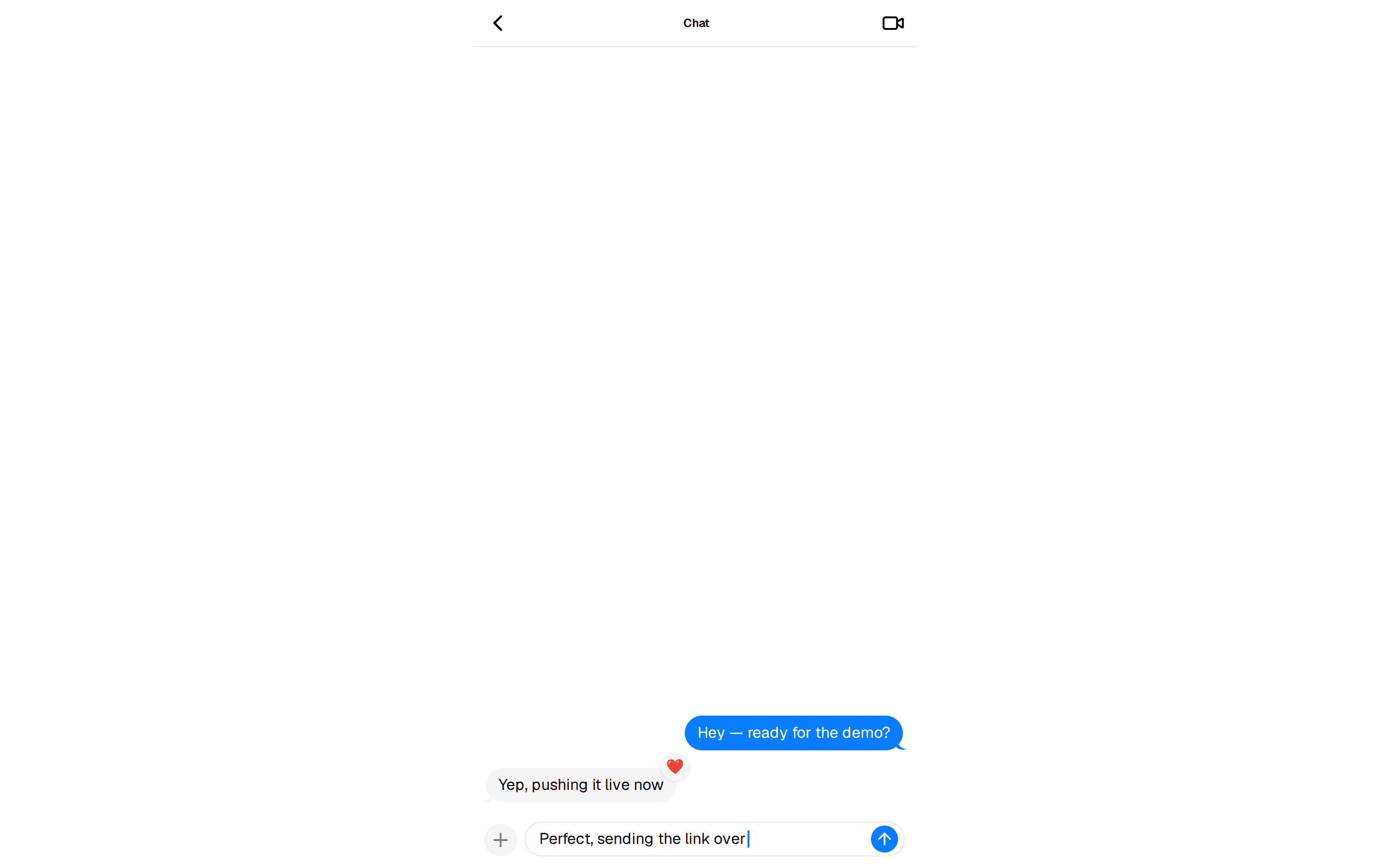
A static emoji row, a pressable reaction with a count, and a top anchored row.
@reui
A static emoji row, a pressable reaction with a count, and a top anchored row.
@reui
c-bubble-4.tsx
"use client"

import { useState } from "react"

import {
  Bubble,
  BubbleContent,
  BubbleReactions,
} from "@/components/ui/bubble"
import { Button } from "@/components/ui/button"
import { Card, CardContent } from "@/components/ui/card"

export function Pattern() {
  const [reacted, setReacted] = useState(false)

  // Derived during render, never mirrored into a second piece of state.
  const cheers = reacted ? 4 : 3

  return (
    // The pill rings itself in the card colour, so these bubbles sit on a Card.
    // On the raw page background that ring reads as a lighter halo in dark.
    <Card className="w-full max-w-sm">
      {/* gap-8, not the thread gap: a reactions row sits three quarters of
          its height outside the bubble and would land on the next message. */}
      <CardContent className="flex flex-col gap-8">
        <Bubble variant="secondary">
          <BubbleContent>
            The new empty state shipped behind the flag.
          </BubbleContent>
          <BubbleReactions
            role="img"
            aria-label="Reactions: thumbs up, party popper, and 2 more"
          >
            <span>👍</span>
            <span>🎉</span>
            <span>+2</span>
          </BubbleReactions>
        </Bubble>
        <Bubble variant="default" align="end">
          <BubbleContent>
            Rolling it out to the beta workspaces now.
          </BubbleContent>
          {/* The row collapses its own padding once it holds a button, so the
              single control is the hit area. That pill is already the muted
              tone ghost hovers to, so the class replaces that hover, and
              rounded-[inherit] takes its radius (square in lyra and sera). */}
          <BubbleReactions align="start">
            <Button
              variant="ghost"
              size="xs"
              className="hover:bg-foreground/10 dark:hover:bg-foreground/15 rounded-[inherit]"
              aria-pressed={reacted}
              aria-label={`React with a party popper, ${cheers} so far`}
              onClick={() => setReacted((value) => !value)}
            >
              <span aria-hidden="true">🎉</span>
              {/* The pressed tint rides on the count, so the state stays
                  visible to anyone who cannot hear aria-pressed read out. */}
              <span className="group-aria-pressed/button:text-primary tabular-nums">
                {cheers}
              </span>
            </Button>
          </BubbleReactions>
        </Bubble>
        <Bubble variant="muted">
          <BubbleContent>Docs update is queued for tomorrow.</BubbleContent>
          <BubbleReactions
            side="top"
            align="start"
            role="img"
            aria-label="Reaction: eyes"
          >
            <span>👀</span>
          </BubbleReactions>
        </Bubble>
      </CardContent>
    </Card>
  )
}