Content Section Five
A sticky editorial narrative with a normal mobile flow and a sequence of image-led content panels.
@navui
A sticky editorial narrative with a normal mobile flow and a sequence of image-led content panels.
@navui
src/registry/blocks/content/content-section-five/content-section-five.tsx
import type { ComponentProps } from 'react'
import Image from 'next/image'
import { ArrowUpRight } from 'lucide-react'

import { cn } from '@/lib/utils'

export type ContentSectionFiveContent = {
  eyebrow: string
  heading: string
  description: string
  link?: {
    label: string
    href: string
  }
}

export type ContentSectionFivePanel = {
  title: string
  description: string
  image: {
    src: string
    alt: string
  }
  metadata?: string
}

export type ContentSectionFiveProps = Omit<ComponentProps<'section'>, 'children' | 'content'> & {
  content?: ContentSectionFiveContent
  panels?: readonly ContentSectionFivePanel[]
}

const defaultContent: ContentSectionFiveContent = {
  eyebrow: 'Content',
  heading: 'Decisions stay connected from planning to release.',
  description:
    'Each stage builds on the last, keeping the original context visible throughout the work.',
  link: {
    label: 'Explore the workflow',
    href: '#workflow',
  },
}

const defaultPanels: readonly ContentSectionFivePanel[] = [
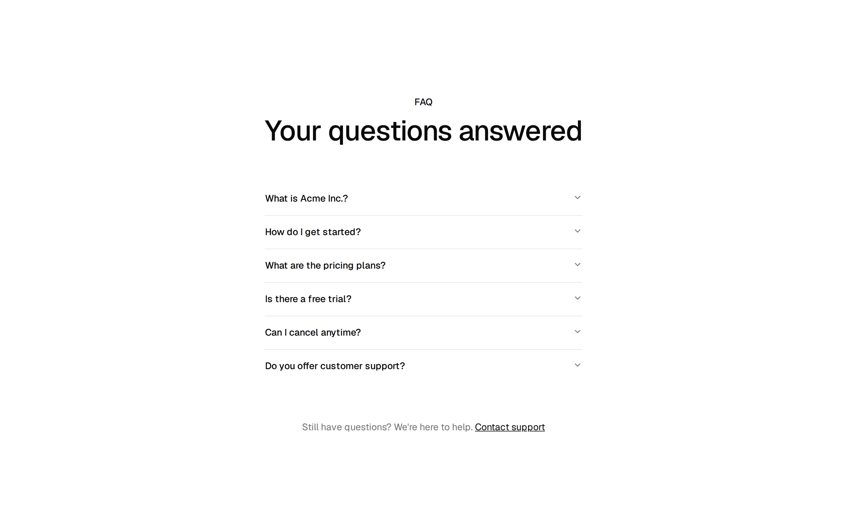
  {
    title: 'Frame the outcome',
    description:
      'Define the customer problem, intended change, and constraints before the work begins.',
    image: {
      src: 'https://p1r7j2dwef.ufs.sh/f/nrPqHGLL1RTlh4cfuGJ0RlaETPbLcZQjyfg2StNvuB13w8rI',
      alt: 'Design Image Phase 1',
    },
    metadata: 'Brief',
  },
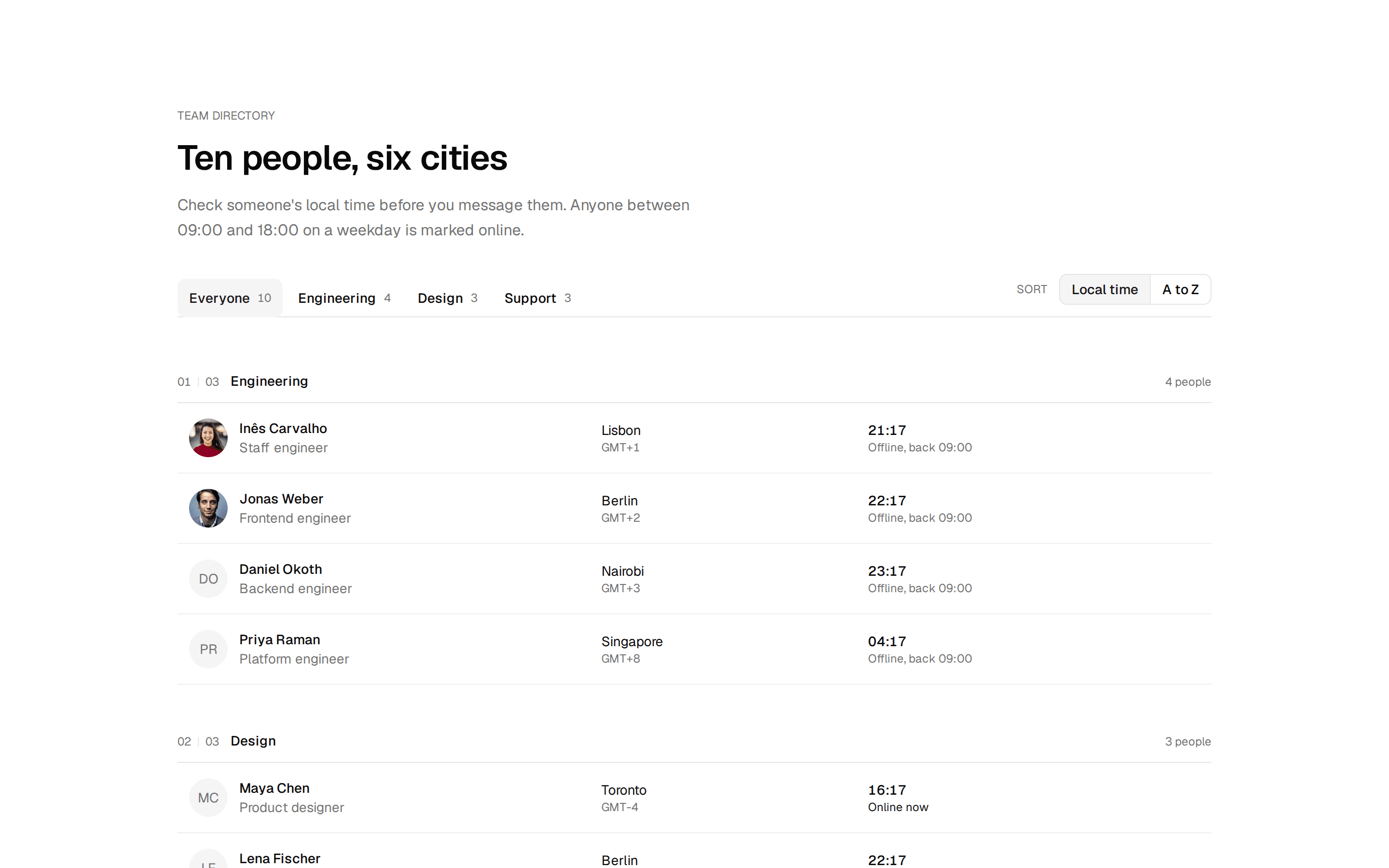
  {
    title: 'Make it tangible',
    description:
      'Give the team something concrete to review while decisions remain inexpensive to change.',
    image: {
      src: 'https://p1r7j2dwef.ufs.sh/f/nrPqHGLL1RTlBE1JQ6bM0rCoZtdKDAVO8yw7eSuvUb1LhYIJ',
      alt: 'Design Image Phase 2',
    },
    metadata: 'Product review',
  },
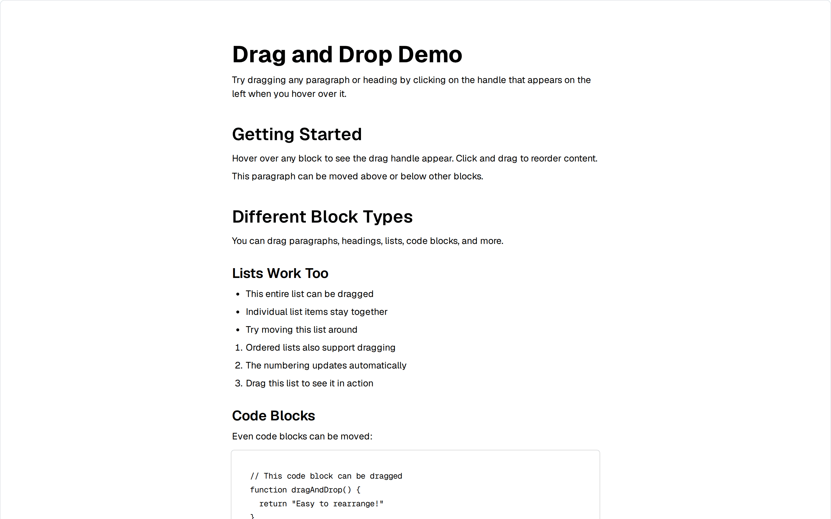
  {
    title: 'Publish the useful version',
    description:
      'Carry the reason, impact, and essential details of the change into the final release.',
    image: {
      src: 'https://p1r7j2dwef.ufs.sh/f/nrPqHGLL1RTljn0lnIziS93GUAyT2Loud5qMEamYgj7C0BVN',
      alt: 'Design Image Phase 3',
    },
    metadata: 'Release',
  },
]

export default function ContentSectionFive({
  className,
  content = defaultContent,
  panels = defaultPanels,
  ...props
}: ContentSectionFiveProps) {
  return (
    <section
      data-slot="content-section-five"
      className={cn('bg-background py-20 text-foreground sm:py-24 lg:py-28', className)}
      {...props}
    >
      <div className="mx-auto grid w-full max-w-7xl gap-12 px-5 sm:px-8 lg:grid-cols-[0.68fr_1.32fr] lg:gap-20">
        <header className="lg:sticky lg:top-24 lg:self-start lg:pr-4">
          <p className="text-xs tracking-wide text-muted-foreground uppercase">{content.eyebrow}</p>

          <h2 className="mt-4 max-w-md text-3xl font-medium tracking-tight text-balance sm:text-4xl">
            {content.heading}
          </h2>

          <p className="mt-4 max-w-sm text-sm leading-6 text-muted-foreground sm:text-base sm:leading-7">
            {content.description}
          </p>

          {content.link ? (
            <a
              href={content.link.href}
              className="mt-5 inline-flex min-h-10 items-center gap-2 text-sm font-medium underline-offset-4 hover:underline focus-visible:outline-2 focus-visible:outline-offset-4 focus-visible:outline-ring"
            >
              {content.link.label}

              <ArrowUpRight aria-hidden="true" className="size-4" />
            </a>
          ) : null}
        </header>

        <ol id="workflow" className="scroll-mt-24 space-y-14 lg:space-y-20">
          {panels.map((panel, index) => {
            const step = String(index + 1).padStart(2, '0')

            return (
              <li key={`${panel.title}-${index}`}>
                <article className="border-t pt-5 sm:pt-6">
                  <div className="mb-4 flex items-center gap-3">
                    <span className="font-mono text-[11px] text-muted-foreground">{step}</span>

                    <span aria-hidden="true" className="h-px flex-1 bg-border/70" />

                    {panel.metadata ? (
                      <span className="text-xs text-muted-foreground">{panel.metadata}</span>
                    ) : null}
                  </div>

                  <div className="aspect-4/3 rounded-xl bg-muted p-1 shadow-sm ring-1 shadow-black/5 ring-foreground/10 sm:aspect-16/10 dark:shadow-black/20">
                    <figure className="relative size-full overflow-hidden rounded-lg">
                      <Image
                        src={panel.image.src}
                        alt={panel.image.alt}
                        fill
                        loading="eager"
                        className="object-cover object-top"
                        sizes="(max-width: 639px) calc(100vw - 40px), (max-width: 1023px) calc(100vw - 64px), 700px"
                      />
                    </figure>
                  </div>

                  <div className="mt-5 grid gap-2 sm:grid-cols-[0.72fr_1.28fr] sm:gap-8">
                    <h3 className="max-w-xs text-lg font-semibold tracking-tight sm:text-xl">
                      {panel.title}
                    </h3>

                    <p className="max-w-lg text-sm leading-6 text-muted-foreground">
                      {panel.description}
                    </p>
                  </div>
                </article>
              </li>
            )
          })}
        </ol>
      </div>
    </section>
  )
}