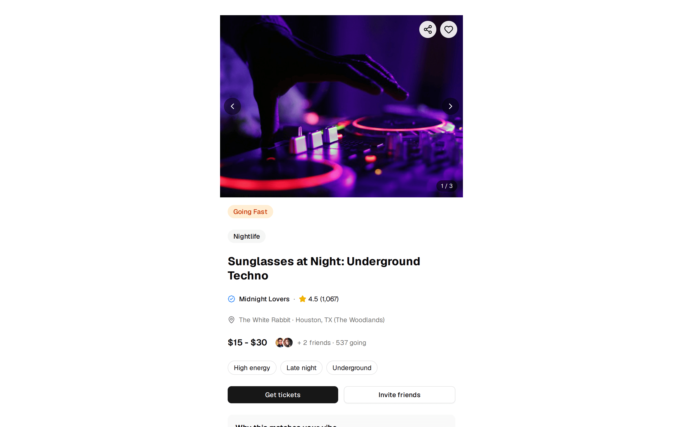
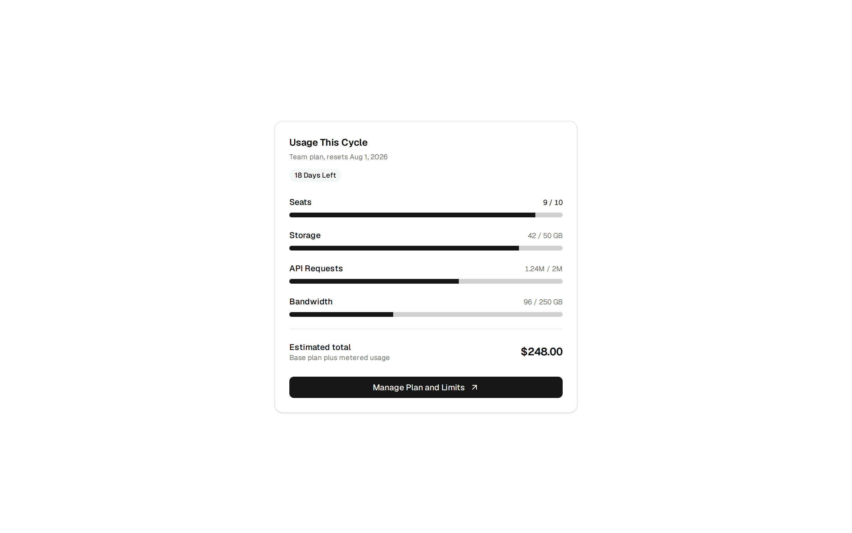
Post Card
Post card with image, title, excerpt, author info and read more button. Supports default, compact, horizontal, and covered variants. Includes post-detail for fullscreen view.
@manifest
Post card with image, title, excerpt, author info and read more button. Supports default, compact, horizontal, and covered variants. Includes post-detail for fullscreen view.
@manifest
'use client'

import { Button } from '@/components/ui/button'

// Import types from shared types file to avoid circular dependencies
import type { Post } from './types'
// Re-export for backward compatibility
export type { Post } from './types'

import { demoPost } from './demo/blogging'


/**
 * ═══════════════════════════════════════════════════════════════════════════
 * PostCardProps
 * ═══════════════════════════════════════════════════════════════════════════
 *
 * Props for the PostCard component, a blog post card with multiple layout variants.
 */
export interface PostCardProps {
  data?: {
    /** The blog post to display. */
    post?: Post
  }
  actions?: {
    /** Called when the read more button is clicked. */
    onReadMore?: (post: Post) => void
  }
  appearance?: {
    /**
     * Card layout variant.
     * @default "default"
     */
    variant?: 'default' | 'compact' | 'horizontal' | 'covered'
    /**
     * Whether to show the cover image.
     * @default true
     */
    showImage?: boolean
    /**
     * Whether to show author information.
     * @default true
     */
    showAuthor?: boolean
    /**
     * Whether to show the category label.
     * @default true
     */
    showCategory?: boolean
  }
}

/**
 * A blog post card component with multiple layout variants.
 * Supports default, compact, horizontal, and covered (overlay) styles.
 *
 * Features:
 * - Four layout variants (default, compact, horizontal, covered)
 * - Cover image with hover zoom effect
 * - Author avatar and info display
 * - Category and tags display
 * - Read more action button
 * - Responsive design
 *
 * @component
 * @example
 * ```tsx
 * <PostCard
 *   data={{
 *     post: {
 *       title: "Getting Started Guide",
 *       excerpt: "Learn the basics of our component library.",
 *       coverImage: "https://example.com/image.jpg",
 *       author: { name: "Sarah Chen", avatar: "https://example.com/avatar.jpg" },
 *       publishedAt: "2024-01-15",
 *       readTime: "5 min read",
 *       tags: ["Tutorial", "Components"],
 *       category: "Tutorial"
 *     }
 *   }}
 *   actions={{
 *     onReadMore: (post) => console.log("Read more:", post.title)
 *   }}
 *   appearance={{
 *     variant: "default",
 *     showImage: true,
 *     showAuthor: true,
 *     showCategory: true
 *   }}
 * />
 * ```
 */
export function PostCard({ data, actions, appearance }: PostCardProps) {
  const resolved: NonNullable<PostCardProps['data']> = data ?? { post: demoPost }
  const post = resolved.post
  if (!post) {
    return null
  }
  const onReadMore = actions?.onReadMore
  const variant = appearance?.variant ?? 'default'
  const showImage = appearance?.showImage ?? true
  const showAuthor = appearance?.showAuthor ?? true
  const showCategory = appearance?.showCategory ?? true

  // Handle "Read more" click - only call callback if provided, otherwise do nothing
  // This lets users decide to use an external link or open fullscreen mode
  const handleReadMore = () => {
    if (onReadMore) {
      onReadMore(post)
    }
  }

  const formatDate = (dateStr: string) => {
    return new Date(dateStr).toLocaleDateString('en-US', {
      month: 'short',
      day: 'numeric',
      year: 'numeric'
    })
  }

  if (variant === 'covered') {
    return (
      <div className="relative overflow-hidden rounded-lg border">
        <div className="min-h-[280px] sm:aspect-[16/9] sm:min-h-0 w-full">
          {post.coverImage ? (
            <img
              src={post.coverImage}
              alt={post.title || ''}
              className="absolute inset-0 h-full w-full object-cover"
            />
          ) : (
            <div className="absolute inset-0 h-full w-full bg-muted" />
          )}
        </div>
        {/* Minimal overlay - solid color instead of gradient per ChatGPT guidelines */}
        <div className="absolute inset-0 bg-black/60" />
        <div className="absolute inset-0 flex flex-col justify-end p-4 text-white">
          <div>
            {showCategory && post.category && (
              <p className="text-[10px] font-medium uppercase tracking-wide text-white/70">
                {post.category}
              </p>
            )}
            {post.title && (
              <h2 className="mt-1 text-lg font-semibold leading-tight">
                {post.title}
              </h2>
            )}
            {post.excerpt && (
              <p className="mt-1 line-clamp-2 text-sm text-white/80">
                {post.excerpt}
              </p>
            )}
            {post.tags && post.tags.length > 0 && (
              <div className="mt-2 flex flex-wrap gap-1">
                {post.tags.slice(0, 2).map((tag) => (
                  <span
                    key={tag}
                    className="rounded-md bg-white/20 px-2 py-0.5 text-xs"
                  >
                    {tag}
                  </span>
                ))}
              </div>
            )}
            <div className="mt-3 flex flex-col gap-3 sm:flex-row sm:items-center sm:justify-between">
              {showAuthor && (
                <div className="flex items-center gap-2">
                  {post.author?.avatar && (
                    <img
                      src={post.author.avatar}
                      alt={post.author?.name || ''}
                      className="h-6 w-6 rounded-full ring-1 ring-white/30"
                    />
                  )}
                  <div className="text-xs">
                    {post.author?.name && (
                      <p className="font-medium">{post.author.name}</p>
                    )}
                    {post.publishedAt && (
                      <p className="text-white/60">
                        {formatDate(post.publishedAt)}
                      </p>
                    )}
                  </div>
                </div>
              )}
              <Button
                size="sm"
                variant="secondary"
                className="w-full sm:w-auto"
                onClick={handleReadMore}
              >
                Read article
              </Button>
            </div>
          </div>
        </div>
      </div>
    )
  }

  if (variant === 'horizontal') {
    return (
      <div className="flex flex-col sm:flex-row gap-4 rounded-lg border bg-card p-3">
        {showImage && post.coverImage && (
          <div className="aspect-video sm:aspect-square sm:h-24 sm:w-24 shrink-0 overflow-hidden rounded-md">
            <img
              src={post.coverImage}
              alt={post.title || ''}
              className="h-full w-full object-cover"
            />
          </div>
        )}
        <div className="flex flex-1 flex-col justify-between">
          <div>
            {showCategory && post.category && (
              <p className="mb-0.5 text-[10px] font-medium uppercase tracking-wide text-muted-foreground">
                {post.category}
              </p>
            )}
            {post.title && (
              <h3 className="line-clamp-2 text-sm font-medium leading-tight">
                {post.title}
              </h3>
            )}
            {post.excerpt && (
              <p className="mt-1 line-clamp-2 text-xs text-muted-foreground">
                {post.excerpt}
              </p>
            )}
            {post.tags && post.tags.length > 0 && (
              <div className="mt-1.5 flex flex-wrap gap-1">
                {post.tags.slice(0, 2).map((tag) => (
                  <span
                    key={tag}
                    className="rounded-full bg-muted px-2 py-0.5 text-xs text-muted-foreground"
                  >
                    {tag}
                  </span>
                ))}
              </div>
            )}
          </div>
          <div className="mt-3 flex flex-col gap-2 sm:flex-row sm:items-center sm:justify-between">
            <div className="flex items-center gap-2 text-xs text-muted-foreground">
              {showAuthor && post.author?.avatar && (
                <img
                  src={post.author.avatar}
                  alt={post.author?.name || ''}
                  className="h-4 w-4 rounded-full"
                />
              )}
              {post.publishedAt && (
                <span>{formatDate(post.publishedAt)}</span>
              )}
              {post.readTime && (
                <>
                  <span>·</span>
                  <span>{post.readTime}</span>
                </>
              )}
            </div>
            <Button
              size="sm"
              className="w-full sm:w-auto"
              onClick={handleReadMore}
            >
              Read
            </Button>
          </div>
        </div>
      </div>
    )
  }

  if (variant === 'compact') {
    return (
      <div className="flex h-full flex-col justify-between rounded-lg border bg-card p-3">
        <div>
          {showCategory && post.category && (
            <p className="mb-0.5 text-[10px] font-medium uppercase tracking-wide text-muted-foreground">
              {post.category}
            </p>
          )}
          {post.title && (
            <h3 className="line-clamp-2 text-sm font-medium">{post.title}</h3>
          )}
          {post.excerpt && (
            <p className="mt-1 line-clamp-2 text-xs text-muted-foreground">
              {post.excerpt}
            </p>
          )}
          {post.tags && post.tags.length > 0 && (
            <div className="mt-1.5 flex flex-wrap gap-1">
              {post.tags.slice(0, 2).map((tag) => (
                <span
                  key={tag}
                  className="rounded-full bg-muted px-2 py-0.5 text-xs text-muted-foreground"
                >
                  {tag}
                </span>
              ))}
            </div>
          )}
        </div>
        <div className="mt-3 flex flex-col gap-2 sm:flex-row sm:items-center sm:justify-between">
          <div className="flex items-center gap-2">
            {showAuthor && post.author?.avatar && (
              <img
                src={post.author.avatar}
                alt={post.author?.name || ''}
                className="h-5 w-5 rounded-full"
              />
            )}
            {post.publishedAt && (
              <span className="text-xs text-muted-foreground">
                {formatDate(post.publishedAt)}
              </span>
            )}
          </div>
          <Button size="sm" onClick={handleReadMore}>
            Read more
          </Button>
        </div>
      </div>
    )
  }

  // Default variant
  return (
    <div className="flex h-full flex-col overflow-hidden rounded-lg border bg-card">
      {showImage && post.coverImage && (
        <div className="aspect-video overflow-hidden">
          <img
            src={post.coverImage}
            alt={post.title || ''}
            className="h-full w-full object-cover transition-transform hover:scale-105"
          />
        </div>
      )}
      <div className="flex flex-1 flex-col justify-between p-4">
        <div>
          {showCategory && post.category && (
            <p className="mb-1 text-[10px] font-medium uppercase tracking-wide text-muted-foreground">
              {post.category}
            </p>
          )}
          {post.title && (
            <h3 className="line-clamp-2 font-medium">{post.title}</h3>
          )}
          {post.excerpt && (
            <p className="mt-2 line-clamp-2 text-sm text-muted-foreground">
              {post.excerpt}
            </p>
          )}
          {post.tags && post.tags.length > 0 && (
            <div className="mt-2 flex flex-wrap gap-1">
              {post.tags.slice(0, 2).map((tag) => (
                <span
                  key={tag}
                  className="rounded-full bg-muted px-2 py-0.5 text-xs text-muted-foreground"
                >
                  {tag}
                </span>
              ))}
            </div>
          )}
        </div>
        <div className="mt-4 flex flex-col gap-3 sm:flex-row sm:items-center sm:justify-between">
          {showAuthor && (
            <div className="flex items-center gap-2">
              {post.author?.avatar && (
                <img
                  src={post.author.avatar}
                  alt={post.author?.name || ''}
                  className="h-6 w-6 rounded-full"
                />
              )}
              <div className="text-xs">
                {post.author?.name && (
                  <p className="font-medium">{post.author.name}</p>
                )}
                {post.publishedAt && (
                  <p className="text-muted-foreground">
                    {formatDate(post.publishedAt)}
                  </p>
                )}
              </div>
            </div>
          )}
          <Button size="sm" onClick={handleReadMore}>
            Read
          </Button>
        </div>
      </div>
    </div>
  )
}