import { Redline } from "@/components/ui/redline";

const tokens = {
  4: "space-1",
  8: "space-2",
  12: "space-3",
  16: "space-4",
  24: "space-6",
  32: "space-8",
};

const rows = [
  {
    name: "Comments",
    note: "Replies and mentions in threads you follow",
    on: true,
    icon: "M4 5h16v11H8l-4 4V5Z",
  },
  {
    name: "Reviews",
    note: "When someone asks you to review a file",
    on: true,
    icon: "M5 12.5 9.5 17 19 7",
  },
  {
    name: "Weekly digest",
    note: "A summary of the week, every Monday",
    on: false,
    icon: "M4 6h16M4 12h16M4 18h10",
  },
];

export function RedlineTokensDemo() {
  return (
    <div className="w-full max-w-md text-zinc-900 dark:text-zinc-50">
      <Redline
        tokens={tokens}
        selector="[data-redline]"
        tour={["panel", ["Comments row", "Reviews row"], "header", "footer"]}
        aria-label="Notification settings, with spacing tokens"
        className="rounded-2xl"
      >
        <div
          data-redline="panel"
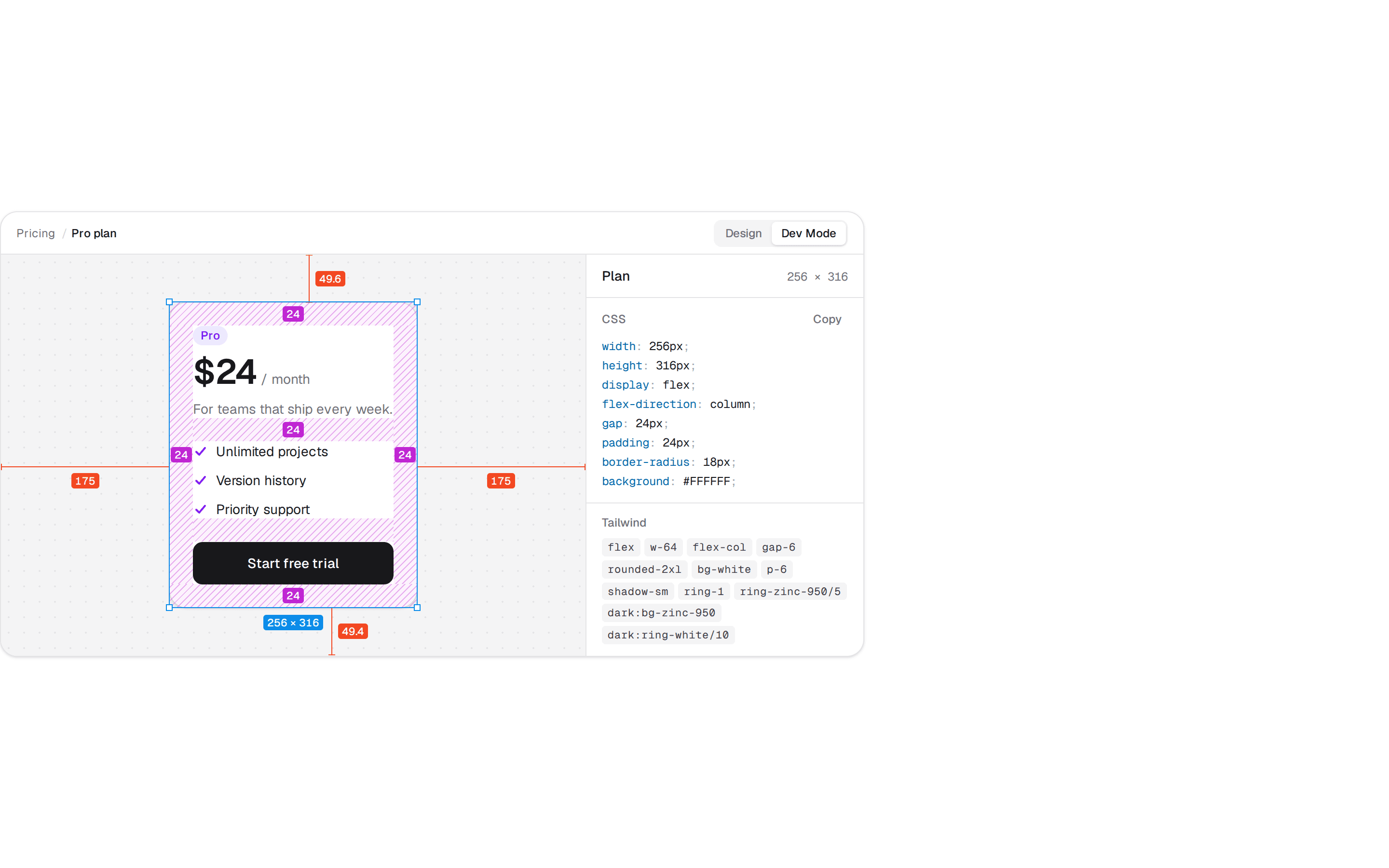
          className="flex flex-col gap-6 rounded-2xl bg-white p-6 shadow-sm ring-1 ring-zinc-950/5 dark:bg-zinc-900 dark:ring-white/10"
        >
          <header data-redline="header" className="flex flex-col gap-1">
            <h3 data-redline="heading" className="text-base/6 font-semibold">
              Notifications
            </h3>
            <p data-redline="summary" className="text-sm/5 text-zinc-500 dark:text-zinc-400">
              Choose what reaches you, and when.
            </p>
          </header>

          <ul data-redline="list" className="flex flex-col gap-2">
            {rows.map((row) => (
              <li
                key={row.name}
                data-redline={`${row.name} row`}
                className="flex items-center gap-3 rounded-xl bg-zinc-50 p-4 ring-1 ring-zinc-950/5 dark:bg-zinc-950/50 dark:ring-white/5"
              >
                <span
                  data-redline={`${row.name} icon`}
                  className="grid size-8 shrink-0 place-items-center rounded-lg bg-white ring-1 ring-zinc-950/10 dark:bg-zinc-800 dark:ring-white/10"
                >
                  <svg
                    viewBox="0 0 24 24"
                    aria-hidden
                    className="size-4 fill-none stroke-current stroke-2 text-zinc-500 dark:text-zinc-400"
                    strokeLinecap="round"
                    strokeLinejoin="round"
                  >
                    <path d={row.icon} />
                  </svg>
                </span>
                <span className="min-w-0 flex-1">
                  <span className="block text-sm/5 font-medium">{row.name}</span>
                  <span className="block truncate text-xs/4 text-zinc-500 dark:text-zinc-400">
                    {row.note}
                  </span>
                </span>
                <span
                  data-redline={`${row.name} switch`}
                  role="img"
                  aria-label={row.on ? "On" : "Off"}
                  className={
                    row.on
                      ? "flex h-5 w-9 shrink-0 justify-end rounded-full bg-zinc-900 p-0.5 dark:bg-zinc-50"
                      : "flex h-5 w-9 shrink-0 rounded-full bg-zinc-200 p-0.5 dark:bg-zinc-700"
                  }
                >
                  <span
                    className={
                      row.on
                        ? "size-4 rounded-full bg-white shadow-sm dark:bg-zinc-900"
                        : "size-4 rounded-full bg-white shadow-sm dark:bg-zinc-300"
                    }
                  />
                </span>
              </li>
            ))}
          </ul>

          <footer
            data-redline="footer"
            className="flex justify-end gap-2 border-t border-zinc-950/5 pt-6 dark:border-white/10"
          >
            <button
              data-redline="cancel"
              type="button"
              className="h-9 rounded-lg px-4 text-sm font-medium text-zinc-600 ring-1 ring-zinc-950/10 dark:text-zinc-300 dark:ring-white/15"
            >
              Cancel
            </button>
            <button
              data-redline="save"
              type="button"
              className="h-9 rounded-lg bg-zinc-900 px-4 text-sm font-medium text-white dark:bg-zinc-50 dark:text-zinc-900"
            >
              Save
            </button>
          </footer>
        </div>
      </Redline>

      <p className="mt-10 text-center text-xs/5 text-pretty text-zinc-500">
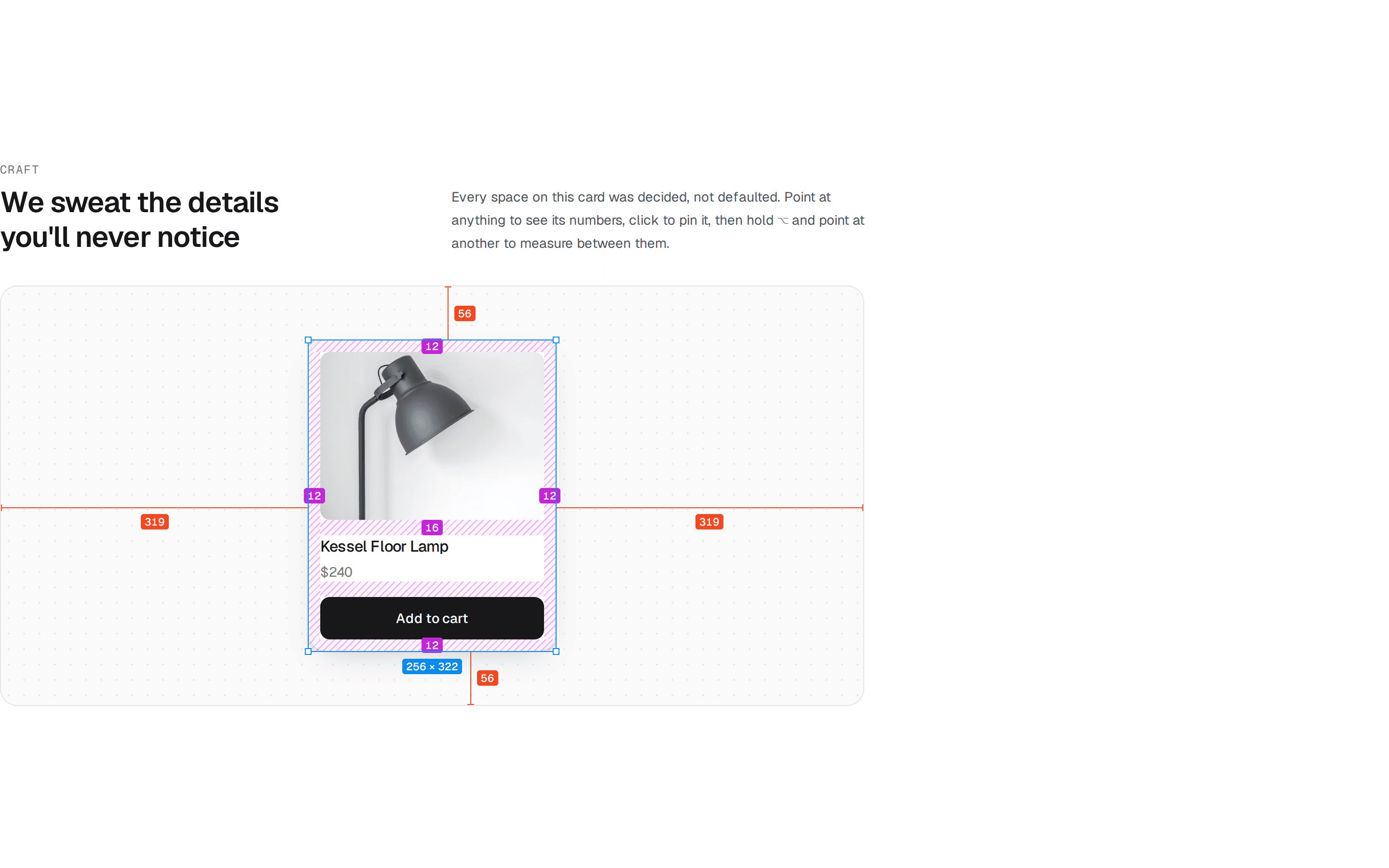
        Click a row to pin it, then hold{" "}
        <kbd className="rounded bg-zinc-100 px-1.5 py-0.5 font-sans text-zinc-600 dark:bg-zinc-800 dark:text-zinc-300">
          ⌥ Option
        </kbd>{" "}
        and point at another. On a phone, tap two rows.
      </p>
    </div>
  );
}