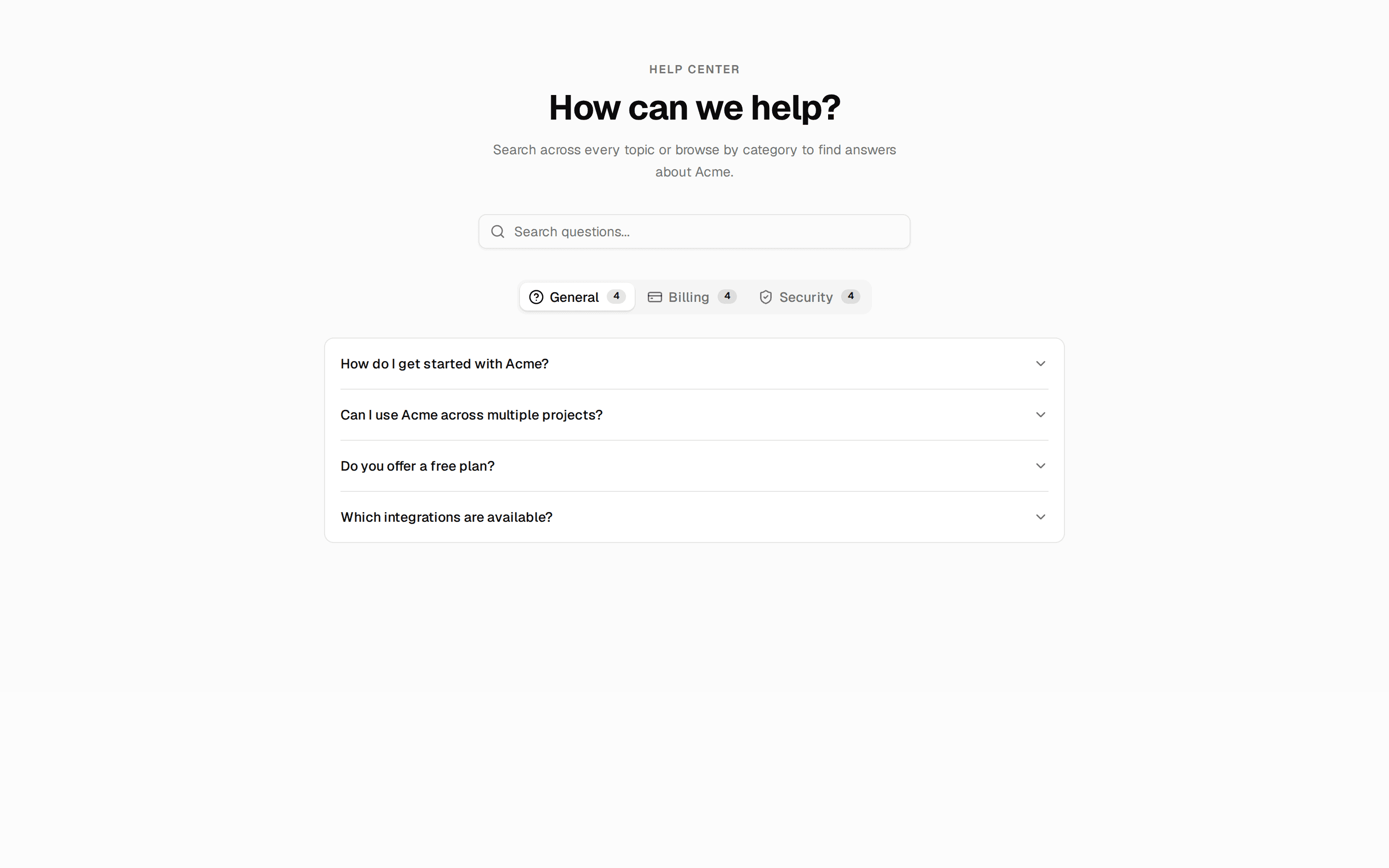
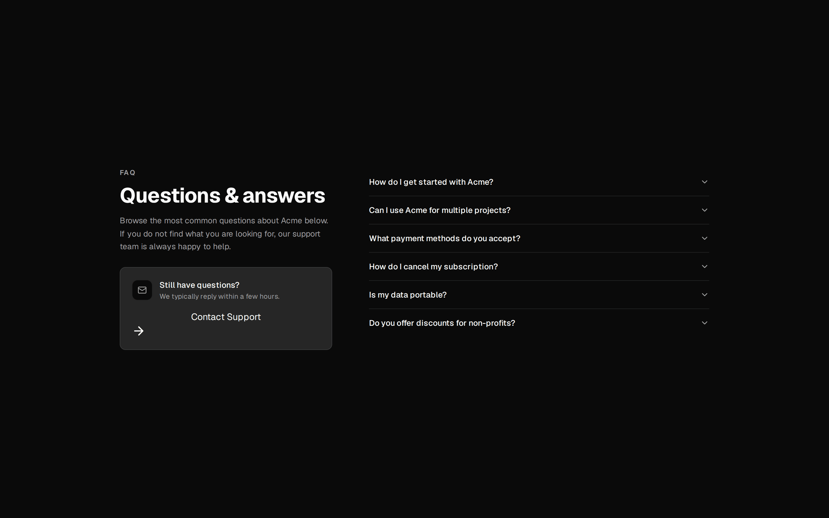
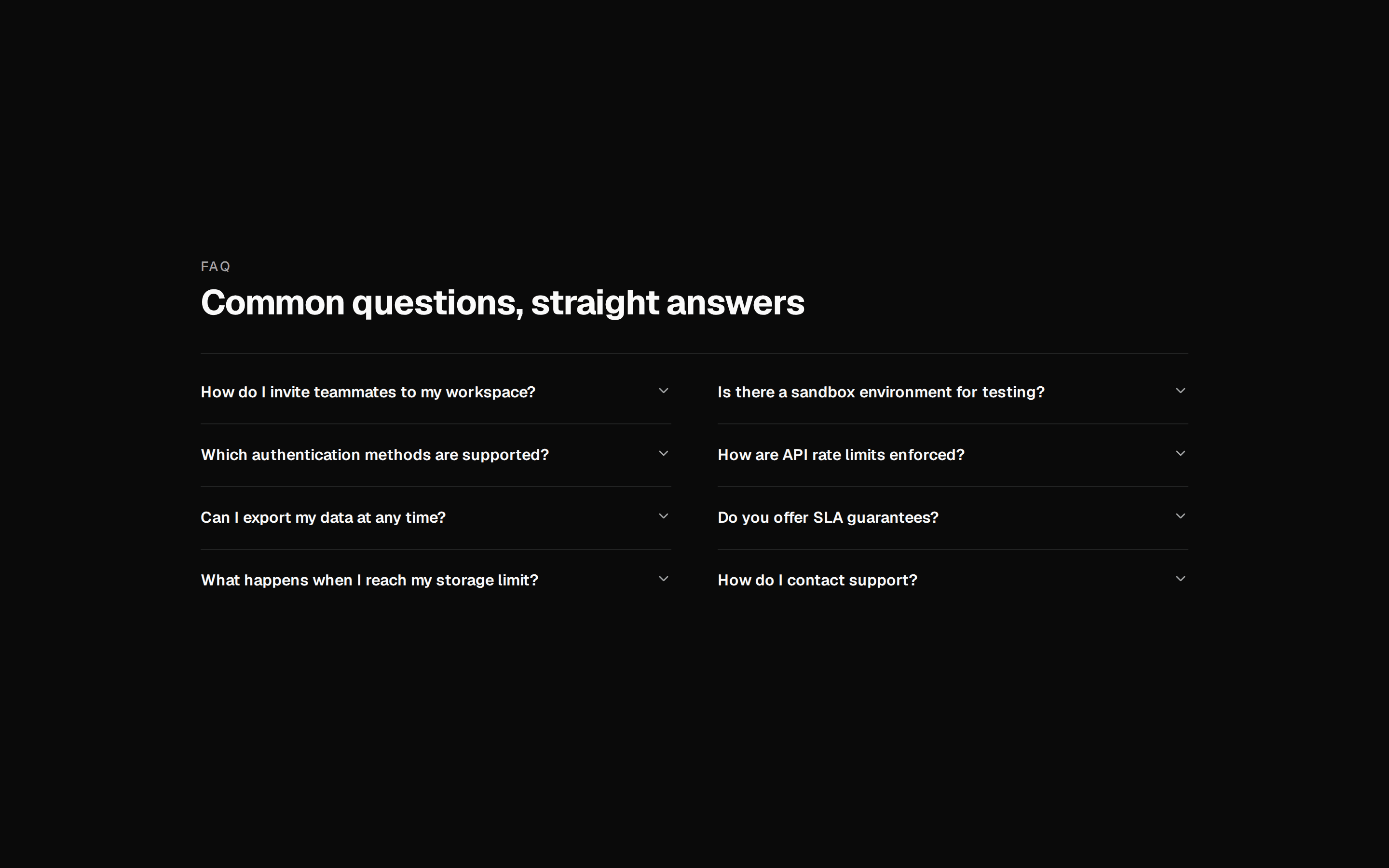
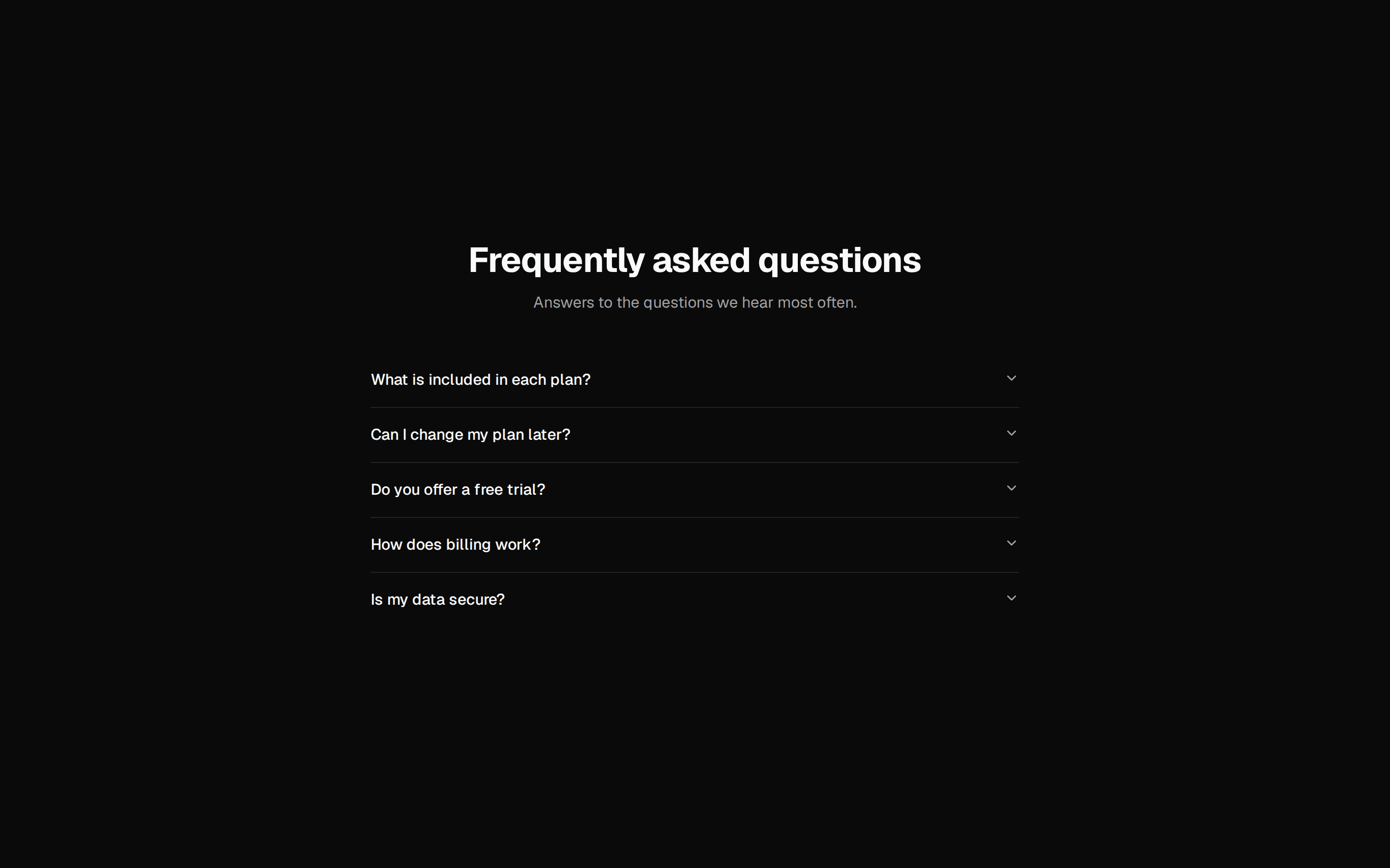
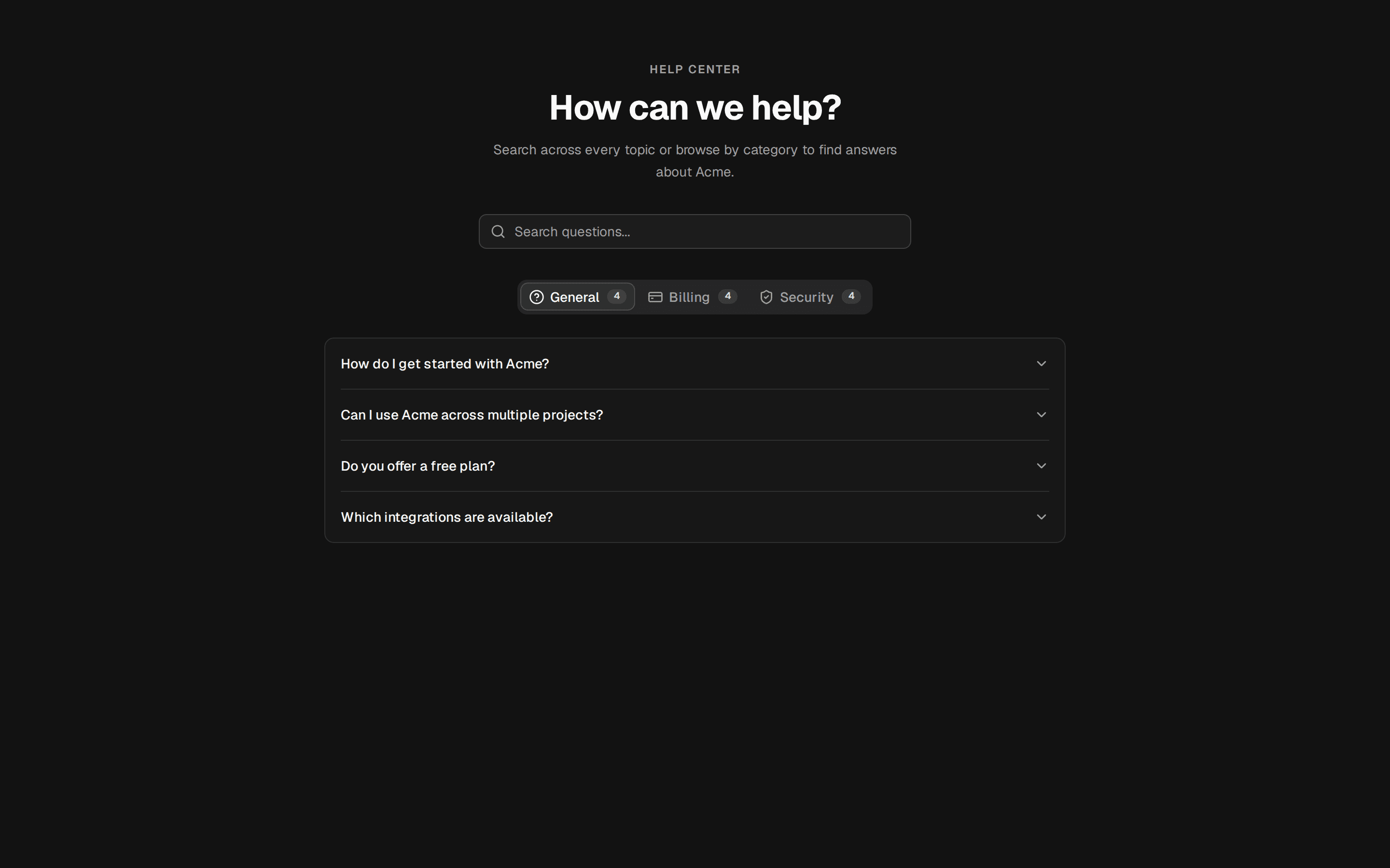
FAQ With Sticky Support Sidebar
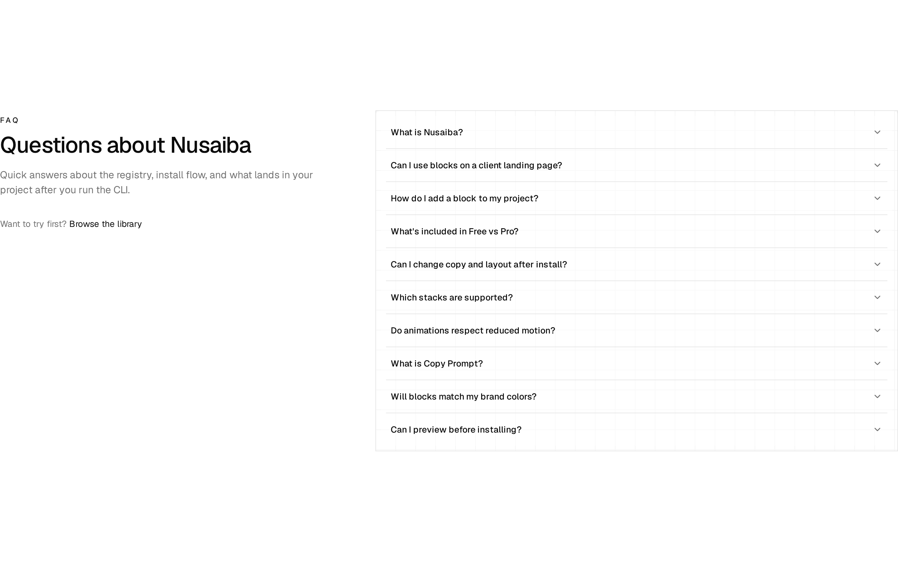
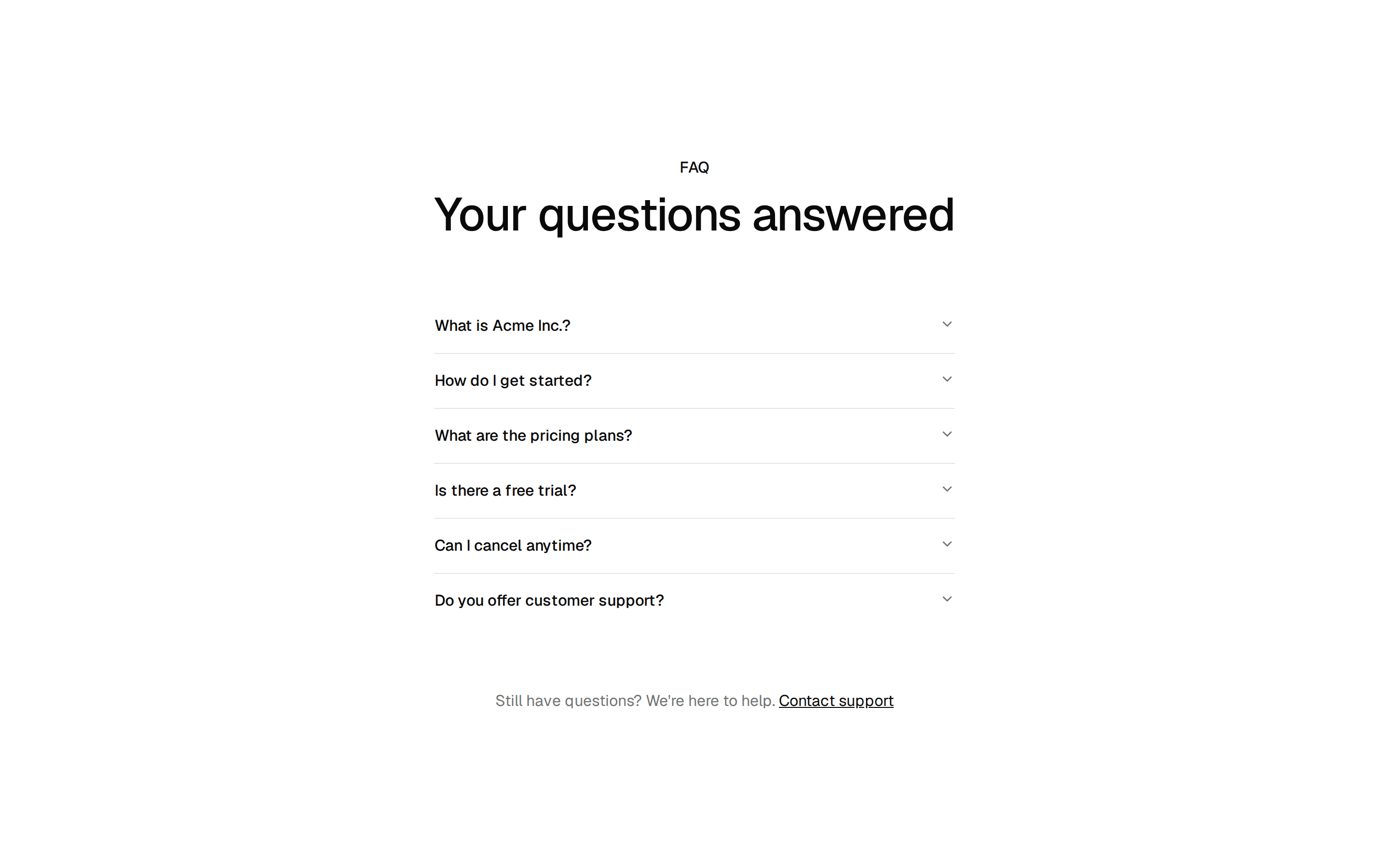
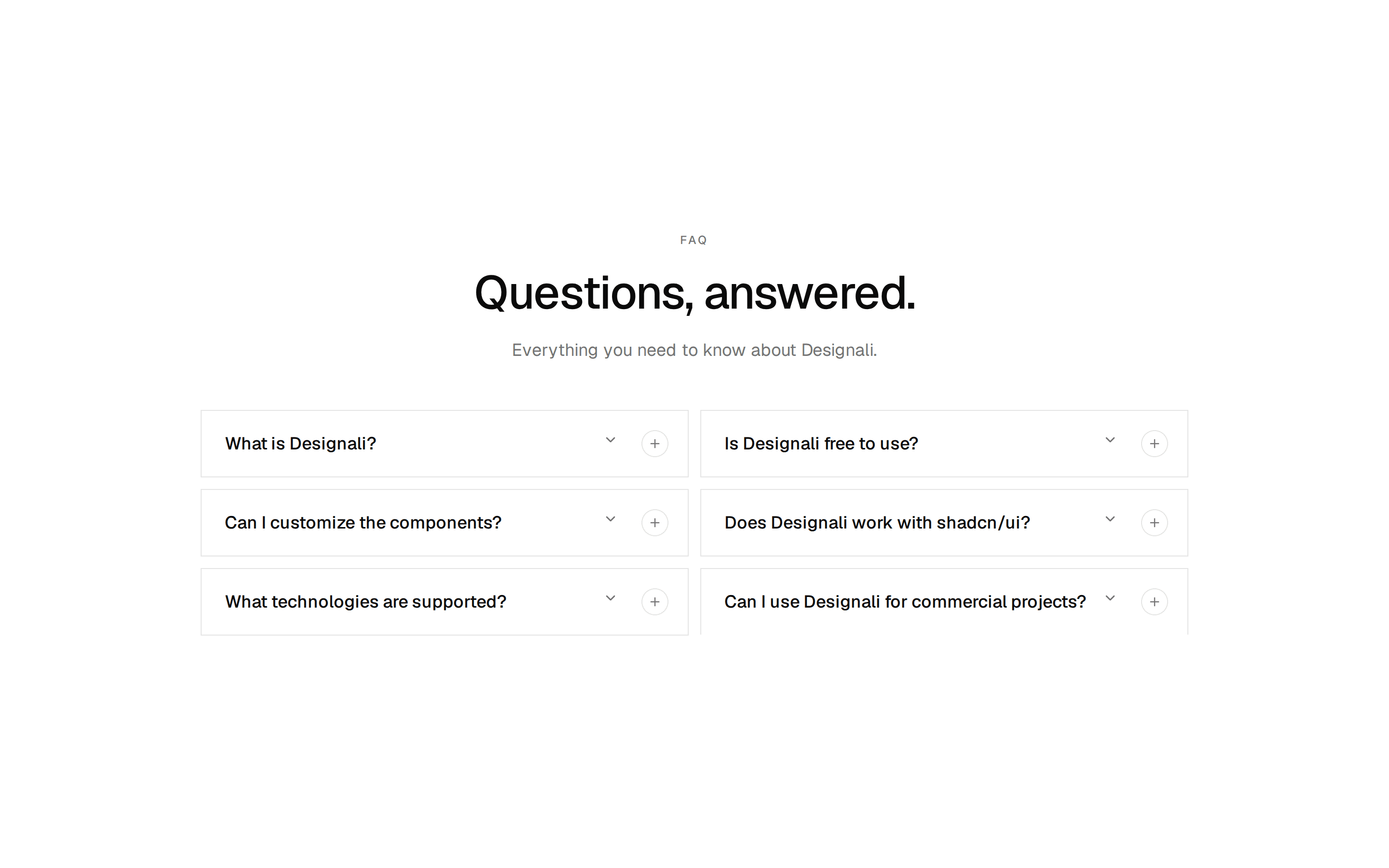
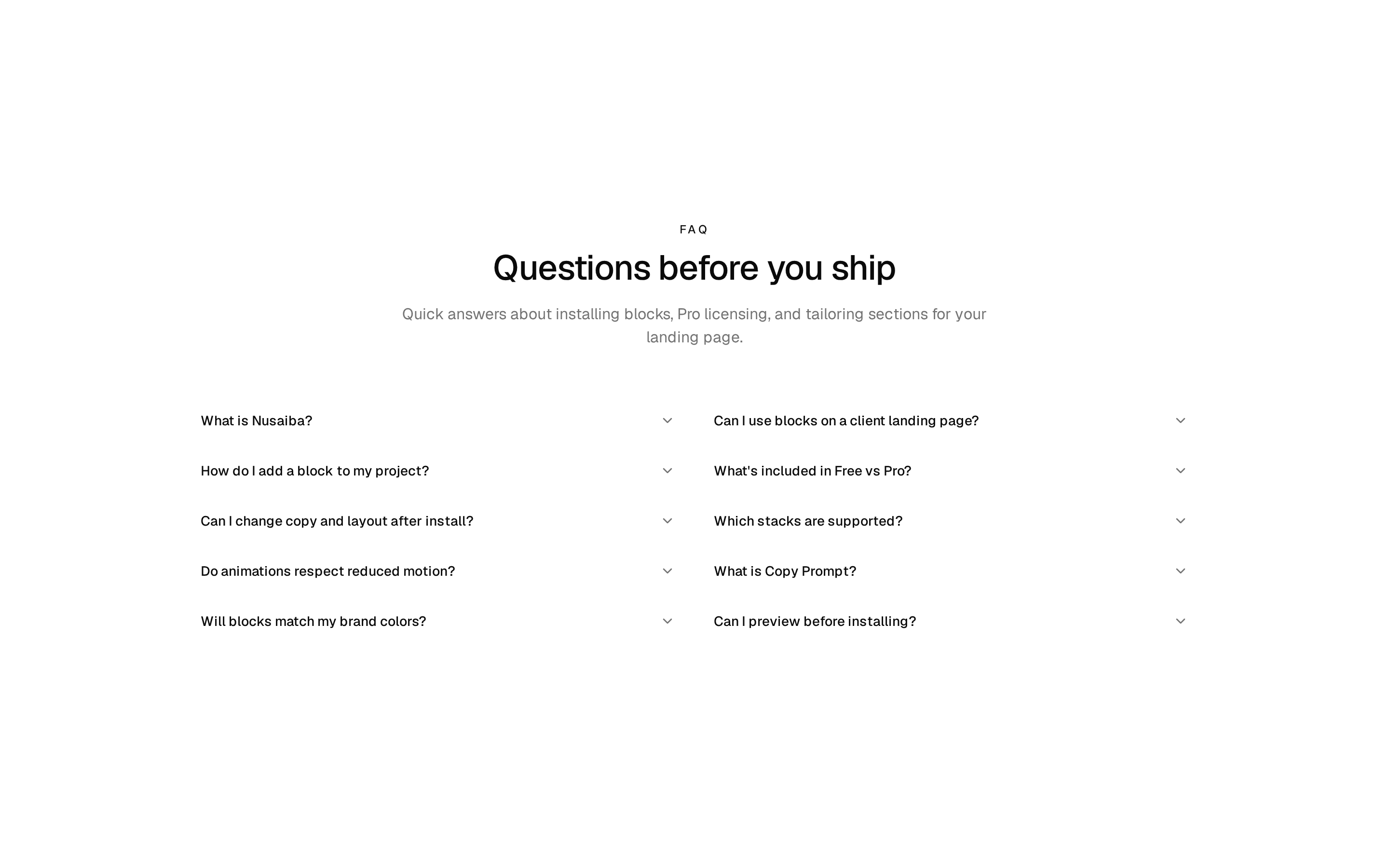
FAQ accordion with a sticky sidebar card offering contact support in a dialog and a link to browse documentation.
@7ovr
FAQ accordion with a sticky sidebar card offering contact support in a dialog and a link to browse documentation.
@7ovr
registry/blocks/faqs/4/faqs-block.tsx
"use client"
import { useState } from "react"
import { toast } from "sonner"
import {
Accordion,
AccordionContent,
AccordionItem,
AccordionTrigger,
} from "@/components/ui/accordion"
import { Button } from "@/components/ui/button"
import {
Card,
CardContent,
CardDescription,
CardHeader,
CardTitle,
} from "@/components/ui/card"
import {
Dialog,
DialogContent,
DialogDescription,
DialogFooter,
DialogHeader,
DialogTitle,
DialogTrigger,
} from "@/components/ui/dialog"
import { Field, FieldGroup, FieldLabel } from "@/components/ui/field"
import { Input } from "@/components/ui/input"
import { Toaster } from "@/components/ui/sonner"
import { Textarea } from "@/components/ui/textarea"
import { IconPlaceholder } from "@/components/icons/icon-placeholder"
const faqs = [
{
q: "How do I install a block from the registry?",
a: "Copy the install command from any block page and run it with the shadcn CLI. The block, its dependencies, and required primitives are added straight to your project.",
},
{
q: "Do the blocks work with my existing theme?",
a: "Yes. Every block is built on shadcn theme tokens, so it inherits your colors, radius, and typography automatically and renders correctly in both light and dark mode.",
},
{
q: "Can I customize a block after installing it?",
a: "Absolutely. Blocks are copied directly into your codebase as plain, editable source, so you own the code and can change markup, styles, and logic however you like.",
},
{
q: "What is the difference between free and Pro blocks?",
a: "Free blocks are open and installable by anyone. Pro blocks unlock advanced layouts, dashboards, and full-page templates, served through your authenticated Acme account.",
},
{
q: "Will updates to a block overwrite my changes?",
a: "No. Because blocks live in your repository, reinstalling a newer version is opt-in. You decide when to pull updates and how to merge them with your edits.",
},
{
q: "Which frameworks are supported?",
a: "Blocks target React 19 and Next.js with the App Router, styled using Tailwind CSS. Most are framework-agnostic enough to drop into any modern React setup.",
},
]
export default function FaqsBlock() {
const [open, setOpen] = useState(false)
return (
<section className="flex w-full items-center justify-center bg-muted/30 px-6 py-16 text-foreground">
<Toaster />
<div className="mx-auto grid w-full max-w-5xl gap-12 md:grid-cols-[1.4fr_1fr] md:gap-16">
<div>
<h2 className="font-heading text-3xl font-bold tracking-tight sm:text-4xl">
Frequently asked questions
</h2>
<p className="mt-3 text-muted-foreground">
Everything you need to know about installing and using Acme blocks.
</p>
<Accordion defaultValue={[faqs[0].q]} className="mt-8">
{faqs.map(({ q, a }) => (
<AccordionItem key={q} value={q}>
<AccordionTrigger className="py-4 text-base font-medium">
{q}
</AccordionTrigger>
<AccordionContent className="pb-4 text-base text-muted-foreground">
{a}
</AccordionContent>
</AccordionItem>
))}
</Accordion>
</div>
<div className="md:pt-16">
<Card className="md:sticky md:top-8">
<CardHeader>
<span className="flex size-10 items-center justify-center rounded-full bg-primary/10 text-primary">
<IconPlaceholder
lucide="Headset"
tabler="IconHeadset"
hugeicons="CustomerSupportIcon"
phosphor="Headset"
remixicon="RiCustomerService2Line"
className="size-5"
/>
</span>
<CardTitle className="mt-4 text-xl">
Still have questions?
</CardTitle>
<CardDescription className="text-base">
Can't find the answer you're looking for? Our support
team usually replies within a few hours.
</CardDescription>
</CardHeader>
<CardContent className="flex flex-col gap-3">
<Dialog open={open} onOpenChange={setOpen}>
<DialogTrigger
render={
<Button className="w-full">
<IconPlaceholder
lucide="Mail"
tabler="IconMail"
hugeicons="MailIcon"
phosphor="Envelope"
remixicon="RiMailLine"
data-icon="inline-start"
/>
Contact Support
<IconPlaceholder
lucide="ArrowRight"
tabler="IconArrowRight"
hugeicons="ArrowRightIcon"
phosphor="ArrowRight"
remixicon="RiArrowRightLine"
data-icon="inline-end"
/>
</Button>
}
/>
<DialogContent>
<form
onSubmit={(event) => {
event.preventDefault()
setOpen(false)
toast.success(
"Message sent. Our support team will reply shortly."
)
}}
>
<DialogHeader>
<DialogTitle>Contact support</DialogTitle>
<DialogDescription>
Send us a message and we'll get back to you within
a few hours.
</DialogDescription>
</DialogHeader>
<FieldGroup className="my-4">
<Field>
<FieldLabel htmlFor="support-email">
Work email
</FieldLabel>
<Input
id="support-email"
type="email"
placeholder="jane@company.com"
required
/>
</Field>
<Field>
<FieldLabel htmlFor="support-message">
How can we help?
</FieldLabel>
<Textarea
id="support-message"
rows={4}
className="resize-none"
placeholder="Describe your question…"
required
/>
</Field>
</FieldGroup>
<DialogFooter showCloseButton>
<Button type="submit">
<IconPlaceholder
lucide="Mail"
tabler="IconMail"
hugeicons="MailIcon"
phosphor="Envelope"
remixicon="RiMailLine"
data-icon="inline-start"
/>
Send Message
</Button>
</DialogFooter>
</form>
</DialogContent>
</Dialog>
<Button
variant="outline"
render={<a href="#" />}
nativeButton={false}
className="w-full"
>
Browse Documentation
</Button>
</CardContent>
</Card>
</div>
</div>
</section>
)
}
Requires a base-* style in components.json (the shadcn init default). Legacy new-york/radix-* styles install Radix primitives, which reject the render prop this block uses.